Welcome
Welcome to the Course Website for EN.580.428 Genomic Data Visualization!
As the primary mode through which analysts and audience members alike consume data, data visualization remains an important hypothesis generating and analytical technique in data-driven research to facilitate new discoveries. However, if done poorly, data visualization can also mislead, bias, and slow down progress. This hands-on course will cover the principles of perception and cognition relevant for data visualization and apply these principles to genomic data, including large-scale single-cell and spatially-resolved omics datasets, using the R statistical programming language. Students will be expected to complete class readings, create weekly data visualizations as homework assignments, and make a major class presentation.
Course Information
Course Staff: Prof. Jean Fan and Rafael dos Santos Peixoto
Lectures: 8:00am-9:50am Monday, Wednesday, and Friday. See Canvas for location details.
Office Hours: 10:00am-10:50am Monday, Wednesday, and Friday. See Canvas for location details.
Course Details
☞ see Course tabFeatured Visualizations
Locating a cell type in breast tissue using spatial transcriptomics data
Describe your figure briefly so we know what you are depicting (you no longer need to use precise data visualization terms as you have been...

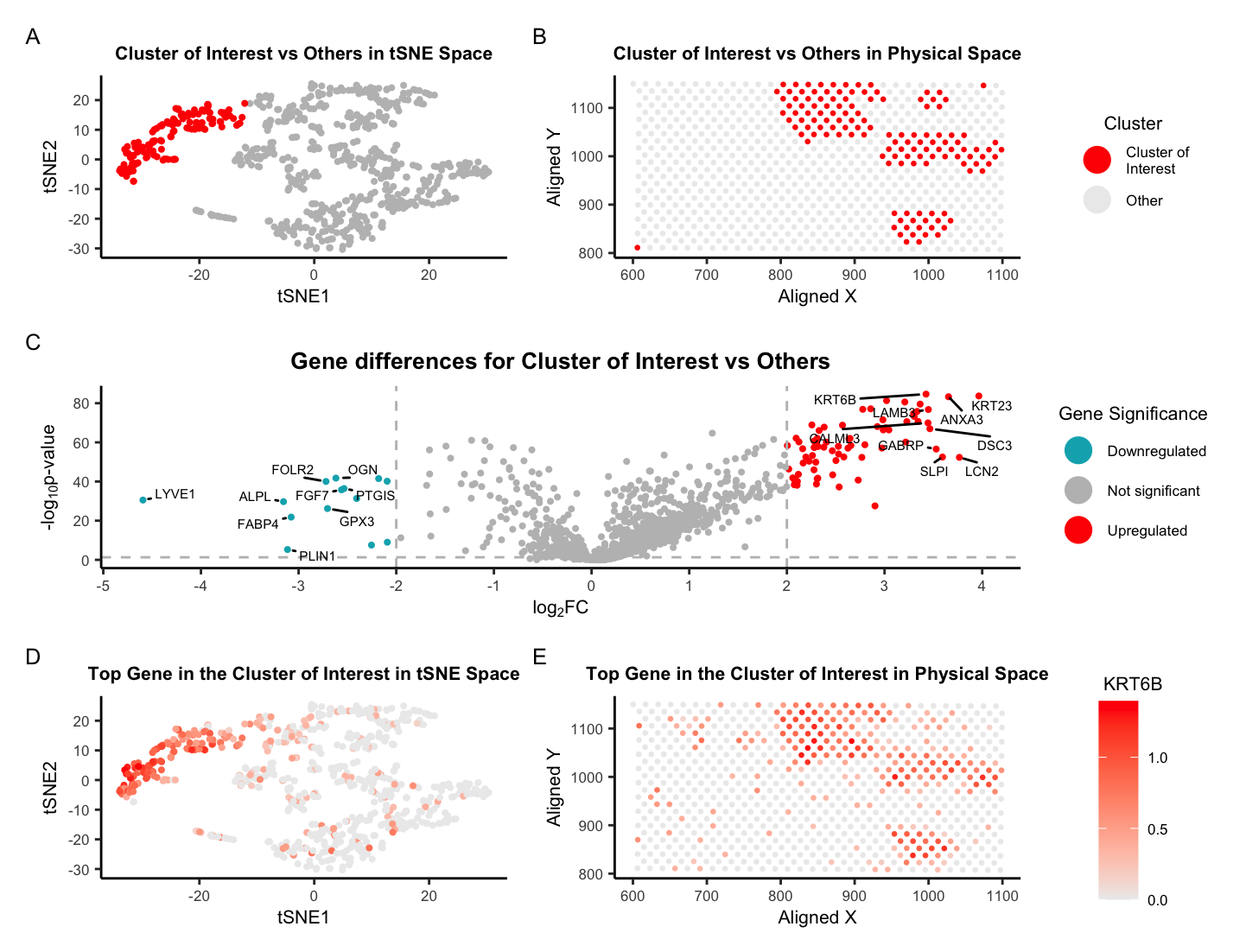
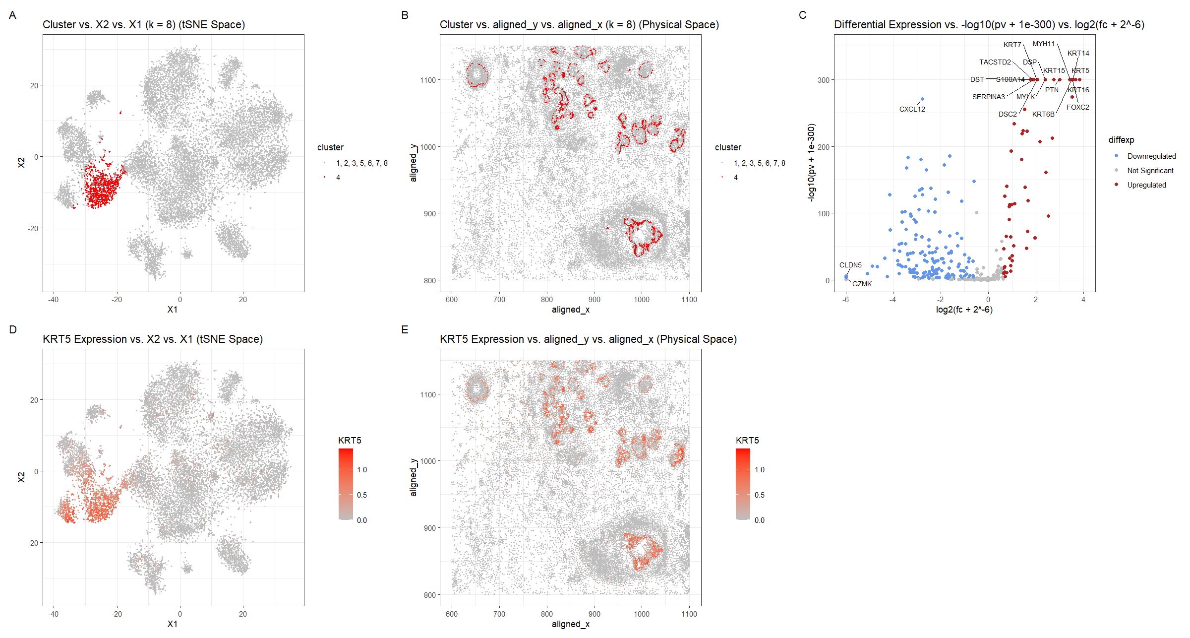
Identifying Cell-type from Breast Cancer Tissue Spatial Transcriptomics Data using K-means Clustering, tSNE, and Wilcox-test
Describe your figure briefly so we know what you are depicting (you no longer need to use precise data visualization terms as you have been...

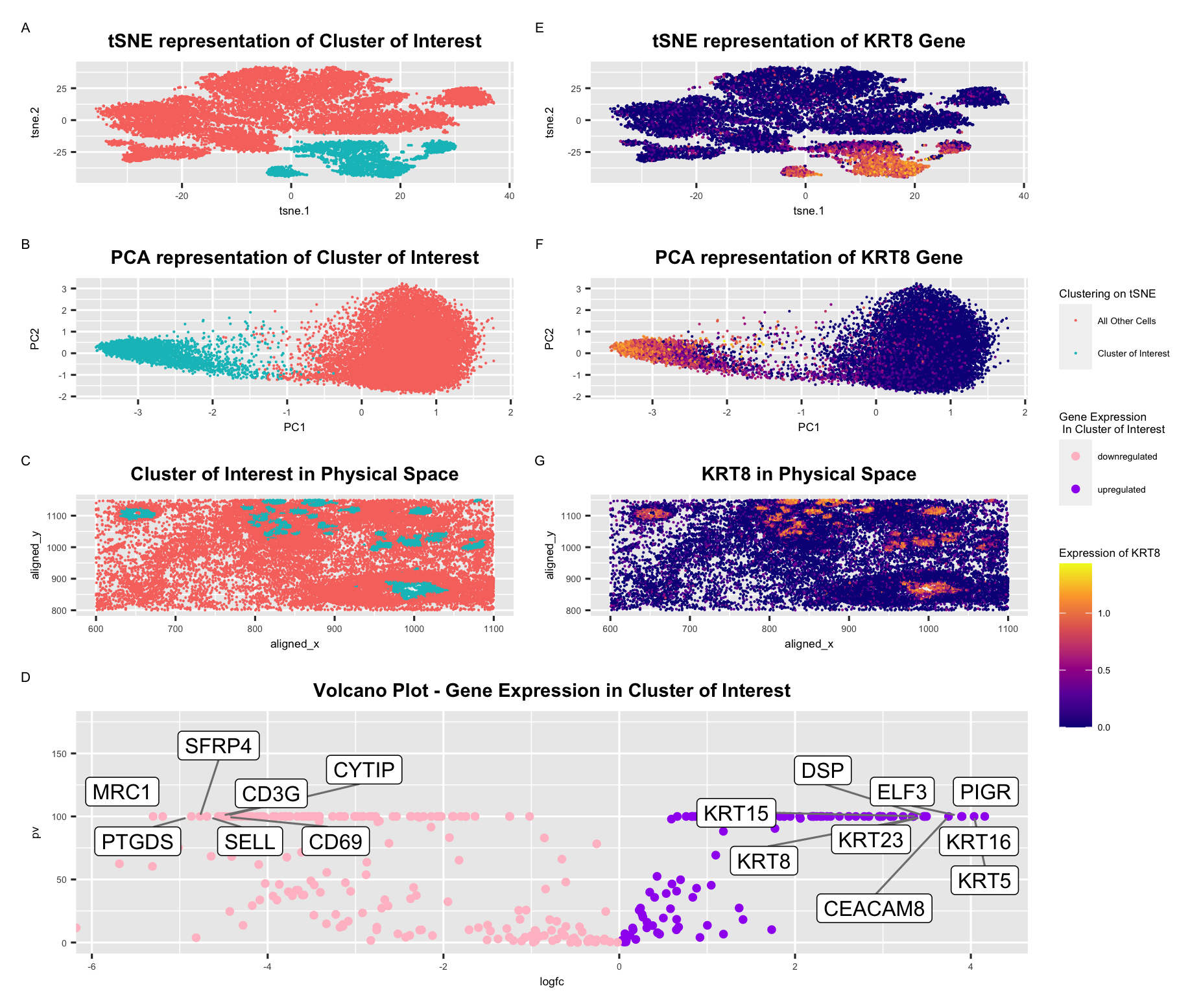
KRT8 Expression in Breast Cancer
In this visualization, I explore the expression of KRT8, a cancer related gene, in breast cancer tissue. In panel A and E, I use points...

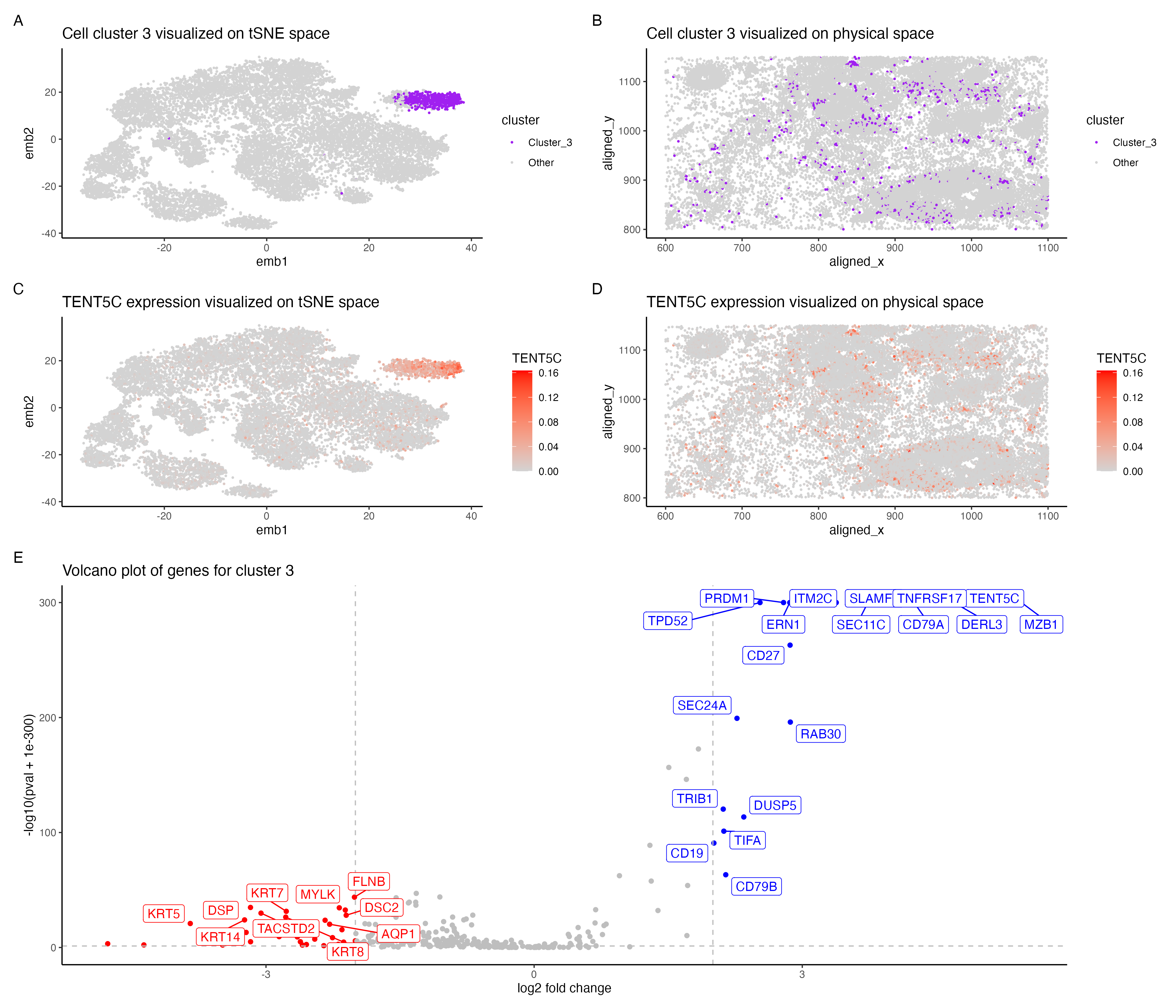
Cell type exploration using differential gene expression analyses
In the above visualization I have identified a cluster that belong to plasma cells or mature B cells. I started with normalizing the gene expression...

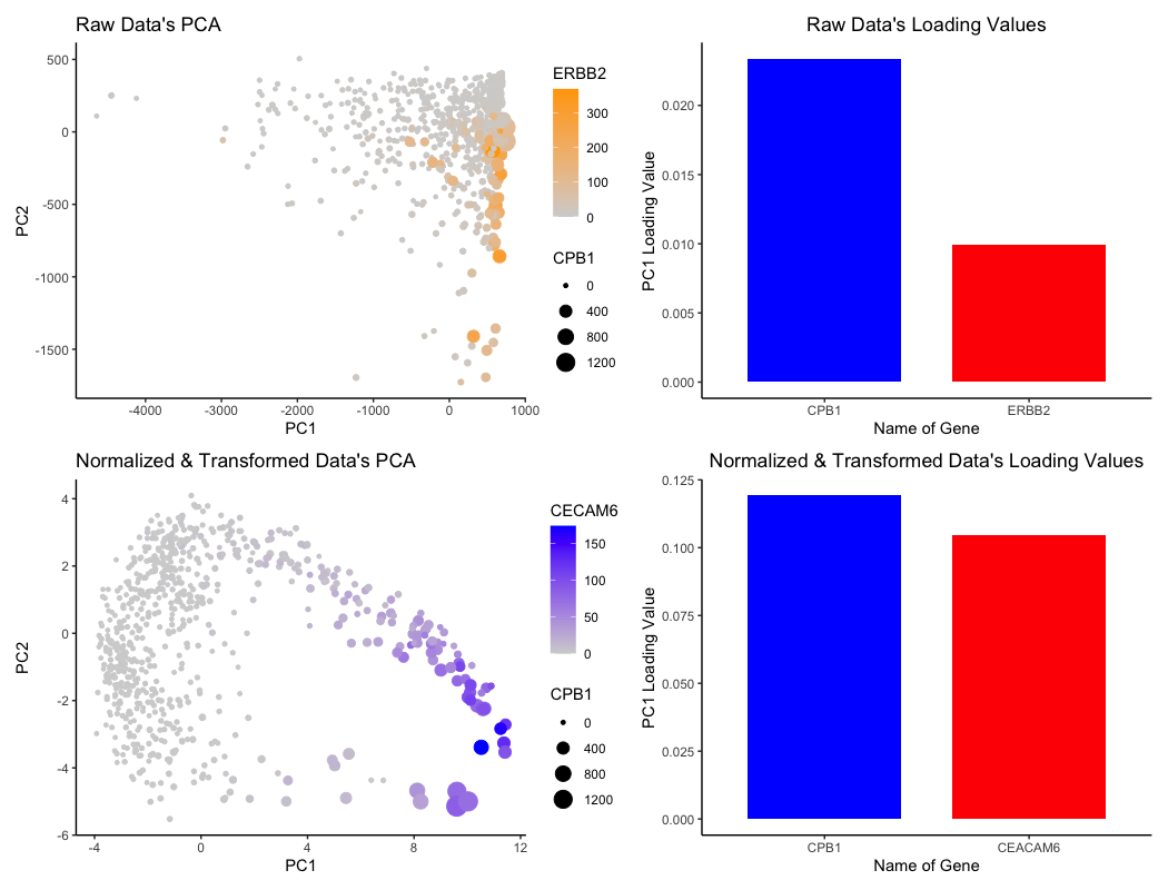
The Effects of Normalization & Transformation on Loading Values for PCA
What data types are you visualizing? For the graph titled “Raw Data’s PCA”, I am visualizing the (1) quantitative data of ERBB2 expression, (2) quantitative...

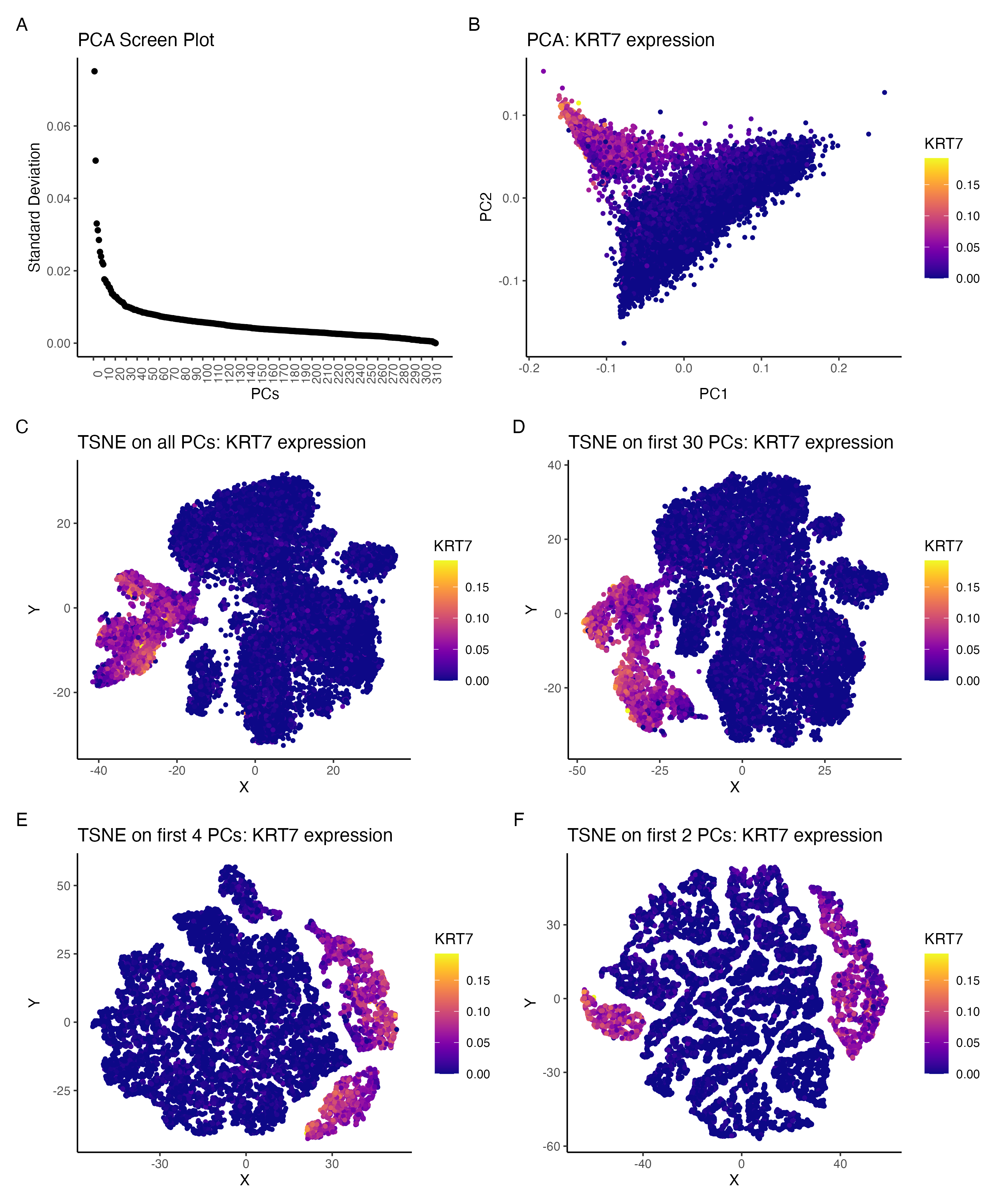
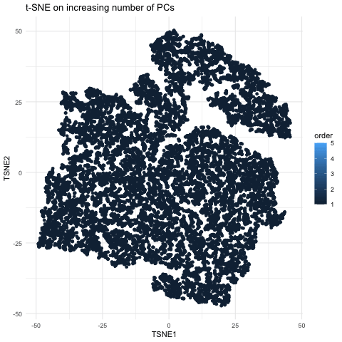
Comparing the effect of tSNE on varying number of PCs:KRT7 expression
I am visualizing the effect of performing non-linear dimensionality reduction (TSNE) on varying number of PCs. The gene expression was normalized (by total gene expression...
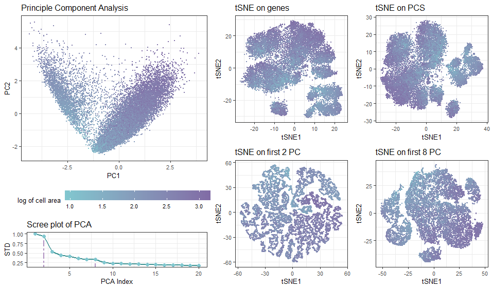
Effect of Introducing Principle Components on Non-linear Dimensionality Reduction
What data types are you visualizing? In the multi-panel plot, I am visualizing spatial and quantitative data with diffrerent projection approaches. The visualization contains spatial...

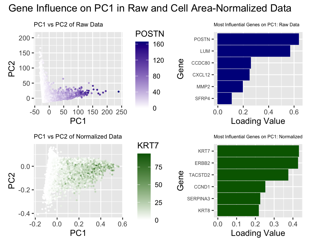
Comparison of Gene Influence on PC1 in Raw and Cell Area-Normalized Data
Write a description describing your data visualization using vocabulary terms from Lesson 1. What data types are you visualizing? What data encodings (geometric primitives and...

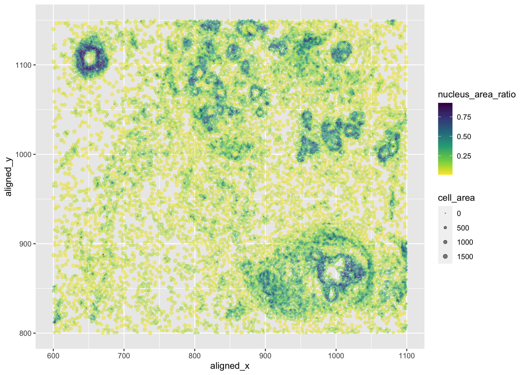
Centroid positions, cell and nucleus areas of each cell
What data types are you visualizing? I am visualizing quantitative data of the ratio of nucleus area to cell area for each cell, quantitative data...

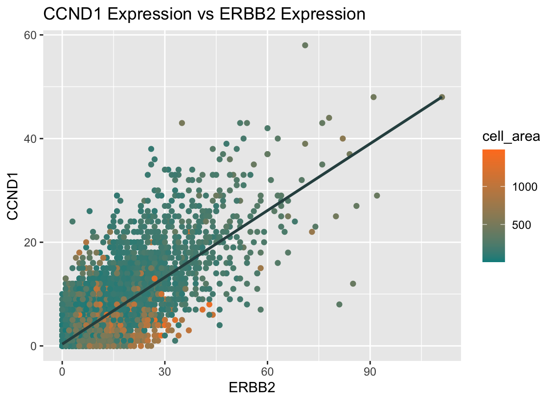
CCND1 Expression vs ERBB2 Expression
What data types are you visualizing? I am visualizing quantitative data for the expression counts of ERBB2 and CCND1, as well as the quantitative data...

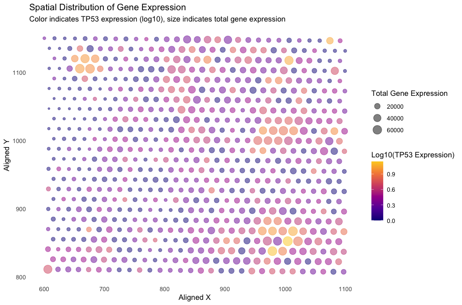
Spatial Distribution of Gene Expression
What data types are you visualizing? I am visualizing quantitative data of the log-10-transformed expression level of the TP53 gene, quantitative data of the total...

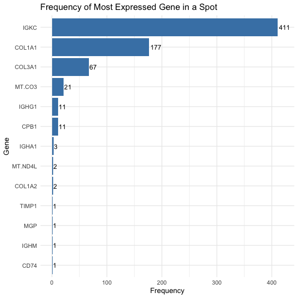
Frequency of Most Expressed Gene in a Spot
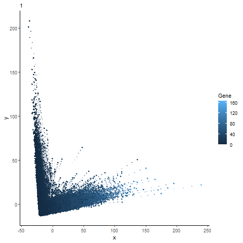
What data types are you visualizing? We are visualizing quantitative data, the number of spots in which the gene is most expressed, and categorical data,...

All Visualizations

Breast Glandular Cells in EEVEE Data Set
Write a description of what you changed and why you think you had to change it.
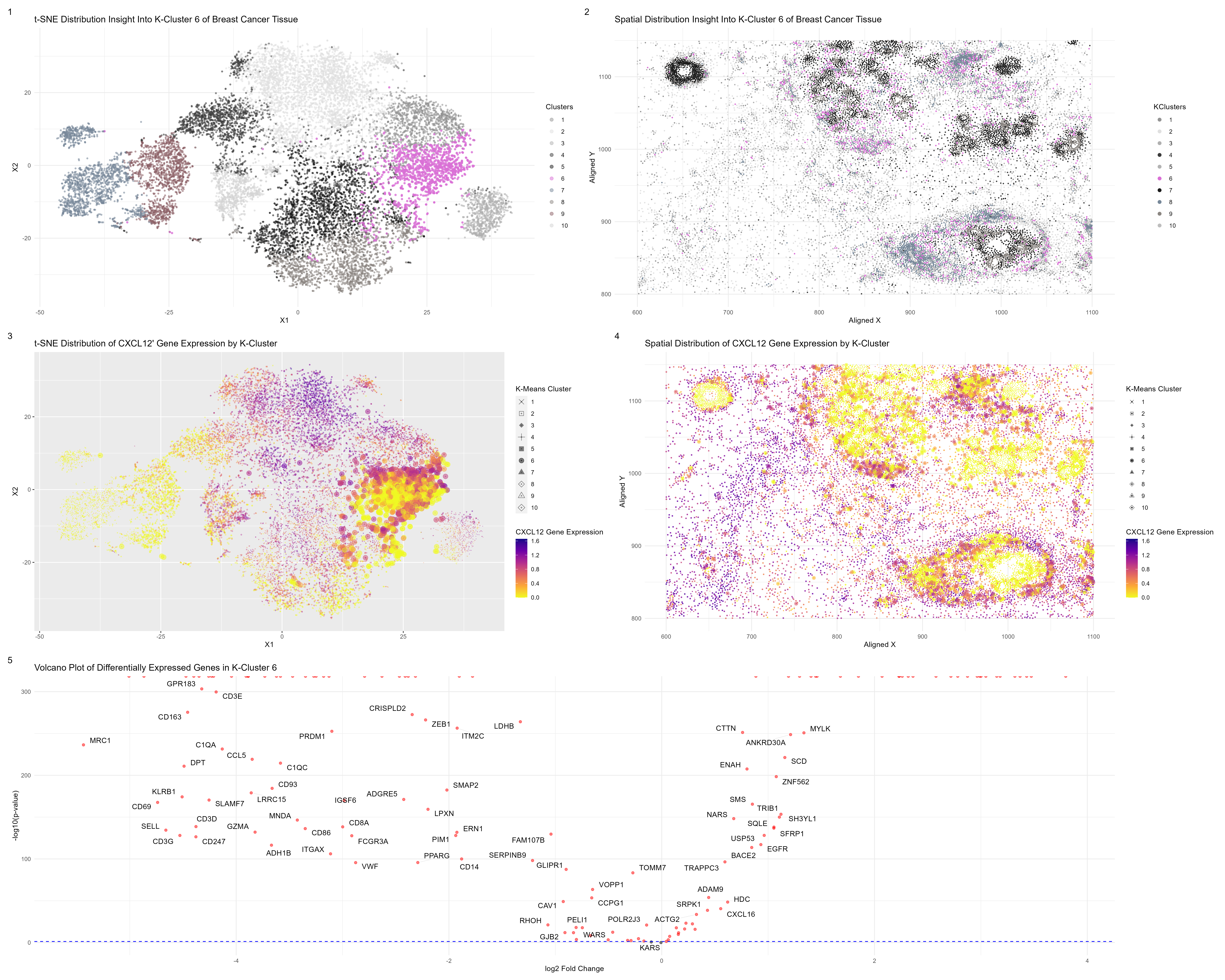
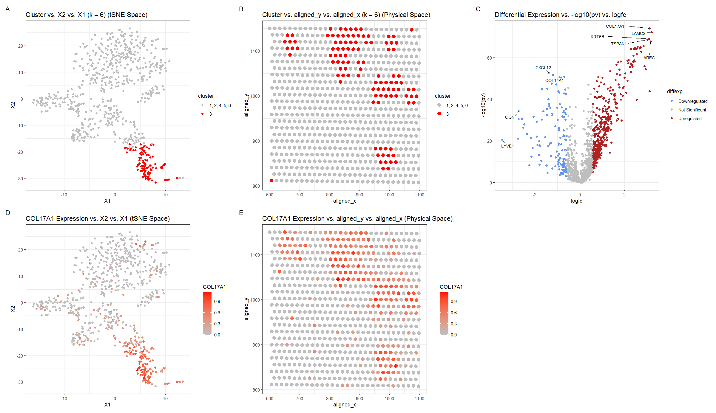
Identifying DCIS & Stromal Cells in Imaging Spatial Transcriptomics Data Through K-Means Cluster Analysis
What am I visualizing? My visualization accomplishes the same goals as my previous one, honing in on a particular k-means cluster and identifying potential cell-types. In my previous Eeevee dataset,...

Expression of CD9 in reduced dimensional and physical space
Create a multi-panel data visualization and write a description to convince me you found the same cell-type. In my original Eevee dataset, I identified a cell cluster that differentially expressed...

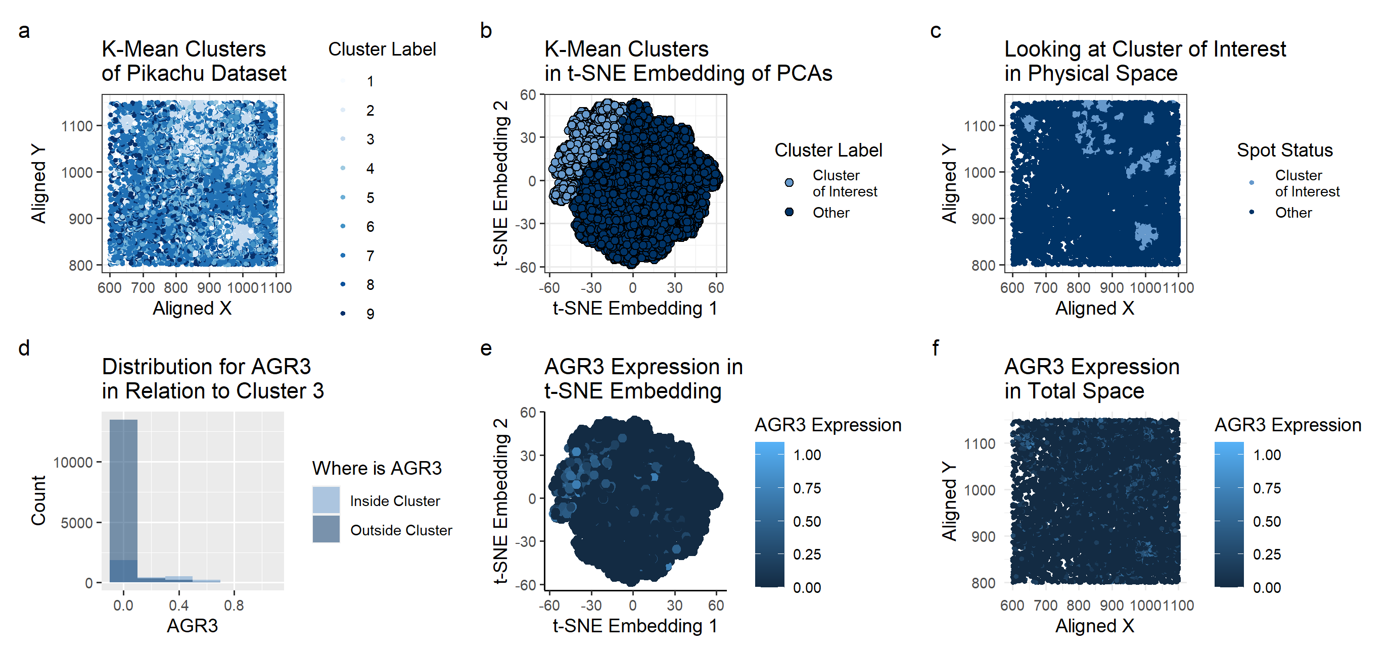
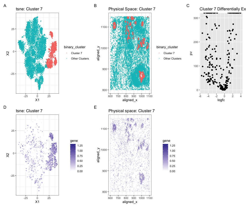
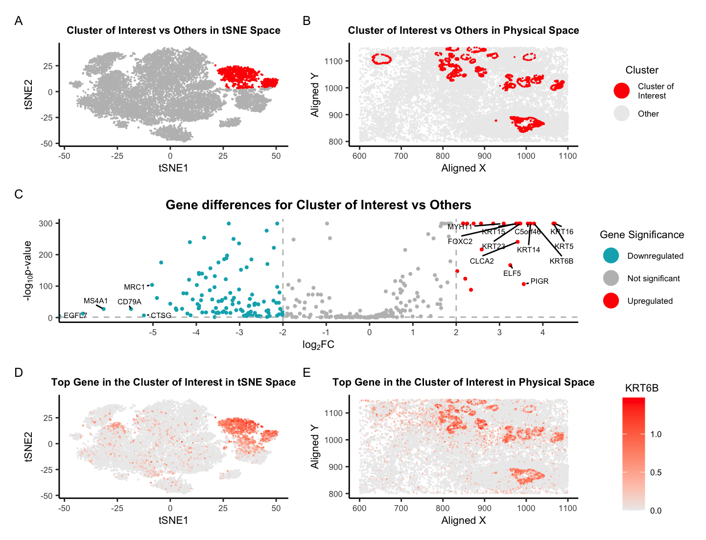
Imaging (Pikachu) Dataset: Identifying Cell-type from Breast Cancer Tissue Spatial Transcriptomics Data using K-means Clustering, tSNE, and Wilcox-test
Describe your figure briefly so we know what you are depicting (you no longer need to use precise data visualization terms as you have been doing) For plot A, I...
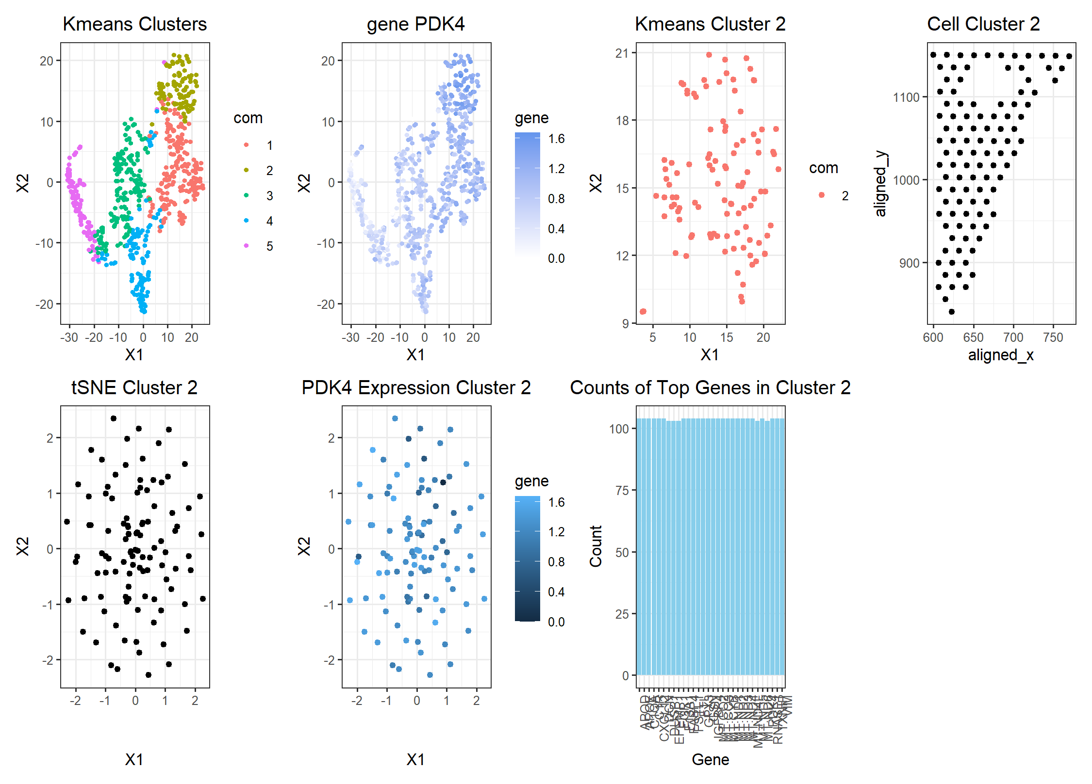
PDK4 in Breast Cancer Adipocytes Cells
Edits to the code Description: I switched from the pikachu to the eevee datset. To choose a better cluster size, I ran a loop to determine the total withiness plotted...

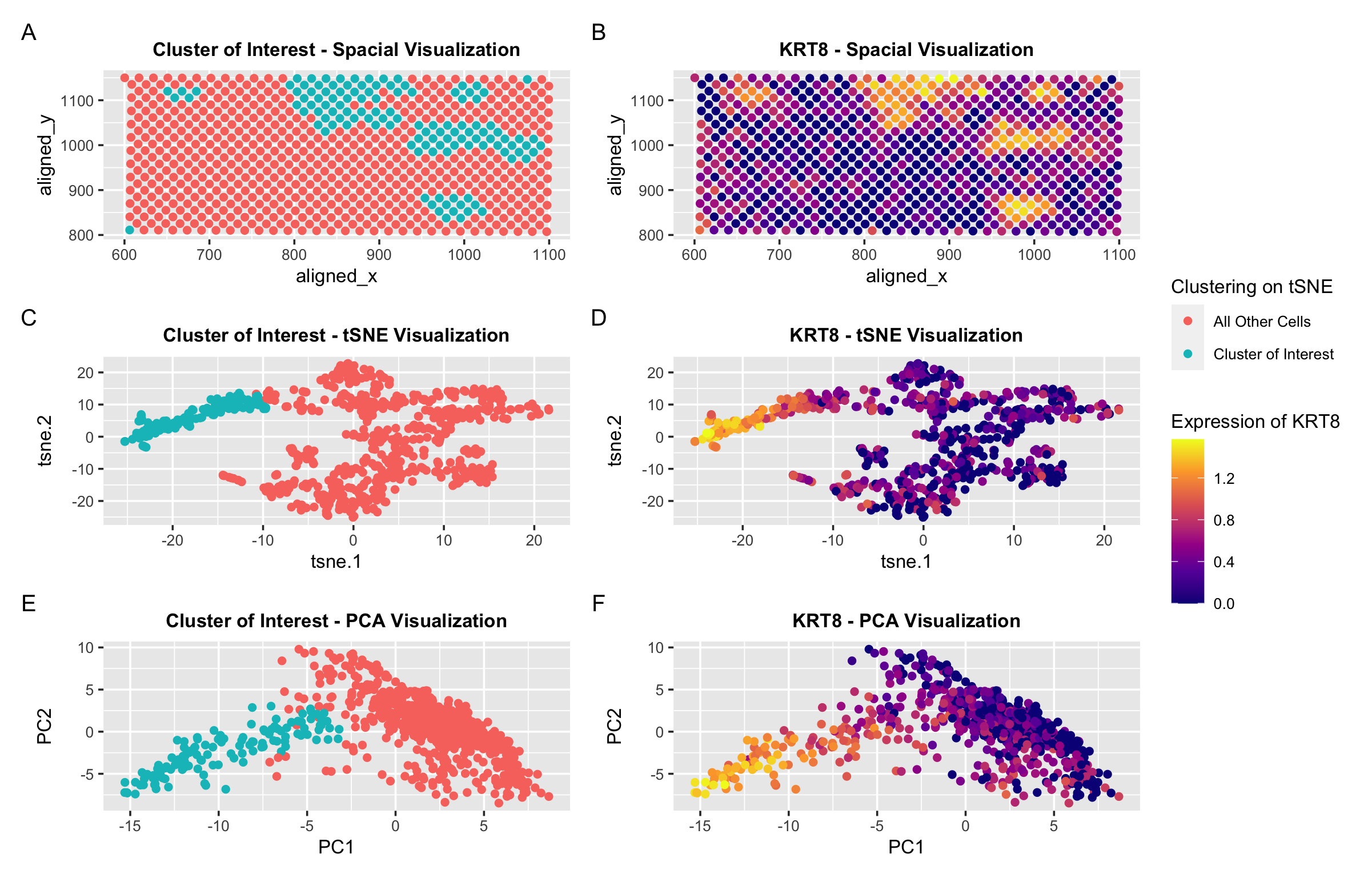
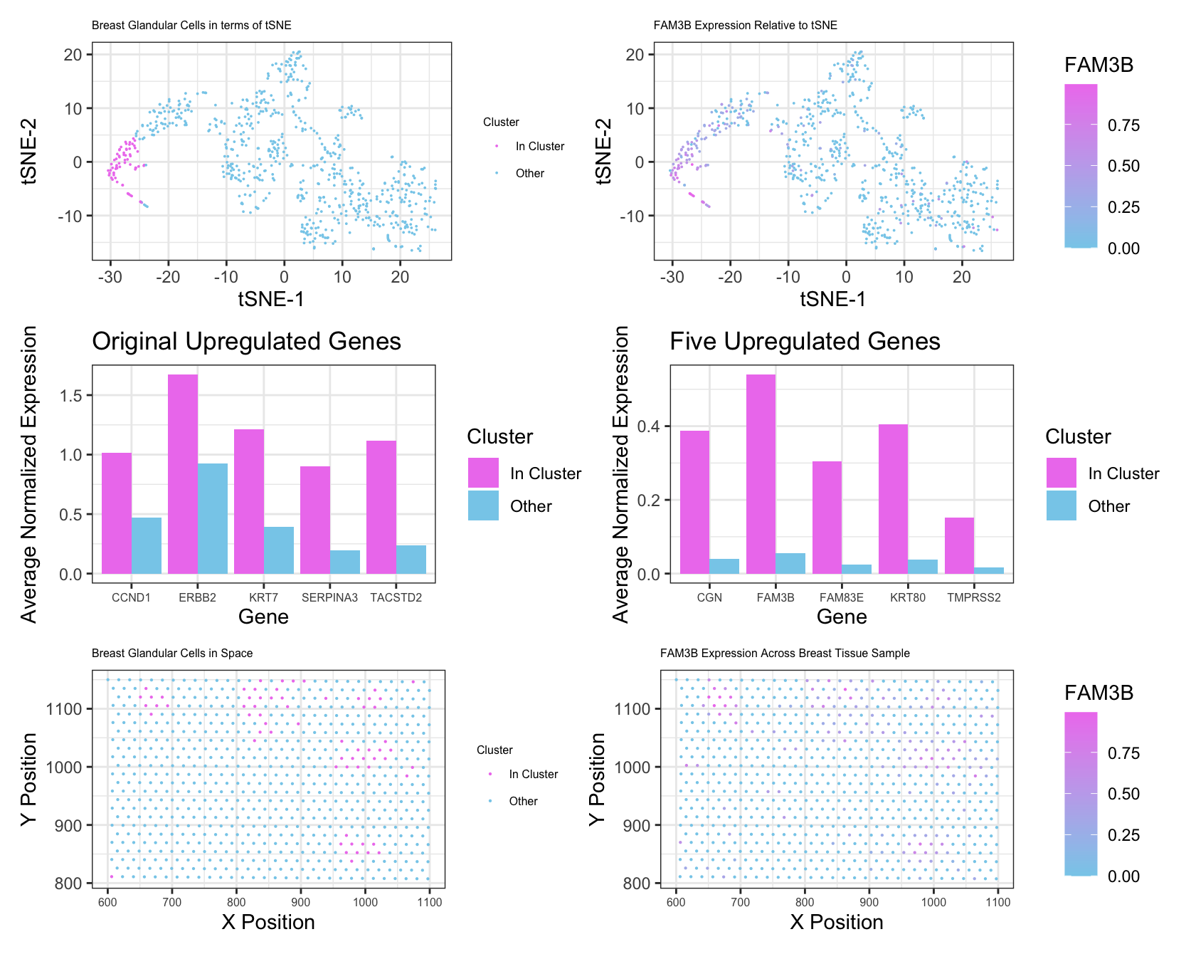
Identifying KRT8 Expression in Spot-Based Spatial Transcriptomic Data Set
In the pikachu Single Cell Data Set, I identified a cluster of cells that had high expression of the KRT8 gene. I hypothesized that these cells were epithelial cells.
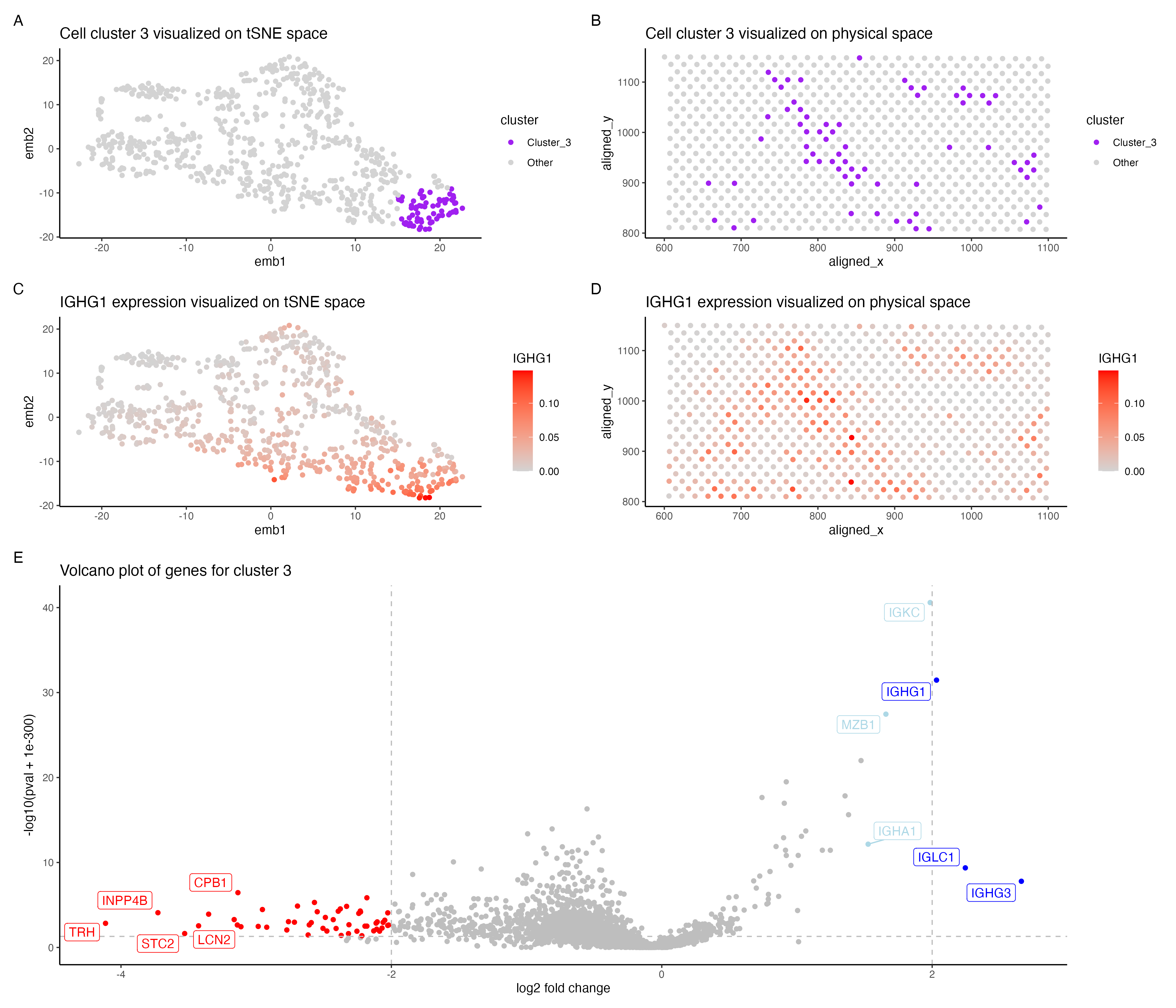
Identifying plasma/mature B cells in the Evee dataset
In the above visualization I have identified a cluster that belong to plasma cells or mature B cells in the evee dataset.
Multi-Panel Data Visualization of Breast Cancer Cell Cluster and Genes - Eevee
Write a description of what you changed and why you think you had to change it.
Visualizing Tighter Clustering Using More PCs
Description This gif is a visualization of what happens when you run nonlinear dimensionality reduction (in this case tSNE) on an increasing number of principal components (PCs) after principal component...

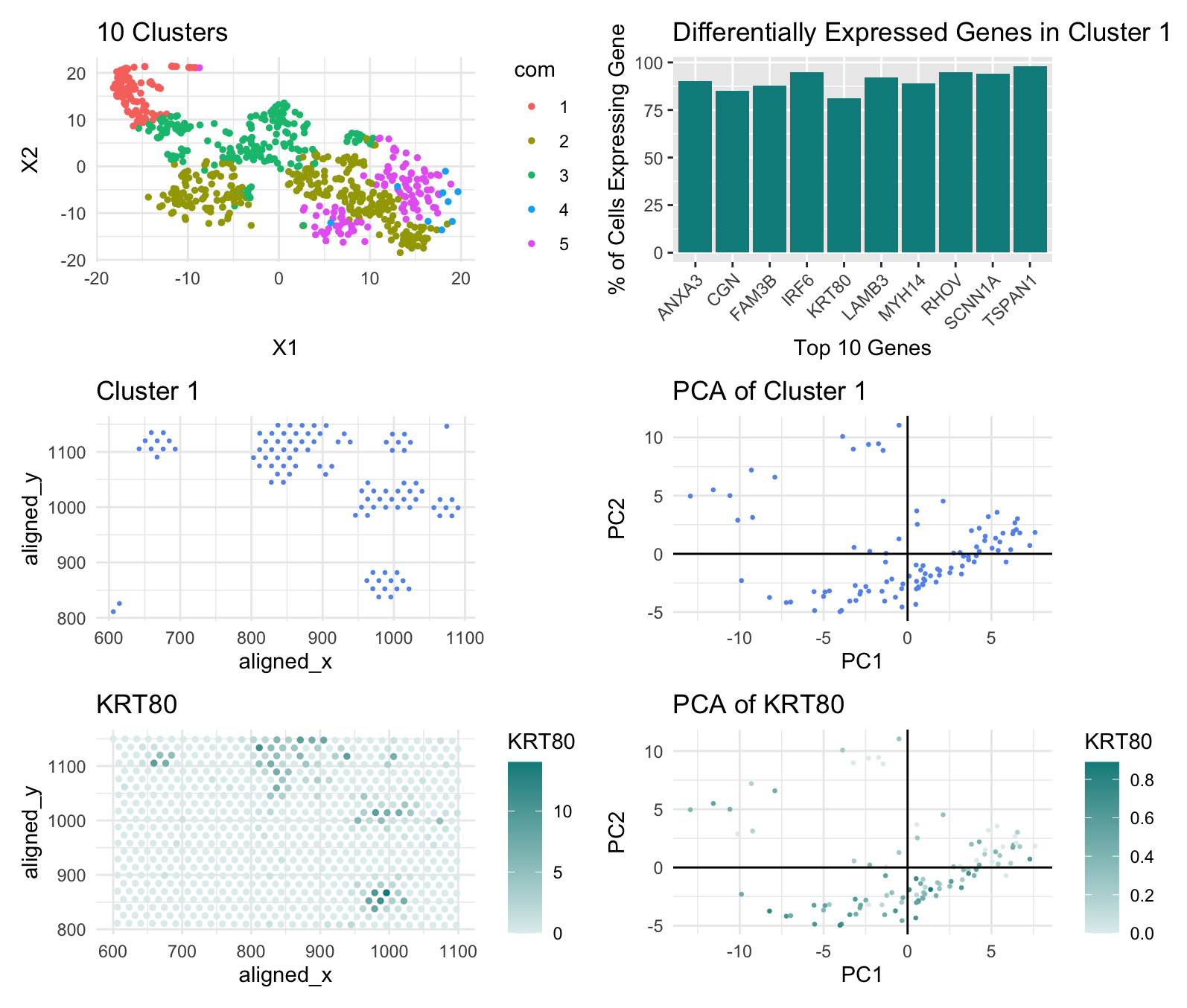
Locating glandular epithelial cells within the Pikachu data
Write a description of what you changed and why you think you had to change it. For Homework 5, I am switching from the Eevee dataset to the Pikachu dataset....