Visualization of spleen tissue structure

Tissue structure representation in the CODEX data
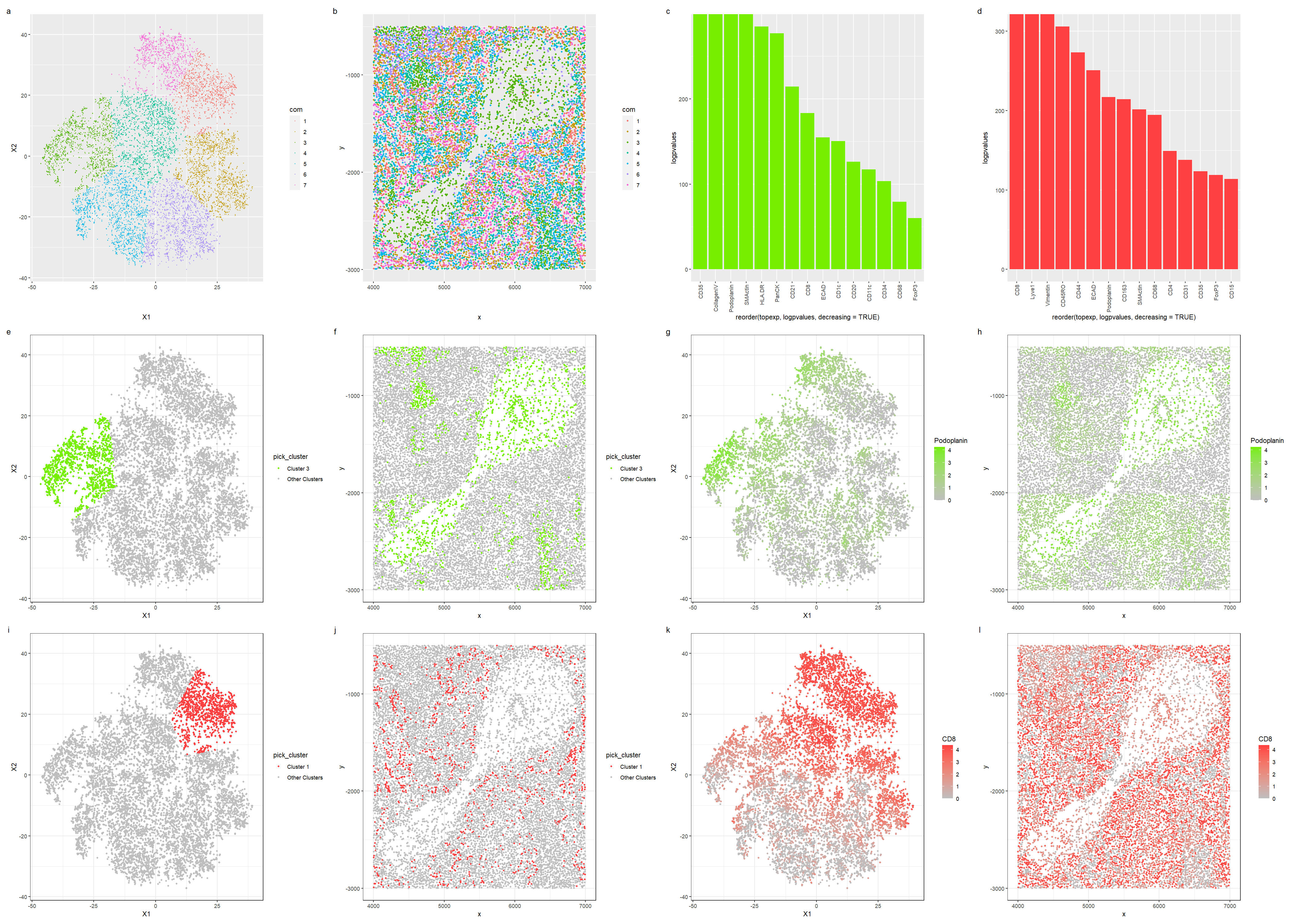
In this visualization, we investigate the tissue structure from spleen protein localization data.
For the first row of visualizations, in plots a and b, we first visualize the clusters in reduced dimensions and physical space. We pick cluster 3 since it appears most in the central sparse region, and we also pick cluster 1 as it is relatively spread out across the dataset, hoping that identifying these two cell types will allow us to infer the tissue structure. Reusing my own code from HW5 for differential gene expression, plots c and d visualize the differential expression of proteins in clusters 3 and 1 respectively in a bar graph, allowing us to pick out the top proteins.
The second row of visualizations showcases cluster 3: we first visualize cluster 3 in reduced dimensions and physical space, then we visualize the expression of CD35, a differentially expressed protein, in reduced dimensions and physical space. Finally, the third row of visualizations first shows cluster 1 in reduced dimensions and physical space; then we pick out Lyve1 and visualize it in reduced dimensions and physical space.
Cell types and tissue type
Cluster 3 was picked out as using plot b of the clusters in physical space, we notice that most of the cells in the central sparse region are from the cluster. Some of the top differential expressed genes in this cluster are podoplanin, which is a protein that is commonly found in lymphatic endothelial cells, and plays a role in development of lymphatic vessels and maintaining the lymphatic architecture. As such, we can conclude that Cluster 3 is probably a endothelial cell cluster that lines a lymph node. To support this conclusion, Cluster 1 has a high expression of CD8, which is a common protein expressed in cytotoxic T cells, that allows them to recognise antigens on antigen-presenting cells [3], which is a process that commonly occurs in the lymph nodes. Hence cluster 1 is likely a cluster of immune cells that functions within a lymph node; as such, we can conclude that the tissue is most likely white pulp, which is lymphoid tissue in the spleen.
[1] https://www.ncbi.nlm.nih.gov/pmc/articles/PMC2567837/ [2] https://www.ncbi.nlm.nih.gov/pmc/articles/PMC3439854/ [3] https://www.proteinatlas.org/ENSG00000153563-CD8A
library(ggplot2)
library(Rtsne)
library(patchwork)
set.seed(1)
data <- read.csv('codex_spleen_subset.csv.gz',
                 row.names=1)
head(data)
colnames(data)
pos <- data[,1:2]
area <- data[,3]
pexp <- data[,4:ncol(data)]

#df <- data.frame(pos,area)
#ggplot(df) + geom_point(aes(x=x,y=y,col=area),size=1) + scale_color_continuous(type='viridis')
#plot(log10(area+1),log10(rowSums(pexp)+1),pch='.')

#normalization of pexp data
pexp.norm <- log10(pexp/rowSums(pexp) * mean(rowSums(pexp))+1)

#dim reduction
pvar <- apply(pexp.norm,2,var)
pmean <- apply(pexp.norm,2,mean)
sort(apply(pexp.norm,2,var))
#conduct principal component analysis
pcs <- prcomp(pexp.norm)
head(pcs$x)
#plot(pcs$sdev[1:30])

#conduct tSNE
emb <- Rtsne::Rtsne(pexp.norm)$Y

#conduct k-means clustering
tw <- sapply(1:20,function(i) {
  kmeans(pexp.norm,centers=i)$tot.withinss
})
#plot(tw,type='l')
#we pick 7 centers as the total withiness value does not decrease much after 7
com <-as.factor(kmeans(emb,centers=7)$cluster)

#Visualize clusters in reduced dimensions
df = data.frame(emb,com)
p0 <- ggplot(df) + geom_point(aes(x=X1,y=X2,col=com),size=0.3)
p0
#Visualize location of clusters in physical space
df = data.frame(pos,com)
p1 <- ggplot(df) + geom_point(aes(x=x,y=y,col=com),size=1)
p1

#We pick cluster 3 since it appears most in the central sparse region.
#We also pick cluster 1 as it's rather spread out across the dataset.
#We now visualize these two clusters in reduced dimensions and physical space.
#<Code is from my own HW5 submission>
#cluster 3 in reduced dimensions
p2 <- ggplot(data.frame(emb, pick_cluster=ifelse(com=='3','Cluster 3','Other Clusters'))) +
  geom_point(aes(x = X1, y = X2, col=pick_cluster), size=1) +
  theme_bw() +
  scale_color_manual(values = c('Cluster 3' = 'chartreuse2', 'Other Clusters' = 'gray'))
#cluster 3 in physical space
df <- data.frame(pos, pick_cluster=ifelse(com=='3','Cluster 3','Other Clusters'))
p3 <- ggplot(df) +
  geom_point(aes(x=x,y=y,col=pick_cluster), size=1) + theme_bw() +
  scale_color_manual(values = c('Cluster 3' = 'chartreuse2', 'Other Clusters' = 'gray'))
#cluster 1 in reduced dimensions
p4 <- ggplot(data.frame(emb, pick_cluster=ifelse(com=='1','Cluster 1','Other Clusters'))) +
  geom_point(aes(x = X1, y = X2, col=pick_cluster), size=1) +
  theme_bw() +
  scale_color_manual(values = c('Cluster 1' = 'brown1', 'Other Clusters' = 'gray'))
#cluster 1 in physical space
df <- data.frame(pos, pick_cluster=ifelse(com=='1','Cluster 1','Other Clusters'))
p5 <- ggplot(df) +
  geom_point(aes(x =x,y=y,col=pick_cluster), size=1) + theme_bw() +
  scale_color_manual(values = c('Cluster 1' = 'brown1', 'Other Clusters' = 'gray'))
p2+p3+p4+p5

################################################

#conduct t tests for differential expression

#t test for differential expression in cluster 3
pvals <- sapply(colnames(pexp), function(p){
  t.test(pexp.norm[com==3,p],pexp.norm[com!=3,p])$p.value
})
logpvalues <- -log10(pvals)
sort(logpvalues)
topexp <- names(sort(logpvalues, decreasing = TRUE)[1:15])
topexp
#fc <- sapply(colnames(pexp), function(p){
#  print(p)
#  mean(pexp.norm[com==3,p])/mean(pexp.norm[com!=3,p])
#})
#fc
#bar plot of top expressed genes, taken from my HW5 submission
df = data.frame(logpvalues = logpvalues[topexp], topexp)
p6 <- ggplot(df, aes(x = reorder(topexp,logpvalues,decreasing=TRUE), y = logpvalues)) +
  geom_bar(stat = "identity", fill = "chartreuse2") +
  theme(axis.text.x = element_text(angle = 90, vjust = 0.5, hjust=1))
p6

#The top 4 proteins are "CD35", "CollagenIV", "Podoplanin", "SMActin", and we pick Podoplanin.

#Podoplanin in reduced dimensions
p7 <- ggplot(data.frame(emb, Podoplanin = pexp.norm[, 'Podoplanin'])) +
  geom_point(aes(x = X1, y = X2, col=Podoplanin), size=1) +
  theme_bw() + scale_color_gradient(low='gray',high='chartreuse2')

#Podoplanin in physical space
df <- data.frame(pos, Podoplanin = pexp.norm[, 'Podoplanin'])
p8 <- ggplot(df) +
  geom_point(aes(x=x,y=y,col=Podoplanin),
             size=1) +
  theme_bw() + scale_color_gradient(low='gray',high='chartreuse2')
p2+p3+p7+p8+plot_layout(ncol = 2)

##################################################

#t test for differential expression in cluster 1
pvals <- sapply(colnames(pexp), function(p){
  t.test(pexp.norm[com==1,p],pexp.norm[com!=1,p])$p.value
})
logpvalues <- -log10(pvals)
sort(logpvalues)
topexp <- names(sort(logpvalues, decreasing = TRUE)[1:15])
topexp
#fc <- sapply(colnames(pexp), function(p){
#  print(p)
#  mean(pexp.norm[com==1,p])/mean(pexp.norm[com!=1,p])
#})
#fc
#bar plot of top expressed genes, taken from my HW5 submission
df = data.frame(logpvalues = logpvalues[topexp], topexp)
p9 <- ggplot(df, aes(x = reorder(topexp,logpvalues,decreasing=TRUE), y = logpvalues)) +
  geom_bar(stat = "identity", fill = "brown1") +
  theme(axis.text.x = element_text(angle = 90, vjust = 0.5, hjust=1))
p6+p9

#The top 4 proteins are "CD8", "Lyve1", "Vimentin", "CD45RO", and we pick CD8

#CD8 in reduced dimensions
p10 <- ggplot(data.frame(emb, CD8 = pexp.norm[, 'CD8'])) +
  geom_point(aes(x = X1, y = X2, col=CD8), size=1) +
  theme_bw() + scale_color_gradient(low='gray',high='brown1')

#CD8 in physical space
df <- data.frame(pos, CD8 = pexp.norm[, 'CD8'])
p11 <- ggplot(df) +
  geom_point(aes(x=x,y=y,col=CD8),
             size=1) +
  theme_bw() + scale_color_gradient(low='gray',high='brown1')
p4+p5+p10+p11+plot_layout(ncol = 2)

#all visualizations
p0 + p1 + p6+p9+p2+p3+p7+p8+p4+p5+p10+p11 + plot_annotation(tag_levels = 'a') + plot_layout(ncol = 4)