Multi-Panel Data Visualization for Pikachu Dataset

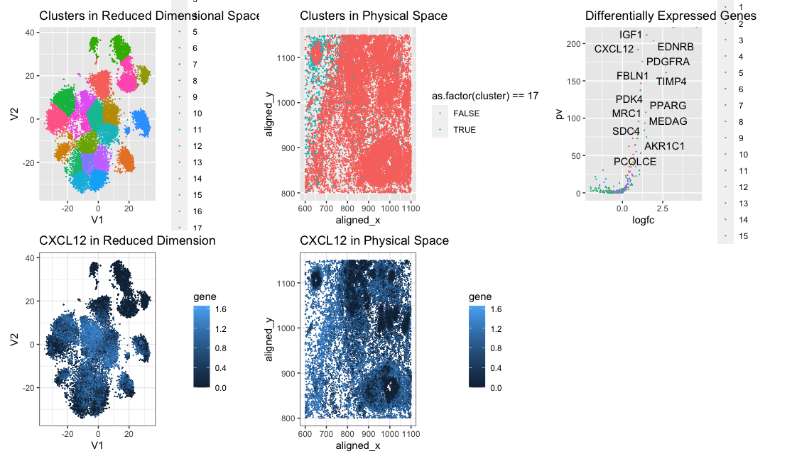
In this data visualization we are visualizing clusters in the pikachu dataset. We identified cluster 17 as potentially being the same cell type we identified from the Eevee dataset due to CXCL12 being upregulated in both clusters. We changed the number of clusters from 15 to 20 due to the plot of total withiness showing a better elbow at 20. This may be because there multiple cell types aren’t consolidated into spots like in the eevee dataset, so there are more distinct cell type clusters.
library(Rtsne)
data<-read.csv("pikachu.csv.gz", row.names = 1)
pos<-data[,4:5]

gexp<-data[,6:ncol(data)]
gexp <- gexp[, colSums(gexp) > 1000]
gexp <- log10(gexp/rowSums(gexp) * mean(rowSums(gexp))+1)
reduced_data <- Rtsne(as.matrix(gexp), dims = 2)  # t-SNE
cluster_labels <- kmeans(reduced_data$Y, centers = 20)$cluster

pcs <- prcomp(gexp) ## maybe normalize?
plot(pcs$sdev[1:100])
results <- sapply(seq(2, 30, by=1), function(i) {
  print(i)
  com <- kmeans(pcs$x[,1:20], centers=i)
  return(com$tot.withinss)
})
results
plot(results, type="l")

# Combine cluster labels with original data
data_with_clusters <- data.frame(cbind(reduced_data$Y, cluster = as.factor(cluster_labels)))
cluster_data <- data_with_clusters[data_with_clusters$cluster == 17, ]
plot1 <- ggplot(data_with_clusters, aes(x = V1, y = V2, col = as.factor(cluster)), size=0.001) +
  geom_point(size=0.01) +
  ggtitle("Clusters in Reduced Dimensional Space (t-SNE)")+scale_colour_hue()
plot1

df<-data.frame(pos, data_with_clusters)
cluster_data <- df[df$cluster == 17, ]
plot2 <- ggplot(df, aes(x = aligned_x, y = aligned_y, col = as.factor(cluster)==17), size=1) +
  geom_point(size=0.01) +
  ggtitle("Clusters in Physical Space")
plot2

head(cluster_data)
df2<-data.frame(pos, gexp, data_with_clusters)
cluster_data <- df2[df2$cluster == 17, ]

results <- sapply(colnames(gexp), function(g) {
  wilcox.test(gexp[cluster_labels == 17, g],
              gexp[cluster_labels != 17, g],
              gexp = "greater")$p.val
})
head(sort(results, decreasing=FALSE))

pv <- sapply(colnames(gexp), function(i) {
  #print(i) ## print out gene name
  wilcox.test(gexp[cluster_labels == 17, i], gexp[cluster_labels != 17, i])$p.val
})
logfc <- sapply(colnames(gexp), function(i) {
  #print(i) ## print out gene name
  log2(mean(gexp[cluster_labels == 17, i])/mean(gexp[cluster_labels != 17, i]))
})

df <- data.frame(pv=-log10(pv), logfc)
ggplot(df) + geom_point(aes(x = logfc, y = pv))
# challenge: label the extreme points (reccomend: ggrepel)
library(ggrepel)
geneclusters <- as.factor(kmeans(t(gexp), centers=15)$cluster)
df <- data.frame(pv=-log10(pv), logfc, geneclusters=geneclusters)
gg<-ggplot(df) + geom_point(aes(x = logfc, y = pv, col=geneclusters),size=0.01)

extreme_points <- subset(df, pv > quantile(pv, 0.95) | logfc > quantile(logfc, 0.95))

# Label extreme points using ggrepel
plot3<-gg + geom_text_repel(data = extreme_points, aes(label = rownames(extreme_points), x = logfc, y = pv))+ggtitle("Differentially Expressed Genes")


plot4<-ggplot(data.frame(df2, gene = gexp[, 'CXCL12'])) +
  geom_point(aes(x = V1, y = V2, col=gene), size=.01) +
  theme_bw()+ggtitle("CXCL12 in Reduced Dimension")


plot5<-ggplot(data.frame(df2, gene = gexp[, 'CXCL12'])) +
  geom_point(aes(x = aligned_x, y = aligned_y, col=gene), size=.01) +
  theme_bw()+ggtitle("CXCL12 in Physical Space")
plot5
library(patchwork)
plot1+plot2+plot3+plot4+plot5