Multi-panel visualization of a cluster with differentially expressed genes

Use/adapt your code from HW4 to identify the same cell-type in the other dataset. Create a multi-panel data visualization and write a description to convince me you found the same cell-type.
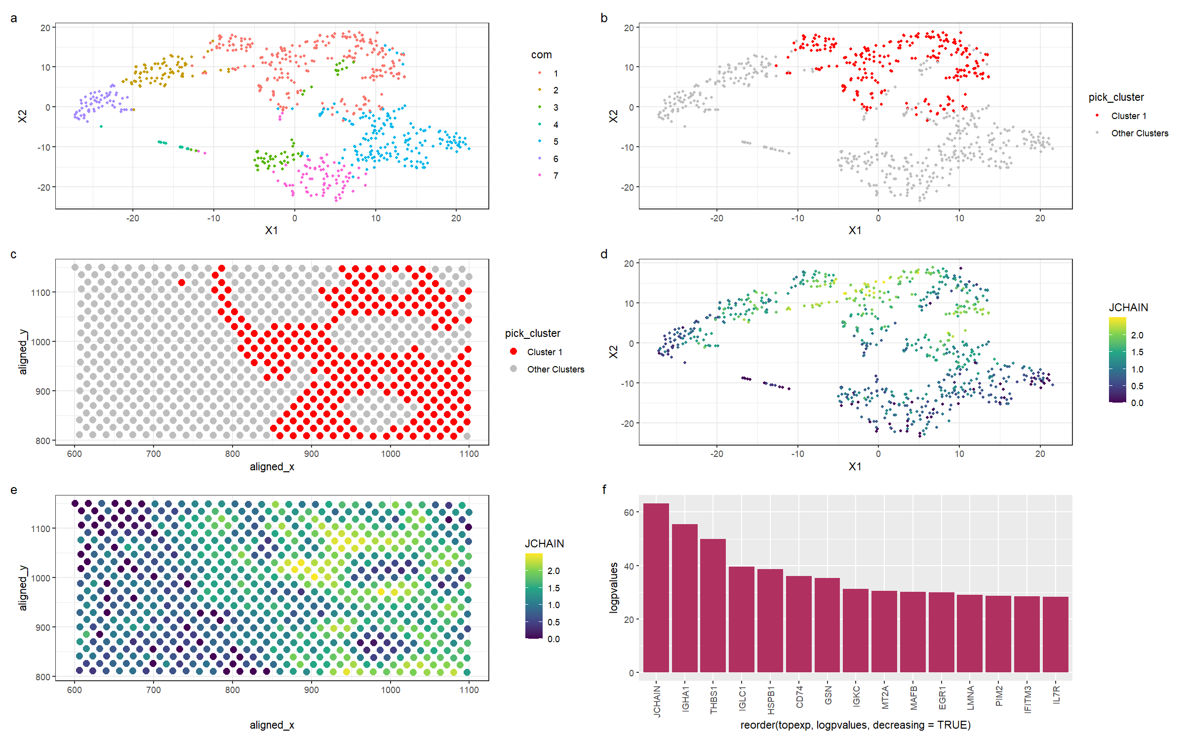
This figure is a multi-panel visualization of data from the eevee dataset. We first conduct normalization, principal component analysis, and t-stochastic neighbour embedding. We then conduct k-means clustering with 7 centers. In figure (a) we first show the 7 distinct clusters in reduced dimensional space, and in figure (b), we highlight cluster 1 in reduced dimensional space. In figure (c), we plot the chosen cluster 1 in physical space. After conducting a wilcox test to determine the most differentially expressed genes, we pick the gene JCHAIN to visualize. Figure (d) shows the expression of JCHAIN in reduced dimensional space, and in figure (e), we plot JCHAIN expression in physical space. Figure (f) shows the -log(p-values) for the top 15 most differentially expressed genes in the cluster.
Previously, I found a cluster of immune cells. These cells can also be found in the new dataset. As we can see from figure (f), JCHAIN and IGHA1 are the top two genes in the cluster. Firstly, the JCHAIN gene codes for a protein that links monomers of the antibodies IgM and IgA, and is expressed preferentially in B cells [1], which are immune cells that produce antibodies. IGHA1 is a protein that encodes the heavy chain of antibodies, and is also expressed by memory B cells and naive B cells [2]. As can be seen from figure (e) of my visualization, which is the expression of JCHAIN in physical space, we can see that the most differentially overexpressed gene is present almost exclusively in the cluster I have chosen. Alongside the evidence that the top 2 differentially expressed genes encode proteins involved in antibody production, I am confident in the assertion that the cluster I have chosen is a cluster of B lymphocytes, helping to mediate the immune response in the breast tissue.
[1] https://www.proteinatlas.org/ENSG00000132465-JCHAIN
[2] https://www.proteinatlas.org/ENSG00000211895-IGHA1
You will likely need to change your code from HW4. Write a description of what you changed and why you think you had to change it. An example is shown on the next slide.
I had to change several things to adapt my code to the eevee dataset. Firstly, the dataset does not contain some data such as nucleus area, cell area, and cell ID, so I changed my code to take gene expression data from the correct columns. Next, the eevee dataset contains many more genes than the pikachu dataset, so I added a filter to select the top 1000 genes. I originally ran my code with 10 clusters when conducting k-means clustering, but upon visual observation of figure (a), I noticed that the groups were spread out very oddly and consistently did not seem to be close together in reduced dimensional space after several runs of the code. Although I ran a check on the total withinness score, I did not notice much of a difference between 10 clusters and reducing the number of clusters to 7; however, the clusters seemed visibly more distinct in reduced dimensional space, so I settled with 7 clusters.
Finally, I changed some of the visual aspects of my code in order to present my data better. I increased the size of the points in graphs that used points as a geometric encoding, as there were fewer datapoints compared to the pikachu dataset and increasing the size of the points would allow the reader to see the points more clearly. Next, I rotated the labels of the bar graph (with Rafael’s help, thank you so much!) so that they could be read more clearly, and also reordered the categorical data on the x-axis according to the total gene expression so that the reader can more clearly distinguish the top genes from the other genes.
library(ggplot2)
library(Rtsne)
library(patchwork)
set.seed(1)
data <- read.csv('eevee.csv.gz', row.names = 1)
#colnames(data)
pos <- data[,2:3]
gexp <- data[,4:ncol(data)]
#pick top 1000 genes
topgene <- names(sort(apply(gexp,2,var),decreasing=TRUE)[1:1000])
gexpfilter <- gexp[,topgene]

#normalization
gexpnorm <- log10(gexpfilter/rowSums(gexpfilter) * mean(rowSums(gexpfilter))+1)
# do PCA
pcs <- prcomp(gexpnorm)
#do tSNE
emb <- Rtsne(pcs$x[,1:20])$Y
#do k-means clustering
com <- as.factor(kmeans(gexpnorm, centers=7)$cluster)

#clusters in reduced dimensions
p0 <- ggplot(data.frame(emb, com)) +
  geom_point(aes(x = X1, y = X2, col=com), size=1) +
  theme_bw()

#we pick cluster 1.

#cluster 1 in reduced dimensions
p1 <- ggplot(data.frame(emb, pick_cluster=ifelse(com=='1','Cluster 1','Other Clusters'))) +
  geom_point(aes(x = X1, y = X2, col=pick_cluster), size=1) +
  theme_bw() +
  scale_color_manual(values = c('Cluster 1' = 'red', 'Other Clusters' = 'gray'))

#cluster 1 in physical space
df <- data.frame(pos, pick_cluster=ifelse(com=='1','Cluster 1','Other Clusters'))
p2 <- ggplot(df) +
  geom_point(aes(x = aligned_x,
                 y=aligned_y,
                 col=pick_cluster),
             size=3) +
  theme_bw() +
  scale_color_manual(values = c('Cluster 1' = 'red', 'Other Clusters' = 'gray'))

#Conduct wilcox test on cluster 1
results <- sapply(colnames(gexpnorm), function(g) {
  wilcox.test(gexpnorm[com == 1, g],
              gexpnorm[com != 1, g])$p.val
})
results
#take -log10 of results
logpvalues <- -log10(results)
sort(logpvalues)
topexp <- names(sort(logpvalues, decreasing = TRUE)[1:15])

#bar plot of top 15 differentially expressed genes in cluster 1
df = data.frame(logpvalues = logpvalues[topexp], topexp)
p5 <- ggplot(df, aes(x = reorder(topexp,logpvalues,decreasing=TRUE), y = logpvalues)) +
  geom_bar(stat = "identity", fill = "maroon") +
  theme(axis.text.x = element_text(angle = 90, vjust = 0.5, hjust=1))

#The top 3 genes are "JCHAIN", "IGHA1", "THBS1", and we pick the gene JCHAIN.

#gene JCHAIN in reduced dimensions
p3 <- ggplot(data.frame(emb, JCHAIN = gexpnorm[, 'JCHAIN'])) +
  geom_point(aes(x = X1, y = X2, col=JCHAIN), size=1) +
  theme_bw() + scale_color_continuous(type = "viridis")

#gene JCHAIN in physical space
df <- data.frame(pos, JCHAIN = gexpnorm[, 'JCHAIN'])
p4 <- ggplot(df) +
  geom_point(aes(x = aligned_x,
                 y=aligned_y,
                 col=JCHAIN),
             size=1) +
  theme_bw() + scale_color_continuous(type = "viridis")
p0 + p1 + p2 + p3 + p4 + p5 + plot_annotation(tag_levels = 'a') + plot_layout(ncol = 2)