Looking for Breast Cancer Cell Types in Pikachu Dataset

Description of Plot
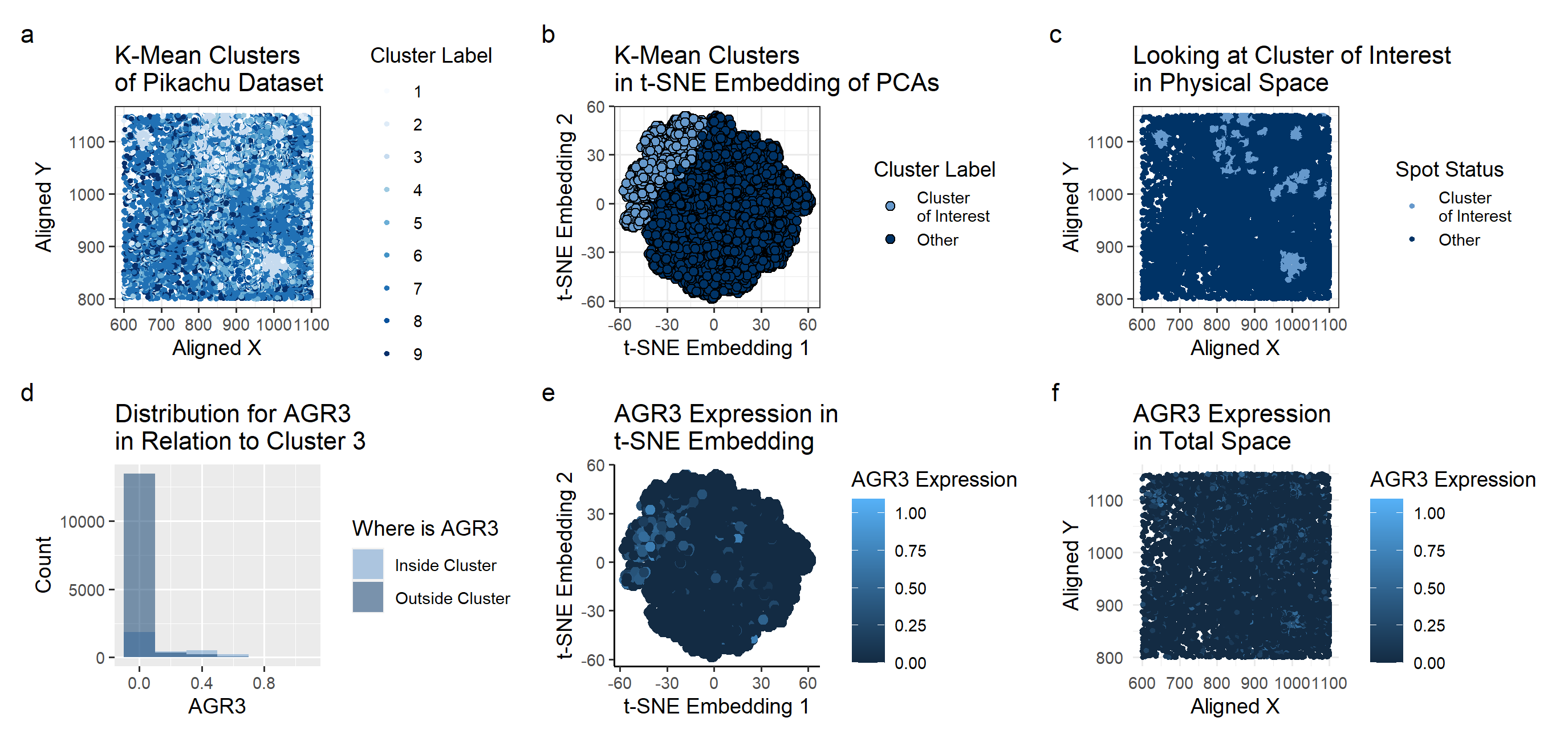
The Pikachu Dataset provided a different perspective on the Breast Cancer Tissue. The gene I had identified for HW4, CD74, did not exist in this dataset, which means I didn’t have a comparison point in terms of the genes. Nevertheless, using clustering methods, I was able to identify the potential cell type and a representative gene expression corresponding to the cell.
One major change that I made was in the k-means clustering. The Eevee dataset had its withiness “elbow” at k=5. In this dataset, calculating the withiness showed the best k value to be k=9. Due to the increased number of clusters, each cluster looked at a smaller area that when looking at the Eevee dataset clusters. This led to some interesting issues while doing the Wilcox test.
Plot A shows how the K-means algorithm identifies 9 clusters . A scale of colors ranging from dark blue to light blue correspons to the cluster label of 5 to 1. With the prior knowledge that we’re looking for breast cancer tissue, I picked cluster 3 for further investigation. Cluster 3, consisting of dense localized groups of points, seemed most like what I would imagine a tumor to look like.
Plot B shows the Cluster 3 on a t-SNE embedding. While it did occupy its own region in the upper left corner, it didn’t seem to have a visually distinctive cluster even in the nonlinear reduced space.
Plot C shows basically the same information as plot A, just focusing on the cluster 3 area.
To look at the differentially expressed genes, we perform a Mann-Whitney test, as we can’t check every single gene to see if it has a Gaussian distribution inside and outside of the cluster. There were a good number of genes that had a p-value of 0 or an extremely small number (at the magnitude of of 10^-100). One possible reason for this is the localization of cluster 3 on specifically the tumor. If a certain gene only expresses in the tumor, then our p-value will be extremely low. Since the k-means clustering for the pikachu dataset seems to have done a good job finding the tumors, perhaps the reason behind so many genes having a low p-value is due to them only expressing in or outside of the cluster.
From the genes with low p-value, I chose AGR3 to plot in the t-SNE embeddings and in the physical space. It largely corresponds with the location of cluster 3 shown in plot B, supporting the idea that AGR3 expresses uniquely in the breast cancer tissue.
Plot F has the same color schematic as before, but mapped on the physical space. Comparing with Plot C, we can see that areas of high AGR3 expression (shown in light blue on Plot F) seems to correspond with the cluster 3 location on Plot C.
The plots overall seem to show that AGR3 has correlations to breast cancer cells, something that is supported by existing research. (https://www.ncbi.nlm.nih.gov/pmc/articles/PMC7377037/).
1
2
3
4
5
6
7
8
9
10
11
12
13
14
15
16
17
18
19
20
21
22
23
24
25
26
27
28
29
30
31
32
33
34
35
36
37
38
39
40
41
42
43
44
45
46
47
48
49
50
51
52
53
54
55
56
57
58
59
60
61
62
63
64
65
66
67
68
69
70
71
72
73
74
75
76
77
78
79
80
81
82
83
84
85
86
87
88
89
90
91
92
93
94
95
96
97
98
99
100
101
102
103
104
105
106
107
108
109
110
111
112
113
114
115
116
117
118
119
120
121
122
123
124
125
126
127
128
129
130
131
132
133
134
135
136
137
138
139
140
141
142
143
144
145
146
147
148
149
150
151
152
153
154
155
156
157
158
159
160
161
162
163
164
165
166
167
168
169
170
171
172
173
174
175
176
177
178
179
180
181
182
183
184
185
186
187
188
189
190
191
192
193
194
195
196
197
198
199
200
201
202
203
204
205
206
207
208
#hw5_code
#Esthe Whang
# homework 4

# Perform clustering on the cells (or spots) in your data. Pick at least one cluster
# and figure out what cell-type (or multiple cell-types) it corresponds to.
#Create a multi-panel data visuAalization that includes at minimum the following components:
# 1. A panel visualizing your one cluster of interest in reduced dimensional space (PCA, tSNE, etc)
# 2. A panel visualizing your one cluster of interest in physical space
# 3. A panel visualizing differentially expressed genes for your cluster of interest
# 4. A panel visualizing one of these genes in reduced dimensional space (PCA, tSNE etc)
# 5. A panel visualizing one of these genes in space

set.seed(1)
data <- read.csv('C:\\Users\\emw\\OneDrive - Johns Hopkins\\spring 2024\\genomic-data-visualization-2024\\data\\pikachu.csv.gz', row.names=1)
library(ggplot2)
colnames(data)
dim(data)
##
pos <- data[, 4:5]
gexp <- data[6:ncol(data)]

# Pikachu as opposite problem to Eevee
# Pikachu is 17136   318
# Eevee is 709 and 18088

#"cell_area"    "nucleus_area" [4] "aligned_x"    "aligned_y"


gexpnorm <- log10(gexp/rowSums(gexp) * mean(rowSums(gexp))+1)


withiness <- c(1:15)
for (i in 3:12) {
  kmeans_i <- kmeans(gexpnorm, centers = i)
  withiness[i] <- kmeans_i$tot.withinss
}
plot(x= c(3:12), y=withiness[3:12])

# we see the elbow at 9
# change withiness code

#based on above plot, do centers = 5
com <- as.factor(kmeans(gexpnorm, centers=9)$cluster)
df <- data.frame(pos,gexpnorm, com)

# Looking at the plots to determine cluster of interest
library(RColorBrewer)
p_clusters <- ggplot(df) +
  geom_point(aes(x = aligned_x, y = aligned_y, col=df$com), size=1) +
  theme_bw() +
  labs(
    title = "K-Mean Clusters \nof Pikachu Dataset",
    x = "Aligned X",
    y = "Aligned Y", color="Cluster Label"
  ) +scale_color_brewer(palette='Blues')
p_clusters


## Looking at Cluster 3 based on p_cluster plot
cluster_of_interest = 3;
df_cluster = df[df$com==cluster_of_interest,]

# Comparing All Clusters to Cluster of Interest
# 1. A panel visualizing your one cluster of interest in reduced dimensional space (PCA, tSNE, etc)

## NOTE TO SELF THIS CODE IS KINDA WEIRD
doIcare <- as.factor(df$com != cluster_of_interest)#*1.5+2
doIcare_cluster <- factor(doIcare, labels = c('Cluster \nof Interest', 'Other') )

df_physicalspace <- data.frame(df, cluster_interest = doIcare_cluster)
p_physicalspace <- ggplot(df_physicalspace) +
  geom_point(aes(x = aligned_x, y = aligned_y, col=cluster_interest), size=1) +
  theme_bw() +
  labs(
    title = "Looking at Cluster of Interest \nin Physical Space",
    x = "Aligned X",
    y = "Aligned Y", color="Spot Status"
  ) +
  scale_color_manual(values = c("Cluster \nof Interest" = "#6699CC",
                                "Other"="#003366"))
p_physicalspace

library(patchwork)


#pca of all datapoints
pcs_whole <- prcomp(df[, colnames(gexpnorm)])
dim(pcs_whole$x)
#df2_whole <- data.frame(pcs_whole$x[,1:2])
#p_pca_whole <- ggplot(df2_whole) + geom_point(aes(x = PC1, y = PC2, col = com)) + theme_classic()
#p_pca_whole

## t-SNE
library(Rtsne)
emb1_whole <- Rtsne(pcs_whole$x[,1:30], dims = 2, perplexity = 5) ## what happens if we run tSNE on PCs?
df_whole <- data.frame(emb1_whole=emb1_whole$Y)

p_tsne_whole <- ggplot(df_whole) +
  geom_point(aes(x = emb1_whole.1, y = emb1_whole.2, fill=doIcare_cluster), shape=21,size=2) +
  theme_bw() +
  labs(
    title = "K-Mean Clusters \nin t-SNE Embedding of PCAs",
    x = "t-SNE Embedding 1",
    y = "t-SNE Embedding 2", fill="Cluster Label"
  ) +   scale_fill_manual(values = c("Cluster \nof Interest" = "#6699CC",
                               "Other"="#003366"))
p_tsne_whole

# 2. A panel visualizing your one cluster of interest in physical space
# Comparing against whole

# 3. A panel visualizing differentially expressed genes for your cluster of interest
all_pvals <- c(length(colnames(gexpnorm)))
i <- 0
#calculate a p-value for all.
# It's too difficult to check the distribution for each and every gene
# doing Mann-Whitney since at least that doesn't assume Gaussian

for (g in colnames(gexpnorm)) {
  i <- i+1
  p_value <- (wilcox.test(gexpnorm[com == cluster_of_interest, g],
                          gexpnorm[com != cluster_of_interest, g],
                          alternative = "two.sided")$p.val)
  all_pvals[i] <-p_value * 10^100

}

#doIcare <- as.factor(df$com != cluster_of_interest)

#find the genes with the lowest p-values
df_pvalue <- data.frame(gene_name = colnames(gexpnorm), pval = as.numeric(all_pvals))
head(df_pvalue)

df_pvalue_sorted <- df_pvalue[order(df_pvalue$pval), ]
head(df_pvalue_sorted)

df_pvalue_sorted$gene_name <- factor(df_pvalue_sorted$gene_name,                                    # Factor levels in decreasing order
                                     levels = df_pvalue_sorted$gene_name[order(df_pvalue_sorted$pval)])
rownames(df_pvalue_sorted) <- NULL #allows for proper sorting of bar plot later
head(df_pvalue_sorted)
topgenes <-df_pvalue_sorted[1:3, 1]


df_diffgene <- data.frame(df, diffgene = rowSums(gexpnorm[, topgenes]))
p_physicalspace_diffgene <- ggplot(df_diffgene) +
  geom_point(aes(x = aligned_x, y = aligned_y, col=diffgene)) +
  theme_minimal() +
  labs(
    title = "The Most Differentially-Expressed Genes \nand their Expressions",
    x = "Aligned X",
    y = "Aligned Y", color="Total Gene\nExpression"
  )
p_physicalspace_diffgene


# quickly look at the distributions as a sanity check
#AGR3  AIF1  BASP1
gene_of_interest = 'AGR3'
doIcare <- factor(doIcare, labels = c('Inside Cluster', 'Outside Cluster') )
df_hist <- data.frame(df, doIcare)


p_hist <- ggplot(df_hist, aes(x = df_hist[,gene_of_interest], fill = df_hist$doIcare)) +
  geom_histogram(binwidth = 0.2, alpha = 0.5, position = "identity") +
  labs(
    title = "Distribution for AGR3 \nin Relation to Cluster 3",
    x = "AGR3",
    y = "Count", fill="Where is AGR3"
  ) +
  scale_fill_manual(values = c("Inside Cluster" ="#6699CC",
                               "Outside Cluster"="#003366"))
p_hist

# 4. A panel visualizing one of these genes in reduced dimensional space (PCA, tSNE etc)
## plot
df_AGR3_reduced <- data.frame(pcs_whole$x[,1:2], emb=emb1_whole$Y, gene = gexpnorm[, 'AGR3'], doIcare)
p_AGR3_reduced <- ggplot(df_AGR3_reduced) + geom_point(aes(x = emb.1, y = emb.2, col=gene), size=2) +
  theme_classic() +
  labs(
    title = "AGR3 Expression in \nt-SNE Embedding",
    x = "t-SNE Embedding 1",
    y = "t-SNE Embedding 2", color="AGR3 Expression"
  )
p_AGR3_reduced

# 5. A panel visualizing one of these genes in space
## Look at gene expression of genes from above
## look at the sum of the genes of interest within cluster
# size_param <- as.numeric(df$com == cluster_of_interest)*1.5+2
#COL10A1
df_physicalspace_AGR3  <- data.frame(df, AGR3_Expression = gexpnorm[, 'AGR3'])
p_physicalspace_AGR3  <- ggplot(df_physicalspace_AGR3) +
  geom_point(aes(x = aligned_x, y = aligned_y, col=AGR3_Expression), size=1) +
  theme_minimal() +
  labs(
    title = "AGR3 Expression \nin Total Space",
    x = "Aligned X",
    y = "Aligned Y", color="AGR3 Expression"
  )
p_physicalspace_AGR3

library(patchwork)
p_clusters + p_tsne_whole + p_physicalspace + p_hist + p_AGR3_reduced+p_physicalspace_AGR3+ plot_layout(ncol = 3) +plot_annotation(tag_levels = 'a')