Identifying DCIS & Stromal Cells in Imaging Spatial Transcriptomics Data Through K-Means Cluster Analysis

What am I visualizing?
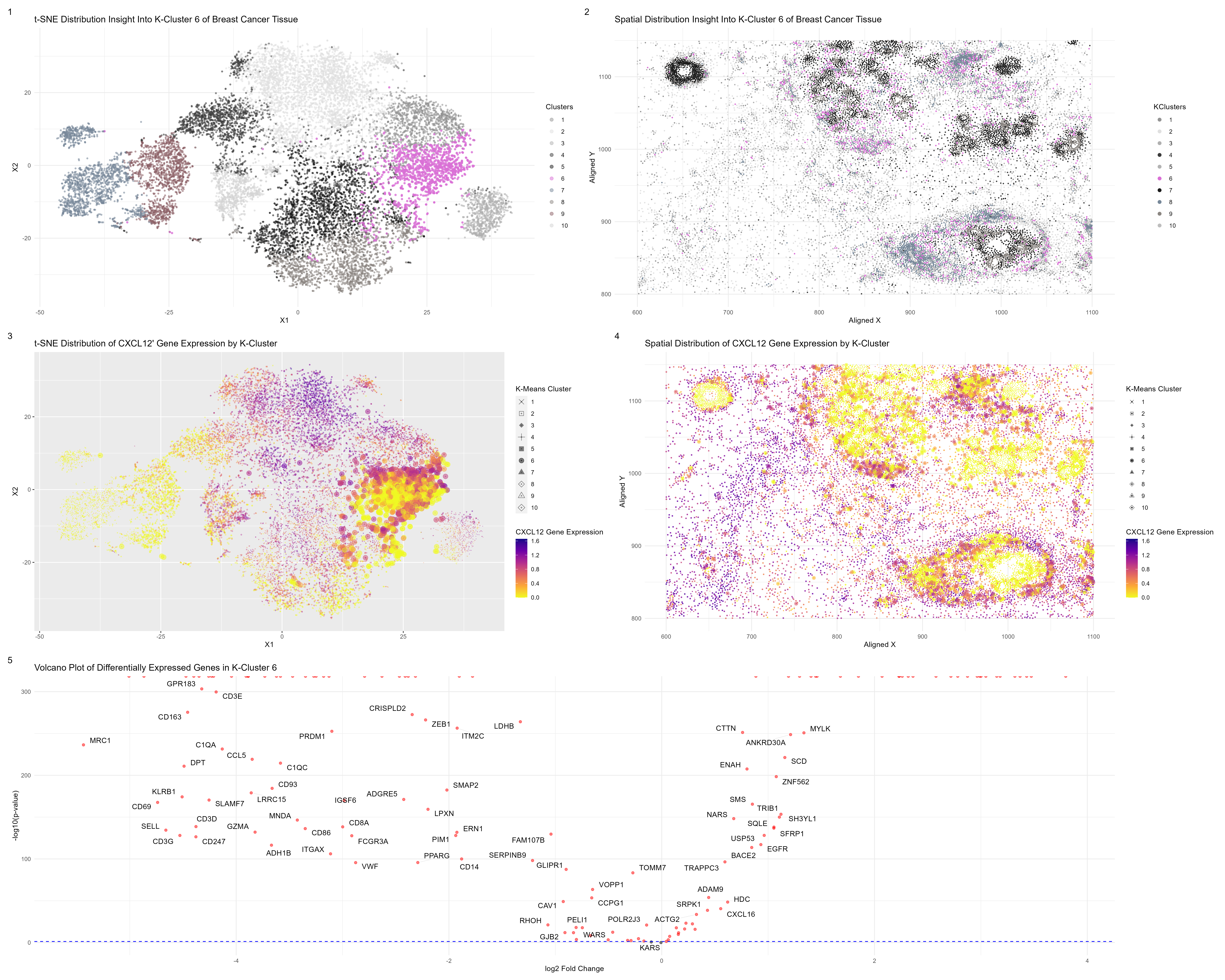
My visualization accomplishes the same goals as my previous one, honing in on a particular k-means cluster and identifying potential cell-types. In my previous Eeevee dataset, a sequencing-based spatial transcriptomics dataset of breast cancer tissue, I was able to identify ductal carcinoma in situ (DCIS) & stromal cells in my particular cluster. Now with the Pikachu dataset, an imaging-based spatial transcriptomics dataset of the same breast cancer tissue, I set out to identify the same cell-types, which I found in cluster 6 in my visualization above.
Subplot 1 displays the t-SNE distribution of my partial components and highlights my chosen cluster, while subplot 2 displays the spatial distribution of my cluster of interest.
Subplot 3 displays the t-SNE distribution of my partial components but highlights the expression level of my gene of interest, CXCL2, throughout the tissue as well as displaying the k-means clusters. Subplot 4 also displays a similar visual but uses spatial distribution in the physical space of the tissue instead. What is evident from both subplots 3 and 4 is that while there is some area that does not express high levels of CXCL2, the other half of cluster 6 is very high in the expression of CXCL2, a differentially expressed and upregulated gene. This leads me to believe I have stromal cells here.
Subplot 5 is a volcano plot of my differentially expressed genes in my chosen closer, showing what genes are upregulated or underregulated.
What was your process? Why do I believe I identified the same cell-types?
After normalizing and filtering out the top 150 genes present in the dataset, I performed a t-SNE dimensionality reduction followed by k-means clustering. From my research from my first visualization, I know that DCIS cells are associated with the overexpression of ERBB2 and stromal cells typically release the gene CXCL12 in breast cancer. Knowing what genes to look out for, I used the Wilcoxon signed rank test to evaluate which of my clusters has the most significantly differential expression of my genes of interest. I found these two to be cluster 5 for ERBB2 and cluster 6 for CXCL12. I conducted a formal Wilcox test on each of these clusters to see the top 5 DE genes, and for cluster 6, I saw that my genes of interest were both found to be the most differentially expressed and upregulated, while in cluster 5, only CXCL12 was. This led me to conclude I found my cell types. Knowing this, I plotted and designed my visualization.
What changes did I make to my original code?
Compared to the Eevee dataset, there are around 10,000 more “spots”. So when I plotted the std.devs of my PCA, I noted that it elbowed around 25. Therefore, I did my kmeans PCA with 25 components instead of 20. When I computed/plotted the tot.withinss, I discovered that there appeared to be 10 cell types instead of 9. This makes sense since again, we have 10,000 more spots and originally and around 300 genes; whereas Eevee had thousands that I had to filter out a lot from to 150. There were a lot of genes here that were not present in Eevee as well. This is why I think the number of transcriptionally distinct cell clusters went up a bit.
But therefore, I chose to have 10 clusters when computing my k-means analysis for my gene expression data that I used for my dimensionality reduction and Wilicox rank tests.
And with the addition of another cell-type cluster, I had to add another ‘shape’ when plotting my clusters since I had one more cell type.
I also chose to focus on the gene CXCL12 instead of ERBB2 because it was the most differentially expressed gene in the cluster, but ERBB2 was also DE. And I still was able to find the same cluster.
# Dee Velazquez
# HW 5

#Get data
data <- read.csv('pikachu.csv.gz', row.names = 1)
#Get pos
pos <- data[, 4:5]
#Get gexp
gexp <- data[6:ncol(data)]

dim(gexp)

#Normalize
gexp_norm <- log10(gexp/rowSums(gexp) *
                     mean(rowSums(gexp))+1)
#Filter and get top 150 genes
top_genes <- names(sort(apply(gexp_norm, 2, mean), decreasing=TRUE)[1:150])
gexp_norm <- gexp_norm[, top_genes]


dim(gexp_norm)

#PCA
pca <- prcomp(gexp_norm)
head(pca$x[,1:5])
head(pca$sdev)
head(pca$rotation[,1:5])
head(sort(pca$rotation[,1], decreasing=TRUE))
#LUM     POSTN    CXCL12    CCDC80      MMP2     CXCR4
head(sort(pca$rotation[,2], decreasing=TRUE))
#PTPRC     CXCR4      IL7R      CD3E      TRAC     CYTIP
df <- data.frame(pca$x, gexp_norm)
#Find optimal k clusters
plot(pca$sdev[1:150])
#25 PCA components in pikachu instead of 20 in eevee
results <- sapply(seq(1, 25, by=1), function(i) {
  #print(i)
  com <- kmeans(pca$x[,1:25], centers=i)
  return(com$tot.withinss)
})
results
plot(results, type="l")
#From plotting tot.withinss, there seems to be around 10 cell types
#compares to 9 in the eevee dataaet
com <- kmeans(pca$x[,1:25], centers=10)
table(com$cluster)

com2 <- kmeans(gexp_norm, centers=10)
com2 <- as.factor(kmeans(gexp_norm, centers=10)$cluster)
table(com2)

df2 <- data.frame(pos, kmeans=as.factor(com$cluster))
head(df2)
p1 <- ggplot(df2) + geom_point(aes(x = aligned_x, y=aligned_y, col=kmeans),
                               size=.3, alpha=.5) + theme_minimal()
p1 + guides(color = guide_legend(override.aes = list(size = 2)))
df3 <- data.frame(pca$x[,1:25], Cluster=as.factor(com$cluster))
p2 <- ggplot(df3) + geom_point(aes(x = PC1, y=PC2, col=Cluster),
                               size=.3, alpha=.5) + theme_minimal()
p2 + guides(color = guide_legend(override.aes = list(size = 2)))
#tSNE
emb <- Rtsne(pca$x[,1:25])$Y
df4 <- data.frame(emb, Clusters=as.factor(com$cluster))
p3 <- ggplot(df4) + geom_point(aes(x = X1, y = X2, col=Clusters), size=.3, alpha=0.5) +
  theme_bw()
p3 + guides(color = guide_legend(override.aes = list(size = 2)))

###
#Want to find same cell from before
gene_of_interest <- 'ERBB2'
# Perform Wilcoxon rank sum test for each cluster
g1results <- sapply(1:10, function(i) {
  wilcox.test(gexp_norm[com2 == i, gene_of_interest],
              unlist(gexp_norm[com2 != i, gene_of_interest]),
              alternative = "greater")$p.val
})
g1results
# Find the cluster with significantly different gene expression
significantly_different_cluster <- which.min(g1results)
cat("Cluster with significantly different expression of gene", gene_of_interest, "is:",
    significantly_different_cluster)
#Cluster with significantly different expression of gene ERBB2 is: 6

#Want to find same cell from before
gene_of_interest2 <- 'CXCL12'
# Perform Wilcoxon rank sum test for each cluster
g2results <- sapply(1:10, function(i) {
  wilcox.test(gexp_norm[com2 == i, gene_of_interest2],
              unlist(gexp_norm[com2 != i, gene_of_interest2]),
              alternative = "greater")$p.val
})

g2results
# Find the cluster with significantly different gene expression
significantly_different_cluster2 <- which.min(g2results)
cat("Cluster with significantly different expression of gene", gene_of_interest2, "is:",
    significantly_different_cluster2)
#Cluster with significantly different expression of gene CXCL12 is: 5


###
#Want to focus on cluster 6 where it has highest , see differentially expressed genes
results <- sapply(colnames(gexp_norm), function(g) {
  wilcox.test(gexp_norm[com2 == 6, g],
              gexp_norm[com2 != 6, g],
              alternative = "two.sided")$p.val
})
head(sort(results, decreasing=FALSE))
#LUM  POSTN  ERBB2 CCDC80 CXCL12   MMP2
#0      0      0      0      0      0
#Now see what genes are differentitally up-regulated in cluster 6
results2 <- sapply(colnames(gexp_norm), function(g) {
  wilcox.test(gexp_norm[com2 == 6, g],
              gexp_norm[com2 != 6, g],
              alternative = "greater")$p.val
})
head(sort(results2, decreasing=FALSE))
#ERBB2    CCND1      DST     KRT7 SERPINA3  TACSTD2
#0        0        0        0        0        0

#Want to focus on cluster 5, see differentially expressed genes
results2 <- sapply(colnames(gexp_norm), function(g) {
  wilcox.test(gexp_norm[com2 == 5, g],
              gexp_norm[com2 != 5, g],
              alternative = "two.sided")$p.val
})
head(sort(results2, decreasing=FALSE))
#LUM  POSTN CCDC80 CXCL12   MMP2  BASP1
#0      0      0      0      0      0
results2 <- sapply(colnames(gexp_norm), function(g) {
  wilcox.test(gexp_norm[com2 == 5, g],
              gexp_norm[com2 != 5, g],
              alternative = "greater")$p.val
})
head(sort(results2, decreasing=FALSE))

#Cluster 6 has both DE genes for ERBB2 & and CXCL12 so it is my cell type(s)

###
ggplot(data.frame(emb, gene = gexp_norm[, 'CXCL12'])) +
  geom_point(aes(x = X1, y = X2, col=gene), size=.3) +
  scale_color_viridis_c(option = "C",
                        name = "CXCL12 Gene Expression",
                        direction = -1)

pv <- sapply(colnames(gexp_norm), function(g) {
  wilcox.test(gexp_norm[com2 == 6, g],
              gexp_norm[com2 != 6, g],
              alternative = "two.sided")$p.val
})
logfc <- sapply(colnames(gexp_norm), function(i) {
  log2(mean(gexp_norm[com2 == 6, i])/mean(gexp_norm[com2 != 6, i]))
})

#Data frame for differential expression analysis results
results_df <- data.frame(
  gene = names(pv),
  p_value = pv,
  log2_fold_change = logfc)

#Define significance threshold
significance_threshold <- 0.05

#Create volcano plot
#Plot 3 of HW 5
volcano_plot <- ggplot(results_df, aes(x = log2_fold_change, y = -log10(p_value))) +
  geom_point(color = ifelse(results_df$p_value < significance_threshold, "red", "black"), alpha = 0.5) +
  geom_hline(yintercept = -log10(significance_threshold), linetype = "dashed", color = "blue") +
  theme_minimal() +
  labs(
    x = "log2 Fold Change",
    y = "-log10(p-value)",
    title = "Volcano Plot of Differentially Expressed Genes in K-Cluster 6"
  ) +
  scale_color_identity() +
  scale_shape_identity() + geom_text_repel(
    data = subset(results_df, p_value < significance_threshold),
    aes(label = gene),
    box.padding = 0.5,
    point.padding = 0.5,
    segment.color = "grey",
    segment.size = 0.2,
    segment.alpha = 0.5
  )
volcano_plot

#Plot 1 of HW5
part1 <- ggplot(df4, aes(x = X1, y = X2, col = Clusters)) +
  geom_point(size = 0.7, alpha = 0.5) +
  scale_color_manual(values = c("grey58", "grey88", "grey69", "grey23", "grey10", "orchid", "lightslategrey", "seashell4", "lightpink4", "lightgrey")) +
  theme_minimal() + labs(
    title = "t-SNE Distribution Insight Into K-Cluster 6 of Breast Cancer Tissue",
    x = "X1",
    y = "X2"
  ) +
  geom_point(data = subset(df4, Clusters == 6), color = "orchid",
             size = 1, alpha = 0.5) +
  guides(color = guide_legend(override.aes = list(size = 2)))
part1
###
#Plot 4 of HW 5
#Combine tSNE components, desired gene of interest, and clusters
df6 <- data.frame(emb, gene = gexp_norm[, 'CXCL12'], KClusters = as.factor(com$cluster))
#Plot by tSNE component, and display expression level of GOI and highlight clusters
part4 <- ggplot(df6, aes(x = X1, y = X2, color = gene, shape = KClusters)) +
  geom_point(size = 0.3, alpha = 0.5) +
  scale_color_viridis_c(option = "C", name = "CXCL12 Gene Expression", direction = -1) +
  scale_shape_manual(values = c(4, 22, 18, 3, 15, 19, 17, 23, 24, 5)) +
  labs(
    title = "t-SNE Distribution of CXCL12' Gene Expression by K-Cluster",
    x = "X1",
    y = "X2"
  ) +
  guides(shape = guide_legend(title = "K-Means Cluster")) +
  theme(legend.position = "right") +
  geom_point(data = subset(df6, KClusters == 6), size = 3, alpha = 0.5) + guides(size = guide_legend(override.aes = list(size = 1)))
part4

###
# Combine pos data with clusters
pos_plot <- data.frame(pos, KClusters = as.factor(com$cluster))

# Plot by position and highlight my cluster, cluster 6
#Plot 2 of HW 5
part2 <- ggplot(pos_plot, aes(x = aligned_x, y = aligned_y, col = KClusters)) +
  geom_point(size = 0.3) +
  scale_color_manual(values = c("grey58", "grey88", "grey69", "grey23", "grey70", "orchid", "grey10", "lightslategrey", "seashell4", "grey","burlywood4", "lightpink4")) +
  theme_minimal() +
  labs(
    title = "Spatial Distribution Insight Into K-Cluster 6 of Breast Cancer Tissue",
    x = "Aligned X",
    y = "Aligned Y"
  ) +
  geom_point(data = subset(pos_plot, KClusters == 6), color = "orchid",
             size = 0.5, alpha = 0.5) +
  guides(color = guide_legend(override.aes = list(size = 2)))
part2
###
#Plot 5 of Hw 5
# Combine pos data with desired gene of interest, and clusters
df8 <- data.frame(pos, gene = gexp_norm[, 'CXCL12'], KClusters = as.factor(com$cluster))

#Plot by position, and display expression level of GOI, and cluster info
part5 <- ggplot(df8, aes(x = aligned_x, y = aligned_y, color = gene, shape = KClusters)) +
  geom_point(size = 0.3) +
  scale_color_viridis_c(option = "C", name = "CXCL12 Gene Expression", direction = -1) +
  scale_shape_manual(values = c(4, 22, 18, 3, 15, 19, 17, 23, 24, 5)) +
  labs(
    title = "Spatial Distribution of CXCL12 Gene Expression by K-Cluster",
    x = "Aligned X",
    y = "Aligned Y"
  ) +
  theme_minimal() +
  guides(shape = guide_legend(title = "K-Means Cluster")) +
  theme(legend.position = "right") +
  geom_point(data = subset(df8, KClusters == 6), aes(x = aligned_x,
                                                     y = aligned_y), size = 2, alpha = 0.5) + guides(size = guide_legend(override.aes = list(size = 2)))
part5


ggplot(df8, aes(x = aligned_x, y = aligned_y, color = gene, shape = KClusters)) +
  geom_point(size = 0.3) +
  scale_color_viridis_c(option = "C", name = "CXCL12 Gene Expression", direction = -1) +
  scale_shape_manual(values = c(4, 22, 18, 3, 15, 19, 17, 23, 24, 5)) +
  labs(
    title = "Spatial Distribution of CXCL12 Gene Expression by K-Cluster",
    x = "Aligned X",
    y = "Aligned Y"
  ) +
  theme_minimal() +
  guides(shape = guide_legend(title = "K-Means Cluster")) +
  theme(legend.position = "right") +
  geom_point(data = subset(df8, KClusters == 6), aes(x = aligned_x,
                                                     y = aligned_y), size = 2, alpha = 0.5) + guides(size = guide_legend(override.aes = list(size = 2)))
###
#Plot 3 of HW5
part3 <- volcano_plot
part3

##Final Graph
part1 + part2 + plot_annotation(tag_levels = '1') + plot_layout(ncol = 3)
part4 + part5 + plot_annotation(tag_levels = '1') + plot_layout(ncol = 3)
part3 + plot_annotation(tag_levels = '1') + plot_layout(ncol = 3)
final_plot <- (part1 |  part2) / (part4 | part5) / part3 + plot_annotation(tag_levels = '1')
#final_plot
ggsave("final_plot.png", final_plot, width = 25, height = 20, units = "in", limitsize=FALSE)