Imaging (Pikachu) Dataset: Identifying Cell-type from Breast Cancer Tissue Spatial Transcriptomics Data using K-means Clustering, tSNE, and Wilcox-test

Describe your figure briefly so we know what you are depicting (you no longer need to use precise data visualization terms as you have been doing)
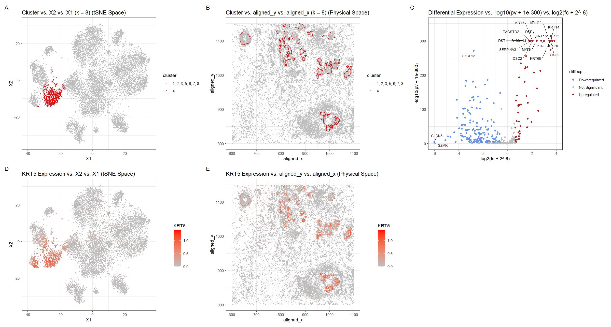
For plot A, I am visualizing the quantitative data of the X1 and X2 tSNE embedding values, and categorical data of the cluster the cell belongs to. I am using the geometric primitive of points to represent each cell. To encode the X1 embedding value, I am using the visual channel of position along the x axis. To encode the X2 value, I am using the visual channel of position along the y axis. To encode the categorical cluster the cell belongs to, I am using the visual channel of saturation going from an unsaturated light grey to a saturated red.
For plot B, I am visualizing the spatial data of the aligned x and y positions for each cell, and categorical data of the cluster the cell belongs to. I am using the geometric primitive of points to represent each cell. To encode the spatial aligned x position, I am using the visual channel of position along the x axis. To encode the spatial aligned y position, I am using the visual channel of position along the y axis. To encode the categorical cluster the cell belongs to, I am using the visual channel of saturation going from an unsaturated light grey to a saturated red.
For plot C, I am visualizing the quantitative data of the log-transformed p-value, the quantitative data of the log-transformed fold change, and the ordinal data for the differential expression level for each gene. I am using the geometric primitive of points to represent each gene. To encode the log-transformed fold change, I am using the visual channel of position along the x axis. To encode the log-transformed p-value, I am using the visual channel of position along the y axis. To encode the differential expression level, I am using visual channel of color hue with blue representing downregulated expression, red representing upregulated expression, and grey representing no significant differential expression for a given gene.
For plot D, I am visualizing the quantitative data of the X1 and X2 tSNE embedding values, and quantitative data of normalized log-scaled KRT5 expression for each cell. I am using the geometric primitive of points to represent each cell. To encode the X1 embedding value, I am using the visual channel of position along the x axis. To encode the X2 value, I am using the visual channel of position along the y axis. To encode the quantitative normalized log-scaled KRT5 expression, I am using the visual channel of saturation going from an unsaturated light grey to a saturated red.
For plot E, I am visualizing the spatial data of the aligned x and y positions for each cell, and quantitative data of normalized log-scaled KRT5 expression for each cell. I am using the geometric primitive of points to represent each cell on the spatial transcriptomics slide. To encode the spatial aligned x position, I am using the visual channel of position along the x axis. To encode the spatial aligned y position, I am using the visual channel of position along the y axis. To encode the quantitative normalized log-scaled KRT5 expression, I am using the visual channel of saturation going from an unsaturated light grey to a saturated red.
Plots A, B, D, E are scatter plots. Plot C is a volcano plot.
The Gestalt principles of proximity and similarity are present because the more similar plots are adjacent. For example, A and B both involve the categorical cluster variable. A and D are both in tSNE space. B and E are both in physical space. D and E involve the quantitative KRT5 expression variable. The Gestalt principle of continuity is used because progressing from plot A to plot E aligns with the steps used to identify cluster 4’s cell-type (described below).
write a description to convince me you found the same cell-type. Your description may reference papers and content that allowed you to interpret your cell cluster as a particular cell-type.
To cluster the data, k-means clustering with k=8 was used. k=8 was found by constructing an elbow plot and picking the elbow. Cluster 4 was chosen because it appeared to be well-defined in tSNE space and separate from the other clusters (Figure A). Also when plotted in physical space, cluster 4 appeared to align with the cluster found in HW4 but at higher single cell resolution rather than spot-based resolution. Visualizing the cluster in physical space allowed for later comparison once a differentially upregulated gene was chosen (Figure B). For this, a two-sided Wilcox test was used comparing the gene expression levels for cluster 4 with those of the other clusters (1, 2, 3, 5, 6, 7, 8) for each gene. The p-values were -log10 transformed with an offset of 1e-300, so small p-values have map to high values, and the log2 fold change was computed, with an offset of 2^-6. These offsets were necessary because otherwise, the log transforms would result in infinite values, since the respective arguments of the log were so small they rounded to 0. 1e-300 was chosen because it is one of the smallest values to represent and so wouldn’t change the result of the logarithm too much. 2^-6 was chosen because it is also pretty small, but not so small that it would affect the x-axis scale drastically. Still, because of the rounding, which cells have a greater -log10 transformed p-values is unclear near the upper bound. Using whether the log2 fold change was positive or negative, the direction of the differential expression, upregulated or downregulated respectively, could be ascertained. Points with p-values >= 0.01 and with absolute value of log2 fold change less than 0.58 (fold-change of 1.5) were considered insignificant (https://training.galaxyproject.org/training-material/topics/transcriptomics/tutorials/rna-seq-viz-with-volcanoplot-r/tutorial.html). Finally, outlier points with high -log10 p-values or extreme log2fc were labeled with the names of the genes. This was done in both the downregulated and upregulated regions. KRT5 was chosen as a gene of interest and its expression was graphed in tSNE and physical space. Regions of high KRT5 expression generally matched the cluster 4 regions, which makes sense because the k-means clustering algorithm would use KRT5 as a major factor since it is differentially expressed.
The top 5 most upregulated genes (KRT5, KRT16, KRT14, FOXC2, KRT6B), were searched for on Human Protein Atlas to identify the tissue cell-type the cluster corresponds to (https://www.proteinatlas.org). Given the hint that the tissue is breast cancer tissue, it was noted that KRT5–the gene with the largest -log10(pv) and log2fc–had a high enrichment score for breast myoepithelial cells of 0.720. Enrichment score is the mean correlation between the gene and the 3 reference transcripts selected to represent each cell type profiled within the tissue. The enrichment score for this gene for breast myoepithelial cells was greater than those of any other breast tissue cell-type (glandular, glandular progenitors, adipocytes), which were < 0.65. For the next most upregulated gene, KRT16, the enrichment score for breast myoepithelial cells was smaller at 0.362, but all the other breast cell types had an enrichment score of 0. For KRT14, the enrichment score for breast myoepithelial cells was high at 0.770 and greater than those of any other breast tissue cell-type, which were < 0.55. FOXC2 had an enrichment score for breast myoepithelial cells that was relatively small at 0.373, but greater than the other breast cell types: 0.326 for glandular progenitors and 0 for the rest. Finally, KRT6B had a moderate enrichment score of 0.568 for breast myoepithelial cells, which was greater than those of any other breast tissue cell-type, which were < 0.5. Overall for every one of the top 5 most upregulated genes, breast myoepithelial cells were the tissue cell-type with the greatest enrichment score compared to the other breast cell-types.
Another gene which was very upregulated based on the -log10 p-value but did not have as extreme of a log2fc was DST. DST and KRT14 (mentioned above) are considered by the Human Protein Atlas to have a moderate enrichment score for breast myoepithelial cells (https://www.proteinatlas.org/search/ce_enriched%3ABreast%3BBreast+myoepithelial+cells%3BModerate/2). This means that the differential score vs. other profiled cell types within the tissue is >0.15. DST’s enrichment score for breast myoepithelial cells was high at 0.734, and greater than those of any other breast tissue cell-type, which were < 0.6. The fact that DST and KRT14 are considered markers for breast myoepithelial cells and were upregulated in cluster 4 compared to the other clusters, strongly suggests that cluster 4 represents the breast myoepithelial cell-type.
I confirmed this with research papers in the literature. KRT14 can play an important role in the progression of breast cancer and is localized in epithelial cells: “Invasive ductal breast cancer (IDC) can be led by specialized cancer cells that retain a basal epithelial phenotype. These leader cells are identified by expression of basal epithelial genes (e.g. KRT14 and p63)” (https://www.ncbi.nlm.nih.gov/pmc/articles/PMC7642004/). KRT5 is also noted as being “coexpressed during differentiation of simple and stratified epithelial tissues” so it may be found in the epithelial tissues of the breast and “specifically expressed in the basal layer of the epidermis with family member KRT14” so it may be found in the breast skin (https://www.ncbi.nlm.nih.gov/gene/3852). Thus it makes sense that KRT5 was upregulated with KRT14 in this cluster since they are localized together.
Thus, I have identified the cell-type of cluster 4 to be breast myoepithelial cells, which was the same cell-type identified in HW4 using the Eevee dataset. This makes sense because both clusters were found to upregulate KRT6B (a lot of the cells analyzed in the Eevee dataset were not in the Pikachu dataset and they might have been upregulated too). The plots of the clusters in physical space also generally match up with blotches in the bottom right, top left, and across the top middle-to-right.
Write a description of what you changed and why you think you had to change it.
I switched from the Eevee to the Pikachu dataset. I changed the way the gene expression values (gexp) were compiled because the Pikachu dataset only analyzes 313 genes compared to the 18088 of the Eevee dataset, so there was no need to filter for the top genes by total expression (no gexpfilter).
I previously performed k-means clustering with k=6. Now I performed k-means clustering with k=8. This is because I found the optimal K based on total withinness to be 8 for this dataset. I think there is a lower optimal number of transcriptionally distinct cell-clusters in the spot-based Eevee dataset compared to the single-cell resolution Pikachu dataset because there are much more cells (observations) in the Pikachu dataset than there are spots in the Eevee dataset, and each cell is assigned to a cluster rather than each spot. Each spot in the Eevee dataset contains multiple cells so it is possible that some of the clusters which form at single-cell resolution do not appear when clustering is performed on groups of cells and the attributes of the individual cells are mixed together. Thus more diverse cell-populations can be found at single-cell resolution. These 8 clusters are used in Figures A and B instead of 6.
I made the size of each point in the scatter plot smaller, at 0.5, so they would not overlap since there are many more cells in the Pikachu dataset than there are spots in the Eevee dataset, and they are not regularly spaced in physical space.
For Figure C with the differential expression, an offset of 1e-300 was used for the -log10 transformed p-value and an offset of 2^-6 was used for the log2 transformed fold change to avoid taking the logarithm of 0 and getting an infinite value. For the p-values, this would mean that for some of the genes were so differentially expressed according to the Wilcox test that their p-value rounded to 0. For the log2fc values, the infinite values which were offset were negative, meaning that some of the genes had a much higher mean expression in the other clusters than the cluster of interest. Potentially, since the Pikachu dataset has greater, single-cell resolution this allows for more cell-populations to be identified (as explained for k-means above), and this has resulted in cell-populations with starker differences between each other, which had been averaged out when the cells were grouped together in spots in the Eevee dataset. These starker differences allow for more extreme -log10 p-values and log2 fold changes.
In figured D and E, I changed the gene of interest to KRT5 because COL17A1, which is in the Eevee dataset, was not analyzed in the Pikachu dataset, along with a lot of other genes. And KRT5 was found to be the gene with the most upregulated expression according to Figure C.
Please share the code you used to reproduce this data visualization.
data <-
    read.csv("genomic-data-visualization-2024/data/pikachu.csv.gz",
             row.names = 1)

data[1:10, 1:10]
pos <- data[, 4:5]
gexp <- data[6:ncol(data)]

gexpnorm <- log10(gexp/rowSums(gexp) * mean(rowSums(gexp))+1)

pcs <- prcomp(gexpnorm)
plot(pcs$sdev[1:100])

# find k with elbow method
set.seed(42)
results <- sapply(seq(2, 14, by=1), function(i) {
    print(i)
    com <- kmeans(gexpnorm, centers=i)
    return(com$tot.withinss)
})
plot(results, type="l")

set.seed(42)
com <- as.factor(kmeans(gexpnorm, centers=8)$cluster)

library(Rtsne)
set.seed(42)
emb <- Rtsne(pcs$x)$Y


library(ggplot2)
df <- data.frame(pos, emb, com)
ggplot(df) +
    geom_point(aes(x = X1, y = X2, col=com), size=1) +
    theme_bw()

ggplot(df) +
    geom_point(aes(x = aligned_x, y = aligned_y, col=com), size=1) +
    theme_bw()

clusterofinterest = 4
df2 <- df
df2[com!=clusterofinterest, "com"] = 1
p1 <- ggplot(df2) +
    geom_point(aes(x = X1, y = X2, col=com), size=0.5) +
    scale_color_manual(values = c("grey", "red"), labels = c("1, 2, 3, 5, 6, 7, 8", "4"))+
    labs(col='cluster') +
    labs(title = 'Cluster vs. X2 vs. X1 (k = 8) (tSNE Space)') +

    theme_bw()
p1

df3 <- data.frame(pos, df2)
p2 <- ggplot(df3) +
    geom_point(aes(x = aligned_x, y = aligned_y, col=com), size=0.5) +
    scale_color_manual(values = c("grey", "red"), labels = c("1, 2, 3, 5, 6, 7, 8", "4"))+
    labs(col='cluster') +
    labs(title = 'Cluster vs. aligned_y vs. aligned_x (k = 8) (Physical Space)') +

    theme_bw()
p2

colnames(gexpnorm)

pv <- sapply(colnames(gexpnorm), function(i) {
    print(i) ## print out gene name
    wilcox.test(gexpnorm[com == clusterofinterest, i],
                gexpnorm[com != clusterofinterest, i])$p.val
})
logfc <- sapply(colnames(gexpnorm), function(i) {
    print(i) ## print out gene name
    log2(mean(gexpnorm[com == clusterofinterest, i])
         / mean(gexpnorm[com != clusterofinterest, i]) + 2^-6)
})

df4 <- data.frame(pv = pv, logpv=-log10(pv + 1e-300), logfc)
df4["gene"] <- rownames(df4)
df4["diffexp"] = "Not Significant"
df4[df4["pv"] < 0.01 & df4["logfc"] > 0.58, "diffexp"] = "Upregulated"
df4[df4["pv"] < 0.01 & df4["logfc"] < -0.58, "diffexp"] = "Downregulated"
df4$diffexp = as.factor(df4$diffexp)

levels(df4$diffexp)

library(ggrepel)

# https://ggrepel.slowkow.com/articles/examples.html#examples
p3 <- ggplot(df4) + geom_point(aes(x = logfc, y = logpv, color=diffexp)) +
    geom_text_repel(aes(label=ifelse((logpv > 290 & logfc > 1.5)
                                     | (logpv > 250 & logfc < -1.5)
                                     | pv < 0.01 & logfc < -5.5,as.character(gene), "")
                        , x = logfc, y = logpv), size=3, max.overlaps = Inf, box.padding = .5) +
    scale_color_manual(values = c("cornflowerblue", "grey", "firebrick")) +
    ylab("-log10(pv + 1e-300)")+
    xlab("log2(fc + 2^-6)")+
    ylim(NA, 350) +
    xlim(NA, 4) +
    labs(title = 'Differential Expression vs. -log10(pv + 1e-300) vs. log2(fc + 2^-6)') +
    theme_bw()
p3

df5 <- data.frame(pos, gexpnorm, emb, com)
p4 <- ggplot(df5) +
    geom_point(aes(x = X1, y = X2, col=KRT5), size=0.5) +
    labs(title = 'KRT5 Expression vs. X2 vs. X1 (tSNE Space)') +
    scale_color_gradient(low="grey", high="red")+
    theme_bw()
p4

p5 <- ggplot(df5) +
    geom_point(aes(x = aligned_x, y = aligned_y, col=KRT5), size=0.5) +
    labs(title = 'KRT5 Expression vs. aligned_y vs. aligned_x (Physical Space)') +
    scale_color_gradient(low="grey", high="red")+
    theme_bw()
p5

library(patchwork)

p1 + p2 + p3 + p4 + p5 +
    plot_annotation(tag_levels = 'A') + plot_layout(nrow = 2, ncol = 3)