PDK4 in Breast Cancer Adipocytes Cells

Edits to the code Description:
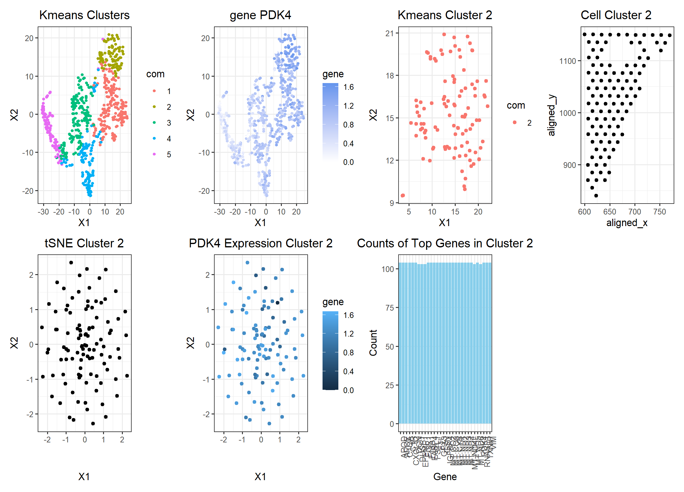
I switched from the pikachu to the eevee datset. To choose a better cluster size, I ran a loop to determine the total withiness plotted against the k cluster and found that k = 5 was an ideal cluster size. In terms of identifying the same patch of cells, when I previously looked at gene CD93, I found that it was prominantly found in either adipocyte cells or endothelial cells. As a result, my goal was to find a gene that similarly was highly expressed in breast cancer tissue as well as found in adipocyte cells. Gene PDK4 has both those qualities. Although PDK4 is expressed in more than one cluster, the wilcox test determined that it was most likely a significant part of cluster 2 which is where I believe the same population of adipocyte cells from the pikachu dataset were found. While searching for similar genes between the pikachu’s dataset cluseter 9 and eevee’s dataset, I found that only 2 of the top genes I had previously filtered for high expression were in common. One of them was PDK4 which happened to be of the same cell type of CD93 which corroborates my reason for concluding that cluster 2 contains the cells in cluster 9. In terms of other edits to the code, I mainly changed variable names like axes titles. I will note that the bar graph of top gene expressions is a little odd since most of the top genes appear to be expressed in equal amounts.
Source for ADP4: https://www.ncbi.nlm.nih.gov/pmc/articles/PMC6176187/ <- says that PDK4 is prominent in breast cancer tissue https://www.proteinatlas.org/ENSG00000004799-PDK4 <- shows that PDK4 is common in adipocytes
Code:
Homework 5
Load data
data <- read.csv(paste(‘C:/Users/Amand/OneDrive/Documents/JHU-undergrad’, ‘/Junior Year/Sem2/Genomic Data/Amanda-K/data/eevee.csv.gz’, sep = ‘’), row.names = 1)
pos = data[,2:3]
Call relevant Libraries
library(Rtsne) library(patchwork) library(ggplot2) library(ggrepel)
normalize the data
gexp <- data[,4:ncol(data)] gexpnorm <- log10(gexp/rowSums(gexp) * mean(rowSums(gexp))+1)
pca
pcs <- prcomp(gexpnorm) plot(pcs$sdev[1:100])
tsne
set.seed(123) emb <- Rtsne(pcs$x[,1:20])$Y
optimal k means cluster
plot(pcs$sdev[1:100]) results <- sapply(seq(2, 20, by=1), function(i) { print(i) com <- kmeans(pcs$x[,1:20], centers=i) return(com$tot.withinss) }) results plot(results, type=”l”) seq(2, 20, by=1)
k optimal = 5
kmeans clustering on tSNE embedding: first 20 pcs for processing speed ——-
set.seed(123) k <- kmeans(pcs$x[,1:20], centers = 5) com <- as.factor(k$cluster) p1 <- ggplot(data.frame(emb,com)) + geom_point(aes(x = X1, y = X2, col = com), size = 1) + theme_bw() + labs(title = “Kmeans Clusters”) + theme(plot.title = element_text(hjust = 0.5)) p1
wilcox test
results2 <- sapply(1:5, function(i) { results <- sapply(colnames(gexpnorm), function(g) { wilcox.test(gexpnorm[com == i, g], gexpnorm[com != i, g], alternative = “greater”)$p.val }) return(names((sort(results, decreasing = FALSE))[1:20])) })
PDK4
‘PDK4’ %in% results2
cluster of interest
c = 2
visualize the AQP1 gene for cluster 9 —————————————-
df <- data.frame(emb,com, gene = gexpnorm[, ‘PDK4’]) p2 <- ggplot(df) + geom_point(aes(x = X1, y = X2, col = gene), size = 1) + theme_bw() + scale_color_gradient(low = ‘white’, high = ‘cornflowerblue’) + labs(title = “gene PDK4”) + theme(plot.title = element_text(hjust = 0.5)) p2
visualize the k means cluster 8 isolated from other clusters —————–
df2 <- data.frame(X1 = emb[,1][com == c], X2 = emb[,2][com == c], com = com[com == c]) p3 <- ggplot(df2) + geom_point(aes(x = X1, y = X2, col = com)) + theme_bw() + labs(title = “Kmeans Cluster 2”) + theme(plot.title = element_text(hjust = 0.5)) p3
spatial postion of cluster 9 ————————————————-
gexp_cluster9 <- gexpnorm[com == c, ] df3 <- data.frame(data[com == c, ]) p4 <- ggplot(df3) + geom_point(aes(x = aligned_x, y = aligned_y)) + labs(title = “Cell Cluster 2”) + theme(plot.title = element_text(hjust = 0.5)) + theme_bw() p4
pca on cluster 8 ————————————————————-
pc8 <- prcomp(gexp_cluster9) plot(pc8$sdev[1:100])
df4 <- data.frame(pc8$x) p5 <- ggplot(df4) + geom_point(aes(x = PC1, y = PC2)) + theme_bw() + labs(title = “PCA Cluster 2”) + theme(plot.title = element_text(hjust = 0.5)) p5
tSNE on cluster 8 ————————————————————
emb2 <- Rtsne(pc9$x)$Y df5 <- data.frame(pc9$x, emb2) p6 <- ggplot(df5) + geom_point(aes(x = X1, y = X2)) + theme_bw() + labs(title = “tSNE Cluster 2”) + theme(plot.title = element_text(hjust = 0.5)) p6
finding differentially expressed genes in cluster 8 ————————–
top_cluster9 <- sapply(colnames(gexp_cluster9), function(g) { wilcox.test(gexpnorm[com == c, g], gexpnorm[com != c, g], alternative = “greater”)$p.val })
multiple test correction…
adjusted_p_values <- p.adjust(top_cluster9, method = “bonferroni”)
top_adjusted <- sort(adjusted_p_values, decreasing = FALSE) top_genes_count <- sum(top_adjusted < 0.05) # 69
Count number of genes in top genes
top_gene_counts <- sapply(1:length(top_genes), function(i) { sum(gexp_cluster9[,top_genes[i]] != 0) })
top_genes <- names(top_adjusted[top_adjusted < 0.05])
df6 <- data.frame(gexp_cluster9, pos[com == c, ], emb2, gene = gexp_cluster9$PDK4) p7 <- ggplot(df6) + geom_point(aes(x = X1, y = X2, col = gene)) + theme_bw() + labs(title = “PDK4 Expression Cluster 2”) + theme(plot.title = element_text(hjust = 0.5))
p7 rownames(top_genes_count) <- top_genes
labeling ———————————————————————
tmp <- data.frame(genes = top_genes, counts = top_gene_counts) tmp <- tmp[order(tmp$counts, decreasing = TRUE), ]
print(tmp) # shows you which genes are the most highly expressed in this sample
Create a data frame for plotting ———————————————
plot_data <- data.frame(Gene = tmp$genes[1:30], Count = tmp$counts[1:30])
Plot the bar graph
p8 <- ggplot(plot_data, aes(x = Gene, y = Count)) + geom_bar(stat = “identity”, fill = “skyblue”) + labs(title = “Counts of Top Genes in Cluster 2”) + theme_bw() + theme(plot.title = element_text(hjust = 0.5)) + theme(axis.text.x = element_text(angle = 90, hjust = 1)) p8
final figure —————————————————————–
p1 + p2 + p3 + p4 + p6 + p7 + p8 + plot_layout(ncol = 4)