Identifying plasma/mature B cells in the Evee dataset

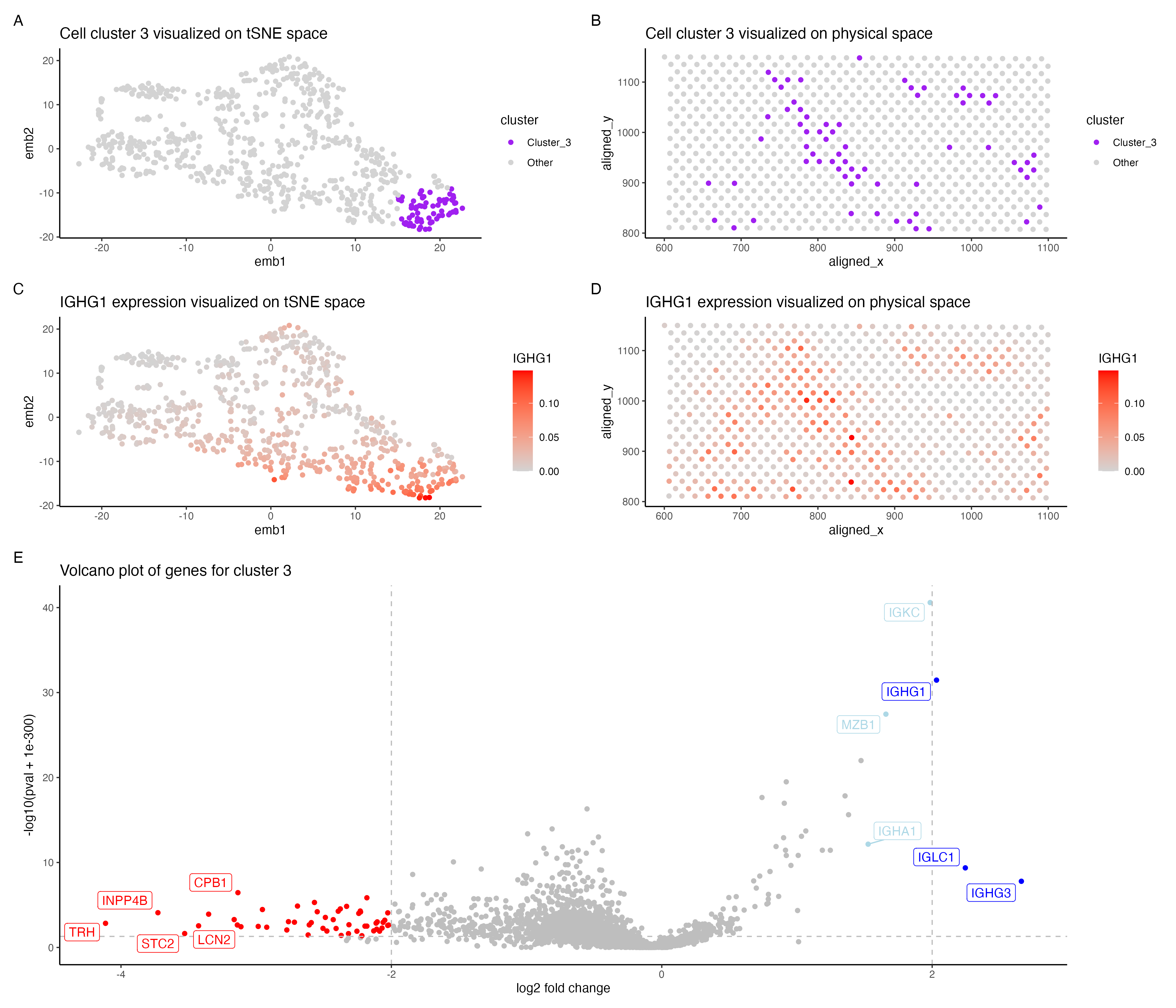
In the above visualization I have identified a cluster that belong to plasma cells or mature B cells in the evee dataset.
I switched from the pikachu to the evee dataset. I previously performed dimensionality reduction (PCA and tSNE) on the entire gene set, however since there are higher number of genes in the evee dataset I subset it to only include the top 4000 most variable genes (source Caleb’s code for HW4). I then performed PCA on the filtered gene expression and tSNE on the top 20 PCs (based on the scree plot). Further I had previosuly performed k-means clustering with k=11 which I switched to k=6 as this seemed optimal for the evee dataset.
In the Pikachu dataset I found a cluster of plasma/mature B cells. Cluster 3 in my current visualization (panels A, B) is also potentially plasma/mature B cells. However there were lesser number of genes that were distinctly upregulated in cluster 3 (pvalue < 0.05 & log2 foldchange > 2). IGHG1, IGCL1 and IGHG3 were upregulated in cluster 3, all of these genes are shown to be highly expressed in plasma cells in the protein atlas [1]. These genes were reported be highly expressed in mature B cells along with plasma cells as well [2]. Further lowering the fold change threshold to 1.5, shows that MZB1, IGKC and IGHA1 (shown in light blue in panel E) are also upregulated in cluster 3. These genes are associated with plasma cells[1] and IGKC has been shown to be highly expressed in plasma cells [3] and so is MZB1 in marginal zone B cells [4]. Hence cluster 3 is potentially plasma cells/ mature B cells. I have shown the expression of IGHG1 in cluster 3 in panels C,D.
However I observed that cluster 1 also shows a similar expression of plasma/B cell gene markers, though it seems to be stronger in cluster 3. This could possibly be attributed to the difference in technologies of both datasets. Since the evee dataset is spot based sequencing, the gene expression of each spot could possibly come from multiple cells and cell types. Since the k-means clustering is performed on the spots , each cluster could potentially have cells from different cell types.
library(dplyr)
library(tidyverse)
library(ggplot2)
library(Rtsne)
library(patchwork)
library(viridis)
library(ggrepel)

set.seed(123)

setwd("/Users/archanabalan/Karchin Lab Dropbox/Archana Balan/Coursework/Spring2024/GDV/homework/")
data <- read.csv("./data/eevee.csv.gz", row.names =1)

# Drop first 3 columns for gene expression (cell_id, cell_area etc)
gexp = data[, -c(1:3)]
rownames(gexp) <- data$barcode


# check variance
# Ref: Caleb's code from HW4
top.genes <- names(sort(apply(gexp, 2, var), decreasing=TRUE)[1:4000])
gexp = gexp[, top.genes]


# normalize data by total gene expression for each cell
gexpnorm <- gexp/rowSums(gexp)
# check if normalization is correct (value would be 1 for all cells)
unique(rowSums(gexpnorm) )

# dimensionality reduction
pcs= prcomp(gexpnorm,  center = TRUE, scale. = FALSE)

# scree plot
# screen plot of first 50 PCs
sd.df = data.frame(sd = pcs$sdev[c(1:50)]) %>% mutate(x = 1:nrow(.))

# Ref: https://stackoverflow.com/questions/11775692/how-to-specify-the-actual-x-axis-values-to-plot-as-x-axis-ticks-in-r
p0.pca <- ggplot(data = sd.df, aes (x=x, y = sd)) +
  geom_point() +
  theme_classic() +
  theme(axis.text.x = element_text(angle=90)) +
  scale_x_continuous(breaks = seq(0,315,by=10 ))+
  labs(x = "PCs", y = "Standard Deviation") +
  ggtitle("PCA Scree Plot")

# First 20 PCs cover most of the variance
# Performing tsne on the first 20 PCs

# tsne on first 20 PCs
tsne = Rtsne(pcs$x[, 1:20], dims =2, pca = FALSE)

## iteratively compute tot.withinness score for different values of k
withinnes.list = sapply(c(1:18), function(x) {
  print(x)
  tmp = kmeans(gexpnorm, centers = x)
  return(tmp$tot.withinss)} )

## visualize data to determine the elbow of the plot
p0.tsne = ggplot(data.frame(k = c(1:18), tot.withinss = withinnes.list),
            aes(k, tot.withinss)) +
  geom_point()

# k=6 is found to be an optimal number for clustering the data
com = kmeans(gexpnorm, centers = 6)$cluster

# set cluster to analyze further
select.cluster = 3

# differential gene expression of cluster 3 vs all other cells
# performing wilcoxon rank sum test for all genes
w.res = sapply(colnames(gexpnorm), function(x){
  wilcox.test(gexpnorm[com == select.cluster, x],
              gexpnorm[!com == select.cluster, x],
              alternative = "two.sided")$p.val})

# compute log2 fold change for cluster 3
logfc = sapply(colnames(gexp), function(i){
  log2(mean(gexpnorm[com ==select.cluster, i])/mean(gexpnorm[com !=select.cluster, i]))})


# Plots

# Visualize cluster 3: tSNE
cluster.cols <- c("purple", "lightgrey" )
names(cluster.cols ) <- c( "Cluster_3", "Other")

plot.df <- data.frame(emb1 = tsne$Y[,1],
                      emb2 = tsne$Y[,2],
                      cluster = ifelse(com == select.cluster, "Cluster_3", "Other"))

p1 <- ggplot(plot.df, aes(emb1, emb2,col=cluster)) +
  geom_point() +
  theme_classic() +
  scale_color_manual(values = cluster.cols)+
  ggtitle("Cell cluster 3 visualized on tSNE space")

# Visualize cluster 3: spatial coords
plot.df <- data.frame(aligned_x = data$aligned_x,
                      aligned_y = data$aligned_y,
                      cluster = ifelse(com == select.cluster, "Cluster_3", "Other"))

p2 <- ggplot(plot.df, aes(aligned_x, aligned_y, col=cluster)) +
  geom_point() +
  theme_classic() +
  scale_color_manual(values = cluster.cols)+
  ggtitle("Cell cluster 3 visualized on physical space")


# Volcano plot
# Ref: https://dplyr.tidyverse.org/reference/case_when.html
plot.df =  data.frame(pv = -log10(w.res + 1e-300),
                      logfc = logfc,
                      name = colnames(gexp)) %>%
  mutate(gene.reg = case_when( pv >1.30103 &  logfc < -2 ~ "Downregulated",
                               pv >1.30103 &  logfc >1.5 & logfc < 2 ~ "Upregulated_below",
                               pv >1.30103 &  logfc >= 2 ~ "Upregulated",
                               .default  = "No_difference"))


gene.cols = c("red","lightblue", "blue", "grey")
names(gene.cols) = c("Downregulated", "Upregulated_below", "Upregulated", "No_difference")

#Ref: https://ggplot2.tidyverse.org/reference/geom_abline.html
#Ref: https://www.datanovia.com/en/blog/how-to-remove-legend-from-a-ggplot/

p3 <- ggplot(data =plot.df , aes(x = logfc, y = pv, col = gene.reg)) +
  geom_point()+
  geom_vline(xintercept = 2, linetype='dashed', col = 'grey') +
  geom_vline(xintercept = -2, linetype='dashed', col = 'grey') +
  geom_hline(yintercept = 1.30103, linetype='dashed', col = 'grey')+
  geom_label_repel(data=subset(plot.df, pv> 1.30103) %>% filter(logfc <= -2 | logfc >=1.5 ) ,
                   aes(logfc,pv,label=name)) +

  theme_classic() +
  theme(legend.position = "None")+
  scale_color_manual(values = gene.cols) +
  xlab( "log2 fold change")+
  ylab("-log10(pval + 1e-300)") +
  ggtitle("Volcano plot of genes for cluster 3")

# Visualize TENT5C: tSNE
plot.df <- data.frame(emb1 = tsne$Y[,1],
                      emb2 = tsne$Y[,2],
                      IGHG1 = gexpnorm$IGHG1)

p4 <- ggplot(plot.df, aes(emb1, emb2,col=IGHG1)) +
  geom_point() +
  theme_classic() +
  scale_color_gradient(low='lightgrey', high='red') +
  ggtitle("IGHG1 expression visualized on tSNE space")

# Visualize IGHG1: spatial coords
plot.df <- data.frame(aligned_x = data$aligned_x,
                      aligned_y = data$aligned_y,
                      IGHG1 = gexpnorm$IGHG1)

p5 <- ggplot(plot.df, aes(aligned_x, aligned_y, col=IGHG1)) +
  geom_point() +
  theme_classic() +
  scale_color_gradient(low='lightgrey', high='red') +
  ggtitle("IGHG1 expression visualized on physical space")

# Ref:https://patchwork.data-imaginist.com/articles/guides/layout.html
# Ref: https://ggrepel.slowkow.com/articles/examples
# define layout using patchwork
plot.layout <- "
AB
CD
EE
"
hw5.plt <- p1 + p2 +  p4 + p5 + p3+
  plot_layout(design = plot.layout, heights = c(1, 1, 2))+
  plot_annotation(tag_levels = 'A')

ggsave( "./hw5/hw5_abalan2.png",hw5.plt, width = 14, height = 12)