Multi-Panel Data Visualization of Breast Cancer Cell Cluster and Genes - Eevee

Write a description of what you changed and why you think you had to change it.
Pikachu –> Eevee
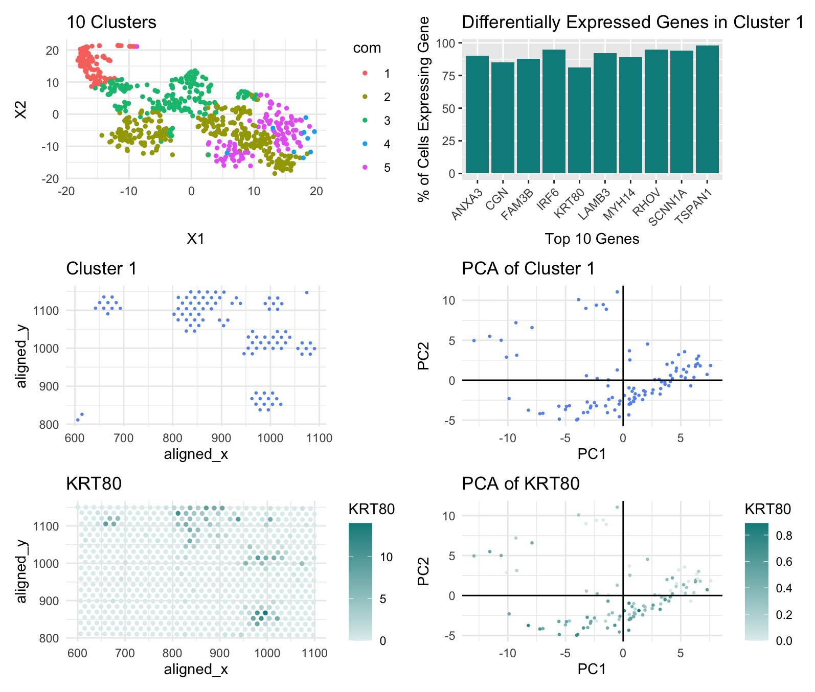
I determined the number of clusters for the k-means plot using a withiness plot. For the Pikachu data, the withiness plot’s slope became less steep around k=10 so I created 10 clusters, but for the Eevee data, the withiness plot’s slope started becoming less steep at k=5. This may be because the Eevee set is spot based so it covers more cells, while the Pikachu set consists of single-cell data points; spot based has a lower resolution so distinct cells near each other may merge to one data point and spot based also compensates for noise which may be misclassified as distinct cell types by single-cell datasets.
I also looked at the KRT80 gene, rather than the CDH1 gene, this time to locate the epithelial cells of breast cancer tissue. I could not find CDH1 in the top 10 of any of the cell clusters, and this may have again been due to the fact that the Eevee dataset is spot based so it may have misclassified some spots containg CDH1 expression to another gene. I selected KRT80 instead because, according to The Human Protein Atlas, it too is found in epithelial cells and upregulated in breast cancer tissue.
External Source: The Human Protein Altas (https://www.proteinatlas.org/ENSG00000167767-KRT80)
The entire code used to generate the figure so that it can be reproduced.
library(ggplot2)
library(Rtsne)
library(patchwork)

data <- read.csv('/Users/shailitripathi/Downloads/GENOMIC/Homework/eevee.csv.gz', row.names=1)
dim(data)
data[1:5, 1:10]
pos <- data[,2:3]
gexp <- data[,4:ncol(data)]

# NORMALIZE

gexpnorm <- log10(gexp/rowSums(gexp) * mean(rowSums(gexp)) + 1)


# PCA

pcs <- prcomp(gexpnorm)
pcs_data <- pcs$x[,1:500]


# TSNE

emb <- Rtsne(pcs_data)$Y


# TOTAL WITHINESS

results <- sapply(seq(2, 30, by = 1), function(i) {
  print(i)
  com <- kmeans(emb, centers = i, iter.max = 20)
  return(com$tot.withinss)
})
results
plot(results, type = "l")


# K-MEANS
set.seed(123)
com <- as.factor(kmeans(pcs$x[,1:20], centers=5)$cluster)

k_means <- ggplot(data.frame(emb, com)) +
  geom_point(aes(x=X1, y=X2, col = com), size = 1) +
  ggtitle("10 Clusters") +
  theme_minimal()
k_means


# CLUSTER OF INTEREST - physical space

cluster_data <- data[com==1, ]
cluster <- ggplot(cluster_data, aes(x = aligned_x, y = aligned_y)) +
  geom_point(color = 'cornflowerblue', size = 0.5) +
  ggtitle("Cluster 1") +
  theme_minimal()
cluster


# CLUSTER OF INTEREST - reduced dimensional space: pca

cluster_gexp <- gexpnorm[row.names(gexpnorm) %in% row.names(cluster_data), ]
cluster_pcs <- prcomp(cluster_gexp)
cluster_pca <- ggplot(data.frame(cluster_pcs$x[, 1:2]), aes(x = PC1, y = PC2)) +
  geom_point(size = 0.5, color = "cornflowerblue") +
  labs(x = "PC1", y = "PC2", title = "PCA of Cluster 1") +
  geom_hline(yintercept = 0, linetype = "solid", color = "black") +
  geom_vline(xintercept = 0, linetype = "solid", color = "black") +
  theme_minimal()
cluster_pca


# DIFFERENTIALLY EXPRESSED GENES - Wilcox test

results <- sapply(colnames(gexpnorm), function(g) {
  wilcox.test(gexpnorm[com == 1, g],
              gexpnorm[com != 1, g],
              alternative = "greater")$p.val
})
results
names(sort(results[results < 0.05], decreasing = FALSE))[1:10]
top_10_genes <- names(sort(results[results < 0.05], decreasing = FALSE))[1:10]
percent_expression <- sapply(top_10_genes, function(gene) {
  mean(cluster_data[gene] > 0) * 100
})
plot_data <- data.frame(
  Gene = top_10_genes,
  Percent_Expression = percent_expression
)

dif_exp <- ggplot(plot_data, aes(x = Gene, y = Percent_Expression)) +
  geom_bar(stat = "identity", fill = "cyan4") +
  labs(x = "Top 10 Genes", y = "% of Cells Expressing Gene", title = "Differentially Expressed Genes in Cluster 1") +
  theme(axis.text.x = element_text(angle = 45, hjust = 1))
dif_exp

# KRT80 - physical space

KRT80_data <- data.frame(data, com, gene=gexpnorm[, 'KRT80'])

krt80 <- ggplot(KRT80_data, aes(x = aligned_x, y = aligned_y, color = KRT80)) +
  geom_point(size = 1) +
  ggtitle("KRT80") +
  scale_color_gradient(low = "azure2", high = "cyan4" ) +
  theme_minimal()
krt80


# KRT80 - reduced dimensional space: pca

cluster_pcs_df <- data.frame(cluster_pcs$x[, 1:2], KRT80 = KRT80_data[rownames(cluster_gexp), "gene"])
KRT80_pca <- ggplot(cluster_pcs_df, aes(x = PC1, y = PC2, color = KRT80)) +
  geom_point(size = 0.5) +
  labs(x = "PC1", y = "PC2", title = "PCA of KRT80") +
  geom_hline(yintercept = 0, linetype = "solid", color = "black") +
  geom_vline(xintercept = 0, linetype = "solid", color = "black") +
  scale_color_gradient(low = "azure2", high = "cyan4") +
  theme_minimal()

KRT80_pca


# DATA VISUALIZATION

k_means + dif_exp +
  cluster + cluster_pca +
  krt80 + KRT80_pca +
  plot_layout(ncol = 2, widths = c(1, 1))