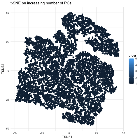
Visualizing Tighter Clustering Using More PCs
Description
This gif is a visualization of what happens when you run nonlinear dimensionality reduction (in this case tSNE) on an increasing number of principal components (PCs) after principal component analysis (PCA). In the visualization, the tSNE embeddings are plotted for each number of PCs used with the increasing number being encoded by lighter shades of blue. The darkest shade represents the lowest number of PCs used (5) up to the highest number of PCs used (55). The initial plot with tSNE run on only 5 PCs shows a much looser plot with little to no distinct grouping of cell types. As you increase the number of PCs from 5 to 15, the grouping gets tighter and more distinct clusters form. This becomes even more pronounced as you move from 15 to 25 PCs. However, there is a less noticeable difference in the distinguishability of clusters as you increase from 25 to 40 and then to 55 PCs. Especially in the transition from 40 to 55 PCs, it is largely a rearrangement of the orientation of the clusters rather than a change in grouping tightness. This makes sense because it is also what we see in the elbow shape of the scree plot. For the imaging dataset, the optimal number of PCs to use is around 20 because that captures most of the variation in the dataset. At this point, the scree plot levels off and there is little gain to increasing the number of PCs used. This is incredibly important to consider with larger datasets as the higher numbers of PCs are also more computationally expensive.
## load the data and necessary libraries
library(patchwork)
library(ggplot2)
library(Rtsne)
library(gganimate)

# read in the data
data = read.csv('/Users/Kyra_1/Documents/College/Junior/Spring/Genomic_Data_Visualization/Homework_1/pikachu.csv.gz', row.names = 1)
data[1:10, 1:10]
gexp = data[, 6:ncol(data)]
rownames(gexp) = data$cell_id

## normalize by number of genes
gexpnorm = log2(gexp/rowSums(gexp)+mean(rowSums(gexp)))

## pca
pcs = prcomp(gexpnorm)
plot(pcs$sdev[1:30])

## tsne on PCs
tsne_pcs0 = Rtsne(pcs$x[, 1:5], is_distance = FALSE)
tsne_pcs01 = Rtsne(pcs$x[, 1:15], is_distance = FALSE)
tsne_pcs1 = Rtsne(pcs$x[, 1:25], is_distance = FALSE)
tsne_pcs02 = Rtsne(pcs$x[, 1:40], is_distance = FALSE)
tsne_pcs2 = Rtsne(pcs$x[, 1:55], is_distance = FALSE)

## generate the data frames
tsne_pcs0_df = data.frame(TSNE1 = tsne_pcs0$Y[,1], TSNE2 = tsne_pcs0$Y[,2], NumPCs = 5)
tsne_pcs01_df = data.frame(TSNE1 = tsne_pcs01$Y[,1], TSNE2 = tsne_pcs01$Y[,2], NumPCs = 15)
tsne_pcs1_df = data.frame(TSNE1 = tsne_pcs1$Y[,1], TSNE2 = tsne_pcs1$Y[,2], NumPCs = 25)
tsne_pcs02_df = data.frame(TSNE1 = tsne_pcs02$Y[,1], TSNE2 = tsne_pcs02$Y[,2], NumPCs = 40)
tsne_pcs2_df = data.frame(TSNE1 = tsne_pcs2$Y[,1], TSNE2 = tsne_pcs2$Y[,2], NumPCs = 55)

## combine the data frames
df = rbind(cbind(tsne_pcs0_df, order = 1), cbind(tsne_pcs01_df, order = 2), cbind(tsne_pcs1_df, order = 3), cbind(tsne_pcs02_df, order = 4), cbind(tsne_pcs2_df, order = 5))

## generate the gif
p = ggplot(df) + geom_point(aes(x = TSNE1, y = TSNE2, col = order))+
  transition_states(order)+
  theme_minimal() +
  ggtitle("t-SNE on increasing number of PCs")

# code for how to save it from chatgpt
# Render and save the animation
anim <- animate(p, nframes = 100, duration = 5, fps = 20, renderer = gifski_renderer())
anim_save("EC_HW1_plot.gif", animation = anim)