Differentially expressed gene (DSC2) in cell clusters by k-means

Write a description to convince me that your cluster interpretation is correct. Your description may reference papers and content that allowed you to interpret your cell cluster as a particular cell-type.
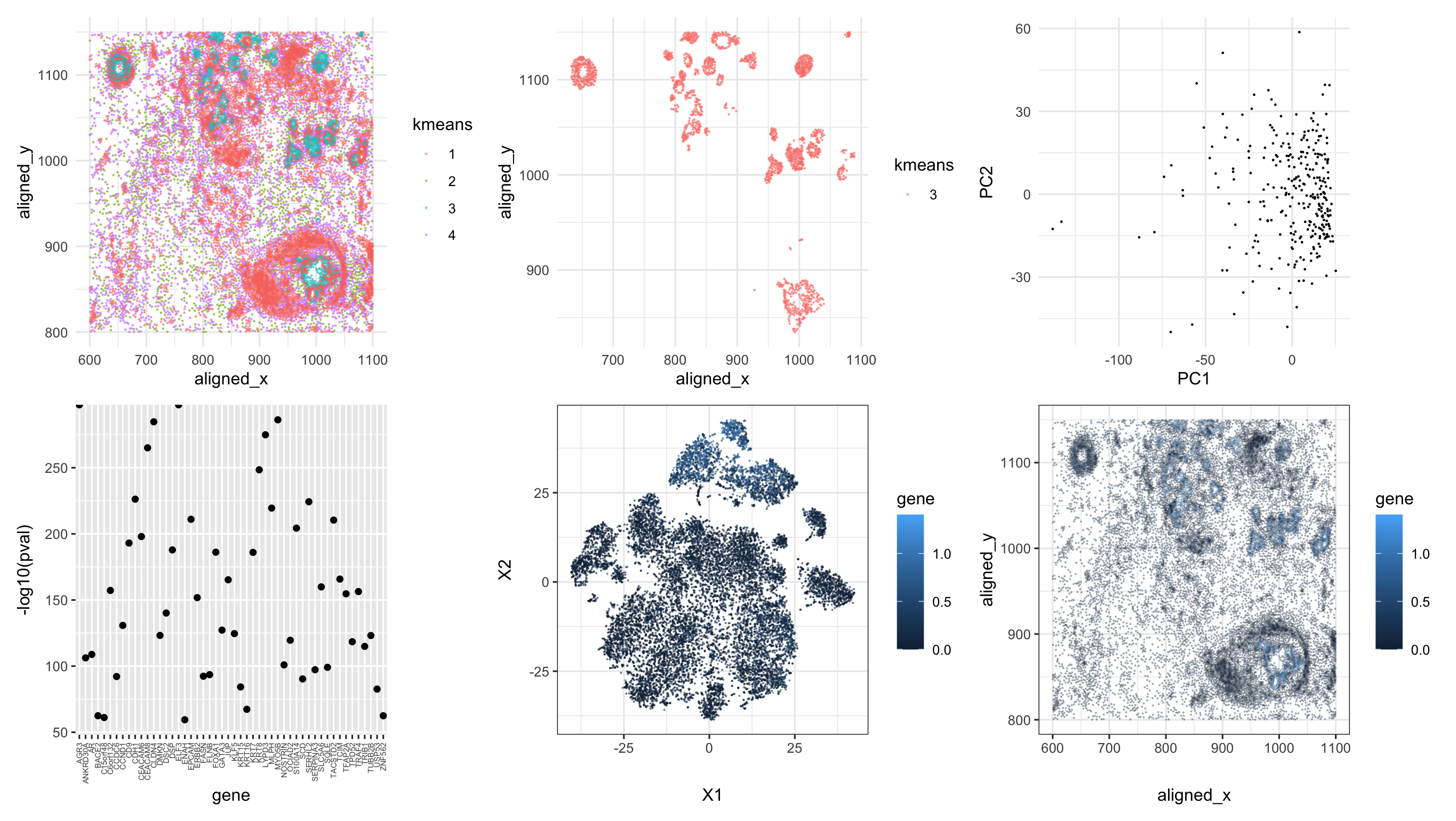
The top left panel demonstrates how k-means clusters are distributed spatially in physical space (aligned_y vs. aligned_x). I choose k=4 because the total withinness values doesn’t change drastically after k=4. The top middle panel only selected the cluster of interest. The top right panel is the PC plot of the selected cell cluster. The principal components are calculated based on all the expression data of each gene. It seems that there could be the cells tend to cluster around where PC1 is close to 0.
We have also plotted the p-values for the top 50 genes with most significant differentially expression level compared with cells in other clusters (see bottom left panel where they were all very close zero, with a quite large value on the scale of -log10). I just randomly picked one called DSC2 (usually expressed in cardiac muscle cells). I plotted all cells in t-SNE embedding space generated by normalized gene expression of all genes. I labeled the cells with normalized DSC2 expression. As we can see from the bottom middle panel, there could be certain clusters on the top corner with lighter blue (i.e., high expression of DSC2) that are distinct from others with darker colors. However, there were more than just one cluster in t-SNE so there could be subtypes in this cell cluster. The expression of DSC2 were also demonstrated in physically space (see bottom right panel). The spatial positions of cells with highly expressed DSC2 overlap in general with the cells in the cluster of interest. As a result, I think that this one type of cell could be cardiac muscle cells.
Please share the code you used to reproduce this data visualization.
data <- read.csv('pikachu.csv.gz', row.names = 1)
library(ggplot2)
library(patchwork)
library(Rtsne)

set.seed(111)
pos <- data[, 4:5]
total_count <- rowSums(data[ ,6:ncol(data)], na.rm=TRUE)
gexp <- data[, 6:ncol(data)]
km <- kmeans(gexp, centers=4)
df <- data.frame(data, kmeans=as.factor(km$cluster))
head(df)
p0 = ggplot(df) + geom_point(aes(x = aligned_x, y=aligned_y, col=kmeans),
             size=0.1, alpha=0.5) + theme_minimal()

# test for total withinness change with k
tot.witness = c()
for (i in 1:10){
  km <- kmeans(gexp, centers=i)
  tot.witness = append(tot.witness, km$tot.withinss)
}
plot(x=1:10, y=tot.witness, xlab = 'K', ylab='total witness')

# cluster of interest: 3
df1 = df[df$kmean == 3,]
p1 = ggplot(df1) + geom_point(aes(x = aligned_x, y=aligned_y, col=kmeans),
             size=0.1, alpha=0.5) + theme_minimal()

pca = data.frame(prcomp(gexp[km$cluster == 3,])$x[,1:2])
p2 = ggplot(pca) + geom_point(aes(x = PC1, y=PC2),
                              size=0.1) + theme_minimal()

# df2 = df[df$kmean != 3,]
gexpnorm <- log10(gexp/rowSums(gexp) * mean(rowSums(gexp))+1)
# com <- as.factor(kmeans(gexpnorm, centers=4)$cluster)
results <- sapply(colnames(gexpnorm), function(g) {
  wilcox.test(gexpnorm[km$cluster == 3, g],
              gexpnorm[km$cluster != 3, g],
              alternative = "greater")$p.val})
pval = data.frame(pval = sort(results, decreasing=FALSE)[1:50])
pval$gene = row.names(pval)
par(mar=c(1,1,1,1))
p3 = ggplot(pval) + geom_point(aes(x=gene, y=-log10(pval))) +
  theme(axis.text.x = element_text(angle = 90, vjust = 0.5, hjust=1, size=5))

pcs <- prcomp(gexpnorm)
emb <- Rtsne(pcs$x[,1:20])$Y
p4 = ggplot(data.frame(emb, gene = gexpnorm[,'DSC2'])) +
  geom_point(aes(x = X1, y = X2, col=gene), size=0.01, alpha=0.5) +
  theme_bw()

p5 = ggplot(data.frame(data[, 4:5], gene = gexpnorm[,'DSC2'])) +
  geom_point(aes(x=aligned_x, y=aligned_y, col=gene), size=0.01, alpha=0.3) +
  theme_bw()

p0 + p1 + p2 + p3 + p4 + p5
external resources
https://en.wikipedia.org/wiki/ACTA2