Identification of Epithelial Cells in Breast Cancer Tissue

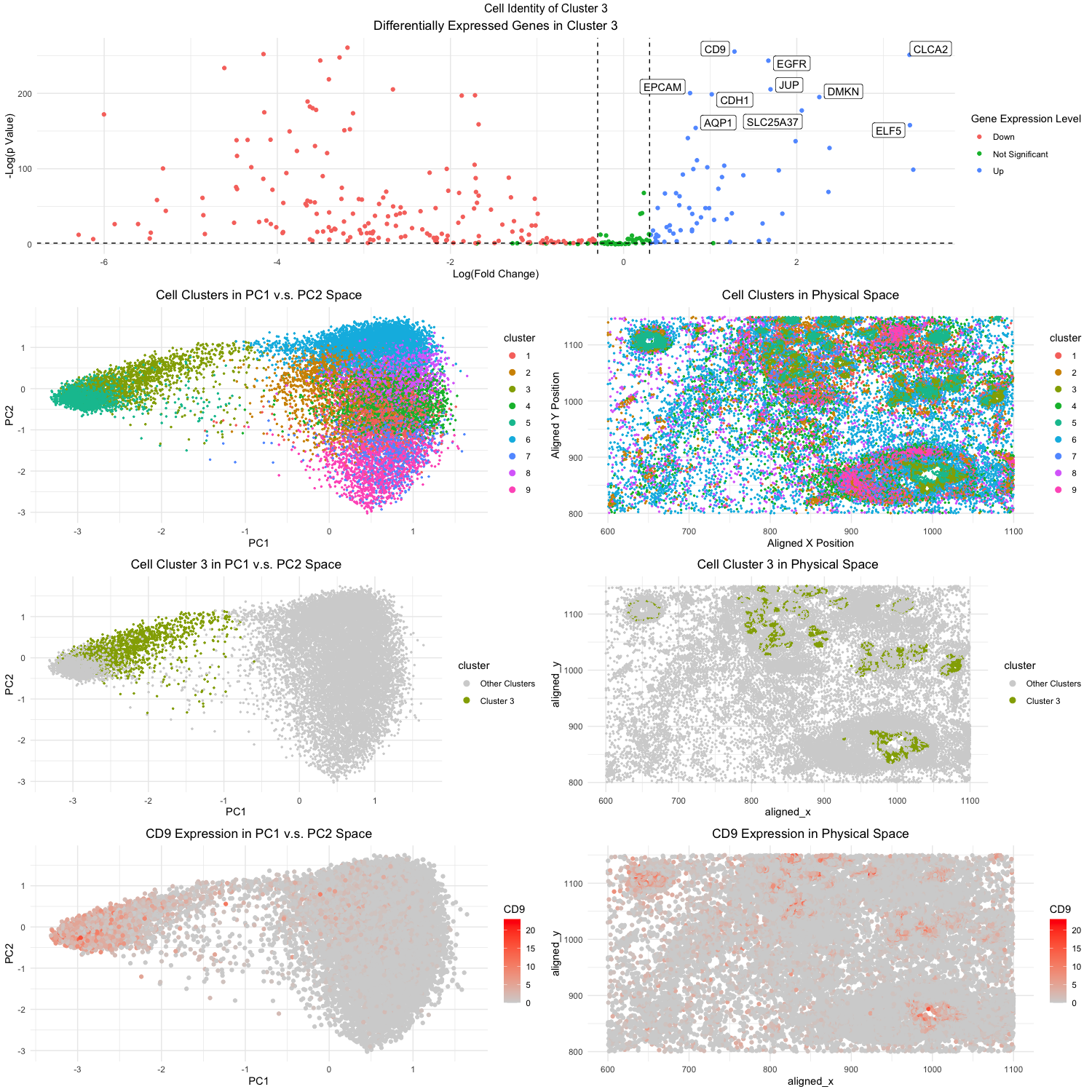
Figure Description:
Looking at the data in the pikachu data set, we can see that there are various cells, each with their own gene expression and cell type. However, our current data does not tell us what cell type each cell is. Therefore, we will attempt to identify some of the cell types present in this sample through kmeans clustering and looking at the differential gene expression of the clusters.
The first step is to conduct PCA on the data set. Doing PCA before kmeans clustering has been shown to have better performance in terms of the accuracy, speed, and stability. This might be due to the fact the PCA helps to reduce the high-dimensional data and filters out some noise in the process. Once we have conducted the PCA, now we can do the kmeans clustering on the PCs. I utilized the elbow-method to determine the most optimal k number to be 9, and have decided to create 9 clusters. In the second to top plot on the right (Fig. 3), I was able to visualize the clusters in the spatial domain, plotting the aligned_x on the x-axis and similarly the aligned_y on the y_axis. Using different color hues I was able to visualize what cluster each cell in each position belonged to. Similarly in the second to top right plot (Fig. 2), I was able to visualize the different clusters with color hues. However this time, I plotted the clusters in the PC domain. Based on these visualizations, I decided to pick cluster 3 due to its interesting high level in PC1 and PC2. Then I did further analysis on all the cells in cluster 3 to see if I could identify their cell type.
To determine the cluster’s cell type, I have to look at the gene expression in the cells to see what is differentially upregulated or downregulated. Cells vary based on their expression of certain proteins and genes, therefore if we can find a uniquely upregulated gene, perhaps we can determine what type of cells these are. Using the sort function in R, I found the most upregulated/expressed genes in the cells of cluster 3. I wanted to visualize the upregulation of these genes in the cells and PCs. So I decided to plot the levels of the gene expression for the most expressed gene (CLCA2) in both the spatial and PC domain. Using color saturations to encode for CLCA2, it can be seen how upregulated it is in cluster 3 compared to other clusters, both in the PC domain and physical domain.
Ultimately, the top 5 most statistically significant genes expressed in cluster 3 were CD9, CLCA2, EGFR, JUP, and EPCAM. Initially looking at the database the Human Protein Atlas (https://www.proteinatlas.org/), I found that such gene expressions most correlated with breast myoepithelial cells. However, the first clue that drew me to the fact the cell types were of cancerous origins was the EGFR gene. EGFR is one of the most well-studied genes linked to breast cancer, with recent studies citing that nearly 20% of all breast cancer patients overexpress the gene [1]. Doing a literature search on the other genes, I was able to find evidence to support this reasoning. CD9 was found by researchers to be upregulated in human breast tissues, often promoting metastasis [2]. CLCA2 is a tumor-suppressor gene that is often down regulated in breast cancer, which also often promotes metastasis [3]. EPCAM is also another well known gene often linked with EGFR in leading to triple-negative breast cancers [4]. EPCAM also directly translates to epithelial cell adhesion molecule, so that provides even stronger evidence that cluster 3 is composed of the epithelial cell type. And finally, while not as prominent, JUP has also been linked to be a part of a larger genomic system that leads to breast cancer [5].
References:
[1] https://pubmed.ncbi.nlm.nih.gov/33260837/
[2] https://pubmed.ncbi.nlm.nih.gov/23225418/
[3] https://pubmed.ncbi.nlm.nih.gov/14973555/
[4] https://pubmed.ncbi.nlm.nih.gov/35682800/
[5] https://pubmed.ncbi.nlm.nih.gov/27654269/
# Load necessary packages
library(factoextra)
library(NbClust)
library(cluster)
library(ggrepel)
library(ggplot2)
library(gridExtra)
library(dplyr)
library(patchwork)

# Load in the data
data <- read.csv("pikachu.csv.gz", row.names = 1)
head(data)

pos <- data[,4:5]
gexp <- data[,3:ncol(data)]

# Filter the cells first for meaningful expression
cell_keep <- rownames(gexp)[rowSums(gexp) > 0]
pos <- pos[cell_keep,]
gexp <- gexp[cell_keep,]

# Normalize gene expression
total_gexp <- rowSums(gexp)
norm_gexp <- (gexp/total_gexp) * median(total_gexp)
norm_gexp <- log10(norm_gexp + 1)

# Run PCA test
pcs <- prcomp(norm_gexp)

# Find optimal PCs for kMeans
plot(1:20, pcs$sdev[1:20], type = "l")
plot(1:10, pcs$sdev[1:10], type = "l")

# 10 PCs seem to account pretty much all the meaningful variance of the dataset
opt_pc <- 10

# Determine optimal number of k's (centroids) for kMeans
elbow <- fviz_nbclust(norm_gexp, kmeans, method = "wss") +
  geom_vline(xintercept = 2, linetype = 2) +
  labs(subtitle = "Elbow Method")

elbow

# Identifying optimal number of k's
opt_k <- 9

# Set seed so we can reproduce kMeans clustering
set.seed(1)

# Run kMeans clustering
kmean_cluster <- kmeans(pcs$x[,1:opt_pc], centers = opt_k)
df_cluster <- data.frame(pos, cluster = as.factor(kmean_cluster$cluster), gexp, pcs$x[,1:opt_pc])

# Visualize the clusters in PC1 v.s. PC2
pc_cluster <- ggplot(data = df_cluster, aes(x = PC1, y = PC2, col = cluster)) +
  geom_point(size = 0.5) +
  theme_minimal() +
  labs(title = "Cell Clusters in PC1 v.s. PC2 Space") +
  theme(plot.title = element_text(hjust = 0.5)) +
  guides(color = guide_legend(override.aes = list(size = 2.5)))

pc_cluster

# Visualize the clusters in physical space
physical_cluster <- ggplot(data = df_cluster, aes(x = aligned_x, y = aligned_y, col = cluster)) +
  geom_point(size = 0.5) +
  theme_minimal() +
  labs(title = "Cell Clusters in Physical Space", x = "Aligned X Position", y= "Aligned Y Position") +
  theme(plot.title = element_text(hjust = 0.5)) +
  guides(color = guide_legend(override.aes = list(size = 2.5)))

physical_cluster

# Pick cluster 3 to analyze

# Visualize cluster 3 in PC1 v.s. PC2
pc_cluster3 <- ggplot(data = df_cluster, aes(x = PC1, y = PC2, col = cluster == 3)) +
  geom_point(size = 0.5) +
  theme_minimal() +
  labs(title = "Cell Cluster 3 in PC1 v.s. PC2 Space") +
  theme(plot.title = element_text(hjust = 0.5)) +
  guides(color = guide_legend(override.aes = list(size = 2.5))) +
  scale_color_manual(name = "cluster", values = c('lightgrey', '#93AA00'), labels = c("Other Clusters", "Cluster 3"))

pc_cluster3

# Visualize cluster 3 in physical space
physical_cluster3 <- ggplot(data = df_cluster, aes(x = aligned_x, y = aligned_y, col = cluster == 3)) +
  geom_point(size = 0.5) +
  theme_minimal() +
  labs(title = "Cell Cluster 3 in Physical Space") +
  theme(plot.title = element_text(hjust = 0.5)) +
  guides(color = guide_legend(override.aes = list(size = 2.5))) +
  scale_color_manual(name = "cluster", values = c('lightgrey', '#93AA00'), labels = c("Other Clusters", "Cluster 3"))

physical_cluster3

# Volcano Plot Creation

# Identify cells that are within cluster 3 and not within cluster 3
cluster3_cells <- df_cluster[df_cluster$cluster == 3,]
not_cluster3_cells <- df_cluster[df_cluster$cluster != 3,]

# Use Wilcox test to find differentially expressed genes within cluster 3
diff_genes <- sapply(colnames(gexp), function(g) {
  wilcox.test(gexp[row.names(cluster3_cells), g],
              gexp[row.names(not_cluster3_cells), g])$p.value
})

# Calculate statistics for volcano plot
# ratio for fold change
fc <- sapply(colnames(gexp), function(g) {
  log2( mean(gexp[row.names(cluster3_cells), g])
        / mean(gexp[row.names(not_cluster3_cells), g]))
})

volcano_df <- data.frame(fc, p = -log10(diff_genes))
finite_index <- is.finite(volcano_df$fc) & is.finite(volcano_df$p)
volcano_df <- volcano_df[finite_index, ]

upreg_genes <- sapply(colnames(gexp), function(g) {
  wilcox.test(gexp[row.names(cluster3_cells), g],
              gexp[row.names(not_cluster3_cells), g],
              alternative = 'greater')$p.value
})

filtered_genes <- upreg_genes[upreg_genes > 0]
top_genes <- sort(filtered_genes, decreasing = FALSE)[1:10]
top_genes

volcano_df$express <- "Not Significant"
volcano_df$express[volcano_df$fc > 0.3 & volcano_df$p > -log10(0.05)] <- "Up"
volcano_df$express[volcano_df$fc < -0.3 & volcano_df$p > -log10(0.05)] <- "Down"

# Now plot the volcano plot
volcano <- ggplot(volcano_df) +
  geom_point(aes(x = fc, y = p, col = express)) +
  geom_hline(yintercept = -log10(0.05), linetype = "dashed") +
  geom_vline(xintercept = c(-0.3, 0.3), linetype = "dashed") +
  geom_label_repel(data = volcano_df[names(top_genes),],
                   aes(x = fc, y = p, label = names(top_genes)),
                   max.overlaps = 40) +
  theme_minimal() +
  labs(title = "Differentially Expressed Genes in Cluster 3", x = "Log(Fold Change)", y = "-Log(p Value)", col = "Gene Expression Level") +
  theme(plot.title = element_text(hjust = 0.5))

volcano

# Plot CD9 (most significant gene)
gene2d_plot <- ggplot(data) +
  geom_point(aes(x = aligned_x, y = aligned_y, col = CD9)) +
  theme_minimal() +
  scale_color_gradient(low = "lightgrey", high = "red") +
  labs(title = "CD9 Expression in Physical Space") +
  theme(plot.title = element_text(hjust = 0.5))

gene2d_plot

genePC_plot <- ggplot(data = df_cluster) +
  geom_point(aes(x = PC1, y = PC2, col = CD9)) +
  theme_minimal() +
  scale_color_gradient(low = "lightgrey", high = "red") +
  labs(title = "CD9 Expression in PC1 v.s. PC2 Space") +
  theme(plot.title = element_text(hjust = 0.5))

genePC_plot

## Combine plots together

lay <- rbind(c(1,1),
             c(2,3),
             c(4,5),
             c(6,7))

grid.arrange(volcano,
             pc_cluster, physical_cluster,
             pc_cluster3, physical_cluster3,
             genePC_plot, gene2d_plot,
             layout_matrix = lay,
             top = "Cell Identity of Cluster 3")

# References
# Elbow Method in R: https://www.statology.org/elbow-method-in-r/
# Volcano plot was done in conjunction / simiar research with classmate Jonathan