Multi-panel visualization of an immune cell cluster with differentially expressed genes

Describe your figure briefly so we know what you are depicting (you no longer need to use precise data visualization terms as you have been doing).
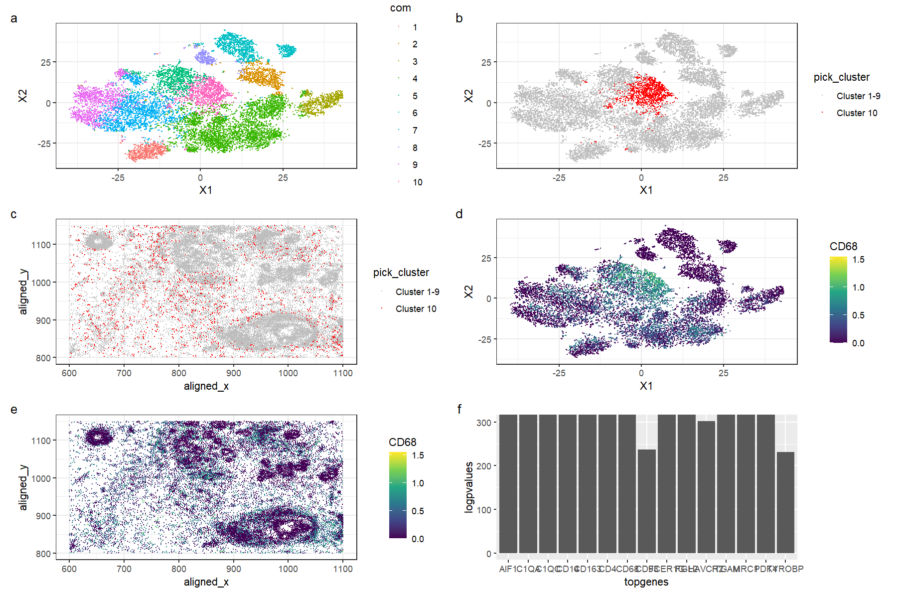
This figure is a multi-panel visualization of data from the pikachu dataset. We first conduct normalization, principal component analysis, and t-stochastic neighbour embedding. We then conduct k-means clustering with 10 centers. In figure (a) we first show the 10 distinct clusters in reduced dimensional space, and in figure (b), we highlight cluster 10 in reduced dimensional space. In figure (c), we plot the chosen cluster 10 in physical space. After conducting a wilcox test to determine the most differentially expressed genes, we pick the gene CD68 to visualize. Figure (d) shows the expression of CD68 in reduced dimensional space, and in figure (e), we plot CD79A expression in physical space. Figure (f) shows the -log(p-values) for the top 15 most differentially expressed genes in the cluster; note that some of the top genes yielded a p-value of 0 and hence we limit the y-axis of the graph to 300.
Write a description to convince me that your cluster interpretation is correct. Your description may reference papers and content that allowed you to interpret your cell cluster as a particular cell-type. You must provide attribution to external resources referenced. Links are fine; formatted references are not required. You must include the entire code you used to generate the figure so that it can be reproduced.
The top differentially expressed genes for the cluster include genes such as CD4, CD14, and CD68. These tend to be highly expressed in immune cells; for example, CD68 is typically found in monocytes and macrophages, as it encodes a protein that is localized to these cells’ organelles such as the lysosome and the endosome. [1][2]. The CD4 gene encodes the CD4 protein primarily found in CD4+, or helper, T cells, that can detect antigens on the surfaces of antigen-presenting cells such as dendritic cells to activate other lymphocytes and trigger the adaptive immune response [3][4][5]. CD14 is a gene highly expressed in monocytes and macrophages as it binds to liposaccharides on the surface of bacteria, which allows cells to recognise targets and enhances the innate immune response [6][7]. Hence, we can conclude that this cluster is very likely to be a cluster of immune cells, potentially at the site of local infection or inflammation.
[1] https://www.ncbi.nlm.nih.gov/gene/968 [2] https://www.proteinatlas.org/ENSG00000129226-CD68 [3] https://www.ncbi.nlm.nih.gov/gene/920 [4] https://pubmed.ncbi.nlm.nih.gov/22474485/ [5] https://www.proteinatlas.org/ENSG00000010610-CD4 [6] https://www.proteinatlas.org/ENSG00000170458-CD14 [7] https://www.science.org/doi/abs/10.1126/science.1698311
library(ggplot2)
library(Rtsne)
library(patchwork)
set.seed(1)
data <- read.csv('pikachu.csv.gz', row.names = 1)
#colnames(data)
pos <- data[,c(4:5)]
gexp <- data[6:ncol(data)]

#normalization
gexpnorm <- log10(gexp/rowSums(gexp) * mean(rowSums(gexp))+1)
# do PCA
pcs <- prcomp(gexpnorm)
#do tSNE
emb <- Rtsne(pcs$x[,1:20])$Y
#do k-means clustering
com <- as.factor(kmeans(gexpnorm, centers=10)$cluster)


#clusters in reduced dimensions
p0 <- ggplot(data.frame(emb, com)) +
  geom_point(aes(x = X1, y = X2, col=com), size=0.01) +
  theme_bw()
p0

#we pick cluster 10.

#cluster 10 in reduced dimensions
p1 <- ggplot(data.frame(emb, pick_cluster=ifelse(com=='10','Cluster 10','Cluster 1-9'))) +
  geom_point(aes(x = X1, y = X2, col=pick_cluster), size=0.01) +
  theme_bw() +
  scale_color_manual(values = c('Cluster 10' = 'red', 'Cluster 1-9' = 'gray'))

#cluster 10 in physical space
df <- data.frame(pos, pick_cluster=ifelse(com=='10','Cluster 10','Cluster 1-9'))
p2 <- ggplot(df) +
  geom_point(aes(x = aligned_x,
                 y=aligned_y,
                 col=pick_cluster),
             size=0.01) +
  theme_bw() +
  scale_color_manual(values = c('Cluster 10' = 'red', 'Cluster 1-9' = 'gray'))

#Conduct wilcox test on cluster 10
results <- sapply(colnames(gexpnorm), function(g) {
  wilcox.test(gexpnorm[com == 10, g],
              gexpnorm[com != 10, g])$p.val
})
results
logpvalues <- -log10(results)
sort(logpvalues)
topgenes <- names(sort(logpvalues, decreasing = TRUE)[1:15])
topgenes
logpvalues
df = data.frame(logpvalues = logpvalues[topgenes], topgenes)
p5 <- ggplot(df, aes(x =  topgenes, y = logpvalues)) +
  geom_bar(stat = "identity")
p5

#some of the top genes are "CD14", "CD163", "CD4" and "CD68", and we pick the gene CD68.

#gene CD68 in reduced dimensions
p3 <- ggplot(data.frame(emb, CD68 = gexpnorm[, 'CD68'])) +
  geom_point(aes(x = X1, y = X2, col=CD68), size=0.01) +
  theme_bw() + scale_color_continuous(type = "viridis")


#gene CD68 in physical space
df <- data.frame(pos, CD68 = gexpnorm[, 'CD68'])
p4 <- ggplot(df) +
  geom_point(aes(x = aligned_x,
                 y=aligned_y,
                 col=CD68),
             size=0.01) +
  theme_bw() + scale_color_continuous(type = "viridis")
p0 + p1 + p2 + p3 + p4 + p5 + plot_annotation(tag_levels = 'a') + plot_layout(ncol = 2)