Multi-Panel Data Visualization of Breast Cancer Cell Cluster and Genes

Describe your figure briefly so we know what you are depicting (you no longer need to use precise data visualization terms as you have been doing).
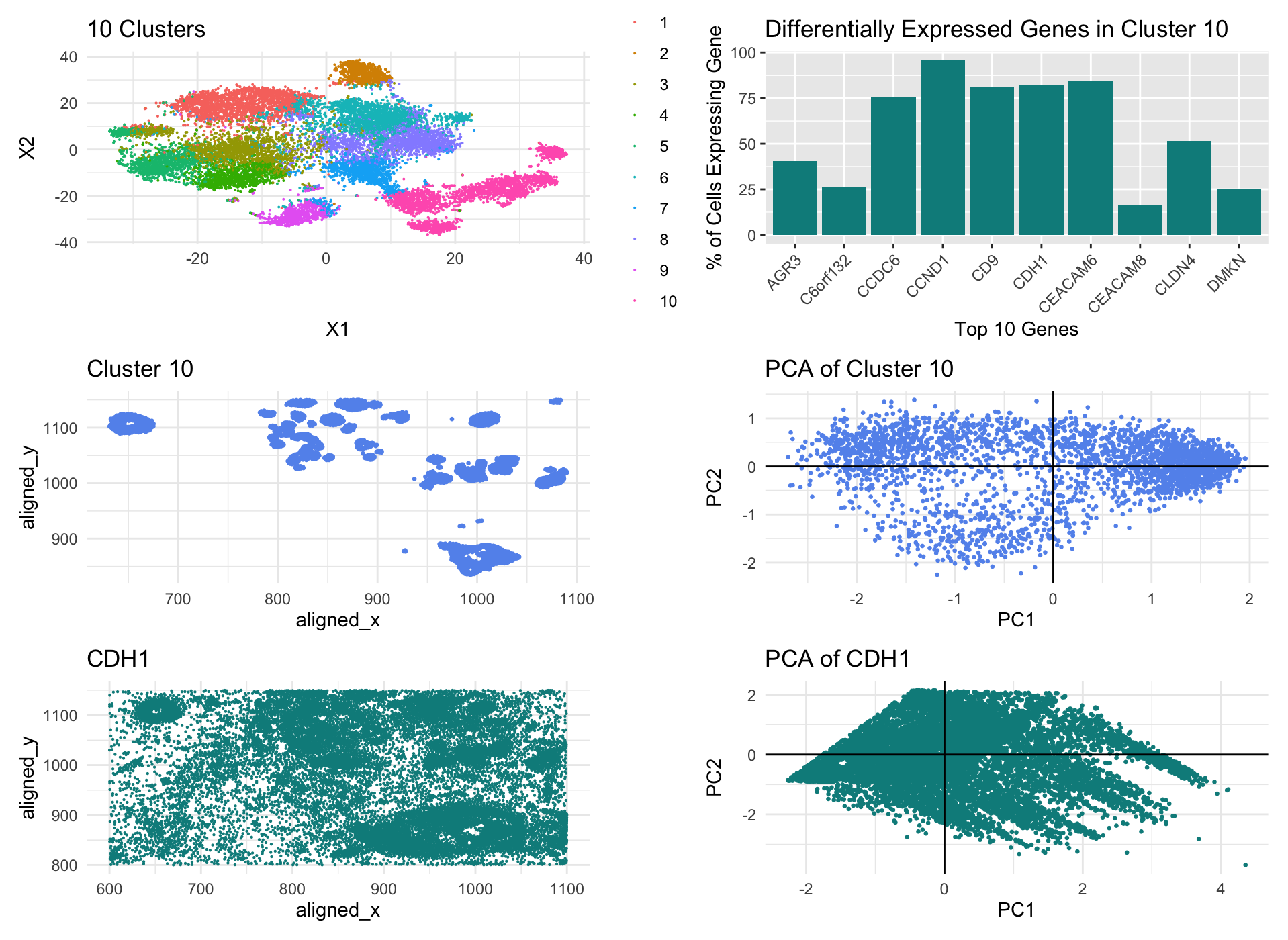
In my data visualization, I first created a k-means cluster plot of the pikachu dataset with 10 centers based on a withiness plot. I then selected cluster 10 as my cluster of interest and plotted it in both physical space and in reduced dimensions, by PCA. I also did a wilcox test on cluster 10 and found the top 10 most differentially expressed genes in my cluster with a p-value less than 0.05 and created a bar graph visualizing what percent of the cells in my cluster expressed each of these genes. Finally, I selected one of these genes: CDH1, and plotted it in both physical space and reduced dimensions, again by PCA.
Write a description to convince me that your cluster interpretation is correct. Your description may reference papers and content that allowed you to interpret your cell cluster as a particular cell-type. You must provide attribution to external resources referenced. Links are fine; formatted references are not required.
The differential expression or upregulation of CDH1 within cluster 10 leads me to believe that this cluster of cells may be epithelial cells of breast cancer tissue. According to The Human Protein Atlas, CDH1 is predominantly expressed in epithelial cells in order to mintain tissue integrity, as it is involved in regulating cell-cell adhesions. The Atlas also points out that this gene is associated with breast cancer, suggesting it involvment in increased proliferation in cancer progression. My bar graph: Differentially Expressed Genes in Cluster 10, shows that over 80% of the cells in cluster 10 express this gene which strongly supports the inference that cluster 10 has breast cancer epithelial cells in it.
External Source: The Human Protein Altas (https://www.proteinatlas.org/ENSG00000039068-CDH1)
The entire code used to generate the figure so that it can be reproduced.
library(ggplot2)
library(Rtsne)
library(patchwork)

data <- read.csv('/Users/shailitripathi/Downloads/GENOMIC/Homework/pikachu.csv.gz', row.names=1)
dim(data)
data[1:5, 1:10]
pos <- data[,4:5]
gexp <- data[,6:ncol(data)]

# NORMALIZE

gexpnorm <- log10(gexp/rowSums(gexp) * mean(rowSums(gexp)) + 1)


# PCA

pcs <- prcomp(gexpnorm)
plot(pcs$sdev[1:100])


# TSNE

emb <- Rtsne(gexpnorm)$Y


# TOTAL WITHINESS

results <- sapply(seq(2, 30, by = 1), function(i) {
  print(i)
  com <- kmeans(emb, centers = i, iter.max = 20)
  return(com$tot.withinss)
})
results
plot(results, type = "l")


# K-MEANS
set.seed(123)
com <- as.factor(kmeans(pcs$x[,1:20], centers=10)$cluster)

k_means <- ggplot(data.frame(emb, com)) +
  geom_point(aes(x=X1, y=X2, col = com), size = 0.03) +
  ggtitle("10 Clusters") +
  theme_minimal()
k_means


# CLUSTER OF INTEREST - physical space

cluster_data <- data[com==10, ]
cluster <- ggplot(cluster_data, aes(x = aligned_x, y = aligned_y)) +
  geom_point(color = 'cornflowerblue', size = 0.5) +
  ggtitle("Cluster 10") +
  theme_minimal()
cluster


# CLUSTER OF INTEREST - reduced dimensional space: pca

cluster_gexp <- gexpnorm[row.names(gexpnorm) %in% row.names(cluster_data), ]
cluster_pcs <- prcomp(cluster_gexp)
cluster_pca <- ggplot(data.frame(cluster_pcs$x[, 1:2]), aes(x = PC1, y = PC2)) +
  geom_point(size = 0.5, color = "cornflowerblue") +
  labs(x = "PC1", y = "PC2", title = "PCA of Cluster 10") +
  geom_hline(yintercept = 0, linetype = "solid", color = "black") +
  geom_vline(xintercept = 0, linetype = "solid", color = "black") +
  theme_minimal()
cluster_pca


# DIFFERENTIALLY EXPRESSED GENES - Wilcox test

results <- sapply(colnames(gexpnorm), function(g) {
  wilcox.test(gexpnorm[com == 10, g],
              gexpnorm[com != 10, g],
              alternative = "greater")$p.val
})
results

top_10_genes <- names(sort(results[results < 0.05], decreasing = FALSE))[1:10]
percent_expression <- sapply(top_10_genes, function(gene) {
  mean(cluster_data[gene] > 0) * 100
})
plot_data <- data.frame(
  Gene = top_10_genes,
  Percent_Expression = percent_expression
)

dif_exp <- ggplot(plot_data, aes(x = Gene, y = Percent_Expression)) +
  geom_bar(stat = "identity", fill = "cyan4") +
  labs(x = "Top 10 Genes", y = "% of Cells Expressing Gene", title = "Differentially Expressed Genes in Cluster 10") +
  theme(axis.text.x = element_text(angle = 45, hjust = 1))
dif_exp

# CDH1 - physical space

cdh1_data <- data.frame(data, com, gene=gexpnorm[, 'CDH1'])

cdh1 <- ggplot(cdh1_data, aes(x = aligned_x, y = aligned_y)) +
  geom_point(color = 'cyan4', size = 0.1) +
  ggtitle("CDH1") +
  theme_minimal()
cdh1


# CDH1 - reduced dimensional space: pca

pca_result <- prcomp(cdh1_data[, c("aligned_x", "aligned_y", "gene")], scale. = TRUE)
pca_scores <- as.data.frame(pca_result$x)
pca_scores$CDH1 <- cdh1_data$CDH1 # Source: ChatGPT

cdh1_pca <- ggplot(pca_scores, aes(x = PC1, y = PC2, color = CDH1)) +
  geom_point(size = 0.5, color = "cyan4") +
  ggtitle("PCA of CDH1 ") +
  geom_hline(yintercept = 0, linetype = "solid", color = "black") +
  geom_vline(xintercept = 0, linetype = "solid", color = "black") +
  theme_minimal()
cdh1_pca


# DATA VISUALIZATION

k_means + dif_exp +
  cluster + cluster_pca +
  cdh1 + cdh1_pca +
  plot_layout(ncol = 2, widths = c(1, 1))