
Description of Visualization
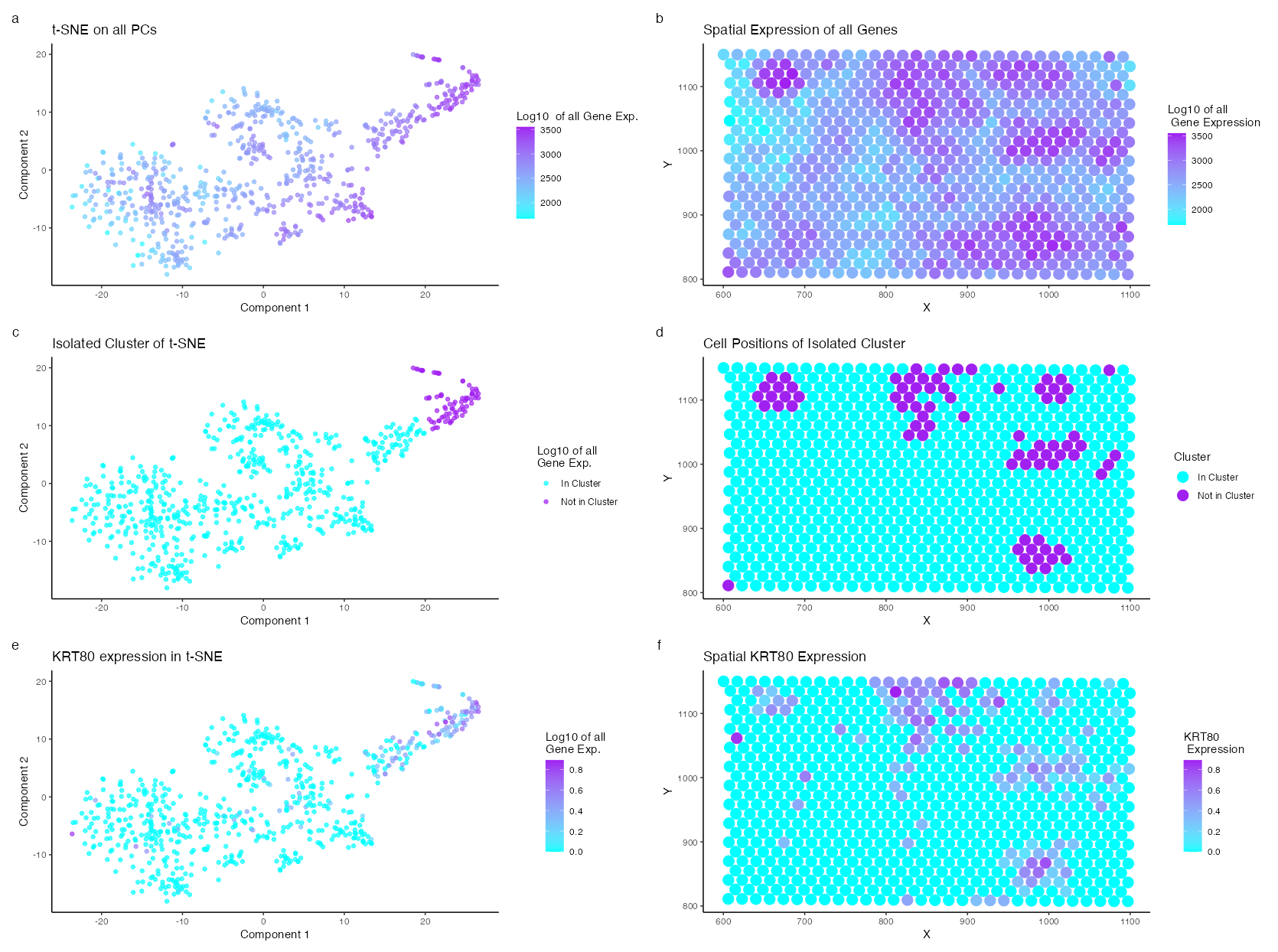
I am visualizing the expression of a distinct cell type identified through clustering of the dimensionally reduced log-normalized gene expression in the Eevee dataset using t-SNE and principal component analysis. Cyan and Purple color scale where used throughout the visualization with purple indicating areas of high expression and cyan representing areas of low expression. Gene expression is a quantitative data type that tends to be proportional to the size of the cell; thus, the genes were normalized. Additionally, gene expression difference becomes relavent in the order of 10, thus the gene expression was logged as well. T-SNE analysis shows a distinct cluster of high expressing cells in the top right corner. This cell cluster was chosen for further analysis. A two sided Willcox t-test was performed and the log fold chain was calculated. The p values from the t-test and the log fold chain were multiplied to identify the highest, most unique expressed gene in the isolated cluster. The top genes include UBE2U, OR56A5, CCDC197, TEPP, ZNF99, KRT80, FAM3B, FAM83E, RIPK4, CACNG4 in descending order. UBE2U, OR56A5, CCDC197, TEPP, and ZNF99 were expressed in very few cells. Therefore, KRT80 was chosen for further visualization. The expression fitted the regions of expected spatial clustering and t-SNE analysis.
Cell Type Interpretation:
Keratin-80 (KRT80) is a “human epithelial intermediate filament type II gene” (Wei Et al.) typically found in epithelial cells. In the context of breast cancer, which originates from epithelial cells, the Protein Atlas indicates that high expression of KRT80 is associated with an unfavorable prognosis. Perone et al. further elaborate that upregulated KRT80 expression “promotes cytoskeletal rearrangements at the leading edge, increased focal adhesion, and cellular stiffening, collectively facilitating cancer cell invasion.” Therefore, the cell type identified in this breast cancer tissue sample is most likely an aggressive carcinogenic epithelial cell.
Wei: https://pubmed.ncbi.nlm.nih.gov/37211956/#:~:text=Background%3A%20KRT80%20is%20a%20human,the%20assembly%20of%20the%20cytoskeleton. Protein Atlas: https://www.proteinatlas.org/ENSG00000167767-KRT80/pathology/breast+cancer Perone Et al.: https://pubmed.ncbi.nlm.nih.gov/31073170/
library(Rtsne)
library(ggplot2)
library(patchwork)
library(viridis)
set.seed(0)
data <- read.csv("/Users/knm/github/genomic-data-visualization-2024/data/eevee.csv.gz", row.names = 1)
gexp <- data[, 4:ncol(data)]
pos <- data[, 2:3]

gexpnorm <- log10(gexp/rowSums(gexp) * mean(rowSums(gexp))+1)

pcs <- prcomp(gexpnorm)
emb <- Rtsne(pcs$x)$Y
com <- as.factor(kmeans(emb, centers=10)$cluster)


df <- data.frame(emb_1 = emb[,1], emb_2 = emb[,2],
                 com = com)

p1 <- ggplot(df) +
  geom_point(aes(x = emb_1, y = emb_2, color = com == 2), alpha = 0.7) +
  scale_color_manual(values = c("TRUE" = "purple", "FALSE" = "cyan"),
                     labels = c("In Cluster", "Not in Cluster")) +
  theme_classic() +
  labs(title = "Isolated Cluster of t-SNE", color = "Log10 of all \nGene Exp.",
       x = "Component 1", y = "Component 2")
p1

p2 <- ggplot(df) +
  geom_point(aes(x = emb_1, y = emb_2, color = rowSums(gexpnorm)), alpha = 0.7) +
  scale_color_gradient(low = "cyan", high = "purple") +
  theme_classic() +
  labs(title = "t-SNE on all PCs", color = "Log10  of all Gene Exp.",
       x = "Component 1", y = "Component 2")
p2


pv <- sapply(colnames(gexpnorm), function(i) {
  wilcox.test(gexpnorm[com == 2, i], gexpnorm[com != 2, i], alternative = "two.sided")$p.val
})
logfc <- sapply(colnames(gexpnorm), function(i) {
  log2(mean(gexpnorm[com == 2, i])/mean(gexpnorm[com != 2, i]))
})

plot_df <- data.frame(logfc = logfc, pv = -log10(pv))

p3 <- ggplot(plot_df, aes(x = logfc, y = pv)) +
  geom_point() +
  theme_classic() +
  labs(title = "logFC vs PV",
       x = "Log Fold Change",
       y = "-log10(p-value)")
p3


df_spatial <- data.frame(x = data$aligned_x, y = data$aligned_y, cluster = com)
p4 <- ggplot(df_spatial) +
  geom_point(aes(x = x, y = y, color = com == 2), size = 4.5) +
  scale_color_manual(values = c("TRUE" = "purple", "FALSE" = "cyan"),
                     labels = c("In Cluster", "Not in Cluster")) +
  theme_classic() +
  labs(title = "Cell Positions of Isolated Cluster", color = "Cluster",
       x = "X", y= "Y")
p4


product <- -log10(pv) * logfc
top_genes <- names(sort(product, decreasing = TRUE))
print(top_genes)
gene_analysis <- top_genes[6]

p5 <- ggplot(df) +
  geom_point(aes(x = emb_1, y = emb_2, color = gexpnorm[,gene_analysis]), alpha = 0.7) +
  scale_color_gradient(low = "cyan", high = "purple") +
  theme_classic() +
  labs(title = "KRT80 expression in t-SNE", color = "Log10 of all \nGene Exp.",
       x = "Component 1", y = "Component 2")
p5

df_spatial_2 <- data.frame(x = data$aligned_x, y = data$aligned_y, gene = gexpnorm[, gene_analysis])
p6 <- ggplot(df_spatial_2) +
  geom_point(aes(x = x, y = y, color = gene), size = 4.5) +
  scale_color_gradient(low = "cyan", high = "purple") +
  theme_classic() +
  labs(title = "Spatial KRT80 Expression", color = "KRT80 \n Expression",
       x = "X", y= "Y")
p6

df_spatial_3 <- data.frame(x = data$aligned_x, y = data$aligned_y, gene = rowSums(gexpnorm))
p7 <- ggplot(df_spatial_3) +
  geom_point(aes(x = x, y = y, color = gene), size = 4.5) +
  scale_color_gradient(low = "cyan", high = "purple") +
  theme_classic() +
  labs(title = "Spatial Expression of all Genes", color = "Log10 of all \n Gene Expression",
       x = "X", y= "Y")
p7

combined_plot <- p2 + p7 + p1 + p4 + p5 + p6 + plot_annotation(tag_levels = 'a') +
  plot_layout(ncol = 2) #p3
combined_plot
ggsave("/Users/knm/Library/CloudStorage/OneDrive-JohnsHopkins/Johns Hopkins [2021-2025]/Junior [2023-2024]/Genomics Data Visualization/Homework/hw4_kmukund1.png", combined_plot, width = 16.70, height = 12.44, units = "in", dpi = 100)