Looking for Breast Cancer Cell Types in Eevee Dataset

Description of Plot
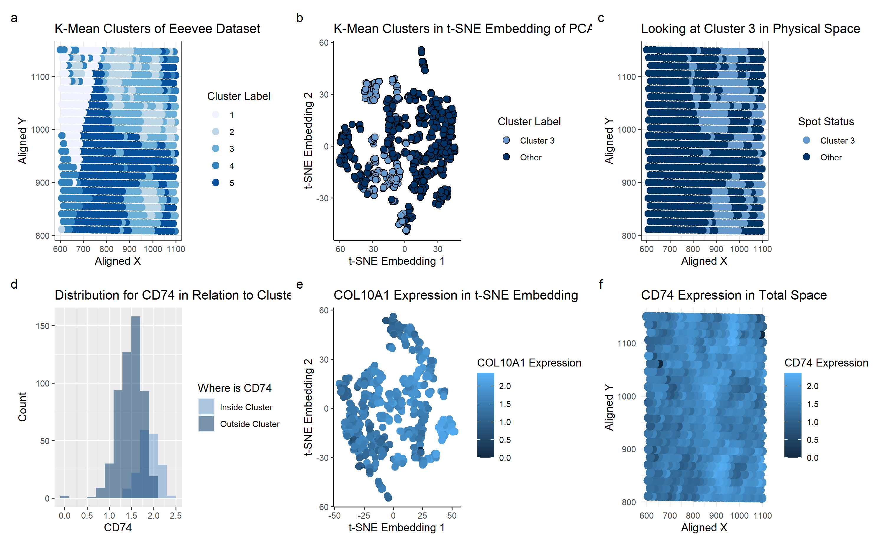
I used the K-means clustering method to identify potential groupings of cell types in the Eevee dataset, specifically for breast cancer tissue.
Plot A shows how the K-means algorithm identifies 5 clusters (k=5 derived based on total withiness). A scale of colors ranging from dark blue to light blue correspons to the cluster label of 5 to 1. With the prior knowledge that we’re looking for breast cancer tissue, I picked cluster 3 for further investigation. It seemed unique around the clusters, making it an interesting point of study.
Plot B shows the Cluster 3 on a t-SNE embedding, which was not particularly enlightening. It didn’t seem to have a visually distinctive cluster even in the nonlinear reduced space.
Plot C shows basically the same information as plot A, just focusing on the cluster 3 area.
To look at the differentially expressed genes, we perform a Mann-Whitney test, as we can’t check every single gene to see if it has a Gaussian distribution inside and outside of the cluster. Based on the calculated p-values, we arrive at the conclusion that the gene CD74 is the most differentially-expressed gene in the cluster. Plot D shows the histogram of CD74 as a sanity check for our p-value result.
Plot E shows the CD74 Expression on a t-SNE embedding, with the color corresponding to the expression. It seems to show a general level of moderate expression everywhere.
Plot F has the same color schematic as before, but mapped on the physical space. Comparing with Plot C, we can see that areas of high CD74 expression (shown in light blue on Plot F) seems to correspond with the cluster 3 location on Plot C.
The plots overall allow us to conclude that CD74 is connected to breast cancer cells. This was supported by “CD74 and intratumoral immune response in breast cancer” (https://www.ncbi.nlm.nih.gov/pmc/articles/PMC5355043/) which described CD74 to be “expressed by breast tumor cells”.
To be honest, all my plots were showing COL10A1 until it was suddenly showing CDC74 and I don’t know what happened to my code to make that sudden switch…
1
2
3
4
5
6
7
8
9
10
11
12
13
14
15
16
17
18
19
20
21
22
23
24
25
26
27
28
29
30
31
32
33
34
35
36
37
38
39
40
41
42
43
44
45
46
47
48
49
50
51
52
53
54
55
56
57
58
59
60
61
62
63
64
65
66
67
68
69
70
71
72
73
74
75
76
77
78
79
80
81
82
83
84
85
86
87
88
89
90
91
92
93
94
95
96
97
98
99
100
101
102
103
104
105
106
107
108
109
110
111
112
113
114
115
116
117
118
119
120
121
122
123
124
125
126
127
128
129
130
131
132
133
134
135
136
137
138
139
140
141
142
143
144
145
146
147
148
149
150
151
152
153
154
155
156
157
158
159
160
161
162
163
164
165
166
167
168
169
170
171
172
173
174
175
176
177
178
179
180
181
182
183
# homework 4

# Perform clustering on the cells (or spots) in your data. Pick at least one cluster
# and figure out what cell-type (or multiple cell-types) it corresponds to.
#Create a multi-panel data visualization that includes at minimum the following components:
# 1. A panel visualizing your one cluster of interest in reduced dimensional space (PCA, tSNE, etc)
# 2. A panel visualizing your one cluster of interest in physical space
# 3. A panel visualizing differentially expressed genes for your cluster of interest
# 4. A panel visualizing one of these genes in reduced dimensional space (PCA, tSNE etc)
# 5. A panel visualizing one of these genes in space

set.seed(1)
data <- read.csv('C:\\Users\\emw\\OneDrive - Johns Hopkins\\spring 2024\\genomic-data-visualization-2024\\data\\eevee.csv.gz', row.names=1)
library(ggplot2)
pos <- data[,2:3]
gexp <- data[, 4:ncol(data)]

## just looking at the top genes
topgene <- names(sort(apply(gexp, 2, var), decreasing=TRUE)[1:1000])
gexpfilter <- gexp[,topgene]
dim(gexpfilter)

## normalize
gexpnorm <- log10(gexpfilter/rowSums(gexpfilter) * mean(rowSums(gexpfilter))+1)


## elbow code taken from https://www.statology.org/elbow-method-in-r/
#library(cluster)
#library(factoextra)
#fviz_nbclust(gexpnorm, kmeans, method = "wss")

#based on above plot, do centers = 5
com <- as.factor(kmeans(gexpnorm, centers=5)$cluster)
df <- data.frame(pos,gexpnorm, com)

# Looking at the plots to determine cluster of interest
library(RColorBrewer)
p_clusters <- ggplot(df) +
  geom_point(aes(x = aligned_x, y = aligned_y, col=df$com), size=3) +
  theme_bw() +
  labs(
    title = "K-Mean Clusters of Eeevee Dataset",
    x = "Aligned X",
    y = "Aligned Y", color="Cluster Label"
  ) +scale_color_brewer(palette='Blues')
p_clusters


## Looking at Cluster 3 based on p_cluster plot
cluster_of_interest = 3;
df_cluster = df[df$com==cluster_of_interest,]

# Comparing All Clusters to Cluster of Interest
# 1. A panel visualizing your one cluster of interest in reduced dimensional space (PCA, tSNE, etc)

#pca of all datapoints
pcs_whole <- prcomp(df[, colnames(gexpnorm)])
dim(pcs_whole$x)
#df2_whole <- data.frame(pcs_whole$x[,1:2])
#p_pca_whole <- ggplot(df2_whole) + geom_point(aes(x = PC1, y = PC2, col = com)) + theme_classic()
#p_pca_whole

## t-SNE
library(Rtsne)
emb1_whole <- Rtsne(pcs_whole$x[,1:30], dims = 2, perplexity = 5) ## what happens if we run tSNE on PCs?
df_whole <- data.frame(emb1_whole=emb1_whole$Y)
## NOTE TO SELF THIS CODE IS KINDA WEIRD
doIcare <- as.factor(df$com != cluster_of_interest)#*1.5+2
doIcare_cluster <- factor(doIcare, labels = c('Cluster 3', 'Other') )

p_tsne_whole <- ggplot(df_whole) +
  geom_point(aes(x = emb1_whole.1, y = emb1_whole.2, fill=doIcare_cluster), shape=21,size=3) +
  theme_classic() +
  labs(
    title = "K-Mean Clusters in t-SNE Embedding of PCAs",
     x = "t-SNE Embedding 1",
    y = "t-SNE Embedding 2", fill="Cluster Label"
  ) +
  scale_fill_manual(values = c("Cluster 3" = "#6699CC",
                               "Other"="#003366"))
p_tsne_whole

# 2. A panel visualizing your one cluster of interest in physical space
# Comparing against whole

df_physicalspace <- data.frame(df, cluster_interest = doIcare_cluster)
p_physicalspace <- ggplot(df_physicalspace) +
  geom_point(aes(x = aligned_x, y = aligned_y, col=cluster_interest), size=3) +
  theme_bw() +
  labs(
    title = "Looking at Cluster 3 in Physical Space",
    x = "Aligned X",
    y = "Aligned Y", color="Spot Status"
  ) +
  scale_color_manual(values = c("Cluster 3" = "#6699CC",
                                "Other"="#003366"))
p_physicalspace
# 3. A panel visualizing differentially expressed genes for your cluster of interest
all_pvals <- c(length(colnames(gexpnorm)))
i <- 0
#calculate a p-value for all.
# It's too difficult to check the distribution for each and every gene
# doing Mann-Whitney since at least that doesn't assume Gaussian
for (g in colnames(gexpnorm)) {
  i <- i+1
  p_value <- (wilcox.test(gexpnorm[com == cluster_of_interest, g],
               gexpnorm[com != cluster_of_interest, g],
               alternative = "two.sided")$p.val)
  all_pvals[i] <-p_value

}

#doIcare <- as.factor(df$com != cluster_of_interest)

#find the genes with the lowest p-values
df_pvalue <- data.frame(gene_name = colnames(gexpnorm), pval = as.numeric(all_pvals))
head(df_pvalue)
df_pvalue_sorted <- df_pvalue[order(df_pvalue$pval), ]
head(df_pvalue_sorted)

df_pvalue_sorted$gene_name <- factor(df_pvalue_sorted$gene_name,                                    # Factor levels in decreasing order
                  levels = df_pvalue_sorted$gene_name[order(df_pvalue_sorted$pval)])


# quickly look at the distributions as a sanity check
gene_of_interest = 'CD74'
doIcare <- factor(doIcare, labels = c('Inside Cluster', 'Outside Cluster') )
df_hist <- data.frame(df, doIcare)

p_hist <- ggplot(df_hist, aes(x = df_hist[,'CD74'], fill = df_hist$doIcare)) +
  geom_histogram(binwidth = 0.2, alpha = 0.5, position = "identity") +
  labs(
    title = "Distribution for CD74 in Relation to Cluster 3",
    x = "CD74",
    y = "Count", fill="Where is CD74"
  ) +
  scale_fill_manual(values = c("Inside Cluster" ="#6699CC",
                                "Outside Cluster"="#003366"))
p_hist
rownames(df_pvalue_sorted) <- NULL #allows for proper sorting of bar plot later

p_bestpvalues<-ggplot(data=df_pvalue_sorted[1:30, ], aes(x=gene_name, y=pval)) +
  geom_bar(stat="identity") +scale_y_log10()+ scale_x_discrete(guide = guide_axis(angle = 90)) +
labs( title = "Which Genes are Differentially Expressed",
  x = "Gene Name",
  y = "p-value (Log10)")
#scale_y_discrete(guide = guide_axis(angle = 90))
p_bestpvalues

# 4. A panel visualizing one of these genes in reduced dimensional space (PCA, tSNE etc)
pcs <- prcomp(gexpnorm)
emb <- Rtsne(pcs$x[,1:30], dims = 2, perplexity = 5) ## what happens if we run tSNE on PCs?
## plot
df_CD74_reduced <- data.frame(pcs$x[,1:2], emb=emb$Y, gene = gexpnorm[, 'CD74'], doIcare)
p_CD74_reduced <- ggplot(df_CD74_reduced) + geom_point(aes(x = emb.1, y = emb.2, col=gene), size=3) +
  theme_classic() +
  labs(
    title = "COL10A1 Expression in t-SNE Embedding",
    x = "t-SNE Embedding 1",
    y = "t-SNE Embedding 2", color="COL10A1 Expression"
  )
p_CD74_reduced

# 5. A panel visualizing one of these genes in space
## Look at gene expression of genes from above
## look at the sum of the genes of interest within cluster
# size_param <- as.numeric(df$com == cluster_of_interest)*1.5+2
#COL10A1
df_physicalspace_CD74 <- data.frame(df, CD74_Expression = gexpnorm[, 'CD74'])
p_physicalspace_CD74 <- ggplot(df_physicalspace_CD74) +
  geom_point(aes(x = aligned_x, y = aligned_y, col=CD74_Expression), size=4) +
  theme_minimal() +
  labs(
    title = "CD74 Expression in Total Space",
    x = "Aligned X",
    y = "Aligned Y", color="CD74 Expression"
  )
p_physicalspace_CD74

library(patchwork)
p_clusters + p_tsne_whole + p_physicalspace + p_hist + p_CD74_reduced+plot_annotation(tag_levels = 'a')+p_physicalspace_CD74+ plot_layout(ncol = 3)