Identifying Differentially Expressed Genes in Breast Cancer Tissue Through K-Means Cluster Analysis

What am I visualizing?
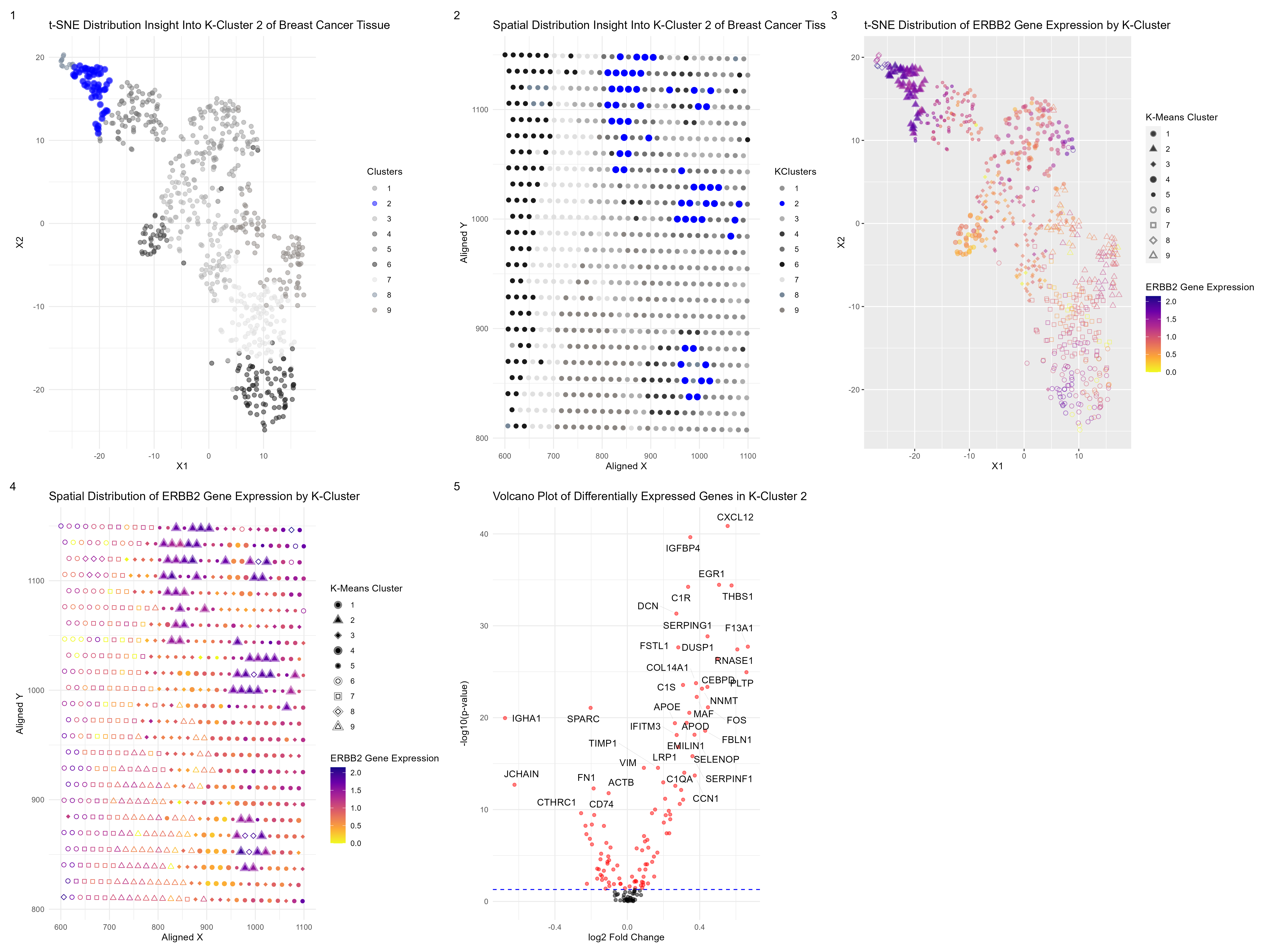
After normalizing and filtering out the top 150 genes present in a subsection of breast cancer tissue, I wanted to know if I could be able to identify any particular cell types. I performed a t-SNE dimensionality reduction followed by k-means clustering. From there, I decided to focus on one cluster, cluster 2, and find any differentially expressed genes that could help me identify potential cell types at those particular spots. I did this by performing a Wilcoxon signed-rank test. After conducting research, I noticed that a very particular gene marker that is overexpressed in breast cancer is ERBB2, which is associated with ductal carcinoma in situ (DCIS) cells. I decided to perform a Wilcoxon signed-rank test to see which cluster had the most significant p-value for this gene, which happened to be my cell-cluster, cluster 2. There is a solid chance this cluster may be of the DCIS cell type.
Subplot 1 displays the t-SNE distribution of my partial components and highlights my chosen cluster, while subplot 2 displays the spatial distribution of my cluster of interest.
Subplot 3 displays the t-SNE distribution of my partial components but highlights the expression level of my gene of interest, ERBB2, throughout the tissue as well as displaying the k-means clusters. Subplot 4 also displays a similar visual but uses spatial distribution in the physical space of the tissue instead. What is clear from both subplots 3 and 4 is that cluster 2 is very high in the expression of ERBB2, a differentially expressed and upregulated gene. Subplot 5 is a volcano plot of my differentially expressed genes in my chosen closer, showing what genes are upregulated or underregulated.
DCIS cells are not the only cell-type at my particular cluster of interest. CXCL12 was a gene found to be the most differentially expressed and upregulated in my cluster. In breast cancer, CXCL12 is typically released from stromal cells. High CXCL12 levels are inversely correlated with overall survival. There is also the gene THBS1, was also highly differentially expressed and upregulated. High THBS1 expression is strongly correlated with tumor-associated macrophages (TAMs), M2 macrophages, and cancer-associated fibroblasts (CAFs). So we have a very cancerous group of cell types in this cluster.
What resources did you use?
Below are the following research articles I used to find breast cancer gene markers & assist me in identifying cell-types: https://www.ncbi.nlm.nih.gov/pmc/articles/PMC7590182/ https://www.ncbi.nlm.nih.gov/pmc/articles/PMC8026652/ https://www.nature.com/articles/s41467-022-30573-4 https://www.ncbi.nlm.nih.gov/pmc/articles/PMC8407783/
As for my code, I used ChatGBT to help me construct the violin plot and debug my subplots when I was running into parentheses and data frame issues, and to help me plot the clusters as shapes.
# Dee Velazquez
# HW 4

# Get data
data <- read.csv('eevee.csv.gz', row.names = 1)

#Get pos
pos <- data[,2:3]
#Get genes
gexp <- data[,4:ncol(data)]

#Normalize
gexp_norm <- log10(gexp/rowSums(gexp) *
                     mean(rowSums(gexp))+1)
#Filter number of genes by getting top 150 genes based on expression level
top_genes <- names(sort(apply(gexp_norm, 2, mean), decreasing=TRUE)[1:150])
gexp_norm <- gexp_norm[, top_genes]

dim(gexp_norm)
#PCA
pca <- prcomp(gexp_norm)
head(pca$x[,1:5])
head(pca$sdev)
head(pca$rotation[,1:5])
head(sort(pca$rotation[,1], decreasing=TRUE))
#RNASE1     IGHG1      PLTP    CXCL12   COL14A1     F13A1
head(sort(pca$rotation[,2], decreasing=TRUE))
#RNASE1     F13A1      PLTP      EGR1    CXCL12      APOD
df <- data.frame(pca$x, gexp_norm)

#Find optimal k clusters
plot(pca$sdev[1:150])
results <- sapply(seq(1, 20, by=1), function(i) {
  #print(i)
  com <- kmeans(pca$x[,1:20], centers=i)
  return(com$tot.withinss)
})
results
plot(results, type="l")

#From plotting tot.withinss, there seems to be around 9 cell types
com <- kmeans(pca$x[,1:20], centers=9)
table(com$cluster)

com2 <- kmeans(gexp_norm, centers=9)
com2 <- as.factor(kmeans(gexp_norm, centers=9)$cluster)
table(com2)

df2 <- data.frame(pos, kmeans=as.factor(com$cluster))
head(df2)
p1 <- ggplot(df2) + geom_point(aes(x = aligned_x, y=aligned_y, col=kmeans),
                              size=2) + theme_minimal()
p1
df3 <- data.frame(pca$x[,1:20], Cluster=as.factor(com$cluster))
p2 <- ggplot(df3) + geom_point(aes(x = PC1, y=PC2, col=Cluster),
                               size=2) + theme_minimal()
p2
#tSNE
emb <- Rtsne(pca$x[,1:20])$Y
df4 <- data.frame(emb, Clusters=as.factor(com$cluster))
p3 <- ggplot(df4) + geom_point(aes(x = X1, y = X2, col=Clusters), size=2, alpha=0.5) +
  theme_bw()
p3

#Want to focus on cluster 2, see differentially expressed genes
results <- sapply(colnames(gexp_norm), function(g) {
  wilcox.test(gexp_norm[com2 == 2, g],
              gexp_norm[com2 != 2, g],
              alternative = "two.sided")$p.val
})
head(sort(results, decreasing=FALSE))
#Differential expressed genes cluster 2:
#CXCL12       IGFBP4         EGR1        THBS1          C1R
#1.378983e-41 2.267958e-40 3.465789e-35 4.071961e-35 5.745487e-35
#DCN
#4.695327e-32

#Now see what genes are differentitally up-regulated in cluster 2
results2 <- sapply(colnames(gexp_norm), function(g) {
  wilcox.test(gexp_norm[com2 == 2, g],
              gexp_norm[com2 != 2, g],
              alternative = "greater")$p.val
})
head(sort(results2, decreasing=FALSE))
#      CXCL12       IGFBP4         EGR1        THBS1          C1R
#6.894913e-42 1.133979e-40 1.732894e-35 2.035980e-35 2.872743e-35
#DCN
#2.347663e-32
ggplot(data.frame(emb, gene = gexp_norm[, 'ERBB2'])) +
  geom_point(aes(x = X1, y = X2, col=gene), size=2) +
  scale_color_viridis_c(option = "C",  name = "ERBB2 Gene Expression",
                        direction = -1)

pv <- sapply(colnames(gexp_norm), function(g) {
  wilcox.test(gexp_norm[com2 == 2, g],
              gexp_norm[com2 != 2, g],
              alternative = "two.sided")$p.val
})
logfc <- sapply(colnames(gexp_norm), function(i) {
  log2(mean(gexp_norm[com2 == 2, i])/mean(gexp_norm[com2 != 2, i]))
})

#Data frame for differential expression analysis results
results_df <- data.frame(
  gene = names(pv),
  p_value = pv,
  log2_fold_change = logfc)

#Define significance threshold
significance_threshold <- 0.05

#Create volcano plot
#Plot 3 of HW 4
volcano_plot <- ggplot(results_df, aes(x = log2_fold_change, y = -log10(p_value))) +
  geom_point(color = ifelse(results_df$p_value < significance_threshold, "red", "black"), alpha = 0.5) +
  geom_hline(yintercept = -log10(significance_threshold), linetype = "dashed", color = "blue") +
  theme_minimal() +
  labs(
    x = "log2 Fold Change",
    y = "-log10(p-value)",
    title = "Volcano Plot of Differentially Expressed Genes in K-Cluster 2"
  ) +
  scale_color_identity() +
  scale_shape_identity() + geom_text_repel(
    data = subset(results_df, p_value < significance_threshold),
    aes(label = gene),
    box.padding = 0.5,
    point.padding = 0.5,
    segment.color = "grey",
    segment.size = 0.2,
    segment.alpha = 0.5
  )
volcano_plot


###
#Define the gene of interest--from research high expression of ERBB2
#signals ductal carcinoma in situ (DCIS) cells

gene_of_interest <- 'ERBB2'
# Perform Wilcoxon rank sum test for each cluster
g1results <- sapply(1:9, function(i) {
  wilcox.test(gexp_norm[com2 == i, gene_of_interest],
              unlist(gexp_norm[com2 != i, gene_of_interest]),
              alternative = "greater")$p.val
})
g1results

# Find the cluster with significantly different gene expression
significantly_different_cluster <- which.min(g1results)
cat("Cluster with significantly different expression of gene", gene_of_interest, "is:",
    significantly_different_cluster)
#Cluster with significantly different expression of gene ERBB2 is: 2, my cluster!
#Cluster 2 may be of this cell type
###

### HW Plots:

#Plot 1 of HW4
part1 <- ggplot(df4, aes(x = X1, y = X2, col = Clusters)) +
  geom_point(size = 2, alpha = 0.5) +
  scale_color_manual(values = c("grey58", "blue", "grey69", "grey23", "grey45", "grey10", "grey88", "lightslategrey", "seashell4")) +
  theme_minimal() + labs(
    title = "t-SNE Distribution Insight Into K-Cluster 2 of Breast Cancer Tissue",
    x = "X1",
    y = "X2"
  ) +
  geom_point(data = subset(df4, Clusters == 2), color = "blue", size = 3, alpha = 0.5)
part1
#
df5 <- data.frame(pos, gene=gexp_norm[, 'ERBB2'])
ggplot(df5) + geom_point(aes(x = aligned_x, y = aligned_y, col=gene), size=2) +
  scale_color_viridis_c(option = "C",  name = "ERBB2 Gene Expression",
                        direction = -1) + labs(
                          title = "Spatial Distribution of ERBB2 Gene Expression At Each Spot",
                          x = "Aligned X",
                          y = "Aligned Y"
                        )
#
##
#Plot 4 of HW 4
#Combine tSNE components, desired gene of interest, and clusters
df6 <- data.frame(emb, gene = gexp_norm[, 'ERBB2'], KClusters = as.factor(com$cluster))
#Plot by tSNE component, and display expression level of GOI and highlight clusters
part4 <- ggplot(df6, aes(x = X1, y = X2, color = gene, shape = KClusters)) +
  geom_point(size = 2, alpha = 0.5) +
  scale_color_viridis_c(option = "C", name = "ERBB2 Gene Expression", direction = -1) +
  scale_shape_manual(values = c(16, 17, 18, 19, 20, 21, 22, 23, 24)) +
  labs(
    title = "t-SNE Distribution of ERBB2 Gene Expression by K-Cluster",
    x = "X1",
    y = "X2"
  ) +
  guides(shape = guide_legend(title = "K-Means Cluster")) +
  theme(legend.position = "right") +
  geom_point(data = subset(df6, KClusters == 2), size = 3, alpha = 0.5)
part4

###
# Combine pos data with clusters
pos_plot <- data.frame(pos, KClusters = as.factor(com$cluster))

# Plot by position and highlight my cluster, cluster 2
#Plot 2 of HW 4
part2 <- ggplot(pos_plot, aes(x = aligned_x, y = aligned_y, col = KClusters)) +
  geom_point(size = 2) +
  scale_color_manual(values = c("grey58", "blue", "grey69", "grey23", "grey45", "grey10", "grey88", "lightslategrey", "seashell4")) +
  theme_minimal() +
  labs(
    title = "Spatial Distribution Insight Into K-Cluster 2 of Breast Cancer Tissue",
    x = "Aligned X",
    y = "Aligned Y"
  ) +
  geom_point(data = subset(pos_plot, KClusters == 2), color = "blue", size = 3)
part2
###
#Plot 5 of Hw 4
# Combine pos data with desired gene of interest, and clusters
df8 <- data.frame(pos, gene = gexp_norm[, 'ERBB2'], KClusters = as.factor(com$cluster))

#Plot by position, and display expression level of GOI, and cluster info
part5 <- ggplot(df8, aes(x = aligned_x, y = aligned_y, color = gene, shape = KClusters)) +
  geom_point(size = 2) +
  scale_color_viridis_c(option = "C", name = "ERBB2 Gene Expression", direction = -1) +
  scale_shape_manual(values = c(16, 17, 18, 19, 20, 21, 22, 23, 24)) +
  labs(
    title = "Spatial Distribution of ERBB2 Gene Expression by K-Cluster",
    x = "Aligned X",
    y = "Aligned Y"
  ) +
  theme_minimal() +
  guides(shape = guide_legend(title = "K-Means Cluster")) +
  theme(legend.position = "right") +
  geom_point(data = subset(df8, KClusters == 2), aes(x = aligned_x, y = aligned_y), size = 4, alpha = 0.5)
part5
###
#Plot 3 of HW4
part3 <- volcano_plot
part3

##Final Graph
part1 + part2 + plot_annotation(tag_levels = '1') + plot_layout(ncol = 3)
part4+ part5 + plot_annotation(tag_levels = '1') + plot_layout(ncol = 3)
part3 + plot_annotation(tag_levels = '1') + plot_layout(ncol = 3)
final_plot <- part1 + part2 + part4 + part5 + part3 + plot_annotation(tag_levels = '1') + plot_layout(ncol = 3)
final_plot
ggsave("final_plot.png", final_plot, width = 20, height = 15, units = "in")