CD8B spatial expression

Plots description
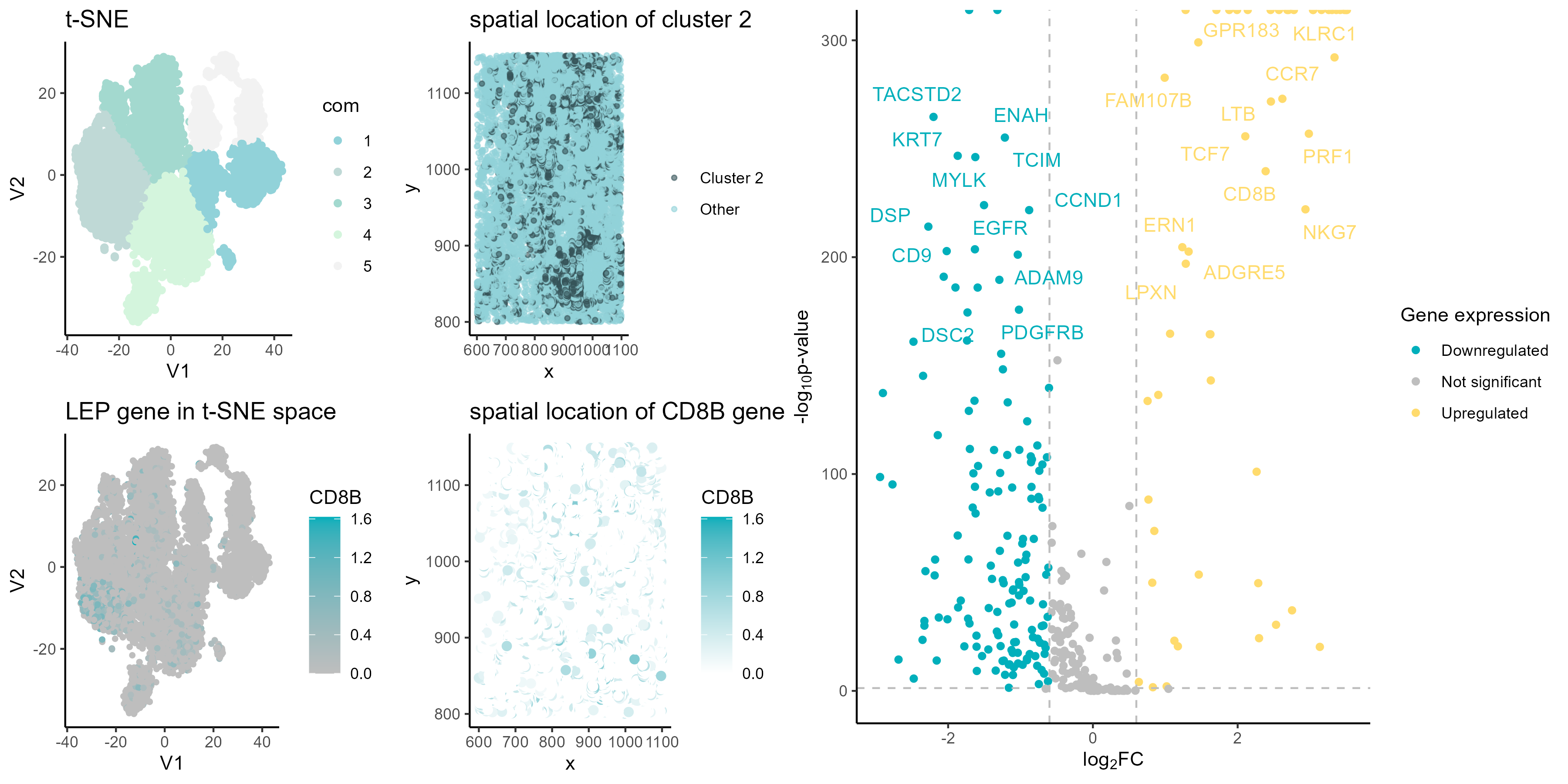
Panel A
Panel A shows a t-SNE visualization of the PCA normalized data, with colored points of 5 clusters from k-means clustering.
Panel B
Panel B shows a spatial plot with cluster 2 highlighted, to see where cells in cluster 2 are located spatially.
Panel C
Panel C generates a volcano plot to identify differentially expressed genes of cluster 2. Points are colored by upregulated, downregulated, or not significant. The top differentially expressed genes are labeled.
Panel D
Panel D visualizes the expression of the upregulated CD8B gene in the t-SNE plot from panel A. Points are colored by LEP expression level to see where high and low expression occurs spatially.
Panel E
Panel E shows a spatial plot of CD8B gene expression, similar to panel B but coloring by gene expression level instead of cluster membership. This shows where the CD8B gene is expressed spatially.
References
https://biostatsquid.com/volcano-plots-r-tutorial/ https://cran.r-project.org/web/packages/gridExtra/vignettes/arrangeGrob.html
#### author ####
# Andre Forjaz
# jhed: aperei13

#### load packages ####
library(Rtsne)
library(ggplot2)
library(patchwork)
library(gridExtra)
library(umap)
library(ggrepel)
library(tidyverse)
library(RColorBrewer)
#### Input ####
outpth <-'~/genomic-data-visualization-2024/homework/hw4/'
pth <-'~/genomic-data-visualization-2024/data/pikachu.csv.gz'
data <- read.csv(pth, row.names=1)

# data preview
data[1:5,1:8]

# xy data
pos <- data[, 4:5]
# gene data
gexp <- data[6:ncol(data)]
# normalize the data with log10 mean
gexpnorm <- log10(gexp/rowSums(gexp) * mean(rowSums(gexp))+1)

rownames(pos) <- rownames(gexpnorm) <- data$cell_id
head(pos)
head(gexp)

# PCA
pcs <- prcomp(gexpnorm)
plot(pcs$sdev[1:50])

# tsne on pcs
emb <- Rtsne::Rtsne(pcs$x[,1:50])$Y
plot(emb)

# identify clusters kmeans
com <- as.factor(kmeans(emb, centers = 5)$cluster)

# pick color palette
colpal <- c("#365359", "#91D2D9", "#BFD9D6", "#A3D9CF","#D4F5DD", "#F2F2F2")

## Panel A
# tsne visualization
df_a <- data.frame(V1 = emb[,1],
                   V2 = emb[,2],
                   cluster = com)

pa <- ggplot(df_a) +
  geom_point(aes(V1, V2, color=com)) +
  scale_color_manual(values = colpal[2:6])+
  ggtitle("t-SNE")+
  theme_classic()

pa

## Panel B
# spatial resolved cluster
df_b <- data.frame(x = pos$aligned_x,
                   y = pos$aligned_y,
                   cluster = com)

pb <- ggplot(df_b) +
  geom_point(aes(x, y,
                 color= ifelse(cluster == 2, "Cluster 2", "Other")),
             size =1,
             alpha = 0.6) +
  scale_color_manual(values = colpal, guide = guide_legend(title = NULL))+
  ggtitle("spatial location of cluster 2")+
  theme_classic()

pb

## Panel C
# differentially expressed genes for your cluster of interest
pv <- sapply(colnames(gexpnorm), function(i) {
  # print(i) ## print out gene name
  wilcox.test(gexpnorm[com == 2, i], gexpnorm[com != 2, i])$p.val
})

logfc <- sapply(colnames(gexpnorm), function(i) {
  # print(i) ## print out gene name
  log2(mean(gexpnorm[com == 2, i])/mean(gexpnorm[com != 2, i]))
})

# volcano plot
df_c <- data.frame(pv=pv, logfc,gene_symbol=colnames(gexpnorm))
# Credit: https://biostatsquid.com/volcano-plots-r-tutorial/
df_c$diffexpressed <- "NO"
# Set as "UP" if log2Foldchange > 0.6 and pvalue < 0.05
df_c$diffexpressed[df_c$logfc > 0.6 & df_c$pv < 0.05] <- "UP"
# Set as "DOWN" if log2Foldchange < -0.6 and pvalue < 0.05
df_c$diffexpressed[df_c$logfc < -0.6 & df_c$pv <0.05] <- "DOWN"
# df_c$delabel <- NA
df_c$delabel <- ifelse(df_c$gene_symbol %in% head(df_c[order(df_c$pv),"gene_symbol"],50),df_c$gene_symbol, NA)

# Explore the data
head(df_c[order(df_c$pv) & df_c$diffexpressed == 'UP', ])


pc <- ggplot(df_c, aes(x = logfc, y = -log10(pv), col = diffexpressed, label = delabel)) +
  geom_point() +
  geom_vline(xintercept = c(-0.6, 0.6), col = "gray", linetype = 'dashed') +
  geom_hline(yintercept = -log10(0.05), col = "gray", linetype = 'dashed') +
  scale_color_manual(values = c("#00AFBB", "grey", "#FFDB6D"),
                     labels = c("Downregulated", "Not significant", "Upregulated")) +
  labs(color = 'Gene expression',
       x = expression("log"[2]*"FC"), y = expression("-log"[10]*"p-value")) +
  scale_x_continuous(breaks = seq(-10, 10, 2)) +
  theme_classic() +
  geom_text_repel(data = subset(df_c, diffexpressed != "NO"),
                  aes(label = delabel),
                  box.padding = 0.5,
                  segment.color = "transparent",
                  point.padding = 0.5,
                  show.legend = FALSE)

pc

## Panel D
# one of these genes in reduced dimensional space (PCA, tSNE, etc)
df_d <- data.frame(V1 = emb[, 1],
                   V2 = emb[, 2],
                   CD8B = gexpnorm["CD8B"])

# Create the plot
pd <- ggplot(df_d) +
  geom_point(aes(x = V1, y = V2, col = CD8B),
             size = 1) +
  scale_color_gradient(low = 'gray', high = '#00AFBB') +
  ggtitle("CD8B gene in t-SNE space") +
  theme_classic()

pd

## Panel E
# one of these genes in space
df_e <- data.frame(x = pos$aligned_x,
                   y = pos$aligned_y,
                   gexpnorm=gexpnorm["CD8B"])


pe <- ggplot(df_e) +
  geom_point(aes(x, y, color= CD8B),
             size =2) +
  scale_colour_gradient2(low = 'gray', high = '#00AFBB')+
  ggtitle("spatial location of CD8B gene")+
  theme_classic()

pe

#### Plot results ####

# https://cran.r-project.org/web/packages/gridExtra/vignettes/arrangeGrob.html
lay <- rbind(c(1,2,3,3),
             c(4,5,3,3))

combined_plot <-grid.arrange( pa , pb , pc, pd , pe, layout_matrix = lay)

#### Save results ####
ggsave(paste0(outpth, "hw4_aperei13.png"),
       plot = combined_plot,
       width = 12,
       height = 6,
       units = "in")