CD93 in Breast Cancer Endothelial Cells

Create a multi-panel data visualization that includes at minimum the following components:
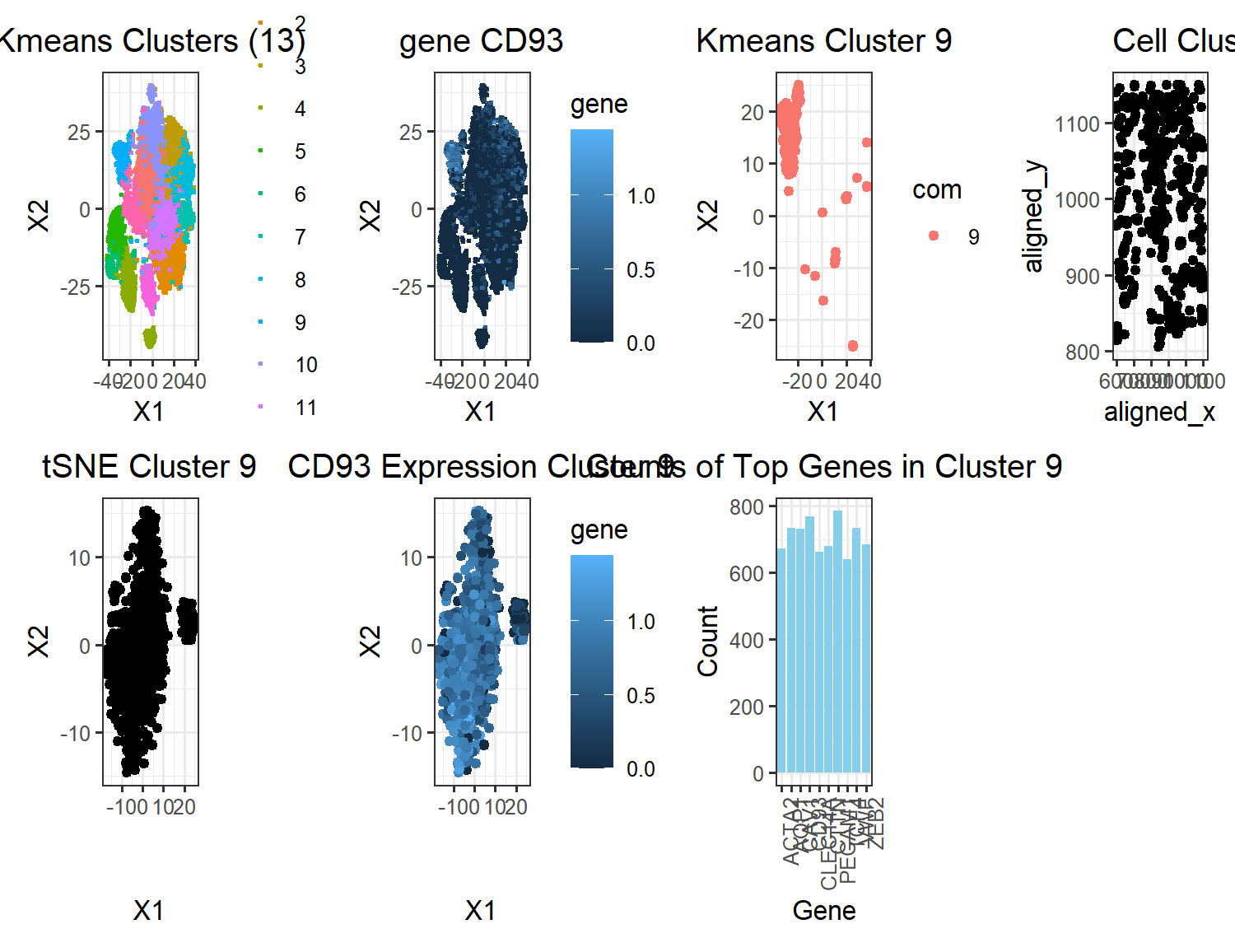
# A panel visualizing your one cluster of interest in reduced dimensional space (PCA, tSNE, etc) plot name: ‘tSNE cluster 9’ # A panel visualizing your one cluster of interest in physical space plot name: ‘cell cluster 9’ # A panel visualizing differentially expressed genes for your cluster of interest plot name: ‘top genes in cluster 9’ # A panel visualizing one of these genes in reduced dimensional space (PCA, tSNE, etc) plot name: ‘CD93 Expression Cluster 9’ # A panel visualizing one of these genes in space plot name: ‘gene CD93’
Note: some additional plots were included to show how the gene fits into the k means clustering
Describe your figure briefly so we know what you are depicting (you no longer need to use precise data visualization terms as you have been doing). Write a description to convince me that your cluster interpretation is correct. Your description may reference papers and content that allowed you to interpret your cell cluster as a particular cell-type. You must provide attribution to external resources referenced. Links are fine; formatted references are not required. You must include the entire code you used to generate the figure so that it can be reproduced.
My figure has a total of 7 plots. The kmeans cluster and CD93 plot in the top row are shown side by side to depict the localization of gene CD93 in the cluster classified by the kmeans algorithm. The third plot from the left in the top row, ‘Kmeans Cluster 9’, visualizes just cluster 9 to show the shape of the cluster and the gene expression in plot2 are very similar. The last plot in the top row, ‘Cell Cluster 9’ shows that the cell clusters are relatively evenly distributed across the tissue. In the bottom row, the three plots show the tSNE clustering of just cluster 9 along with the overlayed expression of CD93. From this, it appears as though there might be two cell populations in this one cluster. Mostly, this cluster interpretation appears to correct, however, because uppon plotting expressions of different genes, they all localize in shapes that resemble the cluster depicted. The bar plot show the top 10 genes that are being upregulated by this cell population. Arbitrarily choosing CD93 to investigate as a gene, as previously mentioned, CD93 is very highly expressed in most of the cells in the cluster which makes me confident that this clustering is correct. It also doesn’t seem to be expressed much in cells outside the clustering. Upon researching cells with highly upregulated levels of CD93, I found that CD93 is a gene that is upregulated in breast cancer tissue, specifically in Adipocytes & Endothelial cells. This finding agrees with the fact that our tissue sample is from a breast cancer patient. Another interesting article I found from NIH showed that CD93 could be used as a biomarker for breast cancer which further solidifies the idea that CD93 is truly an upregulated gene in this cell cluster which seems to be spread out spatially in the tissue as seen from the cell cluster 9 plot. The article concluded the signifance of CD93 as biomarker by comparing CD93 expression levels in tumors with adjacent healthy tissue samples.
While creating plots, I used multiple test correction to correct for the p values found. I also used the wilcox test to determine which genes were most likely a part of cluster 9 in order to find upregulated differentially expressed genes within that cluster.
NIH article: https://www.ncbi.nlm.nih.gov/pmc/articles/PMC8900912/ Source for cell population type: https://www.proteinatlas.org/ENSG00000125810-CD93
Code:
Homework 4
Load data
data <- read.csv(paste(‘C:/Users/Amand/OneDrive/Documents/JHU-undergrad’, ‘/Junior Year/Sem2/Genomic Data/Amanda-K/data/pikachu.csv.gz’, sep = ‘’), row.names = 1)
get the columns indicating postions
pos = data[,4:5]
Call relevant Libraries
library(Rtsne) library(patchwork) library(ggplot2) library(ggrepel)
normalize the data
gexp <- data[,6:ncol(data)] gexpnorm <- log10(gexp/rowSums(gexp) * mean(rowSums(gexp))+1)
pca
pcs <- prcomp(gexpnorm) plot(pcs$sdev[1:100])
tsne
set.seed(123) emb <- Rtsne(pcs$x[,1:20])$Y
kmeans clustering on tSNE embedding: first 20 pcs for processing speed ——-
set.seed(123) k <- kmeans(pcs$x[,1:20], centers = 13) com <- as.factor(k$cluster) p1 <- ggplot(data.frame(emb,com)) + geom_point(aes(x = X1, y = X2, col = com), size = 0.5) + theme_bw() + labs(title = “Kmeans Clusters (13)”) + theme(plot.title = element_text(hjust = 0.5)) p1
c = 9 # setting cluster of interest
figure out which gene is most responsible for each cluster (lowest pvs) ——
results2 <- sapply(1:13, function(i) { results <- sapply(colnames(gexpnorm), function(g) { wilcox.test(gexpnorm[com == i, g], gexpnorm[com != i, g], alternative = “greater”)$p.val }) return(names(head(sort(results, decreasing = FALSE))[1])) })
visualize the AQP1 gene for cluster 9 —————————————-
df <- data.frame(emb,com, gene = gexpnorm[, ‘CD93’]) p2 <- ggplot(df) + geom_point(aes(x = X1, y = X2, col = gene), size = 0.5) + theme_bw() + labs(title = “gene CD93”) + theme(plot.title = element_text(hjust = 0.5)) p2
visualize the k means cluster 8 isolated from other clusters —————–
df2 <- data.frame(X1 = emb[,1][com == c], X2 = emb[,2][com == c], com = com[com == c]) p3 <- ggplot(df2) + geom_point(aes(x = X1, y = X2, col = com)) + theme_bw() + labs(title = “Kmeans Cluster 9”) + theme(plot.title = element_text(hjust = 0.5)) p3
spatial postion of cluster 9 ————————————————-
gexp_cluster9 <- gexpnorm[com == c, ] df3 <- data.frame(data[com == c, ]) p4 <- ggplot(df3) + geom_point(aes(x = aligned_x, y = aligned_y)) + labs(title = “Cell Cluster 9”) + theme(plot.title = element_text(hjust = 0.5)) + theme_bw() p4
pca on cluster 8 ————————————————————-
pc9 <- prcomp(gexp_cluster9) plot(pc8$sdev[1:100])
df4 <- data.frame(pc8$x) p5 <- ggplot(df4) + geom_point(aes(x = PC1, y = PC2)) + theme_bw() + labs(title = “PCA Cluster 9”) + theme(plot.title = element_text(hjust = 0.5)) p5
tSNE on cluster 8 ————————————————————
emb2 <- Rtsne(pc9$x)$Y df5 <- data.frame(pc9$x, emb2) p6 <- ggplot(df5) + geom_point(aes(x = X1, y = X2)) + theme_bw() + labs(title = “tSNE Cluster 9”) + theme(plot.title = element_text(hjust = 0.5)) p6
finding differentially expressed genes in cluster 8 ————————–
top_cluster9 <- sapply(colnames(gexp_cluster9), function(g) { wilcox.test(gexpnorm[com == c, g], gexpnorm[com != c, g], alternative = “greater”)$p.val })
multiple test correction…
adjusted_p_values <- p.adjust(top_cluster9, method = “bonferroni”)
top_adjusted <- sort(adjusted_p_values, decreasing = FALSE) top_genes_count <- sum(top_adjusted < 0.05) # 69
Count number of genes in top genes
top_gene_counts <- sapply(1:length(top_genes), function(i) { sum(gexp_cluster9[,top_genes[i]] != 0) })
top_genes <- names(top_adjusted[top_adjusted < 0.05])
df6 <- data.frame(gexp_cluster9, pos[com == c, ], emb2, gene = gexp_cluster9$CD93) p7 <- ggplot(df6) + geom_point(aes(x = X1, y = X2, col = gene)) + theme_bw() + labs(title = “CD93 Expression Cluster 9”) + theme(plot.title = element_text(hjust = 0.5))
p7 rownames(top_genes_count) <- top_genes
labeling ———————————————————————
tmp <- data.frame(genes = top_genes, counts = top_gene_counts) tmp <- tmp[order(tmp$counts, decreasing = TRUE), ]
print(tmp) # shows you which genes are the most highly expressed in this sample
Create a data frame for plotting ———————————————
plot_data <- data.frame(Gene = tmp$genes[1:10], Count = tmp$counts[1:10])
Plot the bar graph
p8 <- ggplot(plot_data, aes(x = Gene, y = Count)) + geom_bar(stat = “identity”, fill = “skyblue”) + labs(title = “Counts of Top Genes in Cluster 9”) + theme_bw() + theme(plot.title = element_text(hjust = 0.5)) + theme(axis.text.x = element_text(angle = 90, hjust = 1)) p8
final figure —————————————————————–
p1 + p2 + p3 + p4 + p6 + p7 + p8 + plot_layout(ncol = 4)