Visualizing Changes in Clustering from t-SNE Transformation Across Key Principal Component Pairs: Exploring Extremes and Intermediates

What data types are you visualizing?
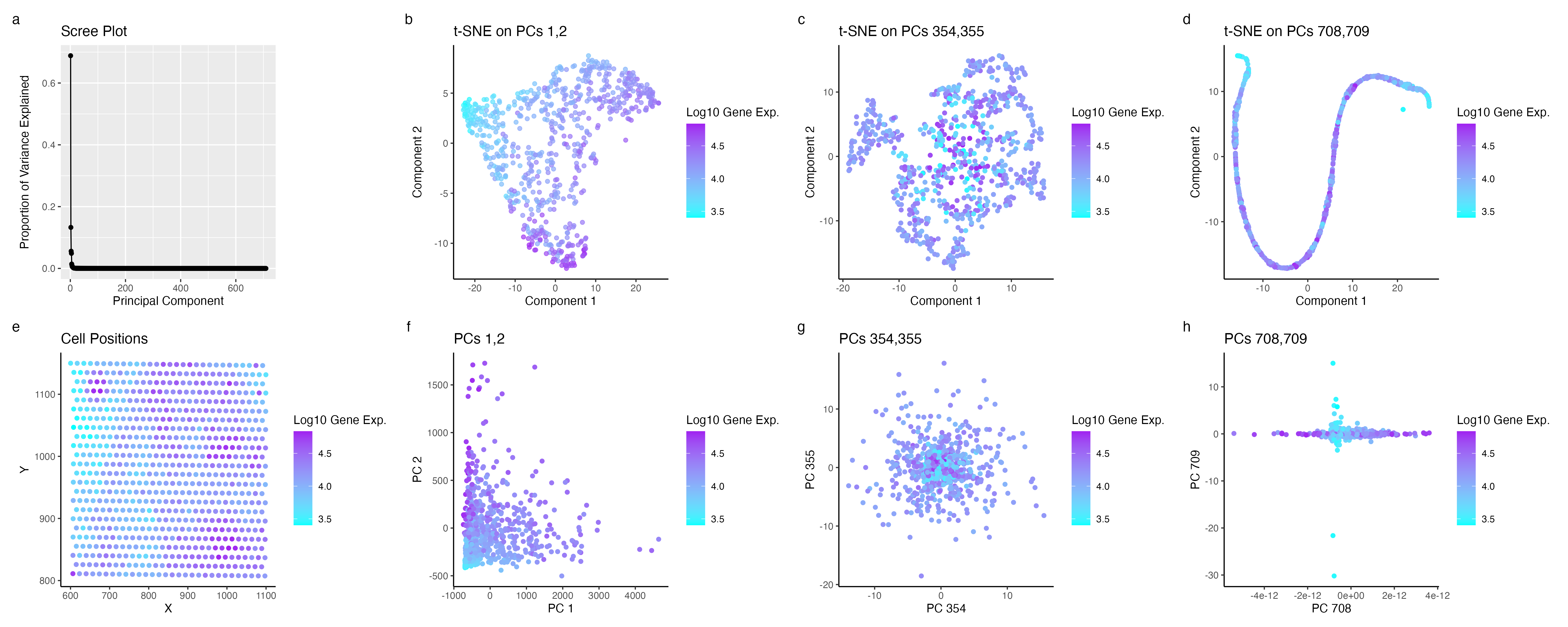
Gene Expression: Quantitative. X,Y positions: Quantitative. Principle Components: Ordinal.
I am visualizing the changes in perceived clustering that emerge from applying t-SNE, a non-linear dimensional reduction method, to the principal component analysis of gene expression data. This data is specifically selected from the most variable genes within the Eevee dataset. The gene expression data is both quantitative and discrete, with each value reflecting the gene expression level in individual cells. Additionally, the X and Y positions, which are also quantitative, denote the central positions of each cell. The principal components are ordinal, with their values (1, 2, 3, etc.) indicating a sequence of progressively lower variance
What data encodings (geometric primitives and visual channels) are you using to visualize these data types?
Geometric Principles: Points. Visual Channels: Position, Size, Color (Hue).
The visualization presents a series of plots (b-h) where each point represents an individual cell from the dataset, specifically denoting their x,y centroid positions. In contrast, plot ‘a’ employs points to represent each principal component (PC), with their position along the y-axis indicating their variance. The plots ‘b-h’ depict each cell’s spatial relationships post-application of both linear and non-linear transformations. Furthermore, color is used as a key element in these plots to signify gene expression levels, with a spectrum ranging from red (indicating high expression) to green (indicating low expression).
What about the data are you trying to make salient through this data visualization?
The aim of my visualization is to make the effects of higher Principal Component (PC) values more salient in the perceived clustering of cells. As indicated by the scree plot, there’s a trend where higher PCs exhibit lower variance. The t-SNE analysis was performed on the first, middle, and last PCs to investigate this. The results show that non-linear dimensionality reduction on PCs 1 and 2 markedly accentuates clustering in cells with low gene expression. In contrast, the middle and last PCs display a more subtle, almost indistinguishable contrast in areas of high and low expression of the most variable gene.
What Gestalt principles or knowledge about perceptiveness of visual encodings are you using to accomplish this?
Similarity: Cells that have similar color are seen as having similar gene expression and may indicate clusters.
Enclosure: Each plot has its own axis which encloses them from the other plots to indicate that they are separate.
Proximity: Plots that analyzed the same principle componets were place in the same column so that they may be percieved as part of the same group.
library(Rtsne)
library(ggplot2)
library(patchwork)

data <- read.csv("/Users/knm/github/genomic-data-visualization-2024/data/eevee.csv.gz", row.names = 1)
gexp <- data[, 4:ncol(data)]
topgene <- names(sort(apply(gexp, 2, var), decreasing = TRUE))
gexpfilter <- gexp[,topgene]

pcs <- prcomp(gexpfilter)
dim(pcs$x)

N <- ncol(pcs$x)

emb1 <- Rtsne(pcs$x[,1:2], dims = 2, perplexity = 50)
middle_start <- floor((N - 1) / 2)
middle_end <- middle_start + 1
emb2 <- Rtsne(pcs$x[,middle_start:middle_end], dims = 2, perplexity = 50)

emb3 <- Rtsne(pcs$x[,(N-1):N], dims = 2, perplexity = 50)


df <- data.frame(PC1_1 = pcs$x[,1], PC1_2 = pcs$x[,2],
                 PC2_1 = pcs$x[,middle_start], PC2_2 = pcs$x[,middle_end],
                 PC3_1 = pcs$x[,N], PC3_2 = pcs$x[,(N-1)],
                 emb1_1 = emb1$Y[,1], emb1_2 = emb1$Y[,2],
                 emb2_1 = emb2$Y[,1], emb2_2 = emb2$Y[,2],
                 emb3_1 = emb3$Y[,1], emb3_2 = emb3$Y[,2],
                 gene = rowSums(gexpfilter), x = data$aligned_x, y = data$aligned_y)


p1 <- ggplot(df) +
  geom_point(aes(x = emb1_1, y = emb1_2, color = log10(gene)), alpha = 0.7) +
  scale_color_gradient(low = "green", high = "red") +
  theme_classic() +
  labs(title = "t-SNE on PCs 1,2", color = "Log10 Gene Exp.",
       x = "Component 1", y = "Component 2")

p2 <-ggplot(df) +
  geom_point(aes(x = emb2_1, y = emb2_2, color = log10(gene))) +
  scale_color_gradient(low = "green", high = "red") +
  theme_classic() +
  labs(title = "t-SNE on PCs 354,355", color = "Log10 Gene Exp.",
       x = "Component 1", y = "Component 2")

p3 <-ggplot(df) +
  geom_point(aes(x = emb3_1, y = emb3_2, color = log10(gene))) +
  scale_color_gradient(low = "green", high = "red") +
  theme_classic() +
  labs(title = "t-SNE on PCs 708,709", color = "Log10 Gene Exp.",
       x = "Component 1", y = "Component 2")

p4 <- ggplot(df) +
  geom_point(aes(x = PC1_1, y = PC1_2, color = log10(gene))) +
  scale_color_gradient(low = "green", high = "red") +
  theme_classic() +
  labs(title = "PCs 1,2", color = "Log10 Gene Exp.",
       x = "PC 1", y = "PC 2")

p5 <- ggplot(df) +
  geom_point(aes(x = PC2_1, y = PC2_2, color = log10(gene))) +
  scale_color_gradient(low = "green", high = "red") +
  theme_classic() +
  labs(title = "PCs 354,355", color = "Log10 Gene Exp.",
       x = "PC 354", y = "PC 355")

p6 <- ggplot(df) +
  geom_point(aes(x = PC3_1, y = PC3_2, color = log10(gene))) +
  scale_color_gradient(low = "green", high = "red") +
  theme_classic() +
  labs(title = "PCs 708,709", color = "Log10 Gene Exp.",
       x = "PC 708", y = "PC 709")


p7 <- ggplot(df) +
  geom_point(aes(x = x, y = y, color = log10(gene))) +
  scale_color_gradient(low = "green", high = "red") +
  theme_classic() +
  labs(title = "Cell Positions", color = "Log10 Gene Exp.",
       x = "X", y= "Y")

variance_explained <- pcs$sdev^2
total_variance <- sum(variance_explained)
proportion_variance_explained <- variance_explained / total_variance
pc_data <- data.frame(PC_Number = 1:length(proportion_variance_explained),
                      ProportionVariance = proportion_variance_explained)
p8 <- ggplot(pc_data, aes(x = PC_Number, y = ProportionVariance)) +
  geom_line() +
  geom_point() +
  labs(title = "Scree Plot", x = "Principal Component", y = "Proportion of Variance Explained")

combined_plot <- p8 + p1 + p2 + p3 + p7 + p4 + p5 + p6 + plot_annotation(tag_levels = 'a') + plot_layout(ncol = 4)
combined_plot

ggsave("/Users/knm/Library/CloudStorage/OneDrive-JohnsHopkins/Johns Hopkins [2021-2025]/Junior [2023-2024]/Genomics Data Visualization/hw3_kmukund1.png", combined_plot, width = 20, height = 8)