Performing non-linear dimensionality reduction on genes V.S. on PCs

What data types are you visualizing?
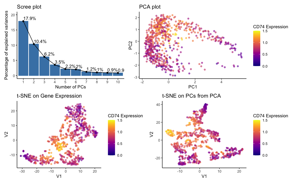
quantatative data of the percentage of variance explained by each principal component; quantatative data of CD74 gene expression; quantatative data of pc1 and pc2 score; spatial data of the coordinates of each point on the PCA plot (PC1 and PC2 axes); spatial data the coordinates on the t-SNE plots (axes labeled V1 and V2)
What data encodings (geometric primitives and visual channels) are you using to visualize these data types?
Geometric Principles: Points, lines, areas Visual Channels: Color hue, position
The PCA and t-SNE plots utilize both position and color to encode data simultaneously. The position of the points in the 2D plot space encodes the transformed data from high-dimensional space, while the color encodes the TP53 gene expression levels. The scree plot uses lines and areas to show the variance explained and overlays text to display the exact percentage value.
What about the data are you trying to make salient through this data visualization?
I am trying to make salient the following items: (1) the number of components that may be sufficient to capture the essential information in the data by displaying the proportion of variance explained by each principal component in the PCA analysis.; (2) clustering patterns within the eevee dataset through the PCA and t-SNE plots; (3) expression level of the CD74 gene across the samples; (4) linear and non-linear dimensionality reduction comparision (5) non-linear dimensionality reduction on genes v.s. pcs
What Gestalt principles or knowledge about perceptiveness of visual encodings are you using to accomplish this?
I used the Gestalt principle of similarity, proximity and continuity.
Proximity: Points that are close to each other in the PCA and t-SNE plots are perceived as part of a group or cluster. This proximity suggests a relationship or similarity between the data points, such as similar gene expression profiles.
Similarity; Similar colors are perceived as related. In the plots, points with similar colors (representing similar levels of gene expression) are perceived as more related than points with dissimilar colors. This helps in identifying areas of high or low gene expression.
Continuity: The scree plot shows a line connecting the tops of the bars, creating a sense of continuity that emphasizes the decreasing trend in variance explained by additional principal components.
What happens if I perform non-linear dimensionality reduction on genes or PCs?
t-SNE on Gene Expression: This plot reveals how cells relate to each other based on their full gene expression profiles in a non-linear reduced-dimensional space.
t-SNE on PCs from PCA: This plot shows how cells relate based on the major trends captured by the PCs when those trends are examined through a non-linear method.
When applied to the gene expression data, t-SNE can create a map where similar expression profiles are located closer together and therefore form the clusters which are more nuanced and localized and may not be apparent in PCA.
When applied to PCs, t-SNE focuses on the major trends and variations captured by PCA while exploring them in a non-linear manner. The t-SNE on PCs plot separates clusters that is not clear as in the PCA plot. Since PCs already summarize the data, applying t-SNE to PCs can simplify the dataset further, which allows for easier interpretation while still retaining the most significant relationships in the data.
To conclude, the resulting plots show that the choice between using genes or PCs as input for t-SNE can affect the separation of clusters in the visualization, thus providing different insights into the dataset.
library(ggplot2)
library(Rtsne)
library(factoextra)
library(viridis)
# read data
data <- read.csv('eevee.csv.gz', row.names = 1)
# remove non-gene expression columns
gexp <- data[, -(1:3)]
# filter out top 1000 genes
top_genes <- names(sort(apply(gexp, 2, var), decreasing = TRUE)[1:1000])
gexp_top <- gexp[, top_genes]
# normalize data
gexp_norm <- log10(gexp_top/rowSums(gexp_top)*1000 + 1)
# apply pca
pcs <- prcomp(gexp_norm)
df_pcs <- as.data.frame(pcs$x)
# interested genes
cd74 <- gexp_norm$CD74

# scree plot
#ref: https://www.rdocumentation.org/packages/factoextra/versions/1.0.7/topics/eigenvalue
p1 <- fviz_eig(pcs, addlabels = TRUE, ylim = c(0, 20), ggtheme = theme_classic(), xlab = "Number of PCs")

#  Plot CD74 expression on PC1 vs PC2
p2 <- ggplot(df_pcs, aes(x = PC1, y = PC2, col = cd74)) +
  geom_point(alpha = 0.6) +
  scale_color_viridis(option = 'plasma',  name = "CD74 Expression") +
  ggtitle("PCA plot ")  +
  theme_classic()

# Apply t-SNE directly to the normalized gene expression data
tsne_genes_res <- Rtsne(gexp_norm, dims = 2, perplexity = 30)
tsne_genes_data <- as.data.frame(tsne_genes_res$Y)
tsne_genes_data$cd74 <- gexp_norm$CD74

# Apply t-SNE to the first few principal components
tsne_pcs_res <- Rtsne(df_pcs[, 1:5], dims = 2, perplexity = 30) # using first 5 PCs
tsne_pcs_data <- as.data.frame(tsne_pcs_res$Y)
tsne_pcs_data$cd74<- gexp_norm$CD74

# Create the t-SNE plot for normalized gene expression
p3 <- ggplot(tsne_genes_data, aes(x = V1, y = V2, color = cd74)) +
  geom_point(alpha = 0.6) +
  scale_color_viridis(option = 'plasma', name = "CD74 Expression") +
  ggtitle("t-SNE on Gene Expression") +
  theme_classic()

# Create the t-SNE plot for PCs from PCA
p4<- ggplot(tsne_pcs_data, aes(x = V1, y = V2, color = cd74)) +
  geom_point(alpha = 0.6) +
  scale_color_viridis(option = 'plasma', name = "CD74 Expression") +
  ggtitle("t-SNE on PCs from PCA") +
  theme_classic()

# combine plots: Vertical Stack with Two
# Ref: chatgpt
library(patchwork)
combined_plot <- (p1 | p2) / (p3 | p4)
combined_plot