Comparison of non-normalized and log-normalized gene expression data with Principal Component Analysis

Description of data visualization
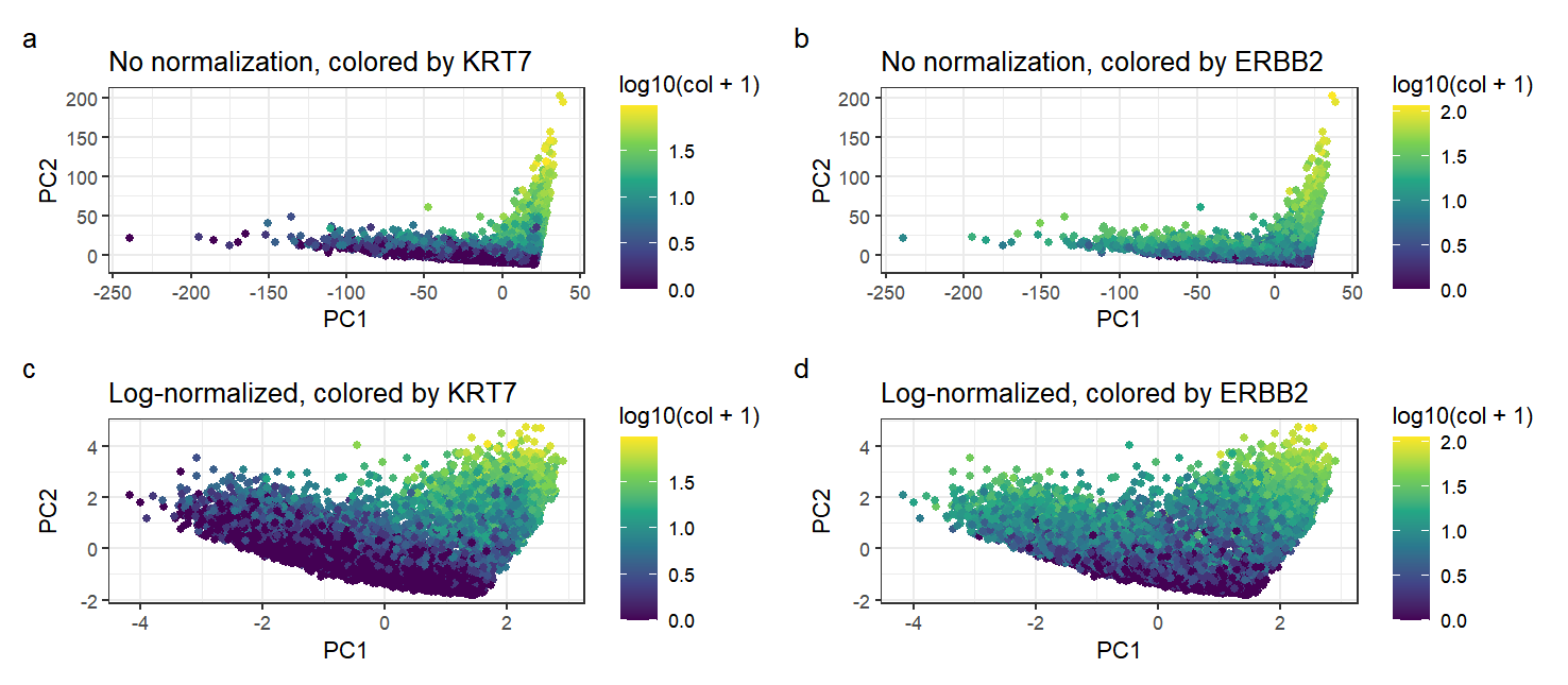
In this data visualization, I have plotted four graphs. The primary aim of the visualization is to compare between gene expression data that has not been normalized and data that has been log-normalized, after the linear dimensionality reduction method of Principal Component Analysis, to make salient the effect of normalization on the gene expression data. The gene expression of each cell is encoded by the geometric primitive of a point. I employed the visual channel of position to encode the gene expression data after dimensionality reduction along a certain principal component axis; here, I selected PC1 and PC2 as the two PCs with highest standard deviation. Additionally, I have employed the visual channel of color to further encode the genes with the highest loading values on PC1 and PC2, which are KRT7 and ERBB2 respectively. By the Gestalt principle of similarity with respect to color, we can tell that points with similar colors represent cells that express a similar amount of the particular gene.
What happens if I do or not not normalize and/or transform the gene expression data (e.g. log and/or scale) prior to dimensionality reduction?
Comparing the positions of the points on the non-normalized graphs to the points on the log-normalized graphs, we can see that the points of the graphs that are not normalized are distributed much more skewed manner than log-normalized points, with many points lying along two lines that are roughly parallel to the axes. This is because without any normalization, genes with a large absolute value of expression data will have a higher loading along PC1 and PC2 as this would serve to increase the standard deviation of the PC. As such, the positions of non-normalized data along the principal components will be much more extreme, dominated by their expression of these genes with large expression quantities. This is particularly evident in the range of the axes for the non-normalized graphs (up to a magnitude of ~250) as compared to the normalized graphs (~4). After log normalization, the points become more spread out in the graph as there is no large difference in magnitude between different genes. In conclusion, we can see that normalization enables a greater visual spread in visualizations by reducing the effect of magnitude differences between different genes. This prevents a small number of highly-expressed genes from dominating the PCs with high loading values and skewing the data.
Comparing the amounts of KRT7 and ERBB2 expressed, we can see that one common trait in all graphs is that there is a high expression of KRT7 and ERBB2 in all points in the top right section of the graph. This is because having a high expression in both genes would result in the point having a very positive value along both PC1 and PC2, given these genes’ high loading on PC1 and PC2. However, comparing the two colorings, we can see that expression of KRT7 is generally low for points that are more negative along both PC1 and PC2. In contrast, points with low ERBB2 expression tend to be very negative along the PC2 axis, but low ERBB2 expression is not correlated with PC1 (as can be seen from points in the extreme left of the graph still having significant ERBB2 expression). From this, we can conclude that KRT7 in fact has a high loading on both PC1 and PC2; in comparison, while ERBB2 has a high loading on PC2, it does not have a high loading on PC1 as its expression does not determine a point’s location along the PC1 axis.
data <- read.csv('pikachu.csv.gz', row.names = 1)
data[1:10,1:10]
genes <- data[, 6:ncol(data)]
genes[1:10,1:10]
#pick the top 50 genes
top50 <- names(sort(apply(genes, 2, var), decreasing=TRUE)[1:50])
gexp <- genes[,top50]
dim(gexp)
colnames(gexp)
gexp[1:10,1:10]

#not normalized at all
gexp_raw <- gexp
#normalized: log10 only; pseudocount=1 to avoid log10(0)
gexp_log <- log10(gexp+1)

#linear dimensionality reduction: PCA
pcs_raw <- prcomp(gexp_raw)
pcs_log <- prcomp(gexp_log)

#genes with the highest loading values in pcs_raw
head(sort(pcs_raw$rotation[,1], decreasing=TRUE))
head(sort(pcs_raw$rotation[,2], decreasing=TRUE))
#genes with the highest loading values in pcs_log
head(sort(pcs_log$rotation[,1], decreasing=TRUE))
head(sort(pcs_log$rotation[,2], decreasing=TRUE))

library(ggplot2)
library(ggforce)

#plots for pcs_raw
df <- data.frame(pcs_raw$x[,1:2], col = data[, 'KRT7'])
head(df)
p_raw_krt <- ggplot(df) + geom_point(aes(x = PC1, y = PC2, col=log10(col+1))) + theme_bw() + scale_color_continuous(type = "viridis") + labs(title='No normalization, colored by KRT7')
df <- data.frame(pcs_raw$x[,1:2], col = data[, 'ERBB2'])
head(df)
p_raw_erbb <- ggplot(df) + geom_point(aes(x = PC1, y = PC2, col=log10(col+1))) + theme_bw() + scale_color_continuous(type = "viridis") + labs(title='No normalization, colored by ERBB2')

#plots for pcs_log
df <- data.frame(pcs_log$x[,1:2], col = data[, 'KRT7'])
head(df)
p_log_krt <- ggplot(df) + geom_point(aes(x = PC1, y = PC2, col=log10(col+1))) + theme_bw() + scale_color_continuous(type = "viridis") + labs(title='Log-normalized, colored by KRT7')

df <- data.frame(pcs_log$x[,1:2], col = data[, 'ERBB2'])
head(df)
p_log_erbb <- ggplot(df) + geom_point(aes(x = PC1, y = PC2, col=log10(col+1))) + theme_bw() + scale_color_continuous(type = "viridis") + labs(title='Log-normalized, colored by ERBB2')

#display graphs together
library(patchwork)
p_raw_krt + p_raw_erbb + p_log_krt + p_log_erbb + plot_annotation(tag_levels = 'a') + plot_layout(ncol = 2)
?scale_color_continuous