The Impact of Normalization on Dimensionality Reduction: IGKC Expression Level Case Study

What data types are you visualizing?
IGKC gene expression count: quantatative PC 1 and 2 scores: quantatative t-SNE coordinates emb1 and emb2: spatial
I am visualizing the expression of the IGKC gene across PC scores and t-SNE coordinates from dimensionality reduction, and the effect of normalizing and not normalizing gene expression data has on dimensionality reduction (for both PCA and t-SNE) and comparing each figure.
What data encodings (geometric primitives and visual channels) are you using to visualize these data types?
Geometric Primatives: Points
Visual Channels: Color hues
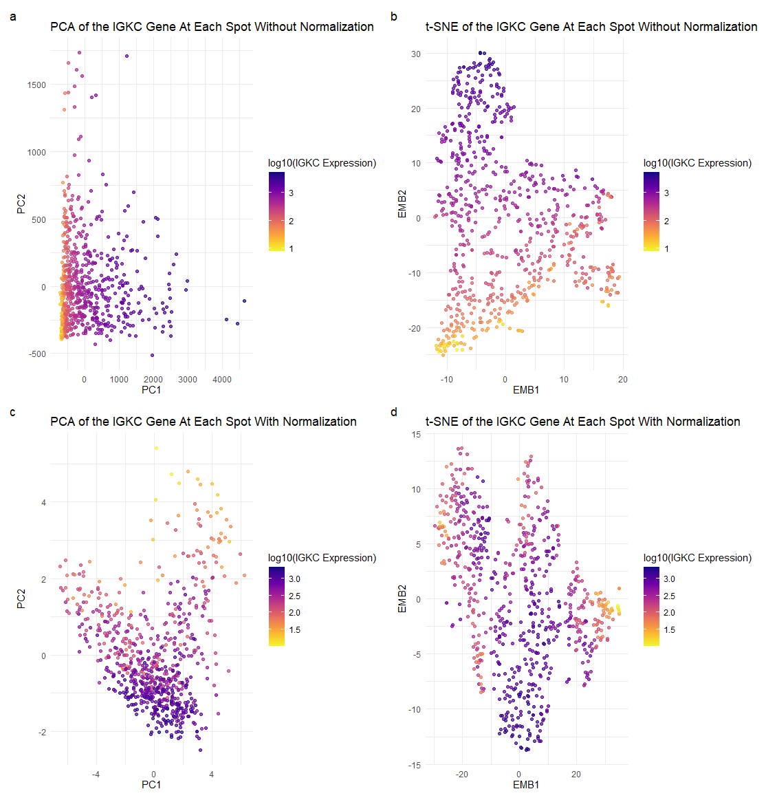
Each point represents a spot that has a linear combination of the top 100 genes present, and the plasma color hues indicate the expression level of IGKC, the lighter the color meaning a low expression of IGKC, and the darker the color meaning a high expression of IGKC.
What about the data are you trying to make salient through this data visualization?
I am trying to illustrate the effect normalizing gene expression data has on dimensionality reduction, especially on max variances and reduced dimensional space positions, and how the visuals change and can impact the way we interpret the relationships between certain points.
What Gestalt principles or knowledge about the perceptiveness of visual encodings are you using to accomplish this?
I used the Gestalt principle of similarity and proximity. Points of the same color are perceived as being part of the same group, in this case, conveying the similarity of spots’ IGKC expression levels. Clusters of similar color points close together can be perceived as being part of the same group, and ideally have similar gene expression profiles and be of similar cell types.
What happens if I do or do not normalize/transform the gene expression data (e.g., log and/or scale) prior to dimensionality reduction?
Without normalizing the gene expression data prior to PCA, the gene with the highest loading factor in PC1 was IGKC and the gene with the highest loading factor in PC2 was COL1A1. With normalization, the gene with the highest loading factor in PC1 was IGHA1, and the gene with the highest loading factor in PC2 was CPB1. This is visually reflected in subplots (a) and (c), where the plots are much more distinct from one another; we see different variances in gene expressions at certain spots, and even more darker points in subplot (c) than (a), indicating greater IGKC expression level. It illustrates the importance of normalization, which may more accurately describe our genetic data.
This is also shown again with our t-SNE subplots (b) and (d). We see that without normalizing the gene expression data prior to t-SNE, we get very different positions of spots in the reduced-dimensional space. We also see in subplot (d) that there is a higher expression of the IGKC gene than in (b), which might accurately represent true IGKC expression in spots and indicate similar cell types.
I think the main takeaway from this is the importance of normalizing data before performing a PCA or t-SNE. Without normalization, features with larger variances may skew results in a PCA. In the case of t-SNE, we measure the distance between points to find the scaled similarity metrics. Without normalization, the distances between points may not accurately represent the true similarities, and can potentially display incorrect information about our genetic data.
# Dee Velazquez
# HW 3

# Get data
data <- read.csv('eevee.csv.gz', row.names = 1)

#Get genes
gexp <- data[,4:ncol(data)]

#Limit number of genes by getting top 100 genes based on expression level
#COL1A1
#IGKC
top_genes <- names(sort(apply(gexp, 2, mean), decreasing=TRUE)[1:100])
filtered_genes <- gexp[, top_genes]
# Apply log10 transformation with addition of 1

# BIG QUESTION:
# Want to know...what happens if I do not normalize gene expression data
# prior to dimensionality reduction?
log_filtered_genes <- log10(filtered_genes + 1)
dim(filtered_genes)
head(log_filtered_genes)
gexp_norm <- log10(filtered_genes/rowSums(filtered_genes) *
                     mean(rowSums(filtered_genes))+1)
dim(gexp_norm)
head(gexp_norm)

## Dimensionalality reduction w/o normalizing gene expression beforehand
# PCA
pca <- prcomp(filtered_genes)
?prcomp
dim(pca$rotation)
#IGKC is the gene with the highest loading value for PC1
head(sort(pca$rotation[,1], decreasing=TRUE))
#COL1A1 is the gene with the highest loading value for PC2
head(sort(pca$rotation[,2], decreasing=TRUE))
head(pca$x[,1:5])
head(pca$rotation[,1:5])
df <- data.frame(pca$x, filtered_genes)
df$IGKC_log10 <- log10(df$IGKC + 1)
#p1 <- ggplot(df) + geom_point(aes(x = PC1, y= PC2, col=IGKC))
#+ theme_minimal()
p1 <- ggplot(df) + geom_point(aes(x = PC1, y= PC2, col=IGKC_log10), alpha = 0.7) +
  scale_color_viridis_c(option = "C",  name = "log10(IGKC Expression)", direction = -1) +
  labs( title = "PCA of the IGKC Gene At Each Spot Without Normalization",
    x = "PC1",
    y = "PC2") + theme_minimal()
p1
#tSNE
emb <- Rtsne(filtered_genes, dims = 2)
?Rtsne
df2 <- data.frame(emb=emb$Y,filtered_genes)
df2$IGKC_log10 <- log10(df$IGKC + 1)
p2 <-ggplot(df2) + geom_point(aes(x= emb.1, y =emb.2,col=IGKC_log10), alpha = 0.7) +
  scale_color_viridis_c(option = "C",  name = "log10(IGKC Expression)", direction = -1) +
  labs(title = "t-SNE of the IGKC Gene At Each Spot Without Normalization",
  x = "EMB1",
  y = "EMB2") + theme_minimal()
p2

## Dimensionalality reduction done after normalized gene expression
# PCA
#gexp_norm
#pca2 <- prcomp(log_filtered_genes)
pca2 <- prcomp(gexp_norm)
head(sort(pca2$rotation[,1], decreasing=TRUE))
#now...IGHA1 is the highest LF for PC1 instead of IGKC
head(sort(pca2$rotation[,2], decreasing=TRUE))
#now...CPB1 is the highest LF for PC2 instead of COL1A1
head(pca2$x[,1:5])
head(pca2$rotation[,1:5])
#df3 <- data.frame(pca2$x, log_filtered_genes)
df3 <- data.frame(pca2$x, gexp_norm)
p3 <- ggplot(df3) + geom_point(aes(x = PC1, y= PC2, col=IGKC), alpha = 0.7) +
  scale_color_viridis_c(option = "C",  name = "log10(IGKC Expression)", direction = -1) +
  labs(title = "PCA of the IGKC Gene At Each Spot With Normalization",
  x = "PC1",
  y = "PC2") + theme_minimal()
p3
#tSNE
#emb2 <- Rtsne(log_filtered_genes, dims = 2)
emb2 <- Rtsne(gexp_norm, dims = 2)
#df4 <- data.frame(emb=emb2$Y,log_filtered_genes)
df4 <- data.frame(emb=emb2$Y,gexp_norm)
p4 <- ggplot(df4) + geom_point(aes(x = emb.1, y =emb.2, col=IGKC), alpha = 0.7) +
  scale_color_viridis_c(option = "C",  name = "log10(IGKC Expression)", direction = -1) +
  labs(title = "t-SNE of the IGKC Gene At Each Spot With Normalization",
  x = "EMB1",
  y = "EMB2") + theme_minimal()
p4
# Plotting
p1 + p3 + plot_annotation(tag_levels = 'a') + plot_layout(ncol = 1)
p2 + p4 + plot_annotation(tag_levels = 'a') + plot_layout(ncol = 1)
final_plot <- p1 + p2 + p3 + p4 + plot_annotation(tag_levels = 'a') + plot_layout(ncol = 2)
final_plot