Linear vs Nonlinear Dimensionality Reduction on Eevee Dataset

What’s the difference if I perform linear or nonlinear dimensionality reduction to visualize my cells in 2D?
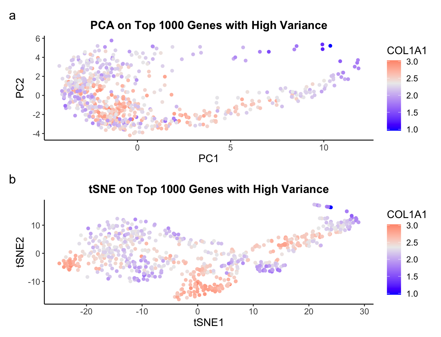
There are fundamental differences in performing Principal Component Analysis (PCA), or a linear dimensionality reduction technique, to t-distributed Stochastic Neighbor Embedding (TSNE), a nonlinear dimensionality reduction, which allow us to glean different and unique insights from the data. For the Eevee dataset consisting of Visium spatial transcriptomics data, we see a complete structural difference between the scatterplots of PCA and tSNE. Plotting the top 2 PCs in PCA is expressing the linear combination of genes that preserves the most variance. The structure is more elongated, or lienar, along both PCs, but especially PC1. The tSNE plot shows more of a clustering of points in various locations. The goal of tSNE is not to preserve the most variation but to find a low dimensional representation of the high dimensional data. Hence, tSNE is typically better than PCA when the goal of an analysis is to cluster the data. This is why I chose to visualize COL1A1 as color on the plots because it has the third highest variance and it shows some potential clustering for the tSNE plot.
Overall, it depends on what the goal of your downstream analysis is for what technique one should use. I also could have made the top X PCs from PCA the input to tSNE and seen a completely different graph, so it is always good to test out a couple of methods before deciding on one.
Write a description describing your data visualization using vocabulary terms from Lesson 1
The visual channel I am using to visualize the quantitative variable of median gene expression of COL1A1 is color, where blue represents a low expression of COL1A1, light gray represents the median expression of COL1A1, and red represent a high expression of COL1A1. The visual channel I am using to visualize the quantitative variables of PC1 and PC2 from PCA and TSNE1 and TSNE2 from TSNE is position, where the x-axis encodes PC1 and TSNE1 and the y-axis encodes PC2 and TSNE2, respectively. The geometric primitive used for the quantitative variables are points. The main Gestalt principle I am utilizing is similarity, where points of similar color represent a similar gene expression of COL1A1. However, I would argue I am also using Gestalts principle of proximity to allow for an easy comparison of PCA and TSNE by stacking them in my visualization.
Note: Data is log normalized.
### HW3 ###
## Caleb Hallinan ##
## Eevee sequencing data ##

# import libraries
library(here)
library(ggplot2)
library(Rtsne)
library(patchwork)

# set seed
set.seed(02052024)

# read in data
data = read.csv(here("data/eevee.csv.gz"), row.names = 1)
# dim(data)

# get info from data
pos <- data[,2:3]
gexp <- data[,4:ncol(data)]
# colnames(gexp)

# check variance
topgenes <- names(sort(apply(gexp, 2, var), decreasing=TRUE)[1:1000])
topgenes

# filter
gexpfilter <- gexp[,topgenes]
# dim(gexpfilter)

# normalize log2
gexpnorm <- log10(gexpfilter/rowSums(gexpfilter) * mean(rowSums(gexpfilter))+1)

# gene to plot
gene <- topgenes[3]

# perform pca
pcs <- prcomp(gexpnorm)

# plot pcs
p_pca <- ggplot(data.frame(pcs$x)) +
    geom_point(aes(x = PC1, y = PC2, color = gexpnorm[[gene]])) +
    theme_classic() +
    labs(
        title = "PCA on Top 1000 Genes with High Variance",
        color = gene
    ) +
    scale_color_gradient2(midpoint = median(gexpnorm[[gene]]), low = "blue", mid = "#ECECEC", high = "red", space = "Lab" ) +
    theme(legend.title.align=0.5,plot.title = element_text(hjust = 0.5, face="bold", size=14), text = element_text(size = 13))

# run tsne
emb <- Rtsne(gexpnorm) # can change dims from
# names(emb)

# plot tsne
p_tsne <- ggplot(data.frame(emb$Y)) +
    geom_point(aes(x = emb$Y[,1], y = emb$Y[,2], color = gexpnorm[[gene]])) +
    theme_classic() +
    labs(
        title = "tSNE on Top 1000 Genes with High Variance",
        color = gene,
        x = "tSNE1",
        y = "tSNE2"
    ) +
    scale_color_gradient2(midpoint = median(gexpnorm[[gene]]), low = "blue", mid = "#ECECEC", high = "red", space = "Lab" ) +
    theme(legend.title.align=0.5,plot.title = element_text(hjust = 0.5, face="bold", size=14), text = element_text(size = 13))

# use patchwork to plot 2 plots
p_pca + p_tsne + plot_annotation(tag_levels = 'a') + plot_layout(ncol = 1)