Visualizing Total Number of Genes, Spatial Position, and Gene Loadings Values with Respect to PCA Components

What data types are you visualizing?
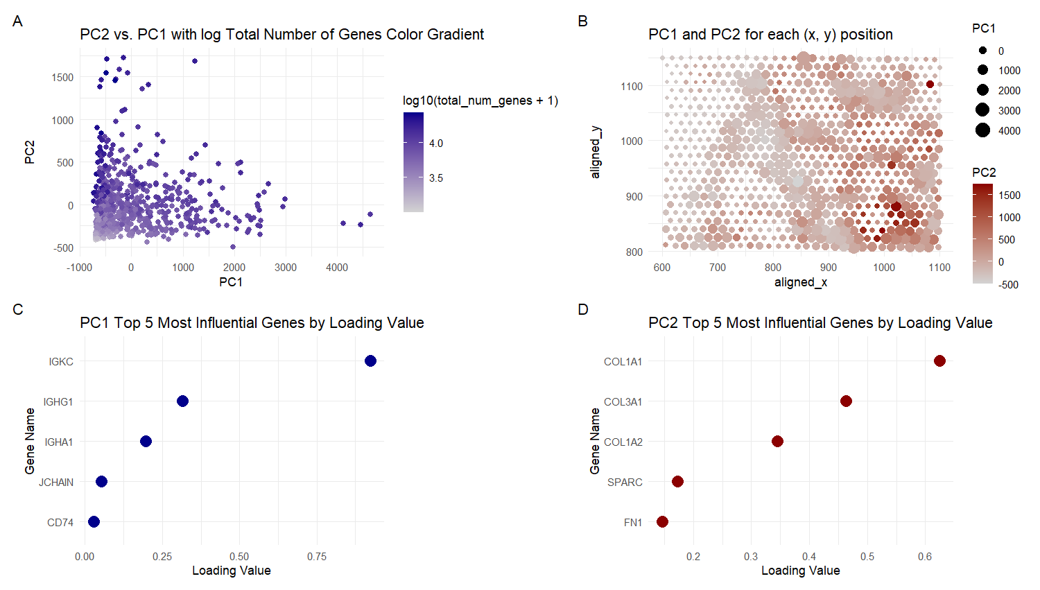
For plot A, I am visualizing quantitative data of the PC1 and PC2 values, and qualitative data of the total number of genes for the particular spot with those values.
For plot B, I am visualizing quantitative data of the PC1 and PC2 values, and spatial data regarding the aligned x and y positions for each spot.
For plot C, I am visualizing quantitative data of the loading values for PC1, and categorical data of the genes with those loading values.
For plot D, I am visualizing quantitative data of the loading values for PC2, and categorical data of the genes with those loading values.
What data encodings are you using to visualize these data types?
For Plot A, I am using the geometric primitive of points to represent each spot on the spatial gene expression slide. To encode the PC1 value, I am using the visual channel of position along the x axis. To encode the PC2 value, I am using the visual channel of position along the y axis. To encode the quantitative total gene number value, I am using the visual channel of saturation going from an unsaturated light grey to a saturated dark blue.
For Plot B, I am using the geometric primitive of points to represent each spot on the spatial gene expression slide. To encode the spatial aligned x position, I am using the visual channel of position along the x axis. To encode the spatial aligned y position, I am using the visual channel of position along the y axis. To encode the quantitative PC2 values, I am using the visual channel of saturation going from an unsaturated light grey to a saturated dark red. For the quantitative PC1 values, I am using the visual channel of area, going from smaller to larger size.
For Plots C and D, I am using the geometric primitive of points to represent each of the top 5 genes with the greatest loading values for PC1 and PC2 respectively. To encode the quantitative loading value, I am using the visual channel of position along the x axis. To encode the categorical gene name, I am using the visual channel of position along the y axis.
The visual channels were chosen because according to the data type chart, area has a better than average resolving time for quantitative data and saturation has a slightly worse than average resolving time for quantitative data. So both they are used for encoding PC1 and PC2 values in plot B. Spatial aligned x or y position were encoded on the x and y axes for intuitiveness and the best resolving time. Saturation is used in plot A because size would cause the points to overlap, especially in the bottom left corner and this visualization is clearer even if the transparency is changed. x and y axis Position was used for PC2 and PC1 for the best resolving time. Plots C and D use x and y axis position for the quantitative loading value and Gene Name because it has the best resolving time for both.
What type of data visualization is this? What about the data are you trying to make salient through this data visualization? What Gestalt principles have you applied towards achieving this goal if any?
Plots A and B are scatter plots. Plots C and D are Cleveland dot plots.
My explanatory data visualization seeks to make more salient the influence that genes and other factors (total number of genes and spatial position) have on the principal components. The influence of the genes is easily inferred from the loading values (i.e. the weights of each gene) in plots C and D. For Plot A, the influence of the total number of genes can be observed from the saturation of different clusters of spots, i.e. high PC2 and low PC1 is dark and has a large total number of genes, while low PC2 and low to medium PC1 is lighter and has less total number of genes. For Plot B, the influence of spatial position is observed form the saturation and size of clusters of spots. The vertically down the middle of the graph there are clusters with low PC2 but high PC1 (light color with large size). In the bottom right corner there is a cluster with high PC2 but low PC1 (dark color small size). The Gestalt principle of proximity is present in the legends because the size and color keys are next to each other. The Gestalt principle of continuity is present because the more similar plots (A and B; C and D) are viewed in sequence from left to right. The Gestalt principle of similarity is used to identify areas of high or low total number of genes in Plots A , since they will have similar color saturation. The Gestalt principle of similarity is also used to identify areas of high or low PC1 or PC2 values in plot B, since they will have similar color saturation and size.
Please share the code you used to reproduce this data visualization.
data <-
    read.csv("genomic-data-visualization-2024/data/eevee.csv.gz",
             row.names = 1)
data[1:10, 1:10]
pos <- data[, 2:3]
gexp <- data[, 4:ncol(data)]

# from lesson 5
topgene <- names(sort(apply(gexp, 2, var), decreasing = TRUE)[1:1000])
gexpfilter <- gexp[, topgene]


? prcomp
pcs <- prcomp(gexpfilter, scale. = TRUE)
names(pcs)
pcs$rotation[, 1:10]

pcs <- prcomp(gexp)

sdev_plt <- plot(pcs$sdev)

PC1_top_loading_names <-
    names(sort(abs(pcs$rotation[, 1]), decreasing = TRUE))[1:5]
PC1_top_loadings <- pcs$rotation[PC1_top_loading_names, 1]
PC1_top_loadings_df <-
    data.frame(gene_name = names(PC1_top_loadings),
               loading_value = PC1_top_loadings)

PC2_top_loading_names <-
    names(sort(abs(pcs$rotation[, 2]), decreasing = TRUE))[1:5]
PC2_top_loadings <- pcs$rotation[PC2_top_loading_names, 2]
PC2_top_loadings_df <-
    data.frame(gene_name = names(PC2_top_loadings),
               loading_value = PC2_top_loadings)

library(ggplot2)

PCA_df = data.frame(pcs$x[,1:2], total_num_genes=rowSums(gexpfilter))
PCA_df[1:5,]
names(PCA_df)

spatial_df = data.frame(pos, pcs$x[,1:2])

main_plt <- ggplot(PCA_df, aes(x= PC1, y=PC2, color = log10(total_num_genes+1))) +
    scale_colour_gradient(low = 'lightgrey', high = 'darkblue') +
    geom_point(size=2) +
    labs(title = 'PC2 vs. PC1 with log Total Number of Genes Color Gradient') +
    xlab('PC1') + ylab('PC2') +
    theme_minimal()

spatial_plt <- ggplot(spatial_df, aes(x=aligned_x, aligned_y, size = PC1, color = PC2)) +
    scale_colour_gradient(low = 'lightgrey', high = 'darkred') +
    geom_point() +
    labs(title = 'PC1 and PC2 for each (x, y) position') +
    theme_minimal()


PC1_top_loadings_plt <- ggplot(PC1_top_loadings_df, aes(reorder(gene_name, loading_value), loading_value, size = 1)) +
    geom_point(color='darkblue', show.legend = FALSE) +
    labs(title = 'PC1 Top 5 Most Influential Genes by Loading Value') +
    xlab('Gene Name') + ylab('Loading Value') +
    theme_minimal() +
    coord_flip()

PC2_top_loadings_plt <- ggplot(PC2_top_loadings_df, aes(reorder(gene_name, loading_value), loading_value, size = 1)) +
    geom_point(color='darkred', show.legend = FALSE) +
    labs(title = 'PC2 Top 5 Most Influential Genes by Loading Value') +
    xlab('Gene Name') + ylab('Loading Value') +
    theme_minimal() +
    coord_flip()

library(patchwork)
main_plt + spatial_plt + PC1_top_loadings_plt + PC2_top_loadings_plt + plot_annotation(tag_levels = 'A') + plot_layout(nrow = 2, ncol = 2)