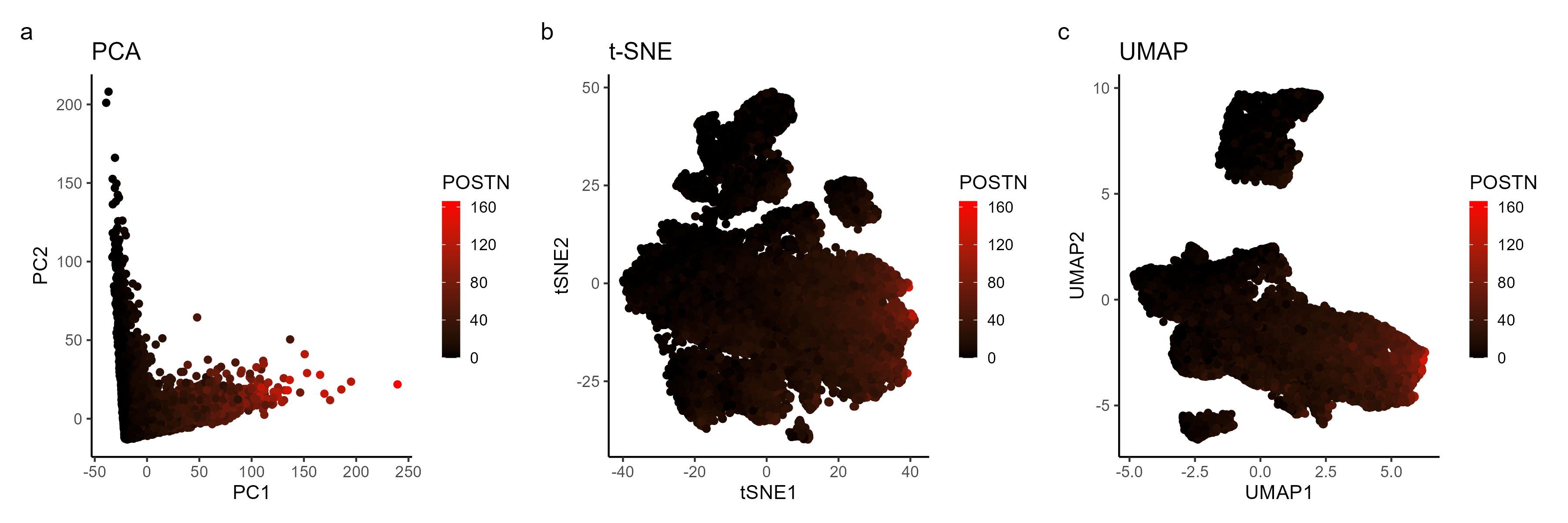
Analysis of most expressed gene (POSTN): PCA, t-SNE, and UMAP Plots

What data types are you visualizing?
I am visualizing quantitative data of the most expressed gene POSTN for each cell, and spatial data regarding the x,y positions for each cell in the embedded 2D space computed by PCA, t-SNE, and UMAP plots that group cells based in gene expression similarities.
What data encodings (geometric primitives and visual channels) are you using to visualize these data types?
I am using the geometric primitive of points to represent each cell across the different dimensionality reduction approaches. To encode the spatial positions of each cell in the resulting 2D space, I am using the visual channel of positions. To encode expression count of the POSTN gene, I am using the visual channel of color from black to red colors.
What about the data are you trying to make salient through this data visualization?
I am showing how the expression of the top gene POSTN can be represented across different dimensionality reduction plots (PCA, t-sne, and UMAP).
What Gestalt principles or knowledge about perceptiveness of visual encodings are you using to accomplish this?
I am using the Gestalt principle of continuity to visualize clusters of cells with similar gene expression profile. I am using the Gestalt principle of similarity to identify POSTN gene expression among the clusters of cells.
Code
#### author ####
# Andre Forjaz
# jhed: aperei13

#### load packages ####
library(Rtsne)
library(ggplot2)
library(patchwork)
library(gridExtra)
library(umap)

#### Input ####
outpth <-'~/genomic-data-visualization-2024/homework/hw3/'
data <- read.csv('~/genomic-data-visualization-2024/data/pikachu.csv.gz', row.names=1)

# data preview
data[1:5,1:8]

# coordinates
coords <- data[,2:3]

# gene expression
gexp <- data[, 6:ncol(data)]
dim(gexp)
colnames(gexp[,1:8])

#### Select top 1 gene ####
topgene <- names(sort(apply(gexp, 2, var), decreasing=TRUE)[1])
gexpfilter <- gexp[,topgene]
colnames(gexpfilter)
dim(gexpfilter)

#### Run pca ####
pca_res  <- prcomp(gexp)

# Make PCA plot
df_top1 <- data.frame(PC1 = pca_res$x[,1],
                       PC2 = pca_res$x[,2],
                       Gene = gexpfilter)

p1 <- ggplot(df_top1) +
      geom_point(aes(PC1, PC2, color=Gene)) +
      scale_color_gradient(low = "black", high = "red",
                           guide = guide_colorbar(barwidth = 0.7))+
      labs(color = topgene, size = 0.5, alpha = 0.6) +
      ggtitle("PCA")+
      theme_classic()

p1
#### Run tsne ####
tsne_res <- Rtsne(gexp, perplexity = 30, dims = 2)

df_tsne <- data.frame(tSNE1 = tsne_res$Y[, 1],
                                tSNE2 = tsne_res$Y[, 2],
                                Gene = gexpfilter)


p2 <-ggplot(df_tsne) +
     geom_point(aes(tSNE1, tSNE2, color = Gene)) +
     scale_color_gradient(low = "black", high = "red",
                          guide = guide_colorbar(barwidth = 0.7))+
     labs(color = topgene, size = 0.5, alpha = 0.6,) +
     ggtitle("t-SNE") +
     theme_classic()

p2

#### Run UMAP ####
umap_res <- umap(gexp, n_neighbors = 15, n_components = 2)

df_umap <- data.frame(UMAP1  = umap_res$layout[, 1],
                      UMAP2  = umap_res$layout[, 2],
                      Gene = gexpfilter)


p3 <-ggplot(df_umap) +
     geom_point(aes(UMAP1 , UMAP2, color = Gene)) +
     scale_color_gradient(low = "black", high = "red",
                       guide = guide_colorbar(barwidth = 0.7))+
     labs(color = topgene, size = 0.5, alpha = 0.6,) +
     ggtitle("UMAP") +
     theme_classic()

p3

#### Plot results ####

p1 + p2 + p3+
  plot_annotation(tag_levels = 'a') +
  plot_layout(ncol = 3)

combined_plot <-p1 + p2 + p3+
                plot_annotation(tag_levels = 'a') +
                plot_layout(ncol = 3)

#### Save results ####
ggsave(paste0(outpth, "hw3_aperei13.png"),
       plot = combined_plot,
       width = 12,
       height = 4,
       units = "in")

####  References ####
# 1- https://rpubs.com/crazyhottommy/pca-in-action
# 2- https://bookdown.org/sjcockell/ismb-tutorial-2023/practical-session-2.html