Centroid positions, cell and nucleus areas of each cell

What genes (or other cell features such as area or total genes detected) are driving my reduced dimensional components?
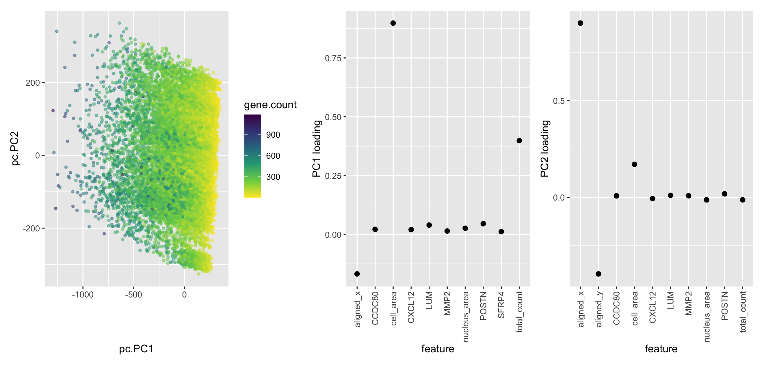
My plot includes three panels, which are respectively the PC plot with each cell labeled by gene count, top 10 features with the highest absolute loading value in PC1, top 10 features with the highest absolute loading values in PC2. In the PC plot, I am using the geometric primitive of points to represent each cell. To encode the total gene count, I am using the visual channel of color hue. To encode the PC1 and PC2 position, I am using the visual channel of position along the PC1 and PC2 axis. I applied the Gestalt principle, similarity, by using similar color for cells with similar total gene counts. In the two PC loading plots, I am using the geometric primitive of points to represent each loading value corresponding to each feature. For the visual channel, I am using the position of y to represent loading values.
As we can observe from the second plot, aligned_x, cell_area, and total_count of genes, which have the largest absolute values of loading, for each cell are driving PC1. The third plot demonstrates that aligned_x, aligned_y, and cell_area are driving PC2.
Please share the code you used to reproduce this data visualization.
library(patchwork)
library(ggplot2)
library(dplyr) # install it if you don't have it
data <- read.csv('pikachu.csv.gz', row.names = 1)
data$total_count <- rowSums(data[ ,6:ncol(data)], na.rm=TRUE)
df <- data[,2:ncol(data)]
PC <- prcomp(df)$x[,1:2]
loadings <- princomp(df)$loadings[,1:2]

x.df <- data.frame(pc = PC, gene.count=df$total_count)
load.df <- data.frame(loadings)
load.df$feature = rownames(load.df)
p1 <- ggplot(x.df) + geom_point(aes(x=pc.PC1, y=pc.PC2, color=gene.count), alpha=0.5) +
  scale_color_continuous(type='viridis', direction=-1)

# plot top 10 loadings for pc1 and pc2
p2 <- load.df %>% top_n(10, Comp.1) %>% ggplot(aes(x=feature, y=Comp.1)) +
  geom_point(size=3) + ylab('PC1 loading') +
  theme(axis.text.x = element_text(angle = 90, vjust = 0.5, hjust=1))

p3 <- load.df %>% top_n(10, Comp.2) %>% ggplot(aes(x=feature, y=Comp.2)) +
  geom_point(size=3) + ylab('PC2 loading') +
  theme(axis.text.x = element_text(angle = 90, vjust = 0.5, hjust=1))
p1+p2+p3
external resources:
https://dplyr.tidyverse.org/reference/top_n.html