Effect of Introducing Principle Components on Non-linear Dimensionality Reduction
What data types are you visualizing?
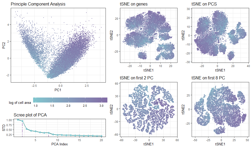
In the multi-panel plot, I am visualizing spatial and quantitative data with diffrerent projection approaches. The visualization contains spatial data of each cell’s position in the transformed spaces, as well as quantitative data of cell’s area.
What data encodings (geometric primitives and visual channels) are you using to visualize these data types?
Geometric Primitives: Each cell is represented by a point using geom_point(), and the accumulated standard deviations of the principle components are connected with line segments to show trend. Visual Channels: To encode each cell’s position in the transformed spaces based on PC1 (tSNE1) and PC2 (tSNE2) axes, I used the visual channel of position along the x axis and y axis, respectively. I am using the visual channel of color to encode the cell area.
What about the data are you trying to make salient through this data visualization?
I am trying to make salient how the data clusters / distrubution of cells are impacted by the choice of whether and how many PCA components are included (question 3 & 4). If tSNA is performed on the full (normalized) dataset after PCA, the result would simply be a rotational (linear) transformation of the orginal dataset, as PCA is simply a linear operation given no dimention is dropped. The more principle components are dropped, the less similar tSNA results are different from direct analysis on genes. Droppping components simplifies the data, reduces noise, but may lose fine details. For me, tSNE on the first 8 PC (38% std dropped from screep plot) gives the most reliable cell clustering.
What Gestalt principles or knowledge about perceptiveness of visual encodings are you using to accomplish this?
Similarity: Cells with the similar color (green/purple/in-between) represent a similar NC ratio (thus the same growth stage). Interestingly, few cells lie in the middle.
# load dataset
data <- read.csv('C:/Users/ivych/OneDrive - Johns Hopkins/Classes/Data Visualization/pikachu.csv.gz', row.names = 1)


# import libraries
library(ggplot2)
library(gridExtra)
library(Rtsne)

# set theme
plot_theme <- theme_bw() +
  theme(text = element_text(size = 10), legend.key.size = unit(0.5, 'cm'))
#ref: https://www.color-hex.com/color-palette/1022322
xiao_plt <- c("#816BA5","#B091C2", "#496170","#3c9393", "#81c7cf" )

# create data frames
gexp <- data[, 6:ncol(data)]
gexp_log <- log10(gexp+1)

# normalization
gexp_norm <- scale(gexp_log, center=TRUE, scale=FALSE)

## pca - linear dimensional reduction
pcs<- prcomp(gexp_norm)
pca_norm <- data.frame(pcs$x[,1:2])
pcaplot <- ggplot(data = pca_norm) +
  geom_point(size = 0.5,aes(x = PC1, y = PC2, col = log10(1+data$cell_area))) +
  plot_theme +
  theme(legend.position = 'bottom', legend.key.width = unit(1.5, 'cm'))+
  labs(title = 'Principle Component Analysis',
       col = "log of cell area")+
  scale_color_gradient(low=xiao_plt[5], high=xiao_plt[1])

## scree plot
#ref: https://r-charts.com/base-r/line-types/
#plot(pcs$sdev[1:20],type = "o",col=xiao_plt[5],lwd=2,
#     xlab="PCA Index", ylab="Standard Deviation",
#     main="Scree Plot")
#ref: https://www.statology.org/round-in-r/
#text(3,pcs$sdev[2], labels=round(pcs$sdev[2], digits = 3),col = xiao_plt[5])
#text(9.5,pcs$sdev[8], labels=round(pcs$sdev[8], digits = 3),col = xiao_plt[5])
#screeplot <- as.ggplot(recordPlot())
var_explained_df <- data.frame(PC= 1:20,
                               var_explained=(pcs$sdev[1:20]))

screeplot <- ggplot(var_explained_df, aes(x=PC,y=var_explained, group=1))+
  geom_line(col = xiao_plt[4], size=1)+
  geom_segment(col = xiao_plt[2], size=1, linetype = 'twodash',
               aes(x = 2, y = var_explained[2], xend = 2, yend = -Inf)) +
  geom_segment(col = xiao_plt[2], size=1, linetype = 'dotdash',
               aes(x = 8, y = var_explained[8], xend = 8, yend = -Inf)) +
  geom_point(size=2,col = xiao_plt[5])+
  plot_theme +
  labs(title="Scree plot of PCA",
       y = "STD", x = "PCA Index")

# loadings for both PC1 and PC2
# head(sort(pcs$rotation[,1], decreasing=TRUE)) #PC1
# head(sort(pcs$rotation[,2], decreasing=TRUE)) #PC2

## tSNE
tsne <- Rtsne(gexp_norm,pca = FALSE,pca_center = FALSE,pca_scale = FALSE)
df_tsne <- data.frame(tsne$Y)
tsneplot<-ggplot(df_tsne) +
  geom_point(size = 0.5, aes(x = X1, y = X2,col = log10(1+data$cell_area))) +
  plot_theme + theme(legend.position="none", ) +
  labs(title = 'tSNE on genes',
       col = "log cell area", x = 'tSNE1', y = 'tSNE2') +
  scale_color_gradient(low=xiao_plt[5], high=xiao_plt[1])

## tSNE on full PCA
df_pcs <- data.frame(pcs$x)
tsne_pcs <- Rtsne(df_pcs,pca = FALSE,pca_center = FALSE,pca_scale = FALSE)
df_pcs_tsne <- data.frame(tsne_pcs$Y)
tsnepcaplot<-ggplot(df_pcs_tsne) +
  geom_point(size = 0.5, aes(x = X1, y = X2,col = log10(1+data$cell_area))) +
  plot_theme + theme(legend.position="none") +
  labs(title = 'tSNE on PCS',
       col = "log area", x = 'tSNE1', y = 'tSNE2') +
  scale_color_gradient(low=xiao_plt[5], high=xiao_plt[1])

## tSNE on first 2 PC
df_pcs2 <- data.frame(pcs$x[,1:2])
tsne_pcs2 <- Rtsne(df_pcs2,pca = FALSE,pca_center = FALSE,pca_scale = FALSE)
df_pcs_tsne2 <- data.frame(tsne_pcs2$Y)
tsnepcaplot2<-ggplot(df_pcs_tsne2) +
  geom_point(size = 0.5, aes(x = X1, y = X2,col = log10(1+data$cell_area))) +
  plot_theme + theme(legend.position="none") +
  labs(title = 'tSNE on first 2 PC',
       col = "log area", x = 'tSNE1', y = 'tSNE2') +
  scale_color_gradient(low=xiao_plt[5], high=xiao_plt[1])

## tSNE on first 8 PC
df_pcs8 <- data.frame(pcs$x[,1:8])
tsne_pcs8 <- Rtsne(df_pcs8,pca = FALSE,pca_center = FALSE,pca_scale = FALSE)
df_pcs_tsne8 <- data.frame(tsne_pcs8$Y)
tsnepcaplot8<-ggplot(df_pcs_tsne8) +
  geom_point(size = 0.5, aes(x = X1, y = X2,col = log10(1+data$cell_area))) +
  plot_theme + theme(legend.position="none") +
  labs(title = 'tSNE on first 8 PC',
       col = "log area", x = 'tSNE1', y = 'tSNE2') +
  scale_color_gradient(low=xiao_plt[5], high=xiao_plt[1])

#plot panel arrangement
layout <- rbind(c(1,1,1,3,3,4,4),
                c(1,1,1,3,3,4,4),
                c(1,1,1,5,5,6,6),
                c(2,2,2,5,5,6,6))
grid.arrange(pcaplot,screeplot,
             tsneplot,tsnepcaplot,
             tsnepcaplot2,tsnepcaplot8,
             layout_matrix = layout)