Normalization of gene expression prior to dimensionality reduction for Spatial Transcriptomic dataset

What happens if I do or not not normalize and/or transform the gene expression data (e.g. log and/or scale) prior to dimensionality reduction?
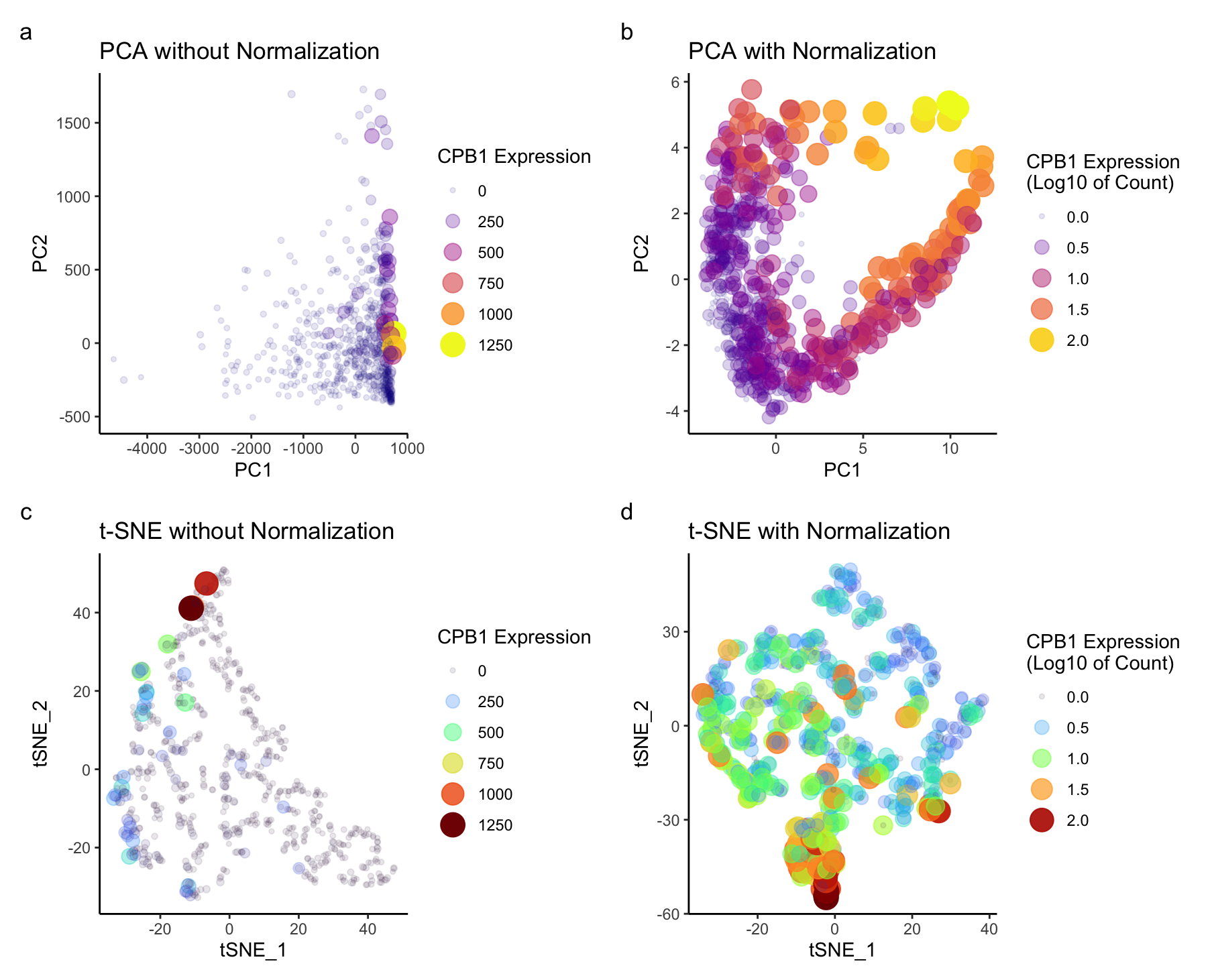
I explored to see the differences in the scatter plot for both the dimensional reduction techniques- prior and after data normalization. Before normalizing for PCA (figure a, b), based on these graphs, genes with larger expression values may dominate the principal components. Most of the variance can be seen only along PC1. Normalization ensures that each gene contributes more equally to the principal components. Hence we can see different groups of CBP1 expression spread across PC1 and PC2. Log transformation stabilizes variance, especially for highly expressed genes. For t-SNE (figure c,d), without normalization higher expression are again dominating. t-SNE is known for preserving local structures, without normalization, it may be influenced by genes with large expression values. After normalization, I could see the groups for both higher and lower expressed genes. Overall, my observation was that normalization in both the techniques stabilizes the variance in this dataset and ensures that each gene contributes proportionally to the analysis.
Write a description describing your data visualization using vocabulary terms from Lesson 1.
I am visualizing quantitative data of the expression level of the CPB1 gene. For all the plots, I used the geometric primitive of points to show each spatial barcode in the sequencing data. The visual channel of color saturation is used to encode the expression levels of the CPB1 gene. I am also using transparency for depth in understanding, and size for an additional layer of information as visual channels. This allows the user to visualize the relationship between possible group of gene expression based on the transparency, intesity of the color, and size of the points.The transparency reveals overlapping points, emphasizing areas of higher density, while the color intensity provides insights into the intensity of gene expression.The reason behind this is that, the data after dimensionality reduction should be separated into groups, the color hue encoding of the expression level allows us to possibly see a trend in groups relating higher or lower gene expression. Another visual channel to visualize the quantative PC1, PC2, and tSNE_1, tSNE_2 variable is position. PC1 and tSNE_1 are on x axis, PC2, tSNE_2 are on y axis.
The gestalt principle of similarity is applied, where points with similar color are perceived as similar having gene expression. The gestalt principle of proximity is also in play since closer points are perceived to be in a group. The side-by-side graphs effectively underscores the salient feature of effect of normalizing the data for dimensionality reduction.
You must include the entire code you used to generate the figure so that it can be reproduced. You must provide attribution to external resources referenced (if any) in writing your code.
Used class notes to write the code:
library(viridis)
library(patchwork)
library(Rtsne)

# data loading
data <- read.csv('/Users/nidhisoley/Desktop/GDataViz/eevee.csv.gz', row.names=1)
pos <- data[, 2:3]
gexp <- data[, 4:ncol(data)]

# top genes
top_gene <- names(sort(apply(gexp, 2, var), decreasing = TRUE)[1:1000])
gexp_filter <- gexp[, top_gene]
dim(gexp_filter)

# Applying PC to gexp without normalizing
pcs_without_norm <- prcomp(gexp_filter)

# Dataframe PC without norm and plot p1
df_pcs_without <- data.frame(pcs_without_norm$x)
gene <- gexp_filter$CPB1
p1 <- ggplot(df_pcs_without) +
  geom_point(aes(x = PC1, y = PC2, col = 0.8 * gene, alpha = 0.8 * gene, size = 0.8 * gene)) +
  scale_color_viridis(option = 'plasma') +
  guides(color = guide_legend(title = "CPB1 Expression"),
         alpha = guide_legend(title = "CPB1 Expression"),
         size = guide_legend(title = "CPB1 Expression")) +
  theme_classic()+  labs(title = "PCA without Normalization")


# Normalize the data and apply PCA and plot p2
gexp_norm <- log10(gexp_filter / rowSums(gexp_filter) * mean(rowSums(gexp_filter)) + 1)
pcs <- prcomp(gexp_norm)
df_pcs <- data.frame(pcs$x)
gene_2 <- gexp_norm$CPB1
p2 <- ggplot(df_pcs) +
  geom_point(aes(x = PC1, y = PC2, col = 0.8 * gene_2, alpha = 0.8 * gene_2, size = 0.8 * gene_2)) +
  scale_color_viridis(option = 'plasma') +
  labs(title = "PCA with Normalization") +
  guides(color = guide_legend(title = "CPB1 Expression\n(Log10 of Count)"),
         alpha = guide_legend(title = "CPB1 Expression\n(Log10 of Count)"),
         size = guide_legend(title = "CPB1 Expression\n(Log10 of Count)")) +
  theme_classic()

# t-SNE
emb1 <- Rtsne(gexp_filter[, 1:5], dim = 2, perplexity = 10)  # genexp without norm
emb2 <- Rtsne(gexp_norm[, 1:5], dims = 2, perplexity = 10)  # genexp with norm

df_emb<-data.frame(emb1=emb1$Y, emb2=emb2$Y, gene_2, gene)
p3 <- ggplot(df_emb) +
  geom_point(aes(x = emb2.1, y = emb2.2, col = 0.8 * gene_2, alpha = 0.8 * gene_2, size = 0.8 * gene_2)) +
  scale_color_viridis(option = "turbo") +
  labs(title = "t-SNE with Normalization") +
  guides(color = guide_legend(title = "CPB1 Expression\n(Log10 of Count)"),
         alpha = guide_legend(title = "CPB1 Expression\n(Log10 of Count)"),
         size = guide_legend(title = "CPB1 Expression\n(Log10 of Count)")) +
  labs(x='tSNE_1',y='tSNE_2')+
  theme_classic()

p4 <- ggplot(df_emb) +
  geom_point(aes(x = emb1.1, y = emb1.2, col = 0.8*gene, alpha = 0.8* gene, size = 0.8*gene)) +
  scale_color_viridis(option = "turbo") +
  labs(title = "t-SNE without Normalization") +
  guides(color = guide_legend(title = "CPB1 Expression"),
         alpha = guide_legend(title = "CPB1 Expression"),
         size = guide_legend(title = "CPB1 Expression")) +
  labs(x='tSNE_1',y='tSNE_2')+
  theme_classic()

# Combine plots
final_plot <- p1 + p2 + p4 +  p3 + plot_annotation(tag_levels = 'a') + plot_layout(ncol = 2)
final_plot