Effect of Normalization on Dimensionality Reduction

Description of the data visualization
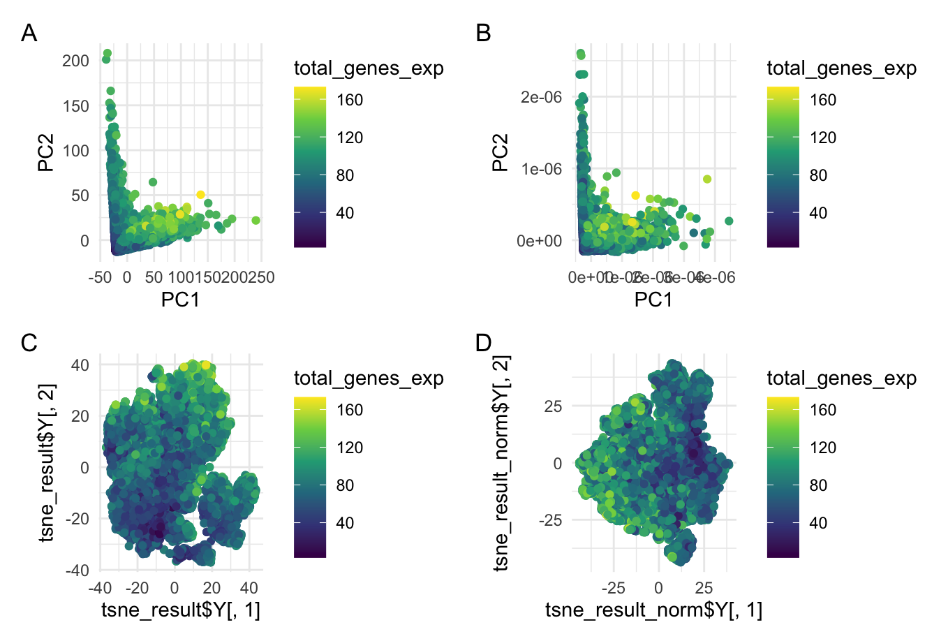
This data visualization is a grid with four plots in which Plot A visualizes Principal Component Analysis (PCA) linear dimensionality reduction on raw gene expression data, Plot B shows PCA on normalized gene expression data, Plot C is a t-SNE nonlinear dimensionality reduction on raw gene expression data, and Plot D is t-SNE on the normalized gene expression data. All four of these plots are encoding the quantitative gene expression level as well as the gene expression level as functions of their principal components (PCA) and t-SNE embeddings. To do this, the geometric primitive used was points to represent cells. The color hue of each point represents the total gene expression level of that cell. On plots A and B, the x-position of the points encodes the first principal component (PC1) while the y-position encodes the second principal component (PC2) of the raw (plot A) and normalized (plot B) data. On plots C and D, the x-position encodes the first embedding and the y-position encodes the second embedding of the raw (plot C) and normalized (plot D) data. The t-SNE dimensionality reduction offers a spatial representation of the cell expression data’s structure. This uses Gestalt’s principle of proximity because it clumps similar cells into groups that are more visually apparent.
What happens if I do or do not normalize and/or transform the gene expression data (e.g. log and/or scale) prior to dimensionality reduction?
When analyzing the gene expression data, normalizing the data before applying dimensionality reduction (both linear and nonlinear) can have an important effect on the visualization and interpretation of the results. Normalization primarily impacts the spread of the data distribution so it is important to highlight the difference in axis labels between the raw and normalized data visualizations. For the PCA, the normalized axis labels are much smaller than those of the raw data indicating a much closer distribution for the normalized data. Without normalizing, the data displays a larger variance across the principal components (PC1 and PC2) as seen in plot A. This could potentially skew the data towards a handful of dominant points and obscure observations of biological relevance. In the context of the t-SNE dimensionality reduction, normalization can reveal more distinct groupings in the data representing cell types or cell states. These may not be as apparent in the raw data. Normalization is important to be able to compare across samples and completely analyze biological variations.
#note that the code and the file are in the same directory
## HW 3
## answering the question: should I normalize the gene expression data
## prior to nonlinear dimensionality reduction

## load the data and necessary libraries
library(patchwork)
library(ggplot2)
library(Rtsne)

data = read.csv('pikachu.csv.gz', row.names = 1)
data[1:10, 1:10]
gexp = data[, 6:ncol(data)]
rownames(gexp) = data$cell_id

## normalize by number of genes
gexpnorm = log2(gexp/rowSums(gexpfilter)+mean(rowSums(gexpfilter)))

## find total number of genes expressed (from jwang248 code)
exp_count <- rowSums(gexp != 0)
total_genes_exp = as.numeric(exp_count)

## PCA
pcs = prcomp(gexp)
pcs_norm = prcomp(gexpnorm)
dim(pcs$x)
plot(pcs$sdev[1:30])
plot(pcs_norm$sdev[1:30])


df = data.frame(pcs$x)
df_norm = data.frame(pcs_norm$x)

## plot the linear dimensionality reduction for normalized and raw data
p1 = ggplot(df) + geom_point(aes(x = PC1, y = PC2, col = total_genes_exp)) +
  scale_color_viridis_c() + theme_minimal()
p2 = ggplot(df_norm) + geom_point(aes(x = PC1, y = PC2, col = total_genes_exp)) +
  scale_color_viridis_c()+ theme_minimal()

## running Rtsne for normalized and raw data
tsne_result = Rtsne(pcs$x[, 1:50], is_distance = FALSE)
tsne_result_norm = Rtsne(pcs_norm$x[, 1:50], is_distance = FALSE)

## plot the tsne results (normalized and raw)
p3 = ggplot() +
  geom_point(aes(x = tsne_result$Y[,1], y = tsne_result$Y[,2], col = total_genes_exp)) +
  scale_color_viridis_c() +
  theme_minimal()

p4 = ggplot() +
  geom_point(aes(x = tsne_result_norm$Y[,1], y = tsne_result_norm$Y[,2], col = total_genes_exp)) +
  scale_color_viridis_c()+
  theme_minimal()


## plotting the results using patchwork
p1 + p2 + p3+p4+ plot_annotation(tag_levels = 'A') + plot_layout(ncol=2)

## credit to class code + notes