Varying non-linear dimensionality reduction on PCs

###I explored the question: If I perform non-linear dimensionality reduction on PCs, what happens when I vary how many PCs should I use?
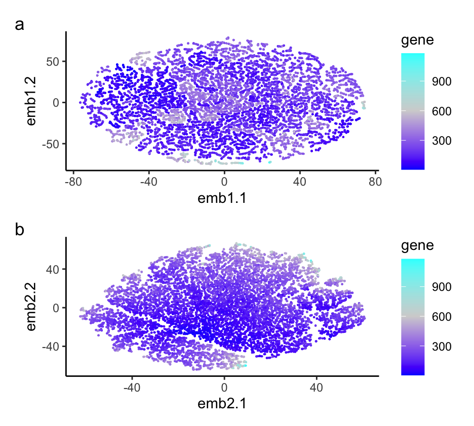
I am visualizing the non-linear dimensionality reduction on varying PCs of 2 and 30, as well as the variance between gene expression in each cell. I am using the geometric primitive of points to represent each gene. I am using the geometric primitive of color saturation to encode the variance in each gene expression per cell. I am also using the geometric primitive of positions to tell how close each cell type is to each other. I am using the gestalt principle of proximity by putting the two different graphs next to each other. I am also using the Gesalt principle of similarity to show the differences between the two graphs with varying numbers of PCs. My data visualization seeks to make more salient the relationship between more PCs in non-linear dimensionality reduction of gene expression. Overall, it’s hard to tell the relationship between cells. The more PCs we include in the data set, the more information we can determine about the data set. For example, in the plot with 30 PCs, we can see some distinct clustering, while in the plot with 2 PCs, we can’t see any clustering.
data <- read.csv('~/Documents/genomicsDataVisualization/pikachu.csv.gz', row.names = 1)

library(ggplot2)
library(gridExtra)
library(Rtsne)
library(patchwork)

gexp <- data[, 6:ncol(data)]
topgene <- names(sort(apply(gexp, 2, var), decreasing=TRUE))
gexpfilter <- gexp[,topgene]
dim(gexpfilter)
pcs <- prcomp(gexpfilter)

emb1 <- Rtsne(pcs$x[, 1:2], dims = 2, perplexity = 5)
emb2 <- Rtsne(pcs$x[, 1:30], dims = 2, perplexity = 5)
df <- data.frame(pcs$x[, 1:2], emb1 = emb1$Y, emb2 = emb2$Y, gene = rowSums(gexpfilter))
p1 <- ggplot(df) + geom_point(aes(x = emb1.1, y = emb1.2, col = gene), size = 0.1) +
  scale_colour_gradient2(low = 'blue', mid = 'lightgrey', high = 'cyan', midpoint = 600) + theme_classic()
p2 <- ggplot(df) + geom_point(aes(x = emb2.1, y = emb2.2, col = gene), size = 0.1) +
  scale_colour_gradient2(low = 'blue', mid = 'lightgrey', high = 'cyan', midpoint = 600) + theme_classic()
p1 + p2 + plot_annotation(tag_levels = 'a') + plot_layout(ncol = 1)