Comparison of Gene Influence on PC1 in Raw and Cell Area-Normalized Data

Write a description describing your data visualization using vocabulary terms from Lesson 1.
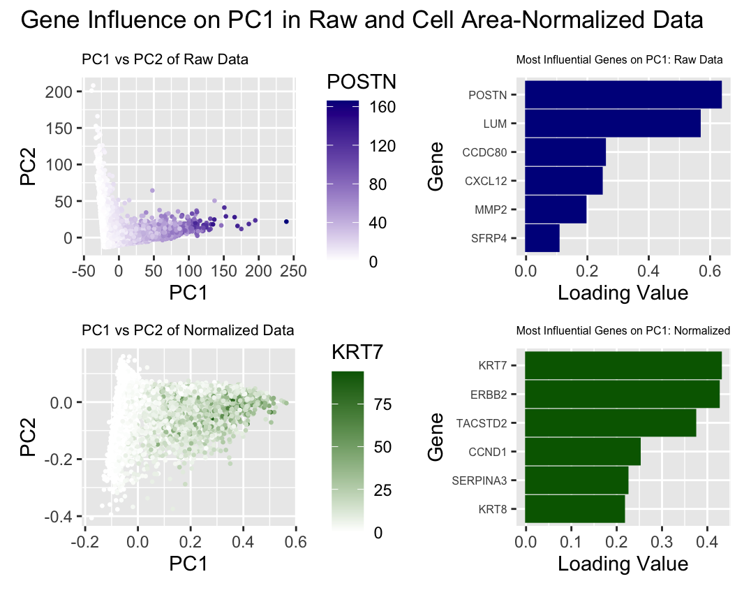
What data types are you visualizing? What data encodings (geometric primitives and visual channels) are you using to visualize these data types? What about the data are you trying to make salient through this data visualization? What Gestalt principles or knowledge about perceptiveness of visual encodings are you using to accomplish this? I am visualizing quantitative data (the PC1 and PC2 values for each cells POSTN/KRT7 expression in each cell, and the loading values for 12 total genes), as well as categorical data (raw and normalized expression, the genes with the 6 highest loading values for each set of data). I am using geometric primitives of points to represent the cells and areas to represent the 6 genes with the largest loading values for both raw and normalized data. I am encoding the PC1 values with the x position visual channel and PC2 values with the y position visual channel. I am encoding POSTN expression with color saturation from white to dark blue, and KRT7 expression with color saturation from white to green in the scatter plots. I am encoding loading values with position along the x axis in the bar graphs. To encode the categorical data of raw vs normalized results, I used the visual channel of color hues, with dark blue representing principle component analysis performed with raw data, and dark green representing principle component analysis performed on data normalized by cell area. To encode the individual genes within the bar plots, I used the visual channel of y position.
I am trying to make salient how normalization of gene expression by cell area can influence principle component analysis. To do this, I used the Gestalt principles of similarity and proximity to group the results from raw and normalized data by color and position. I used similarity within the scatter plots to illustrate cells with similar POSTN/KRT7 expression levels, with color saturation being a better channel for ordered quantitative data. I used proximity within the bar plots to illustrate the influence each gene had on PC1, with position being an optimal visual channel for quantitative data. I made both a scatter plot to reflect all of the PC1 and PC2 data for both categories, as well as bar graphs to show how different genes had greater influence on PC1 in the raw vs. normalized data.
library(patchwork)
library(ggplot2)

## set up set of genes expressed
data <- read.csv('pikachu.csv.gz', row.names = 1)
pos <- data[,4:5]
gexp <- data[, 6:ncol(data)]

## normalizing by total number of genes expressed per cell
## Source:
## https://www.tutorialspoint.com/how-to-divide-each-column-by-a-particular-column-in-r

total <- rowSums(gexp)
norm1 <- gexp/data$cell_area

## Principle component analysis
pcs <- prcomp(gexp)
pc2 <- prcomp(norm1)

## determine genes w/ greatest loading values on PC1 for raw and norm data
## Sources: Dr. Fan's code
## https://www.geeksforgeeks.org/change-column-name-of-a-given-dataframe-in-r/

h1 <- as.data.frame(head(sort(pcs$rotation[,1], decreasing=TRUE)))
colnames(h1) <- c('loading_val')
h2 <- as.data.frame(head(sort(pc2$rotation[,1], decreasing=TRUE)))
colnames(h2) <- c('loading_val')

## plotting PCs based on raw data
## Sources:
## https://www.tutorialspoint.com/how-to-increase-the-x-axis-labels-font-size-using-ggplot2-in-r
## https://community.rstudio.com/t/ggplot-barplot-in-decending-order/31126
## https://r-graph-gallery.com/218-basic-barplots-with-ggplot2.html

df <- data.frame(pcs$x[,1:4], POSTN = gexp$POSTN)
p1 <- ggplot(df) + geom_point(aes(x = PC1, y = PC2, col = POSTN), size = 0.5) +
  scale_colour_gradient(low = 'white', high = 'darkblue') +
  labs(title = 'PC1 vs PC2 of Raw Data') +
  theme(plot.title = element_text(size = 8))
p2 <- ggplot(h1) +
  geom_bar(aes(y = reorder(rownames(h1), loading_val), x = loading_val),
           stat = "identity", color = 'darkblue', fill = 'darkblue') +
  ylab('Gene') + xlab('Loading Value') +
  labs(title = 'Most Influential Genes on PC1: Raw Data') +
  theme(plot.title = element_text(size = 6)) +
  theme(axis.text.y=element_text(size=6))


## plotting PCs based on normalized data
## Sources:
## https://www.tutorialspoint.com/how-to-increase-the-x-axis-labels-font-size-using-ggplot2-in-r
## https://community.rstudio.com/t/ggplot-barplot-in-decending-order/31126
## https://r-graph-gallery.com/218-basic-barplots-with-ggplot2.html

df2 <- data.frame(pc2$x[,1:2], KRT7 = gexp$KRT7)
p3 <- ggplot(df2) + geom_point(aes(x = PC1, y = PC2, col = KRT7), size = 0.5) +
  scale_colour_gradient(low = 'white', high = 'darkgreen') +
  labs(title = 'PC1 vs PC2 of Normalized Data') +
  theme(plot.title = element_text(size = 8))
p4 <- ggplot(h2) +
  geom_bar(aes(y = reorder(rownames(h2), loading_val), x = loading_val),
           stat = "identity", color = 'darkgreen', fill = 'darkgreen') +
  ylab('Gene') + xlab('Loading Value') +
  labs(title = 'Most Influential Genes on PC1: Normalized') +
  theme(plot.title = element_text(size = 6)) +
  theme(axis.text.y=element_text(size=6))

## Combining the plots
## Source:
## https://patchwork.data-imaginist.com/reference/plot_annotation.html

p1 + p2 + p3 + p4  +
  plot_annotation(title = 'Gene Influence on PC1 in Raw and Cell Area-Normalized Data')