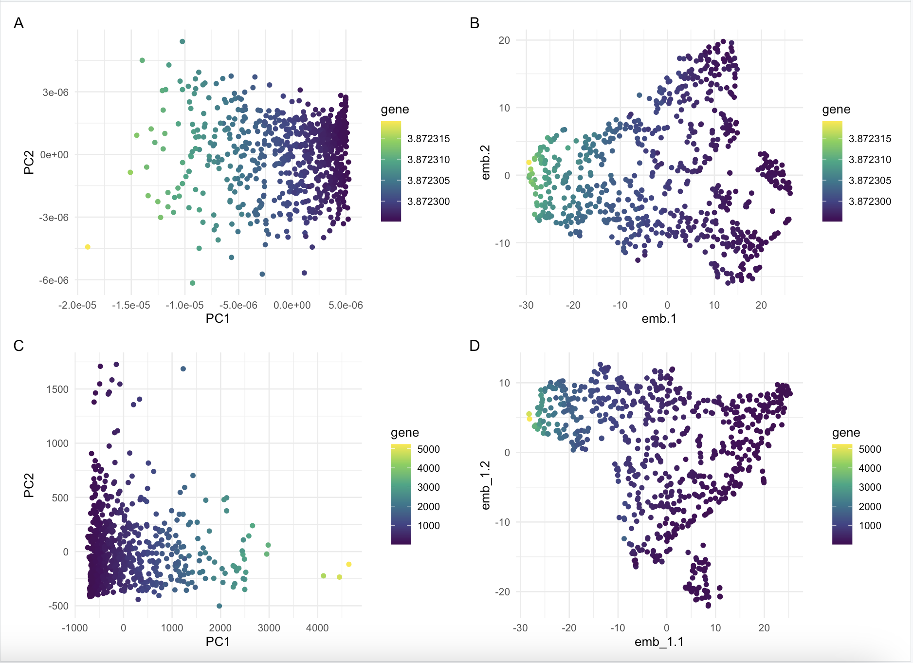
Comparison between normalized vs not normalized dimensionality reduction on IGKC expression

What happens if I do or not not normalize and/or transform the gene expression data (e.g. log and/or scale) prior to dimensionality reduction?
I compared dimensionality reduction on normalized vs not normalized gene expression. I ran both linear and non linear dimensionality reduction to compare the results. It seems that it does not make too big of a difference in terms of how the colors are spreadout, but the layout of the graphs are different and seems to be reflected over a horizontal line.
Write a description describing your data visualization using vocabulary terms from Lesson 1.
My data visualization uses the geometric primitive of points to describe the quantitative data of the log transformed gene expression, principle components and scaled similarity metrics. The visual channels used in my visualization are x and y position which correspond to principle components and scaled similarity metrics. In addition, my visualization employs the use of color hue to represent the quantitative data of gene expression. The Gestalt prinicples used in my visualization are the principles of similarity through color hue and proximity, as points that are closer to each other seem to be grouped together.
Please share the code you used to reproduce this data visualization.
#install.packages('Rtsne')
#install.packages('ggplot2')

library(Rtsne)
library(ggplot2)

data <- read.csv('/Users/conniechen/Documents/Genomic Data Visualization 2024/GDV HW/eevee.csv.gz', row.names = 1)
dim(data)

data[1:5, 1:5]

pos <- data[, 2:3]
gexp <- data[, 4:ncol(data)]

# limiting the number of genes
topgene <- names(sort(apply(gexp, 2, var), decreasing = TRUE)[1:1000])
gexpfilter <- gexp[, topgene]
dim(gexpfilter)

# normalizing data
gexpnorm <- log10(gexpfilter/rowSums(gexpfilter) + mean(rowSums(gexpfilter)))

# applying PCA
pcs <- prcomp(gexpnorm)
pcs_1 <- prcomp(gexp)
dim(pcs$x)
plot(pcs$sdev[1:30])
plot(pcs_1$sdev[1:30])

# applying Rtsne
emb <- Rtsne(pcs$x[, 1:15], dims = 2)
emb_1 <- Rtsne(pcs_1$x[, 1:15], dims = 2)
names(emb)

df <- data.frame(pcs$x[, 1:2], emb = emb$Y, gene = gexpnorm$IGKC)
df_1 <- data.frame(pcs_1$x[, 1:2], emb_1 = emb_1$Y, gene = gexp$IGKC)
p1 <- ggplot(df) + geom_point(aes(x = PC1, y = PC2, col = gene)) + theme_minimal() + scale_color_viridis_c()
p2 <- ggplot(df) + geom_point(aes(x = emb.1, y = emb.2, col = gene)) + theme_minimal() + scale_color_viridis_c()
p3 <- ggplot(df_1) + geom_point(aes(x = PC1, y = PC2, col = gene)) + theme_minimal() + scale_color_viridis_c()
p4 <- ggplot(df_1) + geom_point(aes(x = emb_1.1, y = emb_1.2, col = gene)) + theme_minimal() + scale_color_viridis_c()

# reading in patchwork
library(patchwork)
p1 + p2 + p3 + p4 + plot_annotation(tag_levels = 'A') + plot_layout(ncol = 2, nrow = 2)
# p3 + p4 + plot_annotation(tag_levels = 'A') + plot_layout(ncol = 1)

# Credit to Dr. Fan's code during class