Exploring Gene Expression Effects on Linear and Nonlinear Dimensionality Reduction

What’s the difference if I perform linear or nonlinear dimensionality reduction to visualize my cells in 2D?
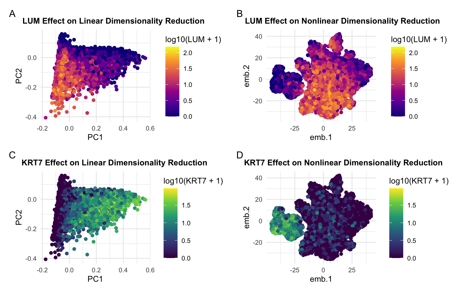
When visualizing the cells in 2D, nonlinear dimensionality reduction showed a more well-defined separation between the two groups of cells. I found that this separation was difficult to observe in the principal components, and this may be because the relationship between the genes that are expressed is not linear. Furthermore, I think the nonlinear dimensionality reduction using T-distributed Stochastic Neighbor Embedding was more effective in showing the dependence of certain cells on the genes with highest and lowest loading value from PCA.
Description of Data Visualization
I’m visualizing quantitative data reprsenting the expression of various genes expressed in each cell as functions of their principal componenets and tsne embeddings. I’m also encoding the quantitative data representing the log10 gene expression of LUM and KRT7, the two genes with lowest and highest loading value respectively.
The geometric primitive of points is used to represent gene expression in each cell.
I am using the visual channel of hue to encode the quantitative gene expression of LUM and KRT7. I’m using the visual channel of position to encode the quantitative information of gene expression as a function of the PCs and embeddings for linear and nonlinear dimensionality reduction.
My data visualization seeks to make more salient the difference between linear and nonlinear dimensionality reduction and how the gene with highest loading value (pannels C & D) and the gene with the lowest loading value (pannels A & B) are respresented differently in the principal components and embeddings. I used the gestault principal of similarity when I represented expression of the same gene with the same color scheme in both the linear and nonlinear plots. I also employed the gestault principal of continuity in the arrangement of the plots to group plots showing expression of the same gene together because people naturally read from left to right, up to down.
What Gestalt principles or knowledge about perceptiveness of visual encodings are you using to accomplish this?
I used similarity as my main method of demonstrating groups because cells expressing the same genes as their top expressed gene are also the same color. Although I didn’t do this explicitly, the cells expressing the same genes are also grouped by proximity.
#HW3

data = read.csv('~/Desktop/GDV class/data/pikachu.csv.gz', row.names = 1)

#import libraries
library(ggplot2)
library(patchwork)
library(Rtsne)


gexp <- data[,6:ncol(data)]

rownames(gexp) <-data$cell_id

#normalize data using cell area
gexpnorm <- gexp/data[,"cell_area"]


#Linear Dimensionality Reduction
pcs <-prcomp(gexpnorm)

#Nonlinear Dimensionality Reduction
emb <- Rtsne(gexpnorm, dims= 2)

#SCREE PLOT
plot(pcs$sdev[1:30], type = 'o')

#Find the gene with greatest and least loading value on PC1
head(sort(pcs$rotation[,1], decreasing = FALSE))
head(sort(pcs$rotation[,1], decreasing = TRUE))


#Plot PC1 and PC2 w/ the genes that have the most drastic effect on PCs
#Highest Loading Value
df = data.frame(pcs$x[,1:2], emb = emb$Y,KRT7 = gexp[,'KRT7'] )
plt_pcs = ggplot(df) + geom_point(aes(x = PC1, y = PC2, col = log10(KRT7+1))) +
  theme_minimal()+scale_color_viridis_c() +
  # labels
  labs(
    title = "KRT7 Effect on Linear Dimensionality Reduction"
  ) +
  # text edit
  theme(
    plot.title = element_text(hjust = 0.25, face="bold", size=10),
    text = element_text(size = 10)
  )

plt_emb = ggplot(df_new) + geom_point(aes(x = emb.1, y = emb.2, col = log10(KRT7+1))) +
  theme_minimal()+scale_color_viridis_c() +
  # labels
  labs(
    title = "KRT7 Effect on Nonlinear Dimensionality Reduction"
  ) +
  # text edit
  theme(
    plot.title = element_text(hjust = 0.25, face="bold", size=10),
    text = element_text(size = 10)
  )


#Lowest Loading Value
df2 = data.frame(pcs$x[,1:2], emb = emb$Y,LUM = gexp[,'LUM'])
plt_pcs2 = ggplot(df2) + geom_point(aes(x = PC1, y = PC2, col = log10(LUM+1)))+
  theme_minimal()+scale_color_viridis_c(option="C")+
  # labels
  labs(
    title = "LUM Effect on Linear Dimensionality Reduction"
  ) +
  # text edit
  theme(
    plot.title = element_text(hjust = 0.25, face="bold", size=10),
    text = element_text(size = 10)
  )
plt_emb2 = ggplot(df2) + geom_point(aes(x = emb.1, y = emb.2, col = log10(LUM+1))) +
  theme_minimal()+scale_color_viridis_c(option="C")+
  # labels
  labs(
    title = "LUM Effect on Nonlinear Dimensionality Reduction",
    legend = "Log10 LUM gene expression"
  ) +
  # text edit
  theme(
    plot.title = element_text(hjust = 0.25, face="bold", size=10),
    text = element_text(size = 10)
  )


#Format the 4 plots
plt_pcs2 + plt_emb2 + plt_pcs + plt_emb+ plot_annotation(tag_levels = 'A')+
  plot_layout(ncol = 2)