Comparison of Linear and Nonliner Dimensionality Reduction

What’s the difference if I perform linear or nonlinear dimensionality reduction to visualize my cells in 2D?
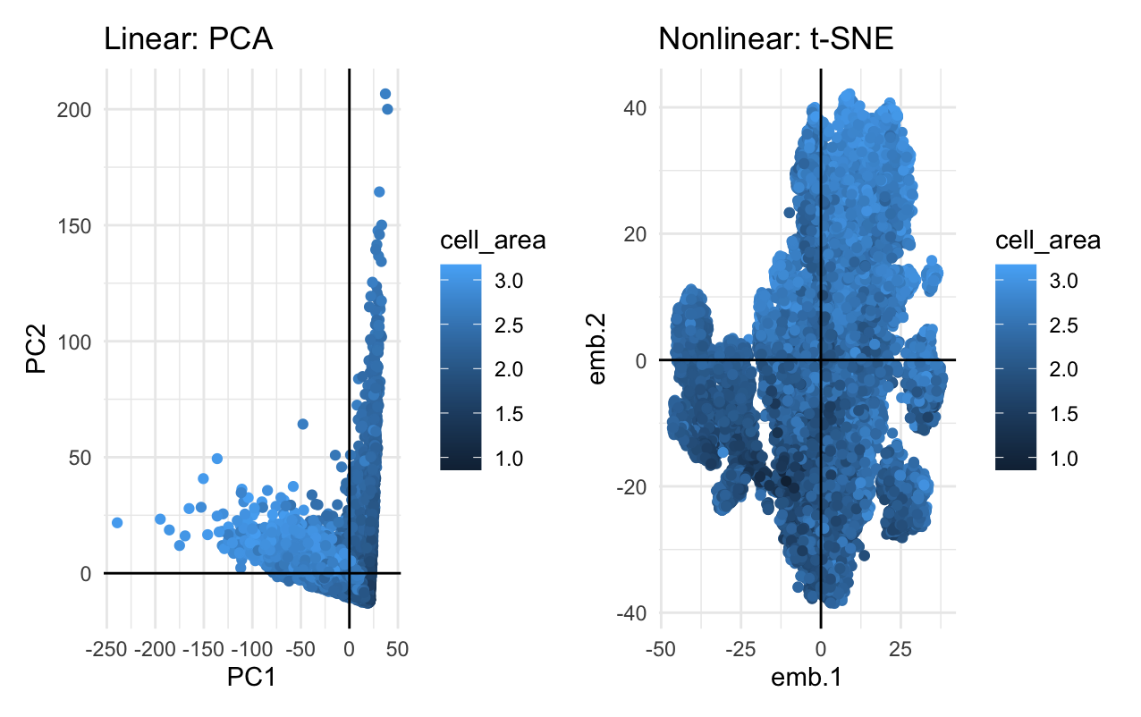
Linear dimensionality reductions, such as principle component analysis, works best with data that is linear by focusing on variance, while nonlinear dimensionality reductions, such as t-distributed stochastic neighbor embedding, focuses on preserving small pairwise distances in order to focus on the relationships between pairs of points. As such, if you perform linear dimensionality reduction, you are getting a visualization of where the cells are with respect to a physical location, but if you perform nonlinear dimensionality reduction, you are getting a visualizaiton of how cells relate to each other.
Source: https://www.datacamp.com/tutorial/introduction-t-sne
Write a description describing your data visualization using vocabulary terms from Lesson 1.
My data visualization uses the geometric primitive of point to represent the cells with the top 100 genes according to variance. In the linear dimensionality reduction plot (left), I am using the visual channel of x-position to represent a cell’s correlation with PC1: the principle component with the most variation, and the visual channel of y-position to represent a cell’s correlation with PC2: the principle component with the second most variation. In the nonlinear dimentionsality reduction plot (right), I am using the visual channel of x and y position to represent a cell’s correlation with embeddings 1 and 2, respectively. For both visualizations, I am using the visual channel of hue to represent the log of the cell’s area. My data visualization represents the quantitative data of all correlations and logarithms of cell area measurements.
The entire code used to generate the figure so that it can be reproduced.
library(ggplot2)
library(Rtsne)
library(patchwork)

data <- read.csv('pikachu.csv.gz', row.names = 1)
dim(data) # ~300 genes and ~17000 cells
data[1:5, 1:7]
pos <- data[,4:5] # aligned_x and aligned_y
gexp <- data[,6:ncol(data)] # gene names

# WHAT IS THE DIFFERENCE IF I PERFORM LINEAR OR NONLINEAR DIMENSIONALITY
# REDUCTION TO VISUALIZE MY CELLS IN 2D

# Limit Data
topgene <- names(sort(apply(gexp, 2, var), decreasing = TRUE)[1:100])
gexpfilter <- gexp[,topgene]
dim(gexpfilter)

# Linear: PCA
pcs <- prcomp(gexpfilter)
df_l <- data.frame(PC1 = pcs$x[,1], PC2 = pcs$x[,2], cell_area = log10(data$cell_area))
p_l <- ggplot(df_l) +
  geom_point(aes(x = PC1, y = PC2, col = cell_area)) +
  labs(title = "Linear: PCA") +
  theme_minimal() +
  geom_hline(yintercept = 0, linetype = "solid", color = "black") +
  geom_vline(xintercept = 0, linetype = "solid", color = "black")

# Non-Linear: tSNE
emb <- Rtsne(gexpfilter)
df_nl <- data.frame(emb.1 = emb$Y[,1], emb.2 = emb$Y[,2], cell_area = log10(data$cell_area))
p_nl <- ggplot(df_nl) + geom_point(aes(x = emb.1, y = emb.2, col = cell_area)) +
  labs(title = "Nonlinear: t-SNE") +
  theme_minimal() +
  geom_hline(yintercept = 0, linetype = "solid", color = "black") +
  geom_vline(xintercept = 0, linetype = "solid", color = "black")

# Compare Plots
p_l + p_nl

# Source: x/y-axis lines using geom_hline and geom_vline from ChatGPT