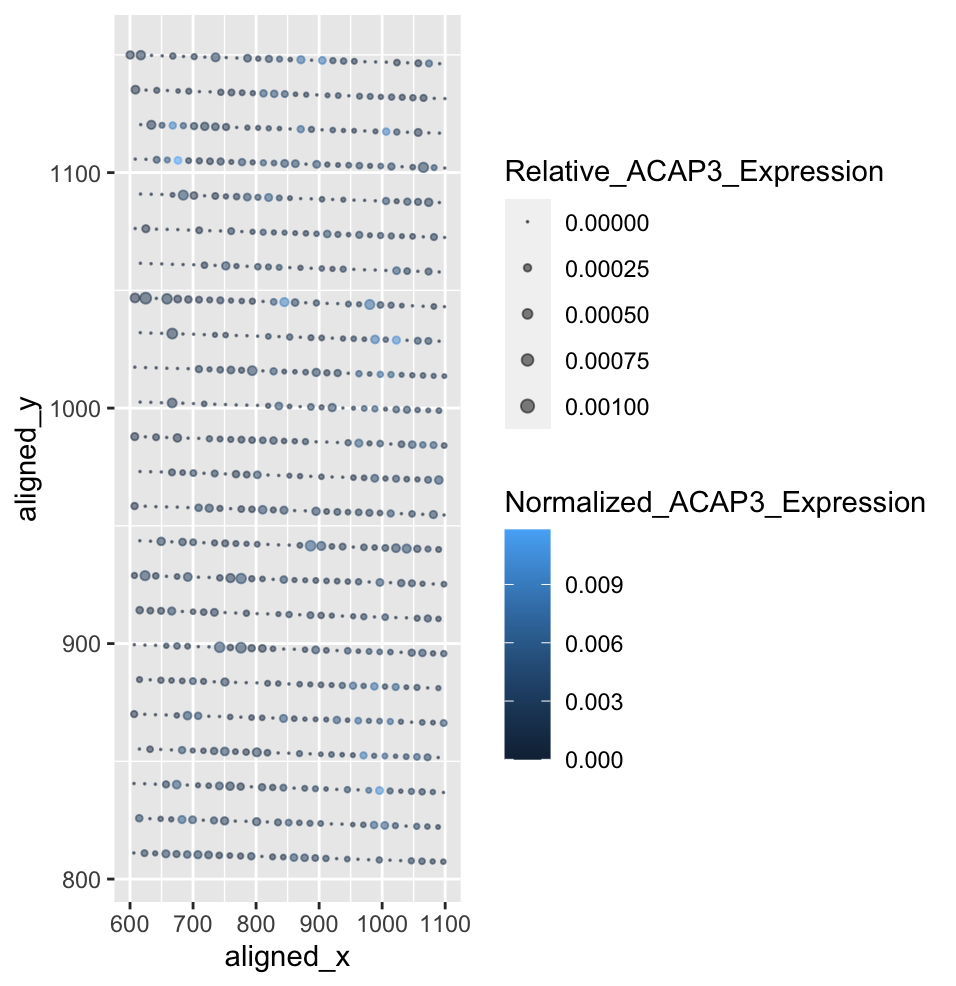
Characterization of Spatial ACAP3 Gene Expression Relative to Total and Single Gene Expression

Whose code are you applying? Provide a JHED
I am applying April Yan’s code. Her JHED is yyan67.
Critique the resulting visualization when applied to your data. Do you think the author was effective in making salient the point they said they wanted to make? How could you improve the data visualization in making salient the point they said they wanted to make? If you don’t think the data visualization can be improved, explain why the data visualization is already effective.
April’s visualization displayed cells as points along the x,y axis. The ratio of nucleus area to cell area was shown using color hue of the point, and cell area was shown using size of the point. My visualization displayed the fraction of ACAP3 gene expression to total gene expression at each bead using point size, and the fraction of ACAP3 gene expression at each bead to total ACAP3 gene expression using color saturation. Initially, using color hue made it difficult to visualize the cell locations on my visualization as the eevee dataset is far more ordered, and the ratios are smaller. I also had to change the size limits of the point size, as April’s data had far larger values. The visualization effectively describes the normalized ACAP3 gene expression, and the fractions make the values easier to understand. However, since the eevee data relies on beads rather than cells, the ordered nature of the data is a little redundant and the point sizes are lacking in displaying spatial truth. For this, a different ggplot item would need to be used.
data <- read.csv('eevee.csv.gz', row.names = 1)
library(ggplot2)
#parse data to numerical columns
data2 <- data[, 4:ncol(data)]

#total genes expressed at each barcode
totalGeneExpression <- rowSums(data2)

#total of a single gene expressed
singleGeneExpression <- colSums(data2)

#total ACAP3 expression
ACAP3GeneExpression <- singleGeneExpression["ACAP3"]

#ACAP3 expression as a fraction of total gene expression at each bead
data$Relative_ACAP3_Expression =  data$ACAP3/totalGeneExpression

#ACAP3 expression at each bead as a fraction of total ACAP3 expression
data$Normalized_ACAP3_Expression = data$ACAP3/ACAP3GeneExpression

ggplot(data) +
  #color scale changed to normalized ACAP3 expression, size changed to ACAP3 expression as a fraction of total gene expression
  geom_point(aes(x = aligned_x, y = aligned_y, color=Normalized_ACAP3_Expression, size=Relative_ACAP3_Expression), alpha=0.5) +
  #limits changed to (0, .001)
  scale_size(range=c(0,2), limits = c(0,.001)) +
  # color scale changed to gradient
  scale_color_continuous(type="gradient")