Critique of Wenyu Yang's 'A Spatial Plot of POSTN Levels in Breast Cancer Tissue'

Whose code are you applying? Provide a JHED
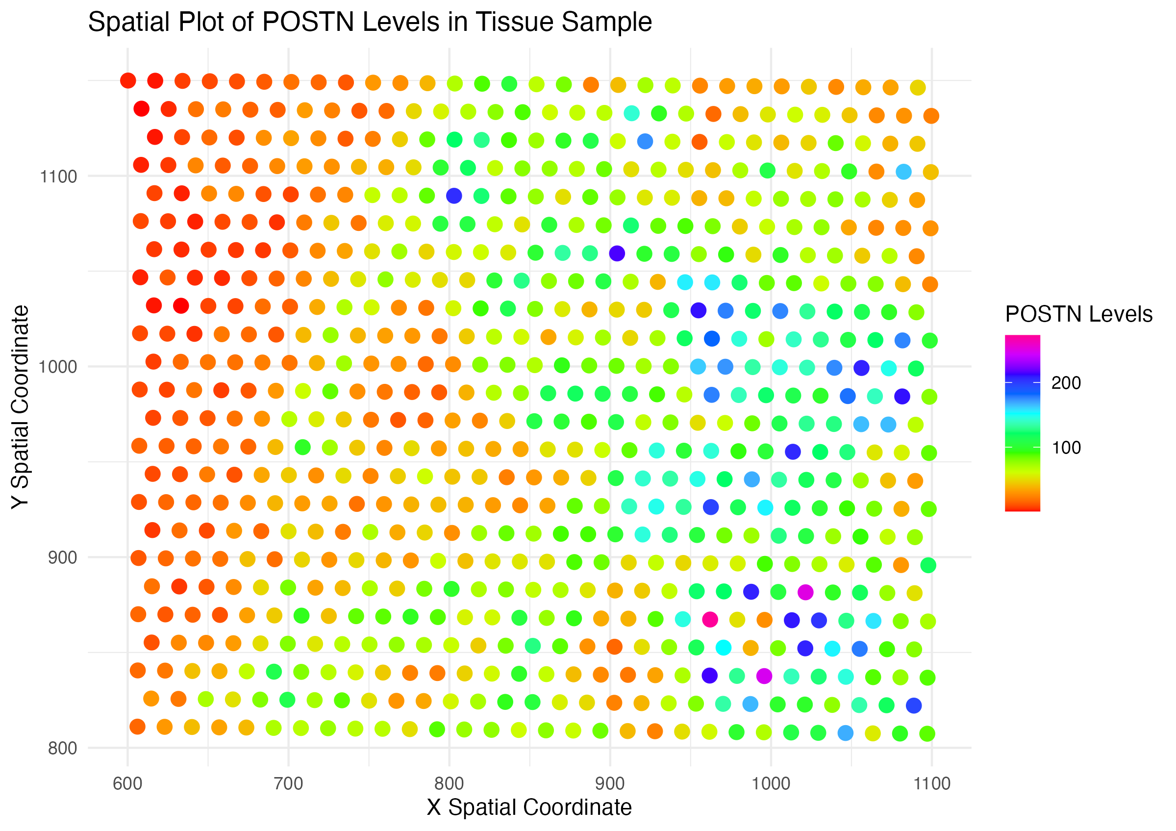
I am critiquing Wenyu Yang’s (wyang51) “A Spatial Plot of POSTN Levels in Breast Cancer Tissue” https://jef.works/genomic-data-visualization-2024/blog/2024/01/28/wyang51/.
Do you think the author was effective in making salient the point they said they wanted to make?
When applied to the Eevee data set, I believe the author does make salient the spatial distribution of POSTN expression in the tissue sample. There are clear areas of low and high expression that follows a meaningful gradient with regards to hue (transitioning from red to purple). With regards to the Pikachu data set, I find it hard to interpret the expression levels in each cell as the points too small to visualize without zooming in.
How could you improve the data visualization in making salient the point they said they wanted to make?
Overall, the data could be better represented if the expression of POSTN was adjusted to be a representation of the total gene expression of a cell or the cell size. Additionally, the purple hue is hard to distinguish from the red/ orange hue. Thus, I would suggest changing to a one or two color scale to improve saliency. The gesalt principle of enclosure may also be applied to highlight regions of high expression thorugh a polygonal enclosing. Specifically for the original visualization on the pikachu dataset, I would add a size component to the points such that higher expression of POSTN stand out more.
Below is the code adapted from Wenyu Yang’s “A Spatial Plot of POSTN Levels in Breast Cancer Tissue” to fit the Eevee dataset.
data <- read.csv("/Users/knm/github/genomic-data-visualization-2024/data/eevee.csv.gz", row.names = 1)
dim(data)
colnames(data)

data[1:10, 1:10]

geneExpression <- data[,6:ncol(data)]

library(ggplot2)

gene_mean_expression <- apply(geneExpression, 2, mean)

most_expressed_gene <- names(gene_mean_expression)[which.max(gene_mean_expression)]

print(paste("Most expressed gene:", most_expressed_gene))

plot <- ggplot(data) +
  geom_point(aes(x = aligned_x, y = aligned_y, color = POSTN), size = 3) +
  labs(title = "Spatial Plot of POSTN Levels in Tissue Sample",
       x = "X Spatial Coordinate",
       y = "Y Spatial Coordinate",
       color = "POSTN Levels") +
  scale_color_gradientn(colors = rainbow(10))+
  theme_minimal()