Critique of CCDC80 spatial expression

Whose code are you applying? Provide a JHED
I am recreating the code of aperei13.
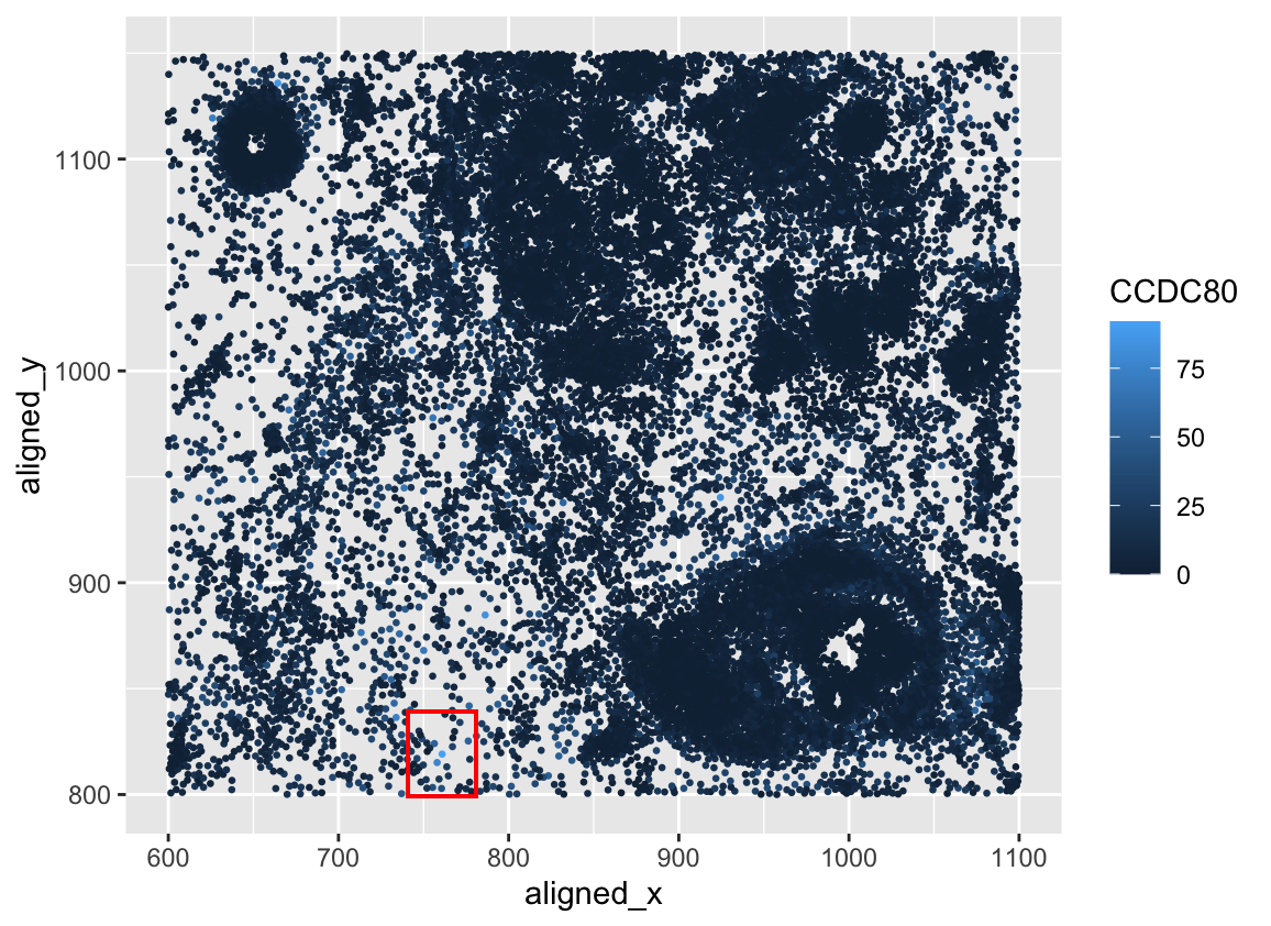
Critique the resulting visualization when applied to your data. Do you think the author was effective in making salient the point they said they wanted to make? How could you improve the data visualization in making salient the point they said they wanted to make? If you don’t think the data visualization can be improved, explain why the data visualization is already effective.
I think the author was mostly effective in making the highest expression of CCDC80 in a spatial field. It is hard to know that that box is the highest expression due to the bright, full red box. It would be great if the alpha of the red box were lower so I could see into the region and visualize the highest expressed region of this gene. Rather than a red box, I suggest making a second plot of the zoomed-in region of this high expression of this gene. Another thing is to make the size of the gene expression smaller so I can see all of the surrounding light hue points.
# got help from https://sape.inf.usi.ch/quick-reference/ggplot2/geom_rect

outpth <-'~/genomicsDataVisualization/'

file <- '~/Documents/genomicsDataVisualization/pikachu.csv.gz'
data <- read.csv(file, row.names=1)

library(ggplot2)

head(data)

# Get coordinates of max CCDC80 region
max_region <- data[which.max(data$CCDC80), c("aligned_x", "aligned_y")]
xmin <- max_region$aligned_x[1] - 20
xmax <- max_region$aligned_x[1] + 20
ymin <- max_region$aligned_y[1] - 20
ymax <- max_region$aligned_y[1] + 20

im_xy_genes<- ggplot(data)+
    geom_point(aes(x=aligned_x,y=aligned_y,
                    col=CCDC80), size = 0.5) +
     geom_rect(aes(xmin = xmin, xmax = xmax, ymin = ymin, ymax = ymax),
               linetype = 1, color = 'red', alpha = 0)

ggsave(paste0(outpth, "hw2_jmoor185.png"), plot = im_xy_genes)