Most Expressed Genes in Breast Cancer Tissue Single Cell Spatial Transcriptomic Data

What data types are you visualizing?
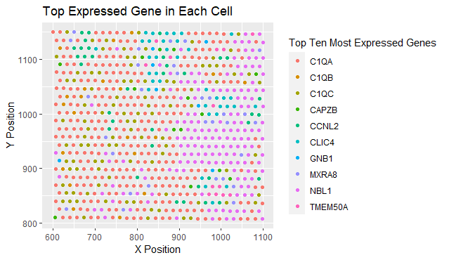
The spatial data regarding the x,y centroid positions for each cell are visualized, and the categorical data representing the most expressed gene in each cell.
What data encodings (geometric primitives and visual channels) are you using to visualize these data types?
The geometric primitive of points are used to represent each cell. To encode the categorical information of which gene is expressed, the visual channel of color. To encode the quantitative information of x,y centroid positions, the visual channel of position is used.
What about the data are you trying to make salient through this data visualization?
The data visualization seeks to make more salient the relationship between gene expression and the cell position. The person who created the visualization wanted to highlight how certain genes are broadly expressed while cells expressing other genes are clustered together.
What Gestalt principles or knowledge about perceptiveness of visual encodings are you using to accomplish this?
Similarity as the main method of demonstrating groups. The cells expressing the same genes are also grouped by proximity.
NOTE Since the adaptation of the visualization is for the eevee dataset which is from a sequencing based approach with predecided barcodes, the location of expression has little importance. Instead of a gradient, I would use size of the points to make the expression counts more salient for this dataset.
```{r}
data <- read.csv(‘C:/Users/Kaashvi Pruthi/Downloads/Genomic data visualization/eevee.csv.gz’, row.names = 1) library(ggplot2) library(dplyr)
#find top expressed genes top_genes <- names(sort(colMeans(data[, 6:318], na.rm = TRUE), decreasing = TRUE))[1:10]
#filter data to only include columns with top 10 genes data_filtered <- data %>% select(aligned_x, aligned_y, all_of(top_genes))
#find the most expressed gene for each cell filtered_highest_expression <- apply(data_filtered[, 3:12], 1, function(x) names(x)[which.max(x)])
#highest expressed gene in each cell: ggplot(data_filtered, aes(x = aligned_x, y = aligned_y, col = filtered_highest_expression)) + geom_point() + labs(title = “Top Expressed Gene in Each Cell”, x = “X Position”, y = “Y Position”, color = “Top Ten Most Expressed Genes”)