Classmate Visualization: Spatial Distribution of Gene Expression

Whose code are you applying?
I am applying Kiki Zhang’s code for Spatial Distribution of Gene Expression.
Critique the resulting visualization when applied to your data. Do you think the author was effective in making salient the point they said they wanted to make? How could you improve the data visualization in making salient the point they said they wanted to make? If you don’t think the data visualization can be improved, explain why the data visualization is already effective.
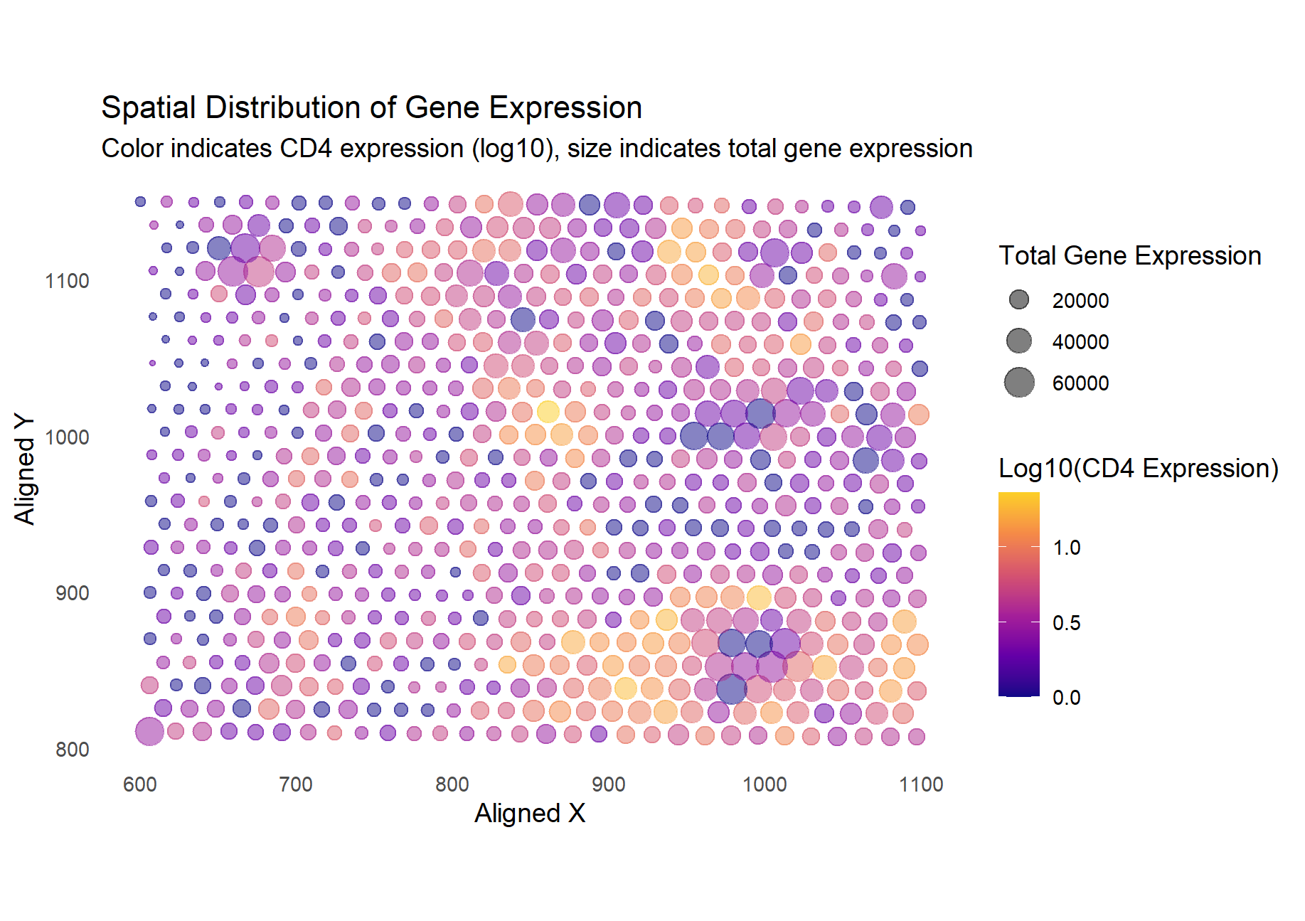
Kiki Zhang stated that they would like to emphasize the connection between spatial distribution/expression of a gene and the total transcriptional activity at the spot. To achieve this aim, they utilized two visual channels: color to indicate the gene expression of TP53 and size for the overall transcriptional activity. Kiki links these two elements by their spatial location. I particularly liked how varying the size creates noticable clusters, giving a physical feel of the overall higher transcriptional activity. From these clusters, it is easy to spot high levels of TP53 expression thanks to the bright yellow color.
I applied the visualization code for my dataset, which looked at CD4 expression. Unlike for TP53, CD4 expression seems to have less of a relationship with overall transcriptional activity, making it not as visually satisfying as the original visualization. However, it still manages to convey any relationships between the location and CD4 vs overall gene activity. Overall, the author was effective in making salient the relationship between TP53 and overall gene expression levels based on their spatial location.