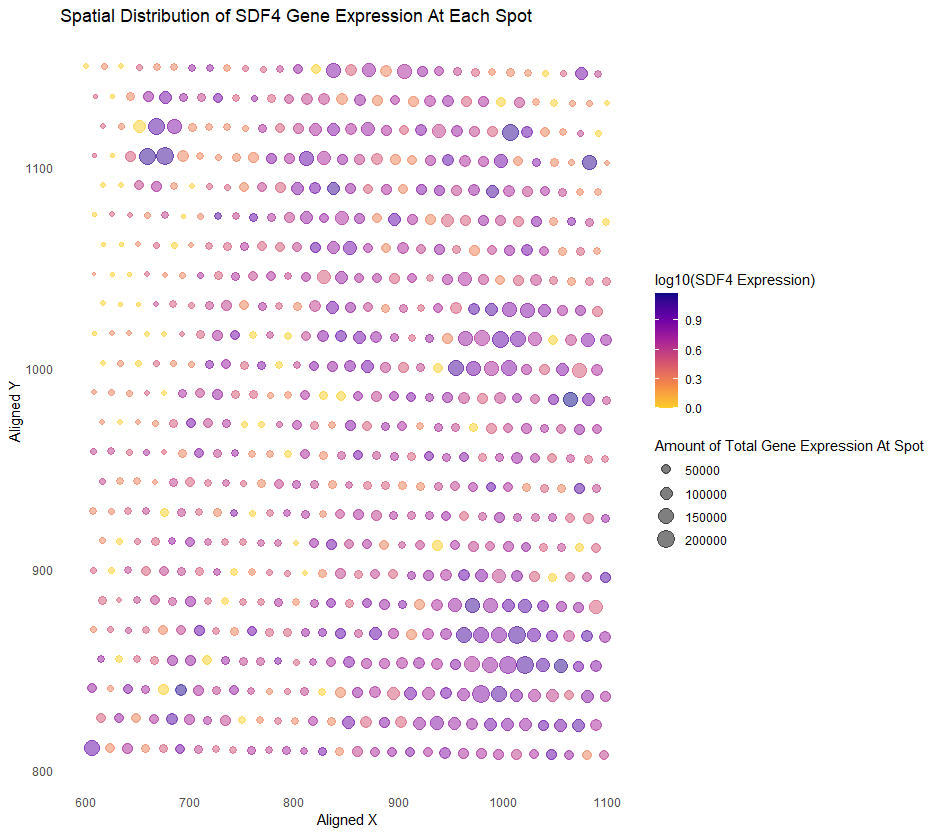
Spatial Distribution of the SDF4 Gene Expression At Each Spot

Whose code are you applying? Provide a JHED
I am applying Kiki Zhang’s visualization code to my data. Kiki’s JHED is szhan128.
Critique the resulting visualization when applied to your data. Critique this visualization. Do you think the author was effective in making salient the point they wanted to make? How could you improve the visualization in making salient the point they wanted to make? If you don’t think the visualization can be improved, explain why the visualization is already effective.
I think the original author was salient in making salient the point they wanted to make. In Kiki’s original visualization, Kiki wanted to show the expression levels of the TP53 gene in a spot as well as the total expression of all genes in a spot, and see if there was any relationship. Although we used the same dataset, I decided to focus on the SDF4 gene for my visualization. I think it’s clear that in areas with higher SDF4 expression, there was also higher gene expression overall, and you can see the specific areas where that is true. I think using color hues to show the level of desired gene expression is smart, and plasma hues generated by ggplot are perfect in the case someone is colorblind. It’s why using a bubble chart is better than a heatmap. However, I disliked how, originally, a lighter yellow indicated a higher gene expression of the desired gene, and a darker purple color indicated a lower gene expression. I find the reverse more intuitive, so that is what I changed in my visualization. Having the saturation of each point be a little light is also good in the case any spots overlap. Also, the use of size to show higher total gene expression is intuitive. Besides my small change with color, I think to improve the visualization, we can use the Gestalt principle of enclosure if they’re a particular region we want to highlight, for example, areas where there are darker, larger points, such as the in the bottom right for SDF4. These areas might be significant.
# Dee Velazquez
# HW 2
# I am applying szhan128's code to my data
# Sources: https://ggplot2.tidyverse.org/reference/scale_viridis.html

# I used the 'eevee' data set and so did Kiki
data <- read.csv('eevee.csv.gz', row.names = 1)
# Make data a df
data <- as.data.frame(data)

library(ggplot2)

# Kiki's visualization code
# Total expression levels at each spot
data$total_expression <- rowSums(data[, -(1:3)])
# log10 normalization of gene expression
# Addding + 1 to avoid log10 of zero
data$SDF4_log10 <- log10(data$SDF4 + 1)
# Plot the data
# Option C = plasma
ggplot(data) +
  geom_point(aes(x = aligned_x, y = aligned_y,
                 col = SDF4_log10,
                 size = total_expression),
             alpha = 0.5) +
  scale_color_viridis_c(option = "C", end = 0.9,
                        name = "log10(SDF4 Expression)", direction = -1) + scale_size_continuous(name = "Amount of Total Gene Expression At Spot",                                                                            range = c(1, 6)) +
  labs(
    title = "Spatial Distribution of SDF4 Gene Expression At Each Spot",
    x = "Aligned X",
    y = "Aligned Y"
  ) +
  theme_minimal()+
  theme(
    panel.grid.major = element_blank(),
    panel.grid.minor = element_blank())