Taking a closer look at Jonathan Wang's HW1 Visualization

Whose code are you applying? Provide a JHED.
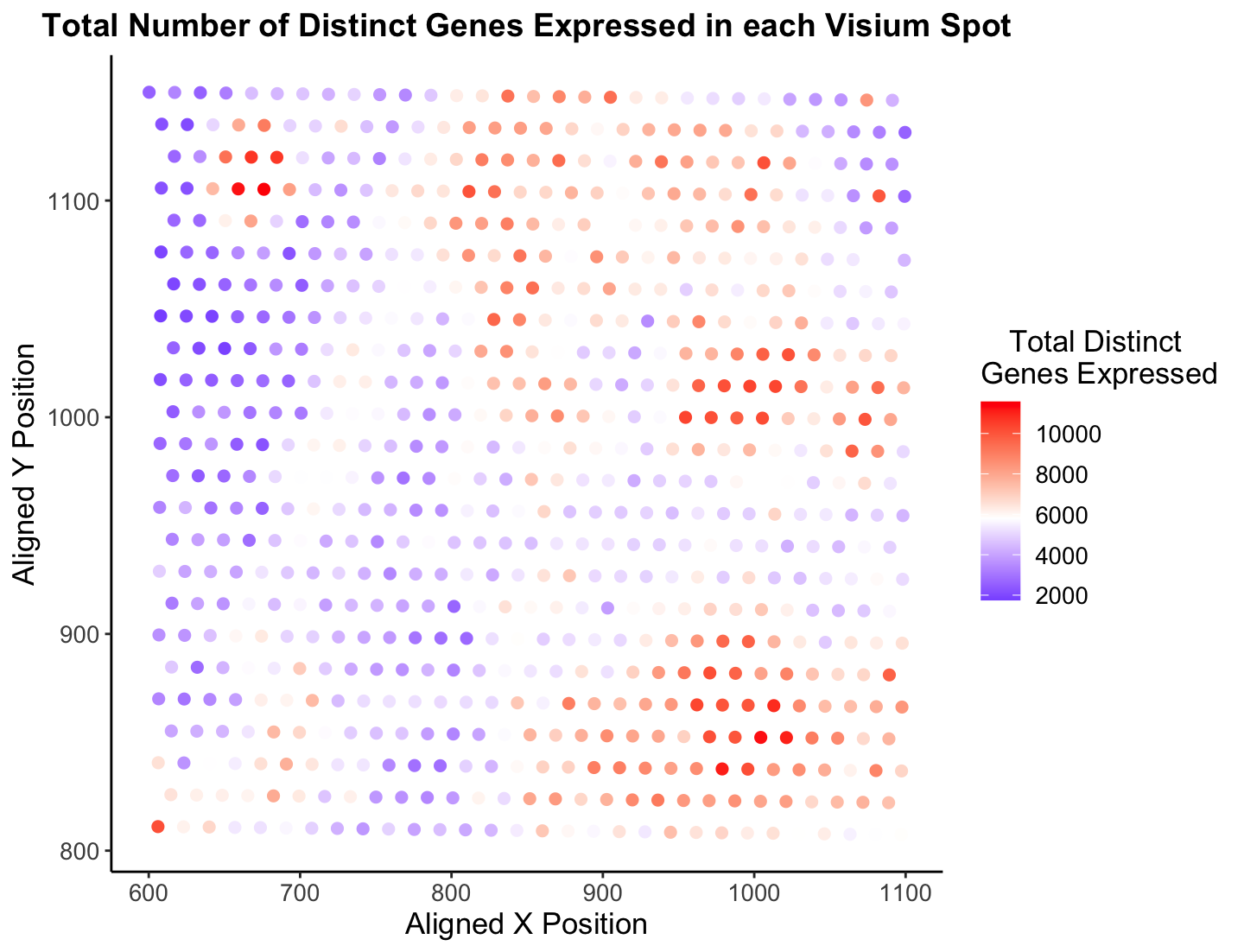
I decided to choose Jonathan Wang’s (JHED = jwang428) visualization from HW1.
Critique the resulting visualization when applied to your data. Do you think the author was effective in making salient the point they said they wanted to make?
Overall, I believe Jonathan’s visualization is certainly effective in making salient the point of how each spatial localization has a diverse amount of gene expression across the sample. Utilizing color as a visual channel for the quantitative variable was an excellent decision in my opinion, as it is easy and intuitive to understand. Further, it is clear there are certain sections in the tissue that have a low “Total Distinct Genes Expressed” (top left in blue) and a high “Total Distinct Genes Expressed” (some top left and bottom right in red). I find this a very cool statistic to analyze, which is why I decided to look into it further!
How could you improve the data visualization in making salient the point they said they wanted to make? If you don’t think the data visualization can be improved, explain why the data visualization is already effective.
There are only a handful of things I would do to make this visualization more salient, and I have done that in the new image presented. First, the color gradient Jonathon choose to use I don’t believe is the easiest to follow. I have found it is best to choose a two or three color gradient, like blue-red which is a common color gradient (think cold to hot), that humans already associate with something else. Also, Rafael (and plenty others) are color blind so it is important to think of them in these plots (At least, I think he would have a hard time looking at this palette, but I could be wrong!) :) I decided to change the gradient to blue-white-red to make the coloring of points more effective. Since the visualization’s goal is to show distinct genes expressed, I think it is ok the white spots blend in with the background. However, I am curious to know what others would do! Another minor change I made is change the theme to have no gray background. Since the x and y-axes values are not of utmost importance, I believe it is fine to have a completely white background with no lines to better contrast the colored points. I did a few other things like make the font slightly bigger, bold the title, and tab the legend to spruce it up a bit. Finally, and this is very nit picky and not really data visualization, I would make the title shorter and more concise. Hope these thoughts make sense, and am open to hear feedback about my suggestions!
### HW2 ###
## Caleb Hallinan ##

# import libraries
library(here)s
library(ggplot2)

# Initialization of variables
data <- read.csv('data/eevee.csv.gz', row.names = 1)

dim(data)
data[1:10, 1:10]
colnames(data)

# Initialization of variables
x_pos <- data[,2]
y_pos <- data[,3]
gen_exp <- data[,4:ncol(data)]
colnames(gen_exp)

# Determine total # of genes expressed by each barcode
gen_exp_count <- rowSums(gen_exp != 0)
total_genes_exp = as.numeric(gen_exp_count)

# making the data visualization
p <- ggplot(data) +
  geom_point(aes(x = x_pos, y = y_pos, col = total_genes_exp), size = 2) +
  xlab("Aligned X Position") +
  ylab("Aligned Y Position") +
  ggtitle("Total Number of Distinct Genes Expressed in each Visium Spot") +
  scale_color_gradient2(midpoint = mean(total_genes_exp), low = "blue", mid = "white", high = "red", space = "Lab" ) +
  # viridis::scale_color_viridis()  +
  # scale_color_gradient(low = "blue", high = "red")
  theme_classic()

p + theme(legend.title.align=0.5,
    plot.title = element_text(hjust = 0.5, face="bold", size=14),
    text = element_text(size = 13)) +
    labs(color="Total Distinct \nGenes Expressed")