Critique of Amanda Kwok's HW1: Relationship between LUM and POSTN Expression

Whose code are you applying? Provide a JHED
I am applying the code of Amanda Kwok (originally for the pikachu dataset) to the eevee dataset. Her JHED is akwok1.
Critique the resulting visualization when applied to your data. Do you think the author was effective in making salient the point they said they wanted to make?
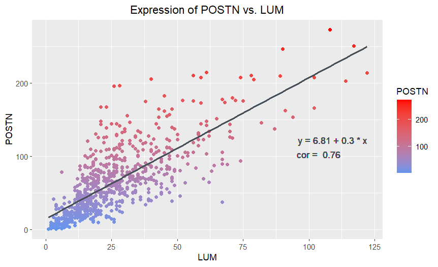
The point that Amanda said she wanted to make salient was “the relationship between LUM gene expression count and POSTN gene expression count.” I believe that Amanda’s visualization was effective at making this salient through her choice of visual channels and Gestalt principles. She used the geometric primitive of points, which is a clear choice for a scatterplot. The visual channel of position, used to encode the quantitative LUM and POSTN expression counts on the x and y axis respectively, has the best resolving time according to the data encoding chart. The POSTN and LUM expression counts for individual or groups of points can be readily assessed by the positions. Plotting the points in this way clearly shows a relatively strong positive linear relationship between POSTN and LUM, which Amanda emphasizes with the trendline and the Gestalt principle of continuity. The added text showing the trendline’s equation and correlation coefficient is a nice touch, allowing the viewer to quantitatively assess the strength of the relationship between POSTN and LUM or predict values. The visualization worked well when applied to the eevee dataset with some minor adjustments to the position of the equation and correlation coefficient text. The overlapping of points in the bottom left is better for the eevee dataset, since it is less dense, than the pikachu dataset, for which the points formed a solid cluster.
How could you improve the data visualization in making salient the point they said they wanted to make?
I would suggest changing the variable encoded by the color hue of the points from POSTN to something else or considering eliminating that visual channel entirely. I think that using the visual channel of position to encode the POSTN expression count is sufficient, since position has the best resolving time for quantitative data, and there is no need to double encode. Rather, I think this addition makes the data visualization appear to prioritize POSTN expression variable over LUM expression by giving its expression an extra visual channel, though there was no reason provided for why this is desirable. I also think that encoding POSTN with color hue leads to a somewhat misleading gradient up the y-axis with the increasing POSTN expression. This is essentially just encoding the scale numbering of the y-axis and can cause the viewer to perceive a blue group at the bottom of the graph and the red group at the top as distinct and notable populations even though the groups are not really defined by a relationship in the data.
If the visual channel of color is removed, I would suggest making the points the same color (i.e. blue) with a dark outline and a transparent (low alpha) interior. This would make it easier to visualize monochrome overlapped points, which is particularly noticable in the bottom left of the original visualization with the pikachu dataset, which is solid blue, but less noticable for the eevee dataset here.
If the visual channel of color hue is changed to another variable, I would suggest cell area for the pikachu dataset or total gene expression count for the eevee dataset. This would make salient what the relationship between POSTN and LUM expression looks like for cells with different properties, and give further insight on the different populations of cells within the dataset.
For the correlation coefficient text, “cor”, I would suggest specifying that this refers to the Pearson coefficient (r), which is only evident by examining the code, since there are other correlation coefficients possible (i.e. the coefficient of determination, R2). This would make the range of values the correlation can take on more apparent, and make it easier for the viewer to assess the strength of the correlation, increasing the saliency of this main aspect of the relationship between POSTN and LUM.
Please share the code you used to reproduce this data visualization.
data <-
    read.csv("genomic-data-visualization-2024/data/eevee.csv.gz",
             row.names = 1)
# load the data
dim(data)
colnames(data)
head(data)

data[1:10, "POSTN"]
data[1:10, "LUM"]

# install ggplot2
# install.packages('ggplot2')
library(ggplot2)


best = 0

# NOTE: This was in Amanda Kwok's original submission, I believe for choosing
# LUM and POSTN. Since LUM and POSTN are also in the eevee dataset, I'm
# just going to use them instead of picking the highest pairwise correlation
# value for the eevee dataset

# find the highest pairwise correlation value
# for (i in 2:318) {
#     for (j in 3:319) {
#         if (i == j) {
#             next
#         }
#         tmp <- cor(data[[i]], data[[j]])
#         if (tmp > best) {
#             best <- tmp
#             best_param1 <- colnames(data)[i]
#             best_param2 <- colnames(data)[j]
#             i_ = i
#             j_ = j
#         }
#     }
# }


# Visualize the Data

# find the trend line by running linear regression: source : chat gpt
lm_result <- lm(LUM ~ POSTN, data = data)

# Extract coefficients: source chat gpt --> asked it how to index the results
intercept <- coef(lm_result)[1]
slope <- coef(lm_result)[2]

ggplot(data) +
    scale_color_gradient(low ='cornflowerblue',high='red') +
    geom_point(aes(x=LUM,
                   y=POSTN,
                   col = POSTN)) + # plot POSTN count as color to visualize an increase in expression
    geom_smooth(aes(x=LUM, y=POSTN), method = "lm", formula = y ~ x, se = FALSE, color = "#474F58") +
    # NOTE: made slight adjustments to text positions so that regression line equation
    # and correlation show up for eevee data
    geom_text(aes(label = paste("y =", round(intercept, 2), "+", round(slope, 2), "* x")),
              x = max(data$LUM), y = min(data$POSTN), hjust = 1, vjust = -12, color = "#474F58") +
    geom_text(aes(label = paste("cor = ",
                                round(cor(LUM, POSTN), 2))),
              x = max(data$LUM), y = min(data$POSTN), hjust = 1.6, vjust = -10, color = "#474F58") +

    ggtitle('Expression of POSTN vs. LUM') +
    theme(plot.title = element_text(hjust = 0.5)) +
    theme(text=element_text(family="sans"))


# source for geom_text and theme --> chat gpt,I asked it how to add the equation of the line
# to the plot and also how to change the fonts