FOXA1 and GATA3 Impact on Cell and Nucleus Area

Whose code are you applying?
JHED: kbowden5
Critique the resulting visualization when applied to your data. Do you think the author was effective in making salient the point they said they wanted to make?
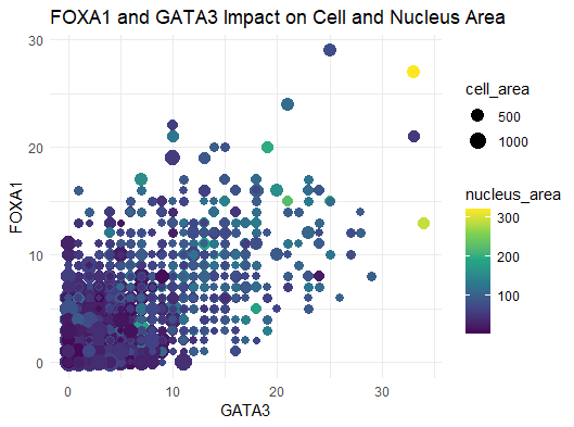
The author’s goal was to make salient the relationship between transcription factors, like FOXA1 and GATA3, and nucleus/cell area. From the data visualization, plotting the gene expression counts of FOXA1 and GATA3 against each other is a good way of visualizing gene expressions of either transcription factor in each cell in the dataset. Further, the encoding of the cell area through color hue and nucleus area through point size is a good way of determining how these gene expression levels are correlated with cell size. All in all, the author was effective in making salient the point that they wanted to make. In terms of the results of the data visualization, however, there doesn’t appear to be an actual trend between cell size and transcription factor expression. It was noted that the largest cell in the top right corner, encoded in yellow, does express high amounts of both genes, however, one cell in a sample size of hundreds doesn’t indicate a trend.
How could you improve the data visualization in making salient the point they said they wanted to make? If you don’t think the data visualization can be improved, explain why the data visualization is already effective.
In terms of improving the saliency, this data visualization did a great job in attempting to make salient the relationship between transcription factors and cell size. Since there doesn’t appear to be an actual trend between these factors, I can’t think of a way to improve the saliency. The goal of a data visualziation is not to prove that a trend exists, but to show with clarity the relationship between a set of variables. In this visualization, any scientist can read it and understand what the goal of the visualization was. And in fact, it’s very clear from this that these two transcription factors do not have any apparent affect on cell size. The proportion of FOXA1 and GATA3 are the highest on the y = x diagonal of the graph. For nearly equal proportions of gene expression for both, as you follow the diagonal across the graph, there’s no indication that the color hue is increasing, nor is there an indication that the point sizes are increasing either. But again, this is made clear by the data visualization therefore, the visualization itself is very effective already.