Visualizing Mean and Variance of Gene Expression

This visualization applies code written by Caleb Hallinan (challin1) with a few minor modifications to better fit the pikachu data set.
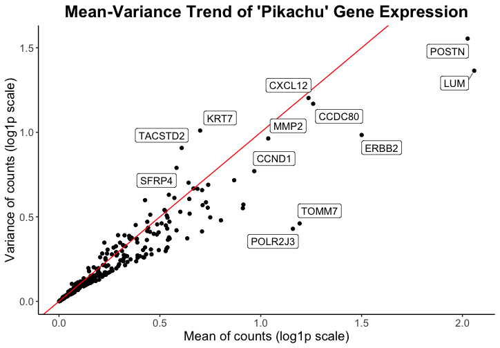
Critique of Data Visualization
Caleb’s goal was to make salient the high mean and/or variance genes within the spatial transcriptomics visium data in order to inform viewers of which genes might be of interest in downstream analysis or spatial plotting of the data. \
He used the visual channel of position, where the x-axis shows the mean of gene counts and the y-axis shows the variance of gene counts, to visualize the quantitative variables of mean and variance of gene expression. When applied to the pikachu dataset, this shows the mean and variance of gene expression in each cell instead of in each spot. The geometric primitive used for the quantitative variables are points.
While I had to make some modifications to the code in order to have the data represented more cleanly with my data set (code with marked modifications below), I believe that Caleb did a good job prioritizing encoding with position to demonstrate quantitative data. I think the use of a log scale also makes the relationship between all the genes easier to visualize. I think the Gestault principle of proximity is really effective in grouping the point representing each gene with its label.
One thing that I would change from Caleb’s visualization is that I would remove the red line which represents a 1:1 relationship of the mean to variance ratio. I don’t think this line highlights outstanding genes because there is no expecation that the variance and mean have a 1:1 ratio. However, I think that if a trendline were plotted instead, it would add more information to the data visualization that may be interesting.
One observation that I made when I used his code on my data is that the mean and variance values were very different by orders of magnitude. This made me consider what data is actually being plotted. I think that because the eevee dataset has the expression of genes per spot, there is higher variance and also much higher gene expression, as there are varied numbers of cells in one spot. As such, I considered whether this type of data/visualization of mean and varaince used in isolation is as effective with the eeveee dataset because it is difficult to determine whether mean and variance depends on the gene or if it is a consequence of multiple cells being contained in one spot.
However, I really appreciate the simplicity of the plot and the effectiveness at representing the quantitative data.
#HW 2 by Andrea Cheng

#Running Code from challin1

# import libraries
library(ggplot2)
library(tidyverse)
library(ggrepel)

# read in data
data <- read.csv('pikachu.csv.gz', row.names = 1)


# QC
dim(data)
head(data)
colnames(data)
rownames(data)

# grab only genes and expression
# modified to remove more columns in pikachu dataset
X = data |>
  select(!c(cell_id, aligned_x, aligned_y, cell_area, nucleus_area))


# log1p transform data
X = log1p(X)

# get mean and variance for each gene
mean_genes <- apply(X, 2, mean)
var_genes <- apply(X, 2, var)

# combine mean and variance into a data frame
mean_var_df <- data.frame(mean_genes, var_genes)

# add gene names as a column
mean_var_df$genes <- rownames(mean_var_df)
rownames(mean_var_df) <- NULL

# set seed for ggrepel
set.seed(44)

# plot
ggplot(mean_var_df) +
  # geom point for mean/variance
  geom_point(aes(x = mean_genes, y = var_genes)) +
  geom_abline(intercept = 0, slope = 1, color = "red") +
  # label high variance genes (modified the code to consider variance and mean together)
  # changed threshold for variance from 2 to 0.75 and mean from 4 to 1
  geom_label_repel(aes(x = mean_genes, y = var_genes, label=ifelse(var_genes>0.75 | mean_genes >1, as.character(genes),'')),
                   box.padding   = 0.35,
                   point.padding = 0.5,
                   segment.color = 'grey50') +
  # theme
  theme_classic() +
  # labels
  labs(
    x = "Mean of counts (log1p scale)",
    y = "Variance of counts (log1p scale)",
    title = "Mean-Variance Trend of 'Pikachu' Gene Expression"
  ) +
  # text edit
  theme(
    plot.title = element_text(hjust = 0.5, face="bold", size=18),
    text = element_text(size = 14)
  )