Correlation of Transcription Factor Expression with Cell and Nucleus Area

1) Whose code did you apply? I applied the code jwang428 wrote for the previous homework assignment.
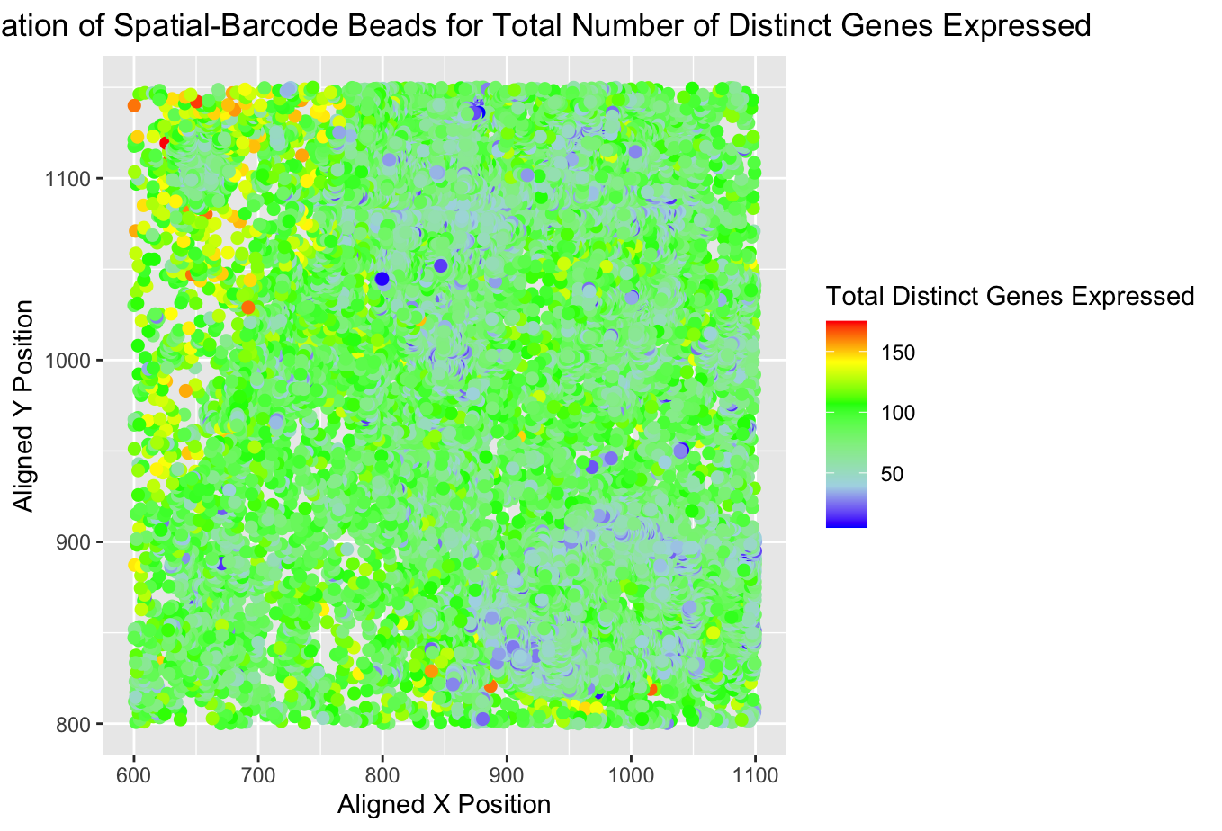
2) Critique the resulting visualization. In the original plot, the author was successful in illustrating the points of higher and lower gene expression in the sequencing data. There were 2-3 clear areas of higher gene expression (red dots) and one section of lower gene expression (blue dots). I think to make this more clear, they could have enclosed these areas, especially the clusters of red and orange to make it more clear that is the focus of the visualization.
I think it is important to note that this code was originally written for the ‘eezee’ (sequencing) dataset and I applied it to the ‘pikachu’ (imaging) dataset. When the code was directly applied to the imaging data set, very little was clearly visible because the imaging dataset is not segmented into the nanodrops and the x,y localization is a less clear differentiator between cells or cell groupings. The figure became a large condensed blob of color and very little was salient. One way to change the visualization to study levels of gene expression across cells in the imaging dataset could be to make a histogram with the bins representing the number of cells on the x-axis and the number of genes expressed on the y-axis. This may also be more generalizable between the datasets.
## HW2 kbowden5
## replicating code from jwang248

data <- read.csv('pikachu.csv.gz', row.names = 1)

dim(data)
data[1:10, 1:10]
colnames(data)

dim(data)
data[1:10, 1:10]
colnames(data)

# Initialization of variables
# x_pos <- data[,2]
# y_pos <- data[,3]
gen_exp <- data[,4:ncol(data)]
colnames(gen_exp)

# Determine total # of genes expressed by each barcode
gen_exp_count <- rowSums(gen_exp != 0)
total_genes_exp = as.numeric(gen_exp_count)

# making the data visualization
## adjusted the x and y position from the original code so that it would apply to the pikachu data
library(ggplot2)
p <- ggplot(data) +
  geom_point(aes(x = aligned_x, y = aligned_y, col = total_genes_exp), size = 2) +
  xlab("Aligned X Position") + ylab("Aligned Y Position") + ggtitle("Spatial Localization of Spatial-Barcode Beads for Total Number of Distinct Genes Expressed") +
  scale_colour_gradientn(colors = c("blue", "lightblue", "lightgreen", "green", "yellow", "red")) + theme(plot.title = element_text(hjust = 0.5))

p + theme(legend.title.align=0.5) + labs(color="Total Distinct Genes Expressed")