Spatial Plot of POSTN Levels Across Spatial-Barcode Beads

Whose code are you applying? Provide a JHED
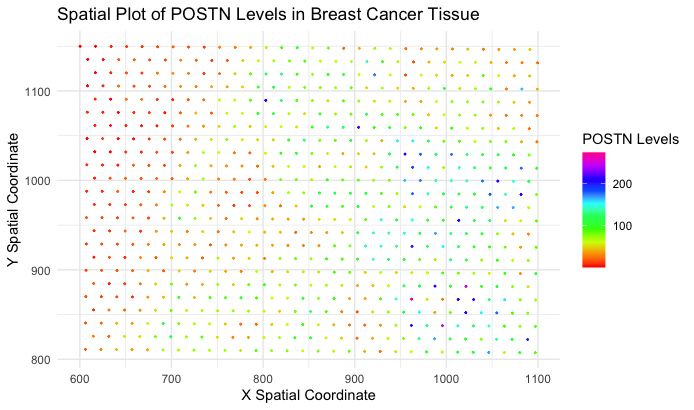
I am applying Wenyu Yang’s (wyang51) code onto the eevee dataset. The source and modified code can be found below.
Critique the resulting visualization when applied to your data. Do you think the author was effective in making salient the point they said they wanted to make? How could you improve the data visualization in making salient the point they said they wanted to make? If you don’t think the data visualization can be improved, explain why the data visualization is already effective.
I appreciate the author’s encoding of POSTN utilizing color hue, though I believe color saturation would have been a little more effective at encoding the quantitative value. Instead of having to visually distinguish between “red”, “green”, “blue”, “yellow”, and etc., modifying the saturation from “low” to “high” can more easily distinguish “low” and “high” expression of POSTN also.
In other words, the visualization would probably be less reliant on distinct color categories and more dependent on the intensity or vividness of the color. Using color saturation to encode the quantitative values of POSTN expression could allow for a smoother and more nuanced representation.
By employing a gradient of saturation, ranging from subtle tones for low expression to vibrant hues for high expression, observers could discern the relative levels of POSTN more intuitively. This approach offers a continuous spectrum, eliminating the need to categorize expression into discrete color bins. It provides a more fluid transition between low and high values, making it easier for the audience to perceive the subtle variations in POSTN expression across different data points.
Another area for potential improvement could be in modifying the size of the points on the graph. When the code was applied to the eevee dataset, the spatial-barcode beads are actually quite small and there is a lot of white space between nearby points. This area could perhaps be utilized in encoding another variable of interest, whether that be another genomic expression within the dataset. Size is also another relatively well approved encoding of quantitative variables as we have learned from the rankings in class.
# R code adapted from wyang51
data <- read.csv('eevee.csv.gz', row.names = 1)
dim(data)
colnames(data)

# look at the data, what are the columns, rows
# column1 = cell_ids, following columns are the cell characteristics
# each row is a cell, 17135 cells, and 317 characteristics
data[1:10, 1:10]

geneExpression <- data[,6:ncol(data)]
# nucleus area estimated from dapi segmentations
# cell area estimated from dilating from the nucleus
# aligned x and y are the cell centroid positions
# breast cancer tissue sections
# serial tissue section
# both datasets are looking at the same structure

# making the data visualization
# I want to plot the aligned_x, aligned_y, and have the color be the gene expression
library(ggplot2)

gene_mean_expression <- apply(geneExpression, 2, mean)

# Find the gene with the maximum mean expression
most_expressed_gene <- names(gene_mean_expression)[which.max(gene_mean_expression)]

print(paste("Most expressed gene:", most_expressed_gene))

ggplot(data) +
  geom_point(aes(x = aligned_x, y = aligned_y, color = POSTN), size = 0.3) +
  labs(title = "Spatial Plot of POSTN Levels Across Spatial-Barcode Beads",
       x = "X Spatial Coordinate",
       y = "Y Spatial Coordinate",
       color = "POSTN Levels") +
  scale_color_gradientn(colors = rainbow(10))+
  theme_minimal()