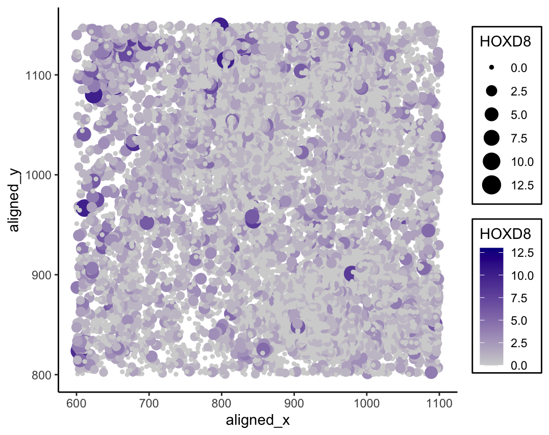
Visualizing the relationship between cell spatial position and HOXD8 expression
Whose code are you applying? Provide a JHED
I am applying Andrew’s code (aying2). I switched out the gene he used (VCAN), as it was not in the pikachu dataset. I used HOXD8 instead.
Critique the resulting visualization when applied to your data. Do you think the author was effective in making salient the point they said they wanted to make? How could you improve the data visualization in making salient the point they said they wanted to make? If you don’t think the data visualization can be improved, explain why the data visualization is already effective.
The author’s goal was to make salient the relationship between a cell’s x and y location and the cell’s expression of the VCAN gene. I think the author was mostly effective in making this point salient. The use of Gestalt principle of similarity was successfully applied to group different cells together through the visual channel color saturation to reflect HOXD8 expression, and the Gestalt principle of enclosure helped to separate the legends from the graph. The use of a second visual channel, size, to also encode the gene expression further draws the viewer’s attention to this aspect of the graph. Area is relatively high on the list of the best encodings for human perception of quantitative data. Additionally, aligning the cell’s relative location on the graph with its actual coordinates made it fit with natural human instincts of position. One improvement to be made would be to adjust the size of the points to better fit the graph. This wasn’t really an issue in the original visualization as the data points were already spaced out due to the nature of bead capture. However, with imaging data, the data points appear cluttered and on top of each other, which makes it more difficult to interpret. Shrinking the entire scale down to allow the points to better fit within the graph with minimal overlap would make the image more salient. Greater separation between the points would strengthen the position encoding to fit with tendencies of human perception. Another area of improvement would be to flip the orientation of one of the legends so they are either both increasing or decreasing. As the legends are for visual channels encoding the same property, keeping a consistent direction between the two would play into the Gestalt principle of similarity and enhance saliency.
data <- read.csv("pikachu.csv.gz",
           row.names = 1)

library(ggplot2)

ggplot(data, aes(
  x = aligned_x,
  y = aligned_y,
  size = HOXD8,
  col = HOXD8,
)) +
  scale_colour_gradient(low = 'lightgrey', high = 'darkblue') +
  geom_point() +
  theme_classic() +
  # box around legend source: https://stackoverflow.com/questions/47584766/draw-a-box-around-a-legend-ggplot2
  theme(legend.background = element_rect(size = 0.5,
                                         colour = 1))