Correlation of Transcription Factor Expression with Cell and Nucleus Area

What data types are you visualizing?
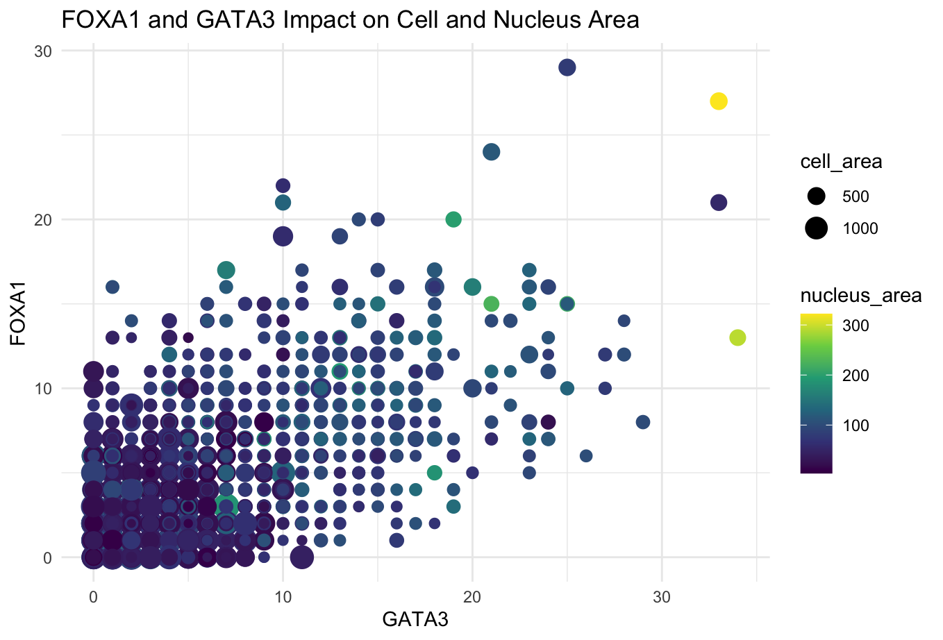
I am visualizing the quantitative data of the expression count of the FOXA1 gene for each cell, quantitative data of the expression count of GATA5 gene for each cell, and the quantitative data of the cell and nucleus areas.
What data encodings (geometric primitives and visual channels) are you using to visualize these data types?
I used the geometric primitive of points. Each point represents a single cell. I used the visual channels of size, color hue, x-position, and y-position. The size of each point represents the cell area, with the larger points indicating larger cells. The color hue represents the nucleus area with light green and yellow points indicating the largest nuclei. The x-position of each point is representative of the expression count of the GATA3 gene for that cell and the y-position represents the expression count of the FOXA1 gene for that cell.
What about the data are you trying to make salient through this data visualization?
The FOXA1 and GATA3 genes are both known transcription factors. This data visualization makes salient the relationship between transcription factor expression, cell area, and nucleus area. Most notably, the cell with the greatest nuclues area has high levels of expression counts of both the transcription factors.
What Gestalt principles or knowledge about perceptiveness of visual encodings are you using to accomplish this?
The main Gestalt principle used in this data visualization is similarity in color. The cells with smaller nucleus areas are all darker blues while the several with significantly larger nuclei are light green or yellow. This use of similarity in color highlights the increased nucleus area with the icnreased transcription factor expression counts. Additionally, this blue to yellow color palette was used knowing that some people are color blind and cannot distinguish between red and green or blue and orange.
#note that the code and the file are in the same directory
data <- read.csv('pikachu.csv.gz', row.names = 1)
dim(data)
data[1:10, 1:10]
colnames(data)

#if it is not already installed
install.packages("viridis")

#access necessary libraries
library(ggplot2)
library(viridis)

#generate the plot
ggplot(data)+
  geom_point(aes(x=GATA3, y = FOXA1, col = nucleus_area, size = cell_area))+
  scale_color_viridis_c()+
  theme_minimal()+
  labs(title = "FOXA1 and GATA3 Impact on Cell and Nucleus Area",
       x = "GATA3",
       y = "FOXA1")